I’ve spent the last ~5 years leading the Material Design team at Google, arguably the world’s largest and most recognized design system. I’ve worked with brilliant minds, backed by incredible resources. And yet, I can’t shake this feeling: design systems have failed us. They don’t do what they say on the (proverbial) box.
Let’s rewind. The promise of design systems was alluring: accelerate the process of building cohesive experiences, ensuring high quality and consistency at scale. We envisioned systems that encompassed patterns, components, motion, content strategy, and even micro-interactions. A holistic guide to creating delightful experiences.
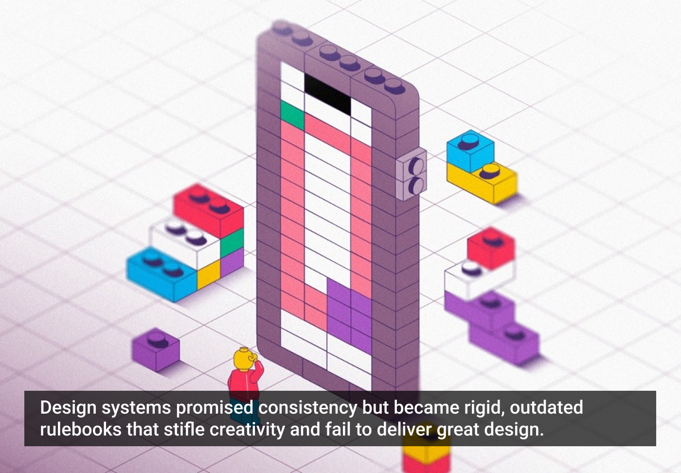
But somewhere along the way, we got lost in the weeds of components, tokens, and documentation. Design systems became rigid rulebooks + glorified Figma sticker sheets — stifling creativity and burying designers in endless updates. And so adoption becomes the main challenge. Any design system professional will tell you that they spend more time trying to convince people to adopt their design system than actually designing it. Could it be that we have not quite reached Product Market Fit for design systems?
Here’s the brutal truth:
They’re unread novels. Anything that requires reading is dead on arrival. No one reads the manual. That is why patterns fall by the wayside. Since we don’t encapsulate patterns in code, they become dead text that serves no real purpose.
They crush innovation. Instead of empowering designers, they force them into pre-defined boxes, leading to a sea of homogenous digital experiences. Designers often spend more time trying to figure out which pattern to use than how to solve a particular problem.
They’re a black hole of maintenance. Keeping them up-to-date and consistent across sprawling organizations is a Sisyphean task.
They’re dinosaurs in the age of AI. While AI is revolutionizing coding, design systems remain stuck in the past, slowing us down instead of propelling us forward.
They don’t scale. They fail small teams striving for product-market fit who don’t have the bandwidth for long-term documentation. At the same time, they fail multi-product teams where a centralized system becomes a compromise, diluting its effectiveness for any single application.
And the biggest lie of all? That adherence to a design system guarantees a good product. A truly great app is usable and desirable because of thoughtful design, not because it religiously follows a set of rules.
So sure, use Material 3. It’s a great design system with some awesome resources. But is it enough? Code reuse is great, and it’s very helpful to have your design and code aligned. But a full adoption of a design system is an expensive proposition; for most organizations, it is not justifiable just for the cost savings alone.
So why do we continue to push design systems as the solution for design at scale? Should we consider that while they might be part of a solution, there are other tools and ideas that we need to develop?
So, what’s the next chapter? How do we harness the power of AI to create designs that are consistent when they need to be but also truly dynamic, intelligent, and adaptable?
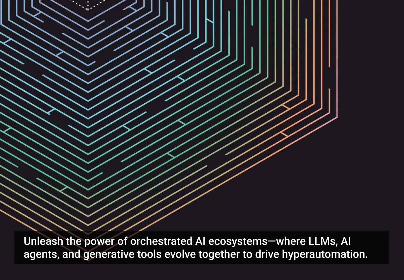
In an ecosystem built for the orchestration of LLMs, AI agents, and other generative tools, conversation is the tissue that connects all the individual nodes at play. A collection of advanced technologies is sequenced in perpetually intelligent ways to create automations of business processes that continue getting smarter. In these ecosystems, machines are communicating with other machines, but there are also conversations between humans and machines. Inside truly optimized ecosystems, humans are training their digital counterparts to complete new tasks through conversational interfaces — they’re telling them how to contextualize and solve problems.
These innovations, algorithms, and systems that get sewn together start to build what’s referred to as artificial general intelligence (AGI). Building on the idea of providing machines a balance of objectives and instructions, and a sort of system that’s achieved AGI, will only need an objective in order to complete a task. This leads to the more imminent organizational AGI we’ve been talking so much about. Josh wrote about this connection in an article last year for Observer:
There’s the immediate and tangible benefit of people eliminating tedious tasks from their lives. Then there’s the long term benefit of a burgeoning ecosystem where employees and customers are interacting with digital teammates that can perform automations leveraging all forms of data across an organization. This is an ecosystem that starts to take the form of a digital twin.
McKinsey describes a digital twin as “a virtual replica of a physical object, person, or process that can be used to simulate its behavior to better understand how it works in real life.” They describe these twins inhabiting ecosystems similar to what we’re describing here, that they call an “enterprise metaverse … a digital and often immersive environment that replicates and connects every aspect of an organization to optimize simulations, scenario planning, and decision making.”
Something as vast as an enterprise metaverse won’t materialize inside a closed system where the tools have to be supplied exclusively by Google or IBM. If you’re handcuffed to a specific LLM, NLP, or NLU vendor, your development cycles will be limited by their schedule and capabilities. This is actually a common misstep for organizations looking for vendors: it’s easy to think that the processing and contextualization of natural language is artificial intelligence — a faulty notion that ChatGPT in particular set ablaze. But LLMs and NLP/NLU are just individual pieces of technology that make up a much broader ecosystem for creating artificial intelligence. Perhaps more importantly, in terms of keeping an open system, LLMs and NLP/NLU are one of many modular technologies that can be orchestrated within an ecosystem. “Modular” means that, when better functionalities — like improved LLMs — emerge, an open system is ready to accept and use them.
LLMs, a common stumbling block
In the rush to begin hyperautomating, LLMS have quickly proven to be the first stumbling block for many organizations. As they attempt to automate specific aspects of their operations with these tools that seem to know so much (but actually “know” basically nothing), the result is usually a smattering of less-than-impressive chatbots that are likely unreliable and operating in their own closed system. These cloistered AI agents are unable to become part of an orchestrated effort and thus create subpar user experiences.
Think of auto manufacturing. In some ways, it would be easier to manage the supply chain if everything came from one supplier or if the manufacturer supplied its own parts, but production would suffer. Ford — a pioneer of assembly-line efficiency — relies on a supply chain with over 1,400 tier 1 suppliers separated by up to 10 tiers between supply and raw materials, providing significant opportunities to identify and reduce costs and protect against economic shifts. This represents a viable philosophy where hyperautomation is concerned as well. Naturally, it comes with a far more complex set of variables, but relying on one tool or vendor stifles nearly every aspect of the process: innovation, design, user experience — it all suffers.
Strive for openness
“Most of the high-profile successes of AI so far have been in relatively closed sorts of domains,” Dr. Ben Goertzel said in his TEDxBerkeley talk, “Decentralized AI,” pointing to game playing as an example. He describes AI programs playing chess better than any human but reminds us that these applications still “choke a bit when you give them the full chaotic splendor of the everyday world that we live in.” Goertzel has been working in this frontier for years through the OpenCog Foundation, the Artificial General Intelligence Society, and SingularityNET, a decentralized AI platform which lets multiple AI agents cooperate to solve problems in a participatory way without any central controller.
In that same TEDx talk, Goertzel references ideas from Marvin Minsky’s book The Society of Mind: “It may not be one algorithm written by one programmer or one company that gives the breakthrough to general intelligence. …It may be a network of different AIs, each doing different things, specializing in certain kinds of problems.”
Hyperautomating within an organization is much the same: a whole network of elements working together in an evolutionary fashion. As the architects of the ecosystem are able to iterate rapidly, trying out new configurations, the fittest tools, AIs, and algorithms survive. From a business standpoint, these open systems provide the means to understand, analyze, and manage the relationships between all of the moving parts inside your burgeoning ecosystem, which is the only way to craft a feasible strategy for achieving hyperautomation.
Don’t fear the scope, embrace the enormity
Creating an architecture for hyperautomation is a matter of creating an infrastructure, not so much the individual elements that exist within an infrastructure. It’s the roads, electricity, and waterways that you put in place to support houses and buildings, and communities. That’s the problem a lot of organizations have with these efforts. They’re failing to see how vast it is. Simulating human beings and automating tasks are not the same as buying an email marketing tool.
The beauty of an open platform is that you don’t have to get it right. It might be frightening in some regards to step outside a neatly bottled or more familiar ecosystem, but the breadth and complexity of AI are also where its problem-solving powers reside. Following practical wisdom applied to emergent technologies — wait until a clear path forward emerges before buying in — won’t work because once one organization achieves a state of hyperautomation, their competitors won’t be able to catch them. By choosing one flavor or system for all of your conversational AI needs, you’re limiting yourself at a time when you need as many tools as you can get. The only way to know what tools to use is to try them all, and with a truly open system, you have the power to do that.
As you can imagine, this distributed development and deployment of microservices gives your entire organization a massive boost. You can also create multiple applications/skills concurrently, meaning more developers working on the same app, at the same time, resulting in less time spent in development. All of this activity thrives because the open system allows new tools from any vendor to be sequenced at will.
To ensure that technology remains truly useful as its power grows exponentially, we need to keep a few basic questions at the center of our thinking. Who is this technology built for? What problems will the people it benefits need to solve and want solved by AI? How might they employ AI agent solutions to find a resolution?
I began asking these questions decades ago, while doing user-centered design work that eventually led to the founding of one of the world’s first UX agencies, Effective UI (now part of Ogilvy). Terms like user-centric and customer experience weren’t in the vernacular, but they were central to the work we did for clients. For one project, I was part of a cross-disciplinary team tasked with redesigning the cockpit of the 747 for the 787 Dreamliner. The Dreamliner was going to have a carbon fiber cockpit, which allowed for bigger windows, which left less space for buttons, and the Dreamliner was going to need more buttons than the button-saturated 747.
Our solution changed the way I thought about technology forever. We solved the button problem with large touchscreen panels that would show the relevant controls to the pilots based on the phase of the flight plan the plane was in. While there’s some truth to the idea that these planes do a lot of the flying automatically, the goal wasn’t to make the pilots less relevant, it was to give them a better experience with a lighter cognitive load. To fly the 747, pilots had to carry around massive manuals that provided step-by-step instructions for pressing buttons in sequence to execute specific functions during flight — manuals that there was barely room for in the crowded cockpits.
The experience of flying a commercial airplane became more intuitive because we were able to contextualize the pilot’s needs based on the flight plan data and provide a relevant interface. Context was the key to creating increasingly rewarding and personalized experiences. The other massive takeaway for me was that if you can automate a 787, you can automate a company.
Of all the experiences people have with technology, conversational ones are typically some of the worst, though thankfully, that’s changing. Creating a framework where conversational AI and AI agents can thrive, though insanely difficult work, creates unmatched potential.
As a technologist, builder, and designer, I’ve been deploying and researching conversational AI for more than two decades. Some of my early experiments with conversational AI came to be known as Sybil, a bot I built about 20 years ago with help from Daisy Weborg (my eventual co-founder of OneReach.ai). The internet was a less guarded space back then, and in some ways, it was easier to feed Sybil context. For example, Sybil could send spiders crawling over geo-tagged data in my accounts to figure out where I was at any given moment. Daisy loved the “where’s Robb” skill because I was often on the move in those days, and she could get a better sense of my availability for important meetings.
Recently, I had a conversation with Adam Cheyer, one of the co-creators of Siri. When I was working on Sybil, I wasn’t fully aware of the work Adam was doing at Siri Labs. Likewise, he wasn’t hip to what I was doing either. Interestingly, though perhaps unsurprisingly in retrospect, we were trying to solve many of the same problems.
Adam mentioned a functionality that was built into the first version of Siri that would allow you to be reading an email from someone and ask Siri to call that person. That might sound simple, but it’s a relatively complex task, even by today’s standard. In this example, Siri is connecting contact information from Mail with associated data in Contacts, connecting points between two separate apps to create a more seamless experience for users.
“At the time, email and contacts integration wasn’t very good,” Cheyer said on our podcast. “So you couldn’t even get to the contact easily from an email. You had to leave an app and search for it. And it was a big pain. “Call him.” It was a beautiful combination of manipulating what’s on the screen and asking for what’s not on the screen. For me, that’s the key to multimodal interaction.”
Adam went on to mention other functionalities that he assumed had been lost to the dustbin of history, including skills around discovery that he and Steve Jobs fought over. Apple acquired Siri in 2010, and the freestanding version of the app had something called semantic autocomplete. Adam explained that if you wanted to find a romantic comedy playing near you, typing the letters “R” and “O” into a text field might auto-complete to show rodeos, tea rooms, and romantic comedies. If you clicked “romantic comedy,” Siri would tell you which romantic comedies were showing near you, along with info about their casts and critical reviews. This feature never made it into the beta version of Siri that launched with the iPhone 4S in October 2011.
“I feel that because I lost that argument with Steve, we lost that in voice interfaces forever. I have never seen another voice assistant experience that had as good an experience as the original Siri. I feel it got lost to history. And discovery is an unsolved problem.”
I’m sharing these stories from Adam for two reasons. One, to remind you that there are people who have been working for decades on conversational AI. ChatGPT blew the doors open on this technology to the public, but for those of us who’ve been toiling on the inside for years, the response was something along the lines of, “Finally, people will believe me when I talk about how powerful this technology is!”
Another reason for sharing is that Adam’s experience with Steve Jobs illustrates that the choices we make now with this technology will set a trajectory that will become increasingly difficult to reset. With their ability to mine unstructured data (like written and recorded conversations), large language models (LLMs) have the power to solve the problem of discovery, but this is a problem that Adam and I have been circling for more than 20 years. Things might have been different if he’d won that argument with Jobs.
You see, the ultimate goal isn’t that we can converse with machines, telling them every little thing we want them to do for us. The goal is for machines to be able to predict the things we want them to do for us before we even ask. The ultimate experience is not one where we talk to the machine, but one where we don’t need to, because it already knows us so well. We provide machines with objectives, but they don’t really need explicit instructions unless we want something done in a very specific way.
Siri’s popularity, along with the widespread adoption of smart speakers and Amazon’s Alexa, made something else clear to me. Talking to speakers in your house can be fun, but there’s really only so much intrinsic value in an automated home. Home is generally a place for relaxation, not productivity. Being able to walk into your office and engage in conversation with technology that’s running a growing collection of business process automations is where the real wealth of opportunity lies. Orgs are going to want their own proprietary versions of Alexa or Siri in different flavors. Intelligent virtual assistants that are finely tuned to meet an organization’s security and privacy needs. Still, coming up on ten years after the introduction of Alexa, there’s still no version of that within a business.
Due to the inherently complex nature of the tasks, the lack of maturity in the tools, and the difficulty in finding truly experienced people to build and run them, creating better-than-human experiences is extremely difficult to do. I once heard someone at Gartner call it “insanely hard.” Over the years, I’ve watched many successful and failed implementations (including some of our own crash-and-burn attempts). Automating chatbots on websites, phone, SMS, WhatsApp, Slack, Alexa, Google Home, and other platforms, patterns began to emerge from successful projects. We began studying those success stories to see how they compared to others.
My team gathered data and best practices over the course of more than 2 million hours of testing with over 30 million people participating in workflows across 10,000+ conversational applications (including over 500,000 hours of development). I’ve formulated an intimate understanding of what it takes to build and manage intelligent networks of applications and, more importantly, how to manage an ecosystem of applications that enables any organization to hyperautomate.
For most companies, ChatGPT has been a knock upside the head, waking them up to the fact that they’re already in the race toward hyperautomation or organizational artificial general intelligence (AGI). As powerful as GPT and other LLMs are, they are just one piece of an intelligent technology ecosystem. Just like a website needs a content strategy to avoid becoming a collection of disorganized pages, achieving hyperautomation requires a sound strategy for building an intelligent ecosystem and the willingness to quickly embrace new technology.
We’ve seen how disruptive this technology can be, but leveraged properly, generative AI, conversational interfaces, AI agents, code-free design, RPA, and machine learning are something more powerful: they are force multipliers that can make companies that use them correctly impossible to compete with. The scope and implications of these converging technologies can easily induce future shock — the psychological state experienced by individuals or society at large when perceiving too much change in too short a period of time. That feeling of being overwhelmed might happen many times when reading this book. Organizations currently wrestling with their response to ChatGPT — that are employing machines, conversational applications, or AI-powered digital workers in an ecosystem that isn’t high functioning—are likely experiencing some form of this.
The goal for this book is to alleviate future shock by equipping problem solvers with a strategy for building an intelligent, coordinated ecosystem of automation — a network of skills shared between intelligent digital workers that will have a widespread impact within an organization. Following this strategy will not only vastly improve your existing operations, but it will also forge a technology ecosystem that immediately levels up every time there’s a breakthrough in LLMs or some other tool. An ecosystem built for organizational AI can take advantage of new technologies the minute they drop.
It took me 20 years to develop the best practices and insights collected here. I’ve been fortunate to have had countless conversations about how conversational AI fits into the enterprise landscape with headstrong business leaders. I’ve seen firsthand how a truly holistic understanding of the technologies associated with conversational AI can make the crucial difference for enterprise companies struggling to balance the problems that come with this fraught territory. That balance will only come about when the people working with it have a strategy that can put converging technologies to work in intelligent ways, propelling organizations and, more broadly, the people of the world, into a bold new future.
By many accounts, AI Agents are already here, but they are just not evenly distributed. However, few examples yet exist of what a good user experience of interacting with that near-futuristic incarnation of AI might look like. Fortunately, at the recent AWS Re: Invent conference, I came upon an excellent example of what the UX of interacting with AI Agents might look like, and I am eager to share that vision with you in this article. But first, what exactly are AI Agents?
What are AI Agents?
Imagine an ant colony. In a typical ant colony, you have different specialties of ants: workers, soldiers, drones, queens, etc. Every ant in a colony has a different job — they operate independently yet as part of a cohesive whole. You can “hire” an individual ant (Agent) to do some simple semi-autonomous job for you, which in itself is pretty cool. However, try to imagine that you can hire the entire ant hill to do something much more complex or interesting: figure out what’s wrong with your system, book your trip, or …Do pretty much anything a human can do in front of a computer. Each ant on their own is not very smart — they are instead highly specialized to do a particular job. However, put together, different specialties of ants present a kind of “collective intelligence” that we associate with higher-order animals. The most significant difference between “AI,” as we’ve been using the term in the blog, and AI Agents is autonomy. You don’t need to give an AI Agent precise instructions or wait for synchronized output — the entire interaction with a set of AI Agents is much more fluid and flexible, much like an ant hill would approach solving a problem.
There are many different ways that agentic AI might work — it’s an extensive topic worthy of its own book (perhaps in a year or two). In this article, we will use an example of troubleshooting a problem on a system as an example of a complex flow involving a Supervisor Agent (also called “Reasoning Agent”) and some Worker Agents. The flow starts when a human operator receives an alert about a problem. They launch an investigation, and a team of semi-autonomous AI Agents led by a supervisory Agent helps them find the root cause and make recommendations about how to fix the problem. Let’s break down the process of interacting with AI Agents in a step diagram:
A multi-stage agentic workflow pictured above has the following steps:
A human operator issues a general request to a Supervisor AI Agent.
Supervisor AI Agent then spins up and issues general requests to several specialized semi-autonomous Worker AI Agents that start investigating various parts of the system, looking for the root cause (Database).
Worker Agents bring back findings to the Supervisor Agent, which collates them as Suggestions for the human operator.
Human operator accepts or rejects various Suggestions, which causes the Supervisor Agent to spin up additional Workers to investigate (Cloud).
After some time going back and forth, the Supervisor Agent produces a Hypothesis about the Root Cause and delivers it to the human operator.
Just like in the case of contracting a typical human organization, a Supervisor AI Agent has a team of specialized AI Agents at their disposal. The Supervisor can route a message to any of the AI Worker Agents under its supervision, who will do the task and communicate back to the Supervisor. The Supervisor may choose to assign the task to a specific Agent and send additional instructions at a later time when more information becomes available. Finally, when the task is complete, the output is communicated back to the user. A human operator then has the option to give feedback or additional tasks to the Supervising AI Agent, in which case the entire process begins again.
The human does not need to worry about any of the internal stuff — all that is handled in a semi-autonomous manner by the Supervisor. All the human does is state a general request, then review and react to the output of this agentic “organization.” This is exactly how you would communicate with an ant colony if you could do such a thing: you would assign the job to the queen and have her manage all of the workers, soldiers, drones, and the like. And much like in the ant colony, the individual specialized Agent does not need to be particularly smart or to communicate with the human operator directly — they need only to be able to semi-autonomously solve the specialized task they are designed to perform and be able to pass precise output back to the Supervisor Agent, and nothing more. It is the job of the Supervisor Agent to do all of the reasoning and communication. This AI model is more efficient, cheaper, and highly practical for many tasks. Let’s take a look at the interaction flow to get a better feel for what this experience is like in the real world.
Use case: CloudWatch investigation with AI Agents
For simplicity, we will follow the workflow diagram earlier in the article, with each step in the flow matching that in the diagram. This example comes from AWS Re: Invent 2024 — Don’t get stuck: How connected telemetry keeps you moving forward (COP322), by AWS Events on YouTube, starting at 53 minutes.
Step 1
The process starts when the user finds a sharp increase in faults in a service called “bot-service” (top left in the screenshot) and launches a new investigation. The user then passes all of the pertinent information and perhaps some additional instructions to the Supervisor Agent.
Step 1: Human Operator launches a new investigation. Image Source: AWS via YouTube
Step 2
Now, in Step 2, the Supervisor Agent receives the request and spawns a bunch of Worker AI Agents that will be semi-autonomously looking at different parts of the system. The process is asynchronous, meaning the initial state of suggestions on the right is empty: findings do not come immediately after the investigation is launched.
Step 2: Supervisor Agent launches Worker Agents that take some time to report back. Image Source: AWS via YouTube
Step 3
Now the Worker Agents come back with some “suggested observations” that are processed by the Supervisor and added to the Suggestions on the right side of the screen. Note that the right side of the screen is now wider to allow for easier reading of the agentic suggestions. In the screen below, two very different observations are suggested by different Agents, the first one specializing in the service metrics and the second one specializing in tracing.
Step 3: Worker Agents come back with suggested observations that may pertain to the problem experienced by the system. Image Source: AWS via YouTube
These “suggested observations” form the “evidence” in the investigation that is targeted at finding the root cause of the problem. To figure out the root cause, the human operator in this flow helps out: they respond back to the Supervisor Agent to tell it which of these observations are most relevant. Thus, the Supervisor Agent and human work side by side to collaboratively figure out the root cause of the problem.
Step 4
The human operator responds by clicking “Accept” on the observations they find relevant, and those are added to the investigation “case file” on the left side of the screen. Now that the humans have added some feedback to indicate the information they find relevant, the agentic process kicks in the next phase of the investigation. Now that the Supervisor Agent has received the user feedback, they will stop sending “more of the same” but instead will dig deeper and perhaps investigate a different aspect of the system as they search for the root cause. Note in the image below that the new suggestions now coming in on the right are of a different type — these are now looking at logs for a root cause.
Step 4: After user feedback, the Agents look deeper and come back with different suggestions. Image Source: AWS via YouTube
Step 5
Finally, the Supervisor Agent has enough information to take a stab at identifying the root cause of the problem. Hence, it switches from evidence gathering to reasoning about the root cause. In steps 3 and 4, the Supervisor Agent was providing “suggested observations.” Now, in Step 5, it is ready for a big reveal (the “denouement scene,” if you will) so, like a literary detective, the Supervisor Agent delivers its “Hypothesis suggestion.” (This is reminiscent of the game “Clue” where the players take turns making “suggestions,” and then, when they are ready to pounce, they make an “accusation.” The Supervisor Agent is doing the same thing here!)
Step 5: Supervisor Agent is now ready to point out the culprit of the “crime.” Image Source: AWS via YouTube
The suggested hypothesis is correct, and when the user clicks “accept,” the Supervisor Agent helpfully provides the next steps to fix the problem and prevent future issues of a similar nature. The Agent almost seems to wag a finger at the human by suggesting that they “implement proper change management procedures” — the foundation of any good system hygiene!
Supervisor Agent also provides the next steps to fix the problem and prevent it in the future. Image Source: AWS via YouTube
Final thoughts
There are many reasons why agentic flows are highly compelling and are a focus of so much AI development work today. Agents are compelling, economical, and allow for a much more natural and flexible human-machine interface, where the Agents fill the gaps left by a human and vice versa, literally becoming a mind-meld of human and a machine, a super-human “Augmented Intelligence,” which is much more than the sum of its parts. However, getting the most value from interacting with agents also requires drastic changes in how we think about AI and how we design user interfaces that need to support agentic interactions:
Flexible, adjustable UI: Agents work alongside humans, to do that, AI Agents require a flexible workflow that supports continuous interactions between humans and machines across multiple stages — starting investigation, accepting evidence, forming a hypothesis, providing next steps, etc. It’s a Flexible looping flow crossing multiple iterations.
Autonomy: while, for now, human-in-the-loop seems to be the norm for agentic workflows, Agents show remarkable abilities to come up with hypotheses, gather evidence, and iterate the hypothesis as needed until they solve the problem. They do not get tired or run out of options and give up. AI Agents also show the ability to effectively “write code… a tool building its own tool” to explore novel ways to solve problems — this is new. This kind of interaction by nature requires an “aggressive” AI, e.g., these Agents are trained on maximum Recall, open to trying every possibility to ensure the most true positive outcomes (see our Value Matrix discussion here.) This means that sometimes the Agents will take an action “just to try it” without “thinking” about the cost of false positive or false negative outcomes. For example, an aggressive AI Agent “doctor” might prescribe an invasive brain cancer biopsy procedure without considering lower-risk alternatives first or even stopping to get the patient’s consent! All this requires a deeper level of human and machine analysis and multiple new approval flows for aggressive AI “exploration ideas” that might lead to human harm or simply balloon the out-of-budget costs.
New controls are required: while much of the interaction can be accomplished with existing screens, the majority of Agent actions are asynchronous, which means that most web pages with the traditional transactional, synchronous request/response models are a poor match for this new kind of interaction. We are going to need to introduce some new design paradigms. For example, start, stop, and pause buttons are a good starting point for controlling the agentic flow, as otherwise you run a very real risk of ending up with the “The Sorcerer’s Apprentice” situation from Fantasia (with self-replicating brooms fetching water without stopping, creating a huge, expensive mess).
You “hire” AI to perform a task: this is a radical departure from traditional tool use. These are no longer tools, they are reasoning entities, intelligent in their own ways. AI service already consists of multiple specialized Agents monitored by a Supervisor. Very soon, we will introduce multiple levels of management with sub-supervisors and “team leads” reporting to the final “account executive Agent” that deals with humans… Just as human organizations do today. Up to now, organizations needed to track Products, People, and Processes. Now, we are adding a new definition of “people” — AI Agents. That means developing workable UIs for safeguarding confidential information, Role-Based Access Control (RBAC), and Agent versioning. Safeguarding the agentic data is going to be even more important than signing NDAs with your human staff.
Continuously Learning Systems: to get full value out of Agents, they need continuous learning. Agents learn, quickly becoming experts in whatever systems they work with. The initial Agent, just like a new intern, will know very little, but they will quickly become the “adult in the room” with more access and more experience than most humans. This will have the effect of creating a massive power shift in the workplace. We need to be ready.
Regardless of how you feel about AI Agents, it is clear that they are here to stay and evolve alongside their human counterparts. It is, therefore, essential that we understand how agentic AIs work and how to design systems that allow us to work with them safely and productively, emphasizing the best of what humans and machines can bring to the table.
Too often, UX design gets confined to a silo, separated from other crucial functions within an organization. This isolation can lead to subpar user experiences, missed opportunities, and ultimately, frustrated users. To truly elevate UX, designers need to break free from this silo and embrace collaboration with product managers, engineers, and stakeholders.
Why collaboration is key
UX design isn’t just about beautiful interfaces; it’s about understanding user needs and creating solutions that are both usable and desirable. This requires a deep understanding of the product’s purpose, technical feasibility, and business goals. Collaboration enables UX designers to:
Gain diverse perspectives: product managers bring insights into market trends and user needs, engineers understand technical constraints and possibilities, and stakeholders provide valuable business context. By incorporating these diverse perspectives, UX designers can create more holistic and effective solutions.
Ensure feasibility: early collaboration with engineers helps identify potential technical challenges and ensures that the proposed design is actually buildable. This avoids costly rework and delays down the line.
Align with business goals: collaboration with stakeholders ensures that the UX design supports the overall business objectives and contributes to the product’s success.
Foster a shared understanding: collaboration helps create a shared understanding of the user experience and its importance across the organization. This leads to greater buy-in and support for UX initiatives.
Examples of successful collaboration
User research: UX designers can collaborate with product managers to conduct user research, analyze data, and identify key user needs. This shared understanding ensures that the design is truly user-centered.
Prototyping and testing: collaboration with engineers during the prototyping phase allows for early feedback on technical feasibility and helps identify potential usability issues. This iterative process leads to more refined and user-friendly designs.
Design reviews: regular design reviews with stakeholders provide an opportunity to gather feedback, address concerns, and ensure alignment with business goals. This collaborative approach ensures that the final design meets the needs of all stakeholders.
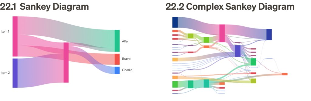
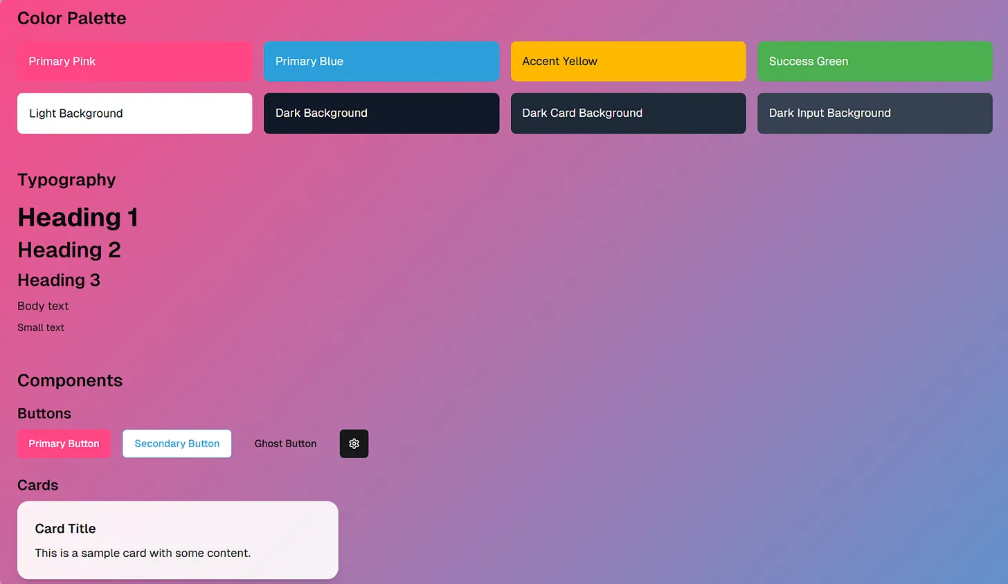
Design systems: collaboratively building a design system with engineers ensures consistency and efficiency in the development process. This involves defining shared components, style guides, and coding conventions. Without this collaboration, inconsistencies and technical debt can quickly accumulate.
Accessibility: working closely with engineers to implement accessibility features ensures that the product is usable by everyone, including people with disabilities. Ignoring accessibility can lead to exclusion and legal challenges.
Performance optimization: collaboration with engineers to optimize page load times and overall performance is crucial for a positive user experience. Without this collaboration, a visually appealing design might be slow and frustrating to use.
To create truly user-centric digital experiences, UX designers need to work closely aligned with other disciplines such as product management and engineering. This means collaborating on user research, analyzing data together, and jointly creating user personas. This shared understanding ensures everyone is on the same page when it comes to user needs and priorities. It also means involving UX designers in product roadmap discussions so that user experience considerations are baked into feature planning and release cycles.
Furthermore, design decisions should be driven by data, not just intuition. UX designers and product managers should work together to define key performance indicators (KPIs) and track user behavior. This data can then be used to inform design decisions and validate whether the product is meeting user needs and achieving business goals. This collaborative approach ensures that the user experience is not only delightful but also effective in driving desired outcomes.
Collaboration gone wrong
Imagine a scenario where UX designers work in isolation, creating a beautiful and user-friendly interface without consulting any other disciplines. Later, it’s discovered that the design is technically infeasible or requires significant compromises. This leads to frustration, delays, and a subpar user experience.
When UX designers and engineers aren’t on the same page, it can lead to some serious design disasters. Imagine a beautiful design that’s impossible to build, or a technically sound feature that’s a nightmare to use. These disconnects often stem from designers focusing solely on aesthetics without considering technical limitations or usability.
Another common pitfall is neglecting performance. A design might look stunning on a high-powered computer but become a slow, clunky mess on a mobile device or slower internet connection. These issues frustrate users, increase support requests, and ultimately damage the brand’s reputation. Effective collaboration is essential to avoid these pitfalls and ensure a smooth, enjoyable user experience.
With product managers, collaboration is essential to ensure that the user experience aligns with business goals. When this collaboration breaks down, you might end up with a fantastic feature that nobody needs, or a functional product that lacks user delight. Designers need to understand the product strategy and business objectives, while product managers need to appreciate the value of user-centered design. By collaborating on user research, analyzing data, and defining key performance indicators (KPIs), UX designers and product managers can create user experiences that are both enjoyable and effective in achieving business goals.
Collaboration can go off the rails when teams work in isolation, communication breaks down, or egos get in the way. This leads to misaligned goals, missed deadlines, and ultimately, a frustrating experience for everyone involved, including the end-user. Remember, teamwork makes the dream work!
Collaboration is not just a buzzword; it’s essential for creating truly exceptional user experiences. By breaking down silos and embracing collaboration, UX designers can tap into a wealth of knowledge and perspectives, leading to more innovative, user-centered, and successful products. Remember, Rodolpho, the best UX is a team effort!
Remember when online shopping was a novelty? Back then, buying something on the internet felt like an experiment. You’d wait days, sometimes weeks, for your order to arrive, unsure if it would even meet your expectations. Fast forward to today, and e-commerce has transformed retail in Southeast Asia, making online shopping a seamless, everyday habit for millions.
This transformation didn’t happen by accident — it required a keen sense of what might come next. Being able to look ahead, anticipating changes, and preparing for them before they happen. This is what we mean by foresight.
It’s not about guessing the future but thinking through different possibilities and adapting strategies based on what might unfold. In e-commerce, it’s about seeing shifts in technology, like how more people would shop through their phones, or predicting changes in consumer behavior, like the growing appeal of interactive and social shopping.
For e-commerce platforms in Southeast Asia, this meant looking beyond their borders, sometimes borrowing ideas from other markets, but always adapting them to local needs¹. They anticipated that a mobile-first approach would thrive in a region where over 90% of internet users are on smartphones².
They knew that making shopping feel fun and social — by adding live streams or games — would keep people coming back, even when they weren’t ready to buy³. And they adjusted their payment methods to fit markets with different banking habits, understanding that many customers would still prefer cash-on-delivery options.
Adapting to these challenges isn’t unique to e-commerce. Across industries, understanding localized contexts plays a critical role in designing solutions that resonate with users. For instance, tools created for small business owners require tailoring to their specific workflows and aspirations to ensure that the design aligns with their realities and goals. (See case study here.)
In e-commerce, this principle translates into finding ways for platforms to respond to declining purchasing power and shifting consumer habits while evolving to maintain dominance. Scenario analysis provides a valuable framework for anticipating which strategies will be most effective, particularly in today’s context of economic uncertainty.
The current state of e-commerce platforms reflects a scenario where decreasing purchasing power and large platforms dominate — a dynamic we refer to as the dominance of cost-efficient platforms.
In such scenarios, large e-commerce platforms have a better advantage because they can leverage economies of scale to offer competitive pricing while keeping consumers engaged through innovative features. Their ability to tailor payment options, such as Cash on Delivery (COD), further solidifies their foothold in cost-sensitive markets.
The struggle of traditional retailers in Indonesia’s economic downturn
As Indonesia faces its current economic situation, the urgency for traditional retailers to adapt cannot be overstated. With deflation occurring over five consecutive months earlier this year (May-September 2024), purchasing power remains strained, and the once-thriving middle class continues to face challenges, with many slipping into the lower-income bracket.
In this environment, traditional retailers — ranging from larger chain stores like Matahari Department Store, Ramayana, and Hypermart, to smaller, family-run shops and warungs, which have long been the backbone of Indonesia’s retail ecosystem — face a harsh reality. Their survival is at risk as they struggle to compete against large e-commerce platforms that are better equipped to handle economic downturns.
For these retailers, foot traffic has always been critical to sustaining business. Whether it’s the busy floors of a department store or a local warung thriving off neighborhood loyalty, the success of traditional retail has long depended on in-person interactions and immediate sales. However, during an economic downturn, fewer consumers are visiting physical stores, opting instead for the convenience and savings offered by online platforms⁴.
What does this mean for e-commerce platforms?
The balance of power tilts heavily in their favor. Platforms like Shopee, Lazada, and Tokopedia not only have the ability to offer more competitive pricing but also control vast logistics and distribution networks that allow them to reach consumers faster and more efficiently.
In a situation where purchasing power is low, this control over both cost and convenience makes them the preferred choice for consumers looking to stretch their budgets. On the other hand, traditional retailers, with their higher fixed costs (rent, staffing) and less flexible infrastructure, cannot compete as easily on price or convenience.
Navigating future scenarios
In light of these challenges, understanding the future of retail in Indonesia requires more than just looking at present trends — it involves planning for multiple possible futures.
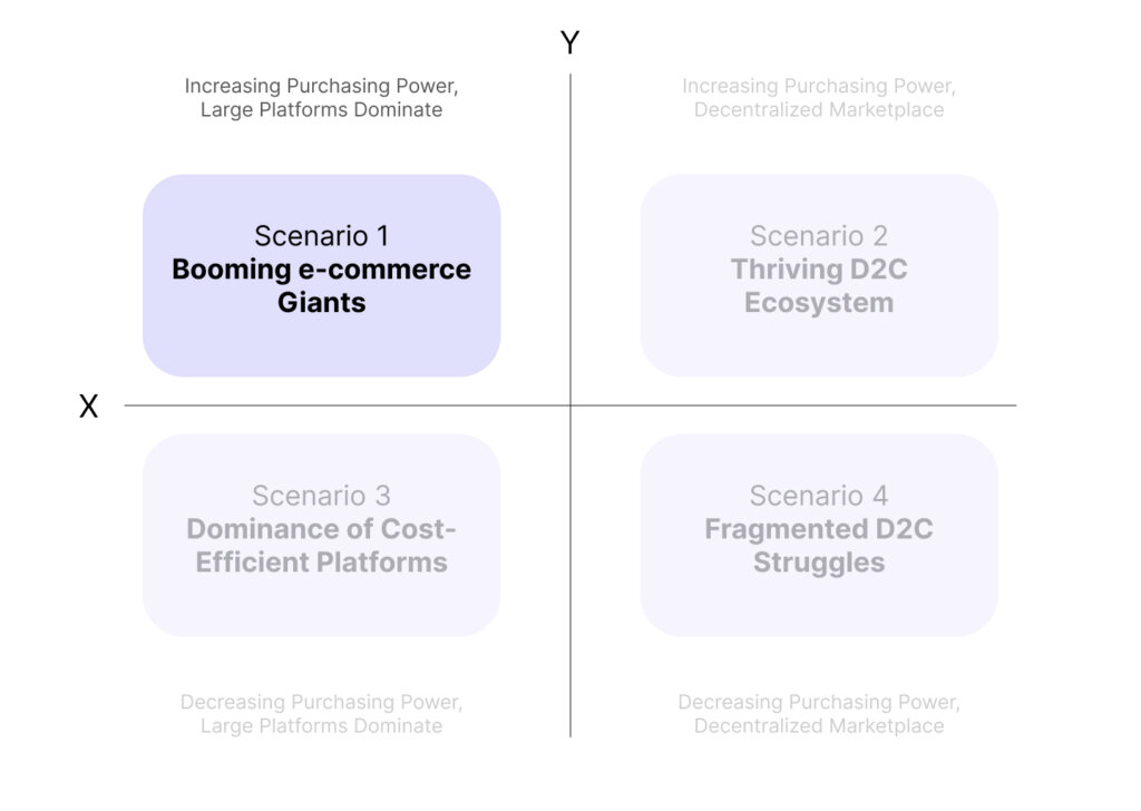
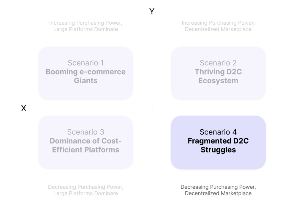
Given the uncertainties in both purchasing power and market structures, we use a foresight framework, a strategic approach widely used by policymakers, business leaders, and innovators to anticipate a range of potential outcomes and assess long-term impacts on industries and societies. By helping decision-makers recognize and prepare for diverse possibilities, foresight enhances resilience and adaptability in uncertain environments. (See here for more details.)
The matrix shown here offers a structured way to examine how different dynamics could unfold over time. The X-axis contrasts decentralized marketplaces on the right with markets dominated by large platforms on the left, while the Y-axis reflects consumer spending, ranging from increasing purchasing power at the top to decreasing purchasing power at the bottom.
With this framework in place, we can better understand how different futures might emerge and where Indonesia is likely to fit into these scenarios.
In this scenario, consumers have more money to spend, and large e-commerce platforms dominate the market. Major platforms benefit from their scalability, offering both budget-friendly essentials and premium products. These giants thrive on their ability to provide efficient logistics, competitive pricing, and a vast range of offerings, from basic goods to luxury items.
Here, consumers seek unique and personalized products from Direct-to-Consumer (D2C) brands. With rising disposable income, consumers are willing to pay a premium for quality, niche products, or sustainability. Independent sellers and smaller brands thrive in this environment, relying on innovation, storytelling, and community-driven commerce to attract customers.
Scenario 3: dominance of cost-efficient platforms (decreasing purchasing power, large platforms dominate)
With declining purchasing power, consumers prioritize affordability, and large e-commerce platforms dominate. These platforms use economies of scale to offer lower prices, discounts, and payment flexibility like Buy Now, Pay Later (BNPL). They also engage consumers through entertainment-based shopping while optimizing logistics for fast, cost-effective delivery.
In this scenario, while purchasing power is low, the market is fragmented, with many small D2C brands struggling. Although consumers still seek affordable products, smaller sellers lack the infrastructure and scale of large platforms, leading to operational challenges. These brands focus on local or niche markets but face difficulties in maintaining profitability due to higher costs and logistical constraints.
Given the current economic trends in Indonesia, two scenarios stand out as the most likely outcomes for the future of retail:
Scenario 3: dominance of cost-efficient platforms
Scenario 4: fragmented D2C struggles
Each scenario paints a different picture of how the market may evolve, based on whether large platforms maintain control or smaller, decentralized brands emerge as competitors.
Scenario 3: dominance of cost-efficient platforms (decreasing purchasing power, large platforms dominate)
Given the current state of decreasing purchasing power, Indonesia fits squarely into Scenario 3 — where large platforms dominate. E-commerce giants, with their ability to offer lower prices, have a natural advantage.
They can lean heavily on flash sales, deep discounts, and “Buy Now, Pay Later” (BNPL) solutions to attract consumers who are increasingly focused on affordability. Their ability to engage consumers through entertainment-driven experiences (like live-stream sales) is crucial to maintaining consumer attention, even as budgets shrink.
To maintain their advantage, large platforms must optimize their supply chains, invest in last-mile delivery, and offer faster, cheaper shipping options, which would be a key differentiator.
Establishing trust through scale: the role of large retail spaces in consumer perception
In today’s retail market, brand perception and consumer trust are key, especially when shoppers are cautious with spending. For larger stores, the sheer physical scale itself can convey an image of stability, reliability, and premium quality — qualities that are particularly appealing in economic downturns⁵.
This is the philosophy behind K3Mart’s flagship store in Jakarta, which doesn’t just sell products; it creates a full-fledged brand experience. With its “World’s Biggest Ramyeon Library,” featuring over 12,000 types of Korean ramen, K3Mart taps into Indonesian consumers’ love for Korean culture, particularly popular with younger, trend-conscious shoppers.
This immersion strategy is not just about the products on shelves; it’s about making the store a memorable destination where the brand feels larger-than-life and authoritative in its market presence.
Adding to this brand authority, K3Mart hosts events with prominent figures to generate buzz and strengthen consumer perception of K3Mart as an innovative and influential brand.
This approach resonates especially well with Gen Z, who value experiences and aspirational branding as much as they do products. The strategy of mixing physical retail with experiential elements fosters loyalty and a sense of exclusivity, encouraging customers to view K3Mart not just as a store but as a lifestyle brand that delivers on both quality and experience — an edge that sets it apart from ordinary retail spaces and reinforces consumer trust in the brand’s reliability and relevance.
Building on this approach, businesses can also take cues from other successful collaborations, such as Miniso’s partnerships with beloved brands like Harry Potter and Cinnamoroll. These collaborations leverage the popularity of iconic brands to draw in diverse consumer segments, sparking excitement and increasing foot traffic.
By aligning with globally recognized names, businesses could create similar co-branded experiences that merge their retail space with beloved cultural icons, enhancing their appeal and attracting loyal fans from these brands.
Staying competitive with omnichannel: how retailers meet modern demands
For traditional retailers to stay competitive, especially against digital-first platforms, an integrated omnichannel strategy and a strong physical presence have become essential. This is successfully demonstrated by MAP (Mitra Adiperkasa), Indonesia’s leading lifestyle retailer, with a vast portfolio including brands like Zara, Starbucks, and Sports Station.
MAP merges physical and digital shopping by offering services like click-and-collect, which allow customers to shop online and pick up their items in-store. While home delivery remains a popular option, click-and-collect offers benefits such as avoiding delivery fees, obtaining last-minute purchases quickly, and allowing customers to inspect items in-store for easier returns.
This omnichannel approach resonates particularly well with Millennials and Gen Z consumers. Studies indicate that channel seamlessness significantly enhances younger consumers’ positive attitudes toward omnichannel shopping⁶.
Recognizing this, omnichannel retailers like MAP have prioritized achieving channel consistency and seamless integration, which not only improves the customer experience but also operational efficiency⁷. For instance, the introduction of such strategies helps retailers reduce inventory risks by optimizing total order quantities and streamlining supply chain management.
In addition, MAP’s mobile app elevates the experience by helping customers secure deals through sale tracking and exclusive membership benefits. With its tiered membership system, shoppers can earn points on purchases, which they can later redeem for rewards — an attractive feature for promo hunters⁸.
By combining practical conveniences like seamless channel integration with loyalty-building incentives, MAP strengthens customer satisfaction and engagement, creating a shopping experience tailored to the expectations of today’s tech-savvy and value-driven consumers.
A tailored approach: building loyalty across ages
Meeting the diverse expectations of different age groups and socioeconomic classes is essential for success in today’s retail landscape. Younger consumers, who are digitally savvy, prefer flexibility and convenience, and MAP’s digital offerings — such as online shopping, mobile access to deals, and cross-brand gift cards — cater to this audience’s need for variety and spontaneity.
These digital gift cards, usable across brands from Starbucks to Massimo Dutti, foster an ecosystem of choice within MAP’s portfolio, allowing younger customers to explore and experience flexibility without committing to a single brand or outlet.
For older, more established consumers, MAP emphasizes service quality and reliability⁹. This demographic values trusted in-store experiences and established brands but appreciates the convenience of digital enhancements that bridge in-store and online interactions.
By integrating digital experiences across its portfolio, MAP ensures that customers enjoy consistent standards of service and product quality, whether shopping at SOGO in-store or online. This blend of digital adaptability and physical presence helps traditional retailers like MAP and K3Mart remain resilient amid Indonesia’s challenging economic landscape.
This approach not only creates a unified, flexible ecosystem that resonates across age groups but also ensures they remain competitive by appealing to Indonesian consumers’ evolving expectations for both cost efficiency and trustworthy, immersive brand experiences.
Driving spending and loyalty through retail and credit card alliances
In today’s competitive retail landscape, branded credit cards have become a powerful tool for both retailers and financial institutions, offering significant advantages in customer loyalty, spending habits, and brand engagement. MAP (Mitra Adiperkasa) exemplifies this strategy through its partnership with BNI, introducing the MAP-BNI co-branded credit card.
This card provides exclusive benefits — loyalty points, cashback, member-only sales, and special discounts across MAP’s vast retail portfolio. Such benefits create a seamless rewards ecosystem that keeps customers engaged within the MAP network.
Studies indicate that credit card holders tend to spend more than cash users due to the convenience and flexibility offered by credit, with some research suggesting a significant increase in spending compared to cash transactions¹⁰. In Indonesia, this trend is evident as credit card transactions rose by 32% in 2022 alone, signaling the rising influence of credit in driving consumer spending¹¹.
This effect is amplified with co-branded cards, where consumers feel encouraged to shop more frequently to accumulate points and access perks. The MAP-BNI card’s tiered rewards structure, which allows customers to redeem points for discounts and exclusive products, caters to value-conscious consumers, such as promo hunters, who actively seek to maximize rewards. This ongoing engagement fosters repeat visits, embedding MAP into customers’ everyday lives and solidifying brand loyalty.
For MAP, the strategy boosts sales and positions the brand as a preferred choice in customers’ shopping routines.
For BNI, this collaboration opens access to MAP’s dedicated customer base, increasing transaction volumes and extending the bank’s reach to a retail-focused demographic.
The MAP-BNI credit card becomes a touchpoint of engagement, enhancing customer loyalty while expanding BNI’s brand influence within MAP’s loyal customer community.
In this scenario, smaller Direct-to-Consumer (D2C) brands find themselves in a difficult position as consumer spending decreases. Brands in Indonesia, particularly in sectors like fashion, beauty, and lifestyle — for example, Sare Studio (modest fashion), Wardah Cosmetics, and Nama Beauty — have built strong identities around personalization, authenticity, and community-driven commerce.
However, with the current economic challenges, they struggle with high operational costs and logistical constraints that make it difficult to compete on price and convenience against larger e-commerce platforms.
Living the brand: immersive strategies for D2C top-of-mind impact
D2C brands are redefining their market presence by shifting from transactional relationships to immersive lifestyle experiences. This approach enables them to connect deeply with consumers and capture a larger share of the market by tapping into diverse lifestyle values.
Wardah Cosmetics, for example, might partner with eco-friendly brands like Sare Studio for sustainability-driven campaigns, allowing both brands to reach like-minded audiences and amplify their message of conscious living. These partnerships not only pool resources but also expand reach beyond traditional e-commerce platforms.
Brands are further enhancing their lifestyle appeal by weaving experiential elements into their offerings. Take Saturdays NYC, which seamlessly integrates eyewear retail with coffee culture, or Oppo’s Finders Cafe, combining tech with a social café experience. Similarly, beauty and wellness brands in Indonesia are blending into health-conscious spaces, collaborating with yoga studios, fitness centers, or running groups.
Wardah Cosmetics could offer skincare samples or discounts for yoga students, while Nama Beauty might co-host wellness events, aligning beauty with health in a way that resonates with today’s lifestyle-driven consumers. Such co-branded events create meaningful, memorable experiences that build deeper brand loyalty¹².
This shift isn’t confined to smaller D2C brands. Established names like Blibli and Tiket.com are leading through initiatives like the EcoTouch “Fashion Take Back” program, which repurposes fashion waste into sustainable materials. Collaborations like these enable them to support the movement toward eco-conscious practices, aligning their brand with lifestyle values that resonate with their audiences¹³.
From large-scale initiatives to intimate D2C partnerships, these strategies meet consumers in spaces where brand interactions and lifestyle values converge, enhancing loyalty and presence across market segments.
Engaging customers with purpose: the bartering model as a brand advantage
During the pandemic, online bartering emerged as a creative solution for consumers looking to exchange goods without spending cash, highlighting a shift towards community-driven, sustainable commerce.
Platforms like Facebook Marketplace became popular hubs for these exchanges, and specialized platforms like Nextbarter have since expanded the concept, allowing businesses to trade surplus products or services for needed resources, all while reducing expenses. This approach aligns well with today’s eco-conscious values, appealing to consumers who appreciate brands that embrace resourceful, environmentally friendly practices.
The appeal goes beyond physical goods. Platforms like Instagram, already popular for unique, niche items — from vintage gold to bespoke fashion — have shown the demand for one-of-a-kind alternatives to mass-produced products.
For D2C brands, this shift means they can offer exclusive bartering options, where customers might trade not only items but also services or specialized skills in exchange for limited-edition products, event spots, or brand experiences. Whether it’s your handmade crafts, expert services, or unique offerings, these exchanges foster a sense of community and exclusivity.
Preparing for what’s ahead
Anticipating challenges before they emerge is key to staying competitive in Indonesia’s fast-paced, evolving business environment. While technology develops rapidly, offering numerous digital tools and strategies, the real value lies in knowing when and how to implement them.
It’s not just about adopting the latest innovations; it’s about assessing if the market and economic conditions are ready for these solutions. Being strategic and thoughtful ensures that businesses don’t just react to change, but actively shape their future.
In this ever-changing landscape, success requires more than just innovation — it calls for strategic foresight. Companies need to evaluate the intersection of technology, market readiness, and consumer behavior to determine which strategies will work in a complex, dynamic environment.
By being agile and focused on real-world applicability, businesses can create ecosystems that are not only forward-thinking but also adaptable to the challenges and opportunities that lie ahead.
² “Analysis of the most widely used e-wallet and e-commerce portals in Indonesia based on the pillars of digital economy”. Nusantara Science and Technology Proceedings, 2022. https://doi.org/10.11594/nstp.2022.2605
³ Thuy An Ngo, Thi, et al. “The effects of social media live streaming commerce on Vietnamese generation Z consumers’ purchase intention”. Innovative Marketing, vol. 19, no. 4, 2023, p. 269–283. https://doi.org/10.21511/im.19(4).2023.22
⁴ Belbağ, Aybegüm G., et al. “Impacts of COVID-19 pandemic on consumer behavior in Turkey: a qualitative study”. Journal of Consumer Affairs, vol. 56, no. 1, 2021, p. 339–358. https://doi.org/10.1111/joca.12423
⁵ “The impact of impulsive purchasing behavior on consumer actual consumption during an economic crisis: evidence from essential goods in the retail industry, Sri Lanka”. SLIIT Business Review, vol. 3, no. 1, 2024, p. 43–64. https://doi.org/10.54389/haia8535
⁶ Ryu, Jay S., et al. “Understanding omnichannel shopping behaviors: incorporating channel integration into the theory of reasoned action”. Journal of Consumer Sciences, vol. 8, no. 1, 2023, p. 15–26. https://doi.org/10.29244/jcs.8.1.15-26
⁷ Wang, H., Zhang, W., & He, Y. (2022). Optimal ordering decisions for an omnichannel retailer with ship‐to‐store and ship‐from‐store. International Transactions in Operational Research, 31(2), 1178–1205. https://doi.org/10.1111/itor.13181
⁸ Kim, Su, et al. “The effects of adopting and using a brand’s mobile application on customers’ subsequent purchase behavior”. Journal of Interactive Marketing, vol. 31, no. 1, 2015, p. 28–41. https://doi.org/10.1016/j.intmar.2015.05.004
⁹ Tomazelli, Joana B., et al. “The effects of store environment elements on customer-to-customer interactions involving older shoppers”. Journal of Services Marketing, vol. 31, no. 4/5, 2017, p. 339–350. https://doi.org/10.1108/jsm-05-2016-0200
¹⁰ Soll, Jack B., et al. “Consumer misunderstanding of credit card use, payments, and debt: causes and solutions”. Journal of Public Policy &Amp; Marketing, vol. 32, no. 1, 2013, p. 66–81. https://doi.org/10.1509/jppm.11.061
¹² Hultén, Bertil, et al. “Sensory cues and shoppers’ touching behaviour: the case of IKEA”. International Journal of Retail & Distribution Management, vol. 40, no. 4, 2012, p. 273–289. https://doi.org/10.1108/09590551211211774
¹³ Khandai, Sujata, et al. “Ensuring brand loyalty for firms practising sustainable marketing: a roadmap”. Society and Business Review, vol. 18, no. 2, 2022, p. 219–243. https://doi.org/10.1108/sbr-10-2021-0189
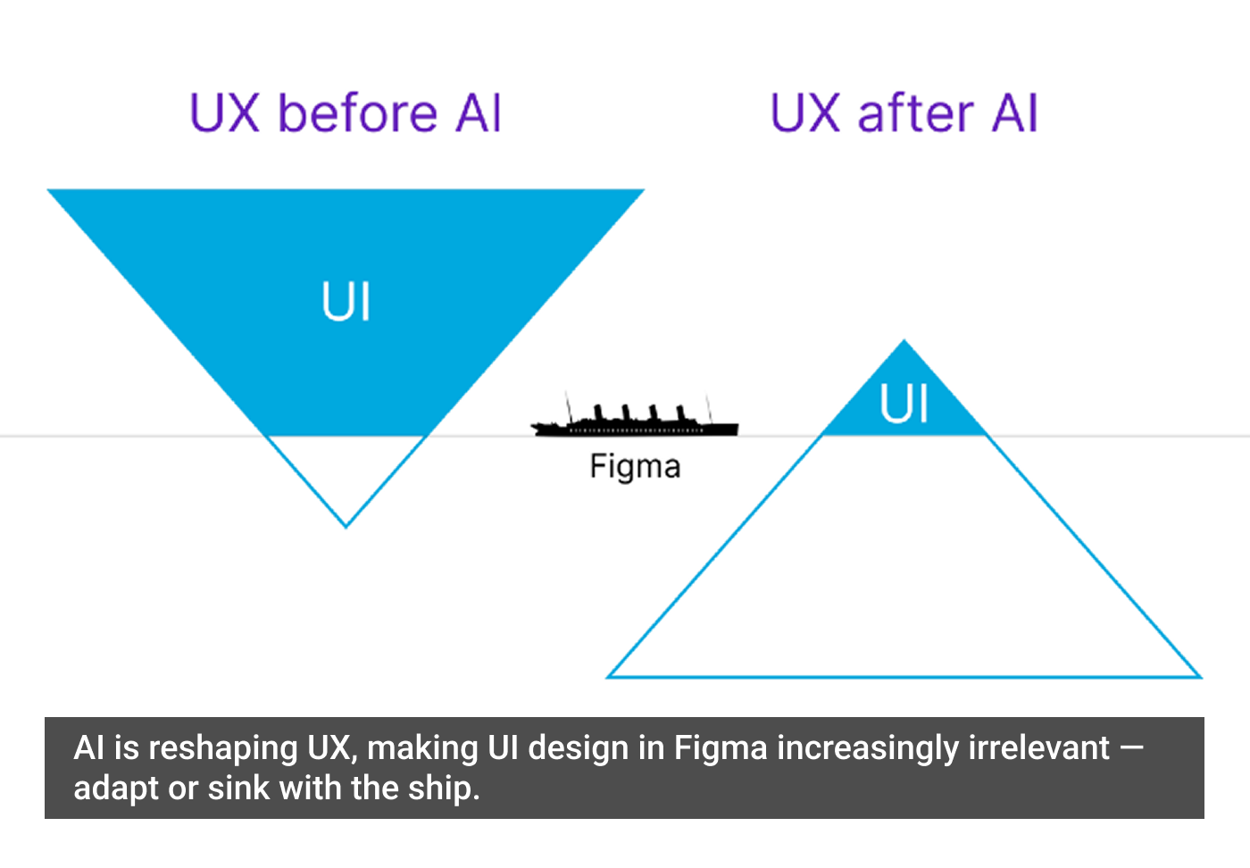
I wrote a piece called Design Isn’t Dead. You Sound Dumb. It was my contribution to the eternal bonfire of design discourse — where someone declares UX or Design dead every six days, and the rest of us dive into gladiator mode, flinging hot takes and Figma screenshots like it’s the Roman Coliseum.
I stand by what I said. Design isn’t dead. UX isn’t dead. Calm down.
But also… I get it. Because when you scroll through the smoldering garbage heap of hot takes, somewhere beneath the ashes of “AI is coming for your job” and “usability is overrated,” there’s actually a fundamental point trying to crawl out.
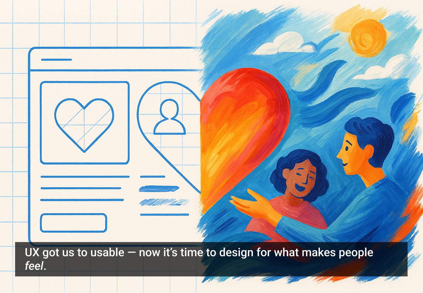
UX didn’t die. It just grew up — and now no one’s impressed by it anymore.
Usability is table stakes. Clean flows, consistent patterns, things that work without making you cry — that’s just the minimum now. You don’t get a gold star for remembering to put the login button where people can find it.
The next era of design isn’t about functionality. It’s about connection.
We’re stepping into the Post-UX Era — where the real work isn’t making things usable, it’s making people feel something.
And most folks haven’t caught on yet.
UX is table stakes now
There was a time when clean flows, intuitive navigation, and user-friendly interfaces made a product stand out. That time? Yeah… It’s gone.
Most teams have design systems. Most patterns are standardized. Most apps feel… fine.
And that’s exactly the problem. Fine doesn’t win. It just exists. It survives. It lingers by being “not broken.”
No one falls in love with “fine.” No one remembers “fine.” And “fine” won’t save you.
Designers, we dreamed of this moment. We have worked hard to get here.
I still remember the day a fellow manager and I walked into that executive’s office to ask for more headcount for UX. We laid out the numbers, heart pounding, and said, “We need 33% more people.”
He didn’t blink. Just leaned forward, studied the numbers, and said, “That’s over a million in salary. You sure you want to wear that?”
“Absolutely,” we said — maybe a little too fast.
He leaned back, gave a slow nod, and said, “Alright. Just know — that’s enough rope to hang yourself with.”
And that was it. No applause. No celebration. Just a quiet moment of truth… and a terrifying amount of trust.
But we stood by it. We built something real. The company was better for it. And I was never the same. Man, that was an exhilarating time.
As designers, we’ve spent years waving the UX flag. Convincing leadership to invest in design. Fighting for accessibility. Begging for usability testing like design gremlins under fluorescent lights, just hoping someone would move the button two pixels to the right.
And it worked. Congratulations — we did it.
In fact, we did such a good job evangelizing design that now everyone wants a piece of it.
Engineers want to do UX. Product managers want to do UX. Marketing? Oh, they’re trying to do UX. Even the intern who just opened Figma yesterday is ready to “clean up the flows.”
Everyone thinks they are a designer now. Except, you know, the actual designers — who are mostly just trying to defend their decisions while being told to make the logo bigger… Again.
Now everyone has a design system. Everything is accessible-ish. Buttons are mostly where they’re supposed to be.
And no one cares.
Because UX is table stakes now, it’s the cover charge. The secret handshake. The “Do you even lift?” of product design.
It gets you into the race, but this isn’t some friendly 5K. It’s NASCAR at 220 mph, and you just rolled up on a Razor scooter.
It’s the train station — and the train didn’t just leave. It’s halfway across the country, first class is already sipping champagne, and you’re still fumbling with your ticket.
Meanwhile, design? Design is in the clouds, strapped to a jet with no brakes, screaming toward the future — and spoiler alert: it’s not waiting for you.
Don’t you get it? Craft is expected. Usability is expected. Accessibility is expected. Clarity is expected.
If you’re still arguing about why UX matters in 2025, you’re not ahead of the game — you’re hosting a TED Talk in a Blockbuster.
What actually makes an experience stand out?
People want more than functional. They want meaningful.
They want:
Emotion: joy, trust, surprise, delight. The micro-interactions that make you smile. The tone of voice that feels like it was written just for you.
Narrative: experiences that build a sense of journey or purpose. Not just “you did the task,” but “that meant something.”
Identity: design that reflects who they are or who they want to be. Products that sound like them. Look like them. Get them.
Intentional Friction: not every step should be fast. Sometimes it should make you pause. Sometimes slowing down is the point.
We’re talking less about flowcharts and more about feeling charts.
This isn’t fluff. It’s what makes the difference between “this works” and “I love this.”
But there’s something deeper happening here too — something human. As automation increases and interfaces get more predictable (and yes, more usable), the digital landscape starts to feel… sterile. Consistent, yes. Efficient, absolutely. But also flat. Forgettable.
What users are really craving — what we’re all craving — is connection. We want to feel something. We want to see a bit of humanity in the products we use. We want to know that someone, somewhere, gets us.
People are craving moments of humanness. Small sparks of personality, imperfection, surprise. The things that remind us that a human was here.
The brands and experiences that lean into that — that dare to feel — those are the ones people fall in love with.
When human experience beats perfect UX
Here’s the truth: 70% solid UX + 30% real emotional connection will beat 100% flawless UX with zero humanity — every single time.
You can craft the smoothest flow imaginable. Check every accessibility box. Label every button perfectly.
But if it doesn’t feel like anything, no one will care.
Because people don’t remember how frictionless it was, they remember how it made them feel.
Want proof? Look around at the things you use today. Here are a few:
Duolingo: the navigation isn’t perfect. Gamification can be intense. But people love it. It feels alive. It has personality. It plays, teases, and connects.
Discord: clunky? Sometimes. But it’s where people live. It creates a sense of belonging, and that beats smooth UX any day.
TikTok: it drops you in with zero guidance. But the “For You” page feels eerily personal. It gets you. That emotional hook outweighs its onboarding flaws.
Early Apple: iTunes was a mess. But the iPod wasn’t about syncing — it was about feeling cool. You weren’t just buying a device. You were buying into creativity.
The takeaway? UX gets you to functional. Human Experience (HX) gets you to unforgettable.
UX still matters — it’s just not the star anymore
Let’s be clear: good UX still matters.
If your product is confusing, broken, or inaccessible, no amount of personality or storytelling is going to save it. The basics are still the foundation.
But once you’re past that? Once things “work”? That’s when the real opportunity begins.
Because people don’t fall in love with working. They fall in love with meaning.
Think of it like this:
Usability earns you permission.
Emotion earns you loyalty.
Story earns you trust.
UX is your runway. HX is the liftoff.
The industry is still fighting yesterday’s battle
Here’s the rub: There are still companies that don’t understand design. They’re the ones writing think-pieces titled “Design is Dead” — because they never truly grasped what design was in the first place.
At the same time, there are designers still fighting for scraps of recognition in outdated structures. Some are fighting to prove their value. Others are clinging to inflated titles, control, or ego — holding tight to a version of UX that’s already beginning to fade.
So what we’re seeing isn’t just noise — it’s a turf war over a space that’s already evolving. Let them fight over the old way.
While they argue over the table, the room is being redesigned.
So where do we go from here?
AI is accelerating. Automation is eating the edges of design. Design systems are streamlining everything.
But the stuff that can’t be templatized? That’s our new frontier:
Craft: the subtlety of well-placed motion. The spacing that just feels right.
Taste:the difference between functional and elevated.
Timing: knowing when to say something — not just what to say.
Judgment: knowing when to break the rules.
Story:framing context, meaning, and purpose.
Emotion:designing for resonance — not just response.
You can’t prompt your way to connection. You can’t automate feeling. You have to understand people. And that’s still our job.
It’s not just UX anymore — it’s HX
We’re not just designing for users. We’re designing for humans.
HX — Human Experience — isn’t a rebrand. It’s a re-centering. UX was about use. HX is about understanding.
It’s about:
Designing not just for actions, but for impact.
Not just for efficiency, but for emotion.
Not just for flows, but for feeling.
HX asks more of us. It demands we think about context, empathy, timing, and tone. It challenges us to create experiences that resonate, that affirm, that connect. Because in the world ahead, the best experiences won’t just work. They’ll feel alive.
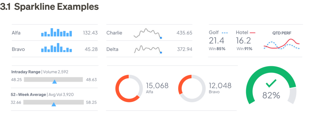
Every day, humanity generates an astonishing 2.5 quintillion bytes of data — streaming from our smart devices, computers, sensors, and beyond. This avalanche of information reaches nearly every aspect of our lives, from weather forecasts to financial transactions, health and fitness stats, and progress updates. But while the data itself is vast and abundant, it rarely speaks for itself. Without context, raw numbers remain just that: raw.
Modern humans need data visualization to make sense of our world. A bar chart summarizes your spending patterns. A progress chart shows how close you are to your fitness goals. These visuals don’t just display information — they make it meaningful and actionable, by design.
This playbook is intended to be your guide to mastering the art of data visualization. Drawing inspiration from pioneers like Edward Tufte, who championed clarity and simplicity, we’ll explore how to transform numbers into compelling stories, from simple to complex. Let’s discover how to communicate data more effectively, produce designs more efficiently, and enjoy better outcomes through tested methodology and proven tools and resources.
What’s in this guide?
How to approach a data visualization project
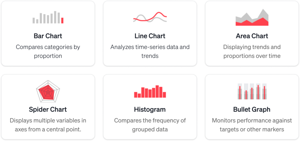
Choosing the right method
Tools and software for data visualization
Data visualization resources
How to approach a data visualization project
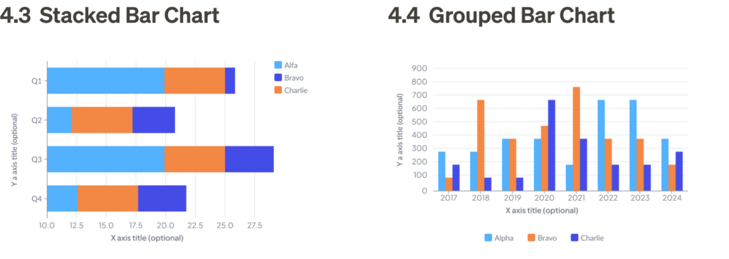
Like any UX design, early decisions in data visualization can have a major impact on your product. Before getting into the weeds with technical details or debating tactics, it’s worth stepping back to consider the foundations — the strategic choices that will guide everything moving forward.
1. Start with the big picture
What story are you trying to tell? Who is your audience? Ask yourself: What insights should the visualization convey? Start with a clear purpose to make your designs align with user needs. For instance:
Executives often prefer high-level dashboards with simple visuals.
Analysts may need more granular visualizations, like scatter plots or heatmaps, to uncover patterns.
2. Prioritize clarity
The best designs are often the simplest. Avoid excessive chart “ink” and technical jargon.
Use clear labels and legends (keys).
Follow the “less is more” principle — remove elements that don’t directly enhance understanding.
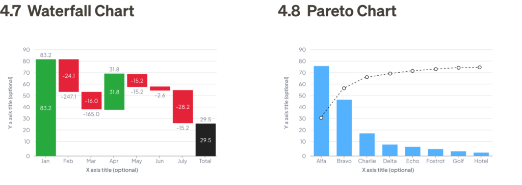
3. Compare like with like
Your comparisons must be truthful to make sense. Remember the old adage, “statistics lie” — without proper context, numbers can be twisted to tell any story, a tactic often exploited by politicians to mislead audiences with skewed metrics.
Ensure that the items being compared are logically similar. For example, “per capita” makes more sense than gross totals when data sets are different.
If necessary, add annotations to explain differences or limitations in the data.
4. Maintain consistency
Stick to a single set of metrics, colors, and styles throughout your visualizations. For example, if tracking sales, use the same time periods and units of measurement.
Random changes in formats imply some sort of meaning, often unintended and confusing.
Consistent color schemes, fonts, and chart types prevent confusion and keep users focused on trends, not formatting.
5. Provide context
Sometimes, data visualization needs additional commentary to drive the point home — determine what editorial content may need to be included in your design.
Add titles, annotations, or callouts to explain trends or anomalies.
For example, if a chart shows a sales dip, a brief note explaining the cause (e.g., “seasonal decline”) can provide clarity.
6. Make it accessible
Accessible design practice makes your visualizations usable for all audiences, including people with disabilities.
Check for sufficient color contrast between text, background, and chart elements to accommodate users with color vision deficiencies.
Avoid relying solely on color to convey meaning. Add patterns, shapes, or labels for clarity.
Include alt text for charts and images to describe key data insights.
For digital dashboards, interactive features should be navigable via keyboard and screen readers.
7. Design it sustainably
Will the data need frequent updates? How will the updates be rendered?
Build flexible visualizations that can be easily refreshed. For dashboards, consider tools that integrate live data updates.
Match your design method to your project’s cadence — real-time dashboards need automation, while a static monthly report can allow for more manual design and bespoke art direction.
Choosing the right method
In this section, we will explore a range of formats, from simple and common to more complex and specialized. While there are often multiple ways to present a set of data, there is typically an ideal method for each specific task. The goal is to choose the simplest, most compact format that tells the story, while providing scalability for more detail as necessary.
Basic data presentation
These chart types are used for presenting straightforward, often basic information, and are suitable for a range of scenarios:
Tables are among the most versatile tools for presenting both text and numerical information. Organized into rows and columns, tables make it easy to structure and comprehend — provided that the headers and row labels make sense.
1.1 Basic Table: This example shows data values over time. The columns represent weeks, and the rows represent years, allowing the viewer to easily compare year-over-year (YOY) performance. Image by Jim Gulsen
In addition to standard tables, software like Excel or Google Sheets can dynamically summarize, analyze, and explore data by grouping and filtering, in what’s known as pivot tables, whereusers can rearrange rows, columns, and values quickly. This flexibility makes them useful for business professionals to gain insights in real time, on the fly.
1.2 Pivot Table: This pivot table shows a summary of transaction data by grouping locations and total sales. It demonstrates how pivot tables allow users to analyze data by rearranging fields. Image by Jim Gulsen
2. Pie charts and variants
Pie charts are one of the most iconic yet controversial tools in data visualization. While they are commonly used to display proportions, many experts argue that they are not the best method for comparing data. Edward Tufte has famously criticized pie charts for their inefficiency, as some people struggle to compare angles accurately.
Despite the controversy, pie charts remain popular for presenting high-level overviews. However, when clarity, precision, or detailed comparison is required, consider alternatives like a donut,square, or waffle chart for a better solution.
2.1 Standard Pie Chart: An example of a pie chart with 6 segments. Ideally, a pie chart should have between three and six segments. 2.2 Doughnut Chart Doughnut charts offer several advantages over pie charts, such as a central hole for additional content and clearer visual separations in smaller sizes. Image by Jim Gulsen2.3 Square Chart: Square charts use rectangles instead of circular slices to represent proportions in a structured, grid-like format. 2.4 Waffle Chart: Waffle charts break proportions into a grid, typically 10×10, where each square represents a percentage point. Image by Jim Gulsen
3. Sparklines
Sparklines are miniature charts that can be embedded within tables or displayed outside of standard X, Y axes. They are much smaller than regular charts and typically provide less detail. While sparklines can have labels, not every data point is typically marked. Despite being simplified, sparklines should still adhere to the same design principles as their larger counterparts.
Sparklines are most useful in dashboards, where key information can be viewed at a glance. They typically link to larger, more detailed visualizations for deeper analysis.
3.1 Sparkline Examples: These dashboard examples include tables with sparklines for bar charts, line charts, pie charts, and sparklines for financial data points.Image by Jim Gulsen
Comparing categories and trends
These types of charts are ideal for comparing different groups or tracking changes over time. Frequently used by business professionals to identify trends, track performance, and provide clarity in pattern analysis:
Bar charts are a common graph type used to present data by category with bars that are proportional to the values they represent. They require two variables, and each bar should start at zero to accurately represent proportional comparisons.
Bar charts are best used for simple category comparisons, and their compact design makes them easy to interpret. Variations of the bar chart can be used to communicate more complex information in a very straightforward way.
4.1 Vertical Bar Chart: This chart enables easy comparison of quantities over time, with years as the time period. 4.2 Horizontal Bar Chart: Similar to the vertical bar chart, this format is often used for comparing categories. It allows for easy comparison of bar lengths without needing to refer to exact values.Image by Jim Gulsen4.3 Stacked Bar Chart: Stacked bar charts are ideal when you need to compare aggregated values within categories. This more complex format shows total sales by quarter while also breaking down the sales by region for each quarter. 4.4 Grouped Bar Chart: Grouped bar charts provide side-by-side comparisons, useful for comparing data across different years or categories over time. Image by Jim Gulsen4.5 Stacked Percent and Grouped Bar Chart: Stacked percent bar charts are great when the focus is on the relative proportions compared to the total. This format allows for easy visual comparison of categories as a percentage of the total. 4.6 Positive/Negative Chart: Centered on zero, this chart displays performance relative to a benchmark. Positive performance is shown in green and negative in red, offering quick insight into under- and over-performing categories.Image by Jim Gulsen4.7 Waterfall Chart: Waterfall charts are used to display the cumulative effect of positive and negative values over time, commonly used for financial data (e.g., earnings and expenses). Each bar cascades, showing the incremental changes that lead to the final total. 4.8 Pareto Chart: Combining a bar graph and a line graph to visualize the principle that roughly 80% of effects come from 20% of causes. To facilitate prioritization, the bars represent individual values in descending order, while the line shows the cumulative total as a percentage. Image by Jim Gulsen
5. Line charts
Line charts are used similarly to bar charts, but they provide greater flexibility, especially when comparing numerous data points or when proportional differences are too small to discern clearly in a bar chart — a basic line chart does not require starting at zero, and can be zoomed into the scale of relevance for the data.
Line charts are ideal for displaying trends over time, and they allow you to narrow the focus to specific sets of data for comparison.
5.1 Basic Line Chart: This chart is useful for visualizing trends over time, especially when small fluctuations are involved. 5.2 Grouped Line Chart: Grouped line charts are better for showing trends over time compared to bar charts, which are better suited for proportions.Image by Jim Gulsen
6. Area charts
Area charts are a variation of line charts that show both trends and proportions. These charts are especially effective when displaying cumulative totals, and they often use color shading to indicate volume. Like bar charts, area charts should start at zero to accurately display proportions. They are used to compare multiple quantities over time.
6.1 Layered Area Chart: This example shows weekly data from two variables, with the data points connected. 6.2 Positive/Negative Area Chart: This chart combines positive and negative values, with zero at the center. The chart allows you to visualize both upward and downward trends using colors like green for positive and red for negative values. Image by Jim Gulsen6.3 Percent Area Chart (range): This chart shows cumulative totals as percentages over time, ideal for showing how breakdowns change relative to the total. 6.4 Percent Area Chart (non-range): In this version, the data is not related quantitatively, and colors are used for ease of visualization rather than representing a quantitative relationship.Image by Jim Gulsen
7. Spider chart and variants
Spider charts, also known as radar charts, visualize multiple variables across axes radiating from a central point, also known as polar coordinates. Each axis represents a different category, and data points are connected to form a shape, allowing for easy comparison across dimensions. Variants like radial charts use a more structured, concentric design to segment data into layers, often for skill mapping, progress tracking, or performance evaluation. Both formats effectively highlight patterns, strengths, and gaps in data, making them versatile tools for analysis.
7.1 Spider Chart: Focuses on forming a polygon by connecting data points along axes, making it ideal for direct comparison. 7.2 Radial Chart: Focuses on segmenting and color-coding data in a circular, layered format, ideal for hierarchical or skill-based evaluations.Image by Jim Gulsen
8. Histograms
Histograms, while visually similar to bar charts, serve a different purpose. Unlike bar charts, which measure the magnitude of categories, histograms measure the frequency of values, grouped into prescribed “buckets.” The first step in creating a histogram is defining the buckets and counting how many data points fall into each one. The frequency is then represented by bars.
Bars in histograms are adjacent to one another because they represent a continuous range of values. Typically, the bars are the same width and represent equal ranges, although this is not mandatory.
Histograms are useful for predicting macro trends in frequency based on a sample of data. The patterns formed by the bars — such as symmetric, unimodal, or bimodal — can help identify trends.
8.1 Histogram: This example shows a histogram of the duration of customer service phone calls. The pattern can be described as “bimodal,” with calls that typically last a very short time, or approximately six minutes.Image by Jim Gulsen
9. Bullet graphs
Bullet graphs are a compact combination of several features, such as a thermometer chart, progress bar, and target indicator, all within one stacked bar. These graphs are ideal for displaying performance against multiple benchmarks.
Bullet graphs are particularly useful in business analysis, as they compare actual performance to expectations using a simple format. The center line represents the actual value, the vertical line shows the target value, and the colored bands indicate performance ranges (e.g., poor, average, good).
9.1 Bullet Graph: This bullet graph shows the performance of four criteria during the same time period. As shown, Alfa underperformed significantly, while Bravo and Delta exceeded expectations, and Charlie just missed the mark.Image by Jim Gulsen
Analyzing relationships and clusters
These types of charts are commonly used by data analysts to uncover relationships between variables, detect patterns, and analyze clusters within datasets. They are essential tools in fields such as market research, scientific analysis, and predictive modeling:
Scatter plots display data points on an x/y coordinate plane, typically comparing two variables. They are useful for visualizing correlations between these variables, which can be positive (rising), negative (falling), or null (uncorrelated).
Scatter plots are powerful tools for visualizing distribution, trends, and outliers. They are most effective when plotting multiple data points rather than a single point over time.
10.1 Single Scatter Plot: A single scatter plot shows individual data points plotted on an X, Y grid. This example plots BMI vs. age, illustrating a positive correlation (as one increases, so does the other). 10.2 Grouped Scatter Plot: Grouped scatter plots allow comparison of multiple categories at once, using color or marker styles to differentiate between groups.Image by Jim Gulsen
11. Bubble charts
Bubble charts are similar to scatter plots but are more flexible. Instead of just plotting on an x/y coordinate plane, they can also represent data with varying sizes or colors, allowing for a deeper level of analysis. These charts are useful for demonstrating the concentration of data points and are most effective when used as a feature of a visualization rather than a supporting element.
X/Y plot bubble charts are similar to scatter plots, but introduce a third variable — scale, as shown in bubble size. This allows for more complex visualizations and can be used in place of scatter plots if you have the three sets of data.
11.1 Bubble Chart: Bubble charts are ideal for displaying the relative differences in value between various items. The bubbles can be adjusted in size, color, and position to represent multiple data set variables. 11.2 X/Y Plot Bubble Chart: X/Y plot bubble charts allow for more complex visualizations and can be used in place of scatter plots when you have additional data to show scale.Image by Jim Gulsen
12. Pairplots
Pairplots are used by data scientists to discover correlations between multiple variables. A pairplot has two main components: diagonally, comparing the distribution of two different data sets, while non-diagonally, showing a single data set in two different chart formats. This setup allows data scientists to quickly assess relationships, such as whether two variables are correlated or if a variable follows a normal distribution.
12.1 Pairplot: This pairplot shows the relationship between two variables, Alfa and Bravo. Looking diagonally compares the two sets in one format. Image byJim Gulsen
13. Heat maps
A heat map visually represents data in which values in a matrix are depicted as colors according to their density. Heat maps make it easy to scan measurements by grouping values into categories and displaying their density through color — the darker the color, the higher the density.
13.1 Heat Map: This heat map compares survey results across different criteria (rows) by participants (columns).Image byJim Gulsen
Distribution and outliers
These chart types are commonly used by data scientists, statisticians, and analysts to examine how data is spread or distributed and to identify anomalies or outliers. They are essential for tasks such as quality control, risk analysis, and understanding the variability in datasets:
Box plots (or box-and-whisker diagrams) are a simple way to show how data is spread out. They highlight five key points: 1) the minimum value, 2) the first quartile, 3) the median, 4) the third quartile, and 5) the maximum value. The chart has a box that shows where most of the data falls (the middle 50%), a line in the center for the median, and “whiskers” that stretch out to the lowest and highest values.
Box plots make it easy to see the distribution of data and identify trends in a compact format.
14.1 Box Plot: This box plot shows data distributions over time. It makes it easy to compare performance across data and to notice anomalies in distribution.Image byJim Gulsen
15. Violin plots
Violin plots are a mix of box plots and density plots, giving a fuller picture of how data is spread out. The outer shape shows the distribution, with its width showing how often certain values occur, like a histogram. Inside, there are layers that represent different portions of the data, and a dot in the center marks the median.
While violin plots give more details than box plots, they’re less commonly used because they can be harder to understand. For people unfamiliar with them, simpler charts like histograms or density plots might be easier to read.
15.1 Violin Plot: Similar to box plots, violin plots show the distribution of data and, in addition, display the density of data as areas within the curves.Image byJim Gulsen
16. KDE plots
Kernel Density Estimation (KDE) plots show where values are most likely to appear, helping to visualize the overall distribution of data. KDE plots provide more nuanced insights compared to histograms and box plots. Unlike histograms, which require binning and thus limit resolution, KDE plots show a smooth representation of the data’s distribution, making them particularly useful for comparing multiple variables.
16.1 KDE Plot: This KDE plot shows the relationship between values of a dataset. The shaded areas show where the likelihood of specific values is higher.Image byJim Gulsen
Specialized charts
These chart types are designed for specific scenarios and offer unique insights into specialized datasets:
Candlestick charts are used to show how prices change for stocks, commodities, or currencies during a trading session. Each candlestick represents one session and shows four key details: the opening price, closing price, highest price, and lowest price. These candlesticks are displayed in a sequence, making it easy to spot trends and patterns in price movements.
17.1 Candlestick Chart: This chart displays open, high, low, and close information per session over time. Color is used to indicate whether there was a net gain or loss for each session. 17.2 OHLC Chart: The OHLC chart presents the same data as the candlestick chart — open, high, low, and close information — but uses tick marks for a more compact visual format. This chart compares the OHLC data with the daily average (dotted line).Image byJim Gulsen
18. Timeline/Gantt charts
A timeline or Gantt chart is a type of bar chart used to illustrate a project schedule. Tasks are typically broken down by rows, called “swim lanes,” and the horizontal bars measure time allocated for each task.
Detailed project plans can include additional information, such as deadlines, milestones, dependencies, and sprints. Timelines help project managers align expectations with team members throughout the project duration.
18.1 Timeline/Gantt Chart: This chart breaks down the stages of a project, assigning roles from planning to launch.Image byJim Gulsen
19. Choropleths/Cartograms
Choropleths and cartograms are two key types of geographic maps used for data visualization.
A choropleth map shades areas on a map to visualize how a variable compares across geographic regions. A cartogram distorts geographic areas proportionally to represent a variable’s value, sometimes causing extreme distortions that make the map unrecognizable. Cartograms are most useful when the user is familiar with the geography enough to interpret the distortion.
19.1 Choropleth: This choropleth map shows survey results across five variables by state. 19.2 Cartogram: This cartogram distorts the size and shape of states to represent vote proportions, making the absolute tallies visually clear.Image byJim Gulsen
20. Tree layout and variants
Tree layouts and sunburst diagrams are hierarchical visualizations used to represent organization and flow. Both provide a clear view of parent-child relationships, but their formats differ: tree layouts are linear and directional, while sunburst diagrams use a circular structure for proportional representation.
20.1 Tree Layout: Shows an organization’s structure with nodes and edges, commonly used for file directories or genealogy trees. Team silos can be indicated with color for added clarity. 20.2 Sunburst Diagram: Visualizes hierarchical data in concentric rings, with each ring representing a level in the hierarchy. Ideal for showing proportional relationships within nested categories, such as budget allocations or website navigation paths.Image byJim Gulsen
Flow and network analysis
These charts are useful for visualizing processes, relationships, or network data, showing the movement or flow of information:
A flow chart is a diagram that represents a process, algorithm, or workflow. It uses boxes to represent steps, connected by arrows to indicate the direction of the flow. Diamond-shaped boxes represent yes/no questions that change the flow’s direction. Flow charts are useful for designing, managing, or documenting a process.
21.1 Procedural Flow Chart: This chart outlines a procedural flow for a mobile app user journey, beginning with app access, login status verification, navigating through media feeds, posting updates, and updating the database. Image byJim Gulsen
22. Sankey diagrams
Sankey diagrams are a type of flow chart where the width of the arrows is proportional to the flow quantity. These diagrams illustrate the transfers or flows within a defined system, typically showing conserved (lossless) quantities.
Sankey diagrams are highly effective for communicating relationships between two or more sets of data. They are powerful at showing trends, especially in systems with complex relationships.
22.1 Sankey Diagram: This simple Sankey diagram shows the flow breakdowns in a system. 22.2 Complex/Multi-tiered Sankey Diagram: This example demonstrates a more complex Sankey diagram, which can highlight and isolate specific flow channels, helping to make complex data more comprehensible. Image byJim Gulsen
23. Network/force-directed graphs
Network and force-directed graph algorithms are used to position graph nodes in a visually uncluttered way. These algorithms minimize edge crossings and use forces among edges and nodes to determine optimal positioning. They are particularly effective for showing relationships between points and analyzing complex interconnections. Two key variants are included below.
23.1 Force-Directed Graph: Visualizes clusters of nodes and their relationships, often used for social networks or system architectures. 23.2 Chord Diagram: Displays interconnections between categories using arcs and ribbons, ideal for visualizing flows like trade relationships or resource allocation.Image byJim Gulsen
Tools and software for data visualization
Choosing the right software and platform
There are a variety of tools available for data visualization, each with its own strengths and considerations. Before choosing the right tool, it’s important to evaluate factors such as the tool category, overall capabilities, limitations, licensing or cost requirements, and the skill set needed for optimal use. The information below outlines the primary data visualization tools used across the industry:
General business design tools
These tools are primarily used for business-related design tasks such as reporting, dashboards, presentations, and data visualizations. They focus on functionality and practicality more than creative or aesthetic design work:
Tableau
Tableau is a powerful data visualization tool that can handle large datasets and create interactive, real-time visualizations. It supports a wide range of chart types and data integration from various sources, making it an excellent choice for more complex data analysis.
Skills: Tableau is user-friendly for both beginners and advanced users, offering drag-and-drop functionality for quick visualizations as well as deep analytical capabilities for expert users.
License: Requires a paid license for full functionality.
Looker Studio (formerly Google Data Studio)
Looker Studio is a powerful tool for creating interactive data reports and dashboards. It allows users to pull data from a variety of sources, including Google Analytics, Google Ads, Google Sheets, and many third-party platforms. Looker Studio is excellent for creating interactive reports that can be shared and embedded. However, its limitations include fewer customization options compared to other professional design tools and some performance issues with very large datasets.
Skills: Looker Studio is designed for both non-technical users and professionals. It’s user-friendly with drag-and-drop functionality, making it easy for business teams to create data visualizations without requiring deep technical skills. For more complex features, users may need basic knowledge of SQL or data manipulation.
License: Free to use, though it offers premium features through Looker, a more enterprise-focused platform. The basic version covers most business data visualization needs.
Microsoft Excel
Excel is widely used for data visualization, particularly through pivot tables, charts, and graphs. Its limitations include a lack of advanced data integrity controls and performance issues with large datasets.
Skills: Excel is accessible to general audiences, and most business users can quickly utilize its basic data visualization features.
License: Typically, no special license is required for most business users (assuming standard Office 365 or standalone Excel license).
Microsoft PowerPoint
PowerPoint is often used for creating presentations with basic graphs and charts. Its limitations include the lack of advanced analysis tools, and it can be difficult to prepare and input data for graphics.
Skills: PowerPoint is user-friendly and accessible to general audiences for simple data visualization tasks like charts and diagrams.
License: PowerPoint is included in standard Office licenses (Office 365, Microsoft 365).
Microsoft Project
Microsoft Project is primarily used for project management tasks like tracking processes, allocating resources, and managing budgets. It’s more focused on project scheduling and resource management rather than advanced data visualization.
Skills: While general users can use it, Microsoft Project is more geared towards project managers and may require more specialized knowledge.
License: Microsoft Project usually requires a separate license, distinct from the standard Office suite.
Microsoft Visio
Visio is widely used for diagramming and creating business process visualizations, flowcharts, and diagrams. It’s useful for outlining processes, but advanced diagramming may require some expertise.
Skills: It can be used by general audiences, but more complex diagrams may require familiarity with advanced templates and features.
License: Visio typically requires a separate license, usually not included in the standard Office suite.
Designer tools
These tools are typically used by designers for creating high-quality, detailed designs. They offer advanced functionality for graphic design, prototyping, animation, and data visualization, among other creative tasks:
Figma plugins for data visualization
When designing data visualizations in Figma, several plugins can significantly enhance your workflow, making it easier to create dynamic, data-driven designs. Below are some of the most popular Figma plugins for data visualization, each offering unique features to help you generate charts, sync data, and visualize connections more efficiently.
A must-have plugin for a variety of workflows — if your data is stored in Google Sheets, this plugin syncs it with your Figma design, enabling automatic updates to visualizations for real-time data accuracy. However, if the data changes after the initial sync, a manual refresh is required. Plugin by:Dave Williames License: Free Link:https://www.figma.com/community/plugin/810122887292777660/Google-Sheets-Sync
Chart
This plugin allows you to create various types of charts directly in Figma, such as bar, line, pie, and scatter charts. It pulls in data from a CSV file or allows manual entry. It’s a simple way to quickly generate basic data visualizations without leaving the design tool. Plugin by: Pavel Kuligin License: Free for basic use only. Accessing full features requires a small annual subscription fee. Link: https://www.figma.com/community/plugin/734590934750866002/chart
This handy plugin automatically creates tables in Figma by pasting CSV-formatted text, allowing you to input data quickly into a tabular format. It’s highly efficient for rapid input of real data, especially when using ChatGPT to format your text. The downside is that it lacks systemization and auto-layout features, and may need manual adjustments for optimal styling. Plugin by:Zwattic License: Free Link:https://www.figma.com/community/plugin/735922920471082658/table-generator
Autoflow
Autoflow allows you to connect design elements in Figma, which is useful for creating flow diagrams or visualizing connections between different data sets. It’s especially helpful for designing network diagrams or process flows. Plugin by:David Zhao and Yitong Zhang License: Free for up to 50 flows. Subscription fee for unlimited access. Link: https://www.figma.com/community/plugin/733902567457592893/autoflow
Designers can fully leverage data visualizations and dashboards within ServiceNow’s ecosystem, which utilizes the Polaris design system as part of a broader offering — a powerful, modern design system scalable for enterprise. By incorporating these visualizations, designers can elevate the overall user experience, create rapid prototypes and efficient workflows while facilitating better collaboration across teams in large-scale initiatives. Templates by: ServiceNow License: Free Link: https://www.figma.com/@servicenow
Seeing Theory — Visual introduction to probability and statistics
Final thoughts
I hope this playbook provides valuable insights and practical guidance to help you visualize data on your next project. If you have any feedback or would like to share your experiences with data visualization, please feel free to comment or reach out. I look forward to hearing from you and learning from your perspective!
Ukrainian people are among the many contributing authors, volunteers, and members of our team that have enabled UX Magazine to serve the community for 17 years.
We stand with our team members from Ukraine, and the people of Ukraine. If you want to help, here is a (growing) list of ways that you can help Ukrainian people through donations and/ or actions:
A simple way to help the Ukrainian army– this help is really needed right now
Calling all Designers!Designers United For Ukraine is collecting names of designers and businesses interested in helpingand/or hiring displaced Ukrainian designers to reach safety and continue to work...
The Return Alive Foundationfights disinformation and cyber-attacks and focuses on helping Ukrainian soldiers, among other initiatives.
A special fundraising account was created by the National Bank of Ukraine specifically to support Ukraine’s Armed Forces – https://bit.ly/3BSQoyv
The International Rescue Comittee (founded by Albert Einstein) is rushing critical aid to displaced families as Russia invades Ukraine and civilians seek safety. Help them support families affected by the Ukraine crisis.
Therapysts for Ukraine – Ukrainians get four therapy sessions (usually 45-50 minutes) free of charge. Please note that most of them speak English, and not Ukrainian!
An animal shelter near Kyiv with a devoted team that won’t abandon the animals they care for and needs financial support, supplies
The Ukrainian Red Cross is helping with on-site first aid and medical services.
TheKyiv Independent is covering the conflict from within the conflict zone and is fundraising to continue coverage.
Voices of Children provides emergency psychological assistance to Ukrainian children impacted by the war.
Sunflower of Peace prepares first aid tactical backpacks for paramedics and doctors on the ground.
Vostok-SOS hotlines are helping people evacuate, and are providing humanitarian aid and psychosocial support.
Doctors Without Borders is equipping surgeons in eastern Ukraine with trauma care traiining and is providing emergency response activities in Poland, Moldova, Hungary, Romania and Slovakia.
When we spoke about Figma-based workflows in the past, the main reasons cited for obsolescence centered around three main themes:
Modern design systems should have all of the components rendered directly in React code. Thus, we no longer need pixel-based workflows if AI can help us generate React code using design system components directly from a sketch or a prompt. (https://www.uxforai.com/p/ai-for-ux-figma-and-the-gods-of-hammers)
Today, we are discussing something profoundly different: nothing short of a complete revolution of what UI means to modern AI-first and Agentic systems. Thanks to this change, Figma is fast turning into a Titanic, which is about to hit this new UX iceberg at full speed. Here is why this is happening and how to avoid going down with the ship.
Let me explain. In the old days, the user experience was often equated with UI. And for good reason! UI was where the majority of the interaction took place. So we used graphical tools like Figma, Sketch, InVision, etc., to paint our rectangles and make our prototypes because those rectangles really were the area where the experience orchestration took place.
This paradigm is undergoing a massive change. When you look at what the majority of startups in the tech space are making with AI, you see minimal interface. Because the best interface for AI is (virtually) no interface. Think about it: No interface. (Well, there will always be some interface, but I love this hyperbole because it helps us escape the curse of our expertise and think past the status quo.)
“As little UI stuff as possible” really seems pretty OK when it comes to AI agents. (Actually, it’s a bit like Google search… Still just a text box…Still kind of works…)
And now, with lots of loud scraping, crashing, and splashing, the whole inverted iceberg is flipping “the right way up” — and that teeny tiny little triangle on top is about all that’s left of the UI. (Start and stop the agent, give it some instructions, read some output, and give some more instructions, etc.) Because we are now entering the era where we are talking with these machines as we would with fellow humans — and we all know that we don’t really need a great deal of Figma-created UI to do that.
Figma is the Titanic that is about to hit that new UX for AI iceberg at full speed and sink. Not because it will be replaced by robots. But because the UI that Figma helps us make is no longer all that important.
What matters is UX, NOT UI
To paraphrase Alan Cooper in “The Inmates Are Running the Asylum,” AI-first (and particularly Agent-first) systems are “dancing robotware.” And just because the robot is not (yet) dancing like Baryshnikov, it does not mean the robot is bad: this “dancing robotware” AI is already adding tremendous value to many workflows. However, specifically because AI is “dancing robotware,” the actual UI is simply not that important to the customer.
In other words, AI-first apps are just not that “UI sensitive,” but at the same time, they are supremely “UX sensitive.” I mean, sure, you have to have all the right buttons and ways to read the output and the like, and some things make it a little easier to use (like the Canvas design pattern we discussed previously here: https://www.uxforai.com/p/modern-information-architecture-for-ai-first-applications). However, if all you do is spend time deciding where the buttons should go, and picking the button colors and the labels of the tabs and controls, you are, to put it politely, completely and utterly screwed.
All that UI “stuff,” all those traditional aspects of what makes up the “design,” are just not that important anymore. It’s like deciding whether the dancing robot should be blue or red. Who cares? The robot is dancing! Come see the dancing robot! (Like Model T Ford — AI comes in “Any color the customer wants, as long as it’s black.”) So if all you care about in your day-to-day design job is what you can show in Figma, you’re gonna be wasting your time. It does not matter if the dancing robot is blue or red. Or purple.
Anyway, at this moment in time, the color does not matter. What matters is how well the robot is dancing.
Let me give you a real-world example: let’s say you are creating an AI-first application that will quickly summarize a document. How that summary is presented in the UI almost does not matter.
Background color? Nope. Not a chance.
Font sizes? Don’t make me laugh.
Where is it on the page? Does not matter. Pick a spot. Any spot. Release the feature, move it post-Beta if you find a better spot.
Is the content in a frame or uses the whole page? Hmmm, maybe that matters a little. But not really. Not unless you completely screw up the display (but most of us know how not to do that… Right? RIGHT? You should know how to do this right if you’ve been reading my articles like this one.
So, what matters in the AI-first UX?
The length of the content.
Organization of the summary.
Its completeness.
Its accuracy, reliability, readability, and scannability.
Unique bespoke data from your enterprise or your customers that is used to add value to the AI summary.
If it gets used alongside the original document, or if it has a life of its own.
If it has an API.
How quickly it is delivered to the customer.
Etc.
In other words,
What matters is UX. NOT UI.
Not one of those things on the list can be properly expressed in Figma. So, most people who today call themselves “UX designers” will just put Lorem Ipsum in the box and call it a day. For them, these critical aspects of UX for AI might as well not exist! This is a HUGE mistake. UX is “one thing” — the only key aspect, and that is where you need to spend the most time as a UX designer. Not on drawing rectangles in Figma to show where to put the dancing robot on the page or how to decorate it properly.
Forget the gargoyle rain spouts
To use yet another analogy, you are designing a modern building where clean lines, form, and function rule supreme, not the fancy Gothic medieval gargoyle rain spouts or Baroque-style dolphins. And everything you are doing in Figma is fast becoming just this:decoration. Gargoyles. Lions, dragons, frogs, snakes. The whole menagerie of miscellaneous “decorative stuff” that looked cool once upon a time and now just looks increasingly old-fashioned and ridiculous. Like the Windows 3.0 skewmorphic buttons or wood panel veneer.
Of course, proper decorations are important. They help usability, readability, accessibility, etc., but honestly,
AI-first interfaces are just not that UI-sensitive.
In multiple recent research projects, when I showed multiple versions of very, very different UIs to a customer, regardless of which version we started with, they always said: “Oh wow, that is really cool. I’d love to have that. This will save me and my team so much time. When can I buy it?” Where the boxes are, or what color, or labels, etc., almost doesn’t matter to these folks. They just want that summary box because it will save them and their team a ton of time and effort.
Here’s the clincher
If you, as a UX designer, are seen as somebody who is continuously slowing down the release process in favor of adding decoration, instead of speeding up and streamlining delivery of value, you are going to be seen as a bottleneck and your position will be eliminated. It’s just that simple. AI is moving fast and turning things topsy-turvy all over the place. So you need to get on board and completely rethink your contribution to the team.
95% of that contribution needs to be in the form of:
Digital twin workshops with data scientists, to understand how the data flows in and out, what the controls are, etc. (https://www.uxforai.com/p/digital-twin)
Value matrix of AI decisions, that is, understanding the benefits of true positive/negative vs. costs of false positive/negative, the impact of hallucinations, etc. (https://www.uxforai.com/p/ai-accuracy-is-bullshit-75b3)
Do you see how far that UI design is down on the list? That is how it should be on your list of priorities.
Now, ask yourself this: How often do you talk to your customers? How about your data scientists? If the answer is “seldom,” you need to rethink how you contribute to the team because AI is moving your cheese in a huge way. Your mad mastery of the Figma auto-layouts will not be there as your crutch for drawing gargoyle rectangles for that much longer.
Figma is the Titanic that is about to hit that new UX iceberg at full speed and sink. Will it take you down with it? Or will you do the work become indispensable?
If Mobile-First thinking has revolutionized the UX Design industry, AI-First is promising to be an even more spectacular kick in the pants.
For likely the first time in history, we can build products and services truly centered around functional AI. The next wave of AI products promises to combine LLMs with mobile, audio, video, vision, movement, and much more. This is giving rise to a functional set of products that can be called “AI-First.”
And many of the design “rules” are going out the window.
As a concept, AI-First Design was introduced to me by Itai Kranz, the Head of UX at Sumo Logic, who wrote this nice article: “AI-First Product Design.” One of the earliest mentions of the concept in online literature seems to point to Masha Krol’s Medium.com article “AI-First: Exploring a new era in design,” published Jul 13, 2017.
In an AI-first company, AI is not an afterthought or a tool to be tacked on later for incremental efficiency gains. Instead, it is an integral part of the company’s DNA, influencing every decision, from the problem the company chooses to solve, the product it builds, to the way it interacts with its customers.
Well said.
Co-pilot is not an AI-first design
The first wave of LLM-enabled products has largely been add-ons, the now so-called “co-pilots.” We explored various co-pilot design patterns at length and even sketched a few that have not yet been made into products on our blog, UXforAI.com, in “How to Design UX for AI: The Bookending Method in Action.” Essentially, the idea behind a co-pilot is to retrofit an existing product with a side panel that will work with the LLM engine and information on the main screen in order to produce some acceleration or insight. A nice recent example of this is Amazon Q integration with QuickSight:
Amazon Q co-pilot panel answers natural language questions, explains dashboards, creates themed reports, and more. While this is pretty impressive and useful, it is not an AI-first approach. It is a way to retrofit an existing product (QuickSight) with some natural language processing accelerators.
We tried AI-first with Alexa
We’ve seen a few attempts at AI-first products in the past, such as Amazon Echo with Alexa. However, Alexa suffered and continues to suffer from a lack of context, as I wrote about in my 5th book, Smashing Book 6.
Echo with Alexa also lacks access to essential secure services that would allow the product to actually “do stuff” outside of Amazon’s own ecosystem. If you ask Alexa to add your dog food to your Amazon shopping cart, it will do it quite well. However, don’t expect Alexa to work when ordering a pizza. Much less to execute a complex multi-step flow like booking a trip. In fact, any multi-step experience with Alexa is borderline excruciating.
The Alexa “Skills” (Amazon’s name for voice-activated apps) is the worst failure of the platform, in my opinion. Greg wrote extensively about this previously (https://www.smashingmagazine.com/2018/09/smashing-book-6-release/), but it comes down to a problem of lengthy invocation utterance, inability to pass the context, clunky enter and exit strategies, and inability to show system state (like are you inside a Skill or inside Alexa?). And the worst part is that you have to say everything very, very quickly and concisely, or else Alexa’s minuscule patience will time out, and you’ll have to start all over again.
I once did a pilot project spike for GE where I created an Alexa skill called Corrosion Manager to report on the factory assets that were about to rust out and thus were posing an increased risk. (See our UXforAI.com article, “Essential UX for AI Techniques: Vision Prototype”) The easiest Alexa Skill invocation command we could come up with was something like: “Alexa, ask Corrosion Manager if I have any at-risk assets in the Condensing Processor section in the Northeastern ACME plant.” (Try to say that five times fast. Before Alexa times out and before your morning coffee. I can tell you my CPO at the time was not impressed when he tried it.)
Alexa skills don’t just fail the smell test for serious SaaS applications. One memorable experience came from trying to introduce a nice middle-aged religious couple who were friends of mine to Bible Skill on Alexa. Let’s just say they did not have the pre-requisite patience of a saint and, therefore, failed to invoke even a single Bible Skill task successfully. (They eventually forgave me for introducing a satanic device into their home. Yes, we are still friends. Barely.)
Humane AI pin
Humane AI Pin (https://humane.com/) was arguably the first commercially available AI-first product of the new generation. We already discussed the issues with the AI Pin at length in the UXforAI.com article “Apps are Dead.” Among the problems were awkward I/O and controls. While it seemed to be able to mimic Alexa’s functions on the go, it was hard to see people doing real work on this device, even something relatively simple like ordering a pizza. Booking a trip was definitely out of the question. However, this device helped show that the new paradigm seems to be about the unabashed and uncompromising death of the app store paradigm.
We wrote about that extensively in the past issue of our column, “Apps are Dead,” here: https://www.uxforai.com/p/apps-are-dead (It’s a quick read, and I highly recommend a refresher as it will help put this next product in the proper perspective.)
r1 rabbit
Another AI-first product, r1, from Rabbit, was launched 13 months ago, on January 9th, 2024. The r1 is part of the next wave of AI products promising to combine LLMs with mobile form-factor, voice, and vision capabilities. The r1 appears to be a smaller version of a cell phone with a touch screen and a spinner wheel, somewhat reminiscent of late Crackberry designs. (Have you seen the movie Blackberry? It’s excellent. Must watch for all the mobile design nerds.)
The most prominent feature of the r1 device is what it does NOT have: apps.
All of the usual apps are available instead as permanent integrations that are embedded behind the scenes into the ChatGPT voice-assistant interaction. Here’s a full transcript of the r1 demo ordering a pizza:
The key strategy seems to be a simple end-to-end experience that works reliably and consistently, together with simple pricing.
Sadly, this appears to be much harder to build than it sounds.
Down the rabbit hole: the slippery slope of AI product ethics
Unfortunately, 13 months after the release, all is not well in the rabbit land. Based on multiple early product reviews from YouTube tech influencers including Marques Brownlee (who calls r1 “barely reviewable”) (Brownlee, Marques. Rabbit R1: Barely Reviewable. https://www.youtube.com/watch v=ddTV12hErTc) and Coffeezilla (who just straight up calls r1 “a scam”) (Coffeezilla. $30,000,000 AI Is Hiding a Scam. https://www.youtube.com/watch?v=NPOHf20slZg), the r1 might have gone a bit too far down the marketing hype rabbit hole and failed to deliver up to the hype.
According to these and many other reviewers, the device is plagued by multiple issues, including broken interfaces to key services like Uber, DoorDash, Spotify, etc., buggy visual recognition, terrible battery life, a bad GPS locator, and general inability to connect various experiences together.
The main problem is that it does not actually appear to do any of the stuff the Marketing promised. Reviewers like The Verge and Coffeezilla have pointed out that all of the connectivity with various services that were supposed to make r1 work appears to be done by hand, directly through a hard-coded open-source web interface plugin called Playwright, and not as the rabbit alleged through the “Large Action Model” AI. (Coffeezilla. Rabbit Gaslit Me, So I Dug Deeper. May 24, 2024. https://www.youtube.com/watch v=zLvFc_24vSM Obtained Nov 18, 2024. and Pierce, David. Rabbit R1 review: nothing to see here. The Verge. May 2, 2024 https://www.theverge.com/2024/5/2/24147159/rabbit-r1-review-ai-gadget Obtained Nov 18, 2024.)
It also appears that the entire product is basically ChatGPT that has been specially instructed not to reveal that truth to the user:
As Emily Sheppard explains in the video: “The way LAM was observed to work is not actually how it works. It’s meant to be an AI live controlling website and understanding that website… But what they have is a bunch of static commands… And the problem with that is that if the user interface changes… If the website changes… If there is a CAPTCHA… The hard-coded script cannot cope with that.” (Coffeezilla. Rabbit Gaslit Me, So I Dug Deeper. May 24, 2024. https://www.youtube.com/watch?v=zLvFc_24vSM) In other words, the interface breaks.
According to Coffeezilla and others, many signs point to LAM as being more of a “Marketing Term” and actually not existing as promised.
AI-first is hard
Regardless of your experience with r1, I think we can all agree: AI-first is hard.
While a few early failures and hype are to be expected, AI ethics quickly becomes a crucial consideration for AI-first products because they naturally aggregate massive amounts of data from various apps across the entire spectrum of use cases. However, today, there is no strict code governing the considerations for the design and development of these potentially powerful products.
What we have instead is closer to the pirate code from Jack Sparrow’s famous adventures:
“The code is more what you’d call ‘guidelines’ than actual rules.” — Captain Barbossa
Recall that with “great power comes great responsibility.” Although it is tempting, we simply cannot think like pirates in our approach to ethical AI-first systems designs, especially if those devices are going to be handling the combined total of human lives the way our mobile devices currently do. In the next section, I will attempt to put down some of the principles and key considerations for AI-first designers. May your seas be smooth and the wind always at your back!
Rules for rule-breakers
While there is clearly much to learn, we can already deduce a few rules for this new AI-first design paradigm. Here’s what we’ve got to go on so far:
Smooth, simple, seamless: The AI-first experience must feel much simpler and smoother than the current app paradigm. This is where r1 takes a hit by requiring the use of another device (a computer with a keyboard and large screen) to set up all the app integrations. We already do everything on the mobile. Not being able to do everything on the AI-First device is a step backward and just will not work. The sub-second LLM response speed is nice, though.
Personalization: The AI assistant must learn my preferences quickly. The AI assistant must know whether I like pepperoni, or want vegan cheese, or gluten-free crust. It should know where I live and what I prefer at what hour of the day, above and beyond the app preferences. For example, the Amazon app keeps trying to make me return my packages to Kohls’ two towns over when I have a UPS store next door. This nonsense simply must cease.
Data privacy: With this intimate knowledge of my life across all of the apps, I must know that data about my personal habits will not be used to enslave me and sell me down the river. AI is powerful enough for me to pay extra to have my interests served first. Not make me into another piece of rabid rabbit robot food.
Use existing phone, watch, earbuds, glasses, tablet, headphones, etc.: Please, please, please — I mean it! Use the same device if possible. I already have too many devices. There is no new interaction in r1 to warrant me owning yet another device. None. I don’t need a smaller screen, it’s a bad idea. I already have two cameras on my phone, and I’m used to that, so there is no need to reduce it back to one camera. That’s another bad idea.
Security of transactions: We are going to be doing everything with our AI-first device, so use established high-security methods like facial recognition and fingerprint. I like what r1 is doing with the transaction confirmation dialog, but this needs to be more secure, like double click + facial recognition that Apple iPhone provides.
Non-voice is more important than voice: Both r1 and AI Pin are missing the most important lessons from the mobile-first. Voice is not going to be the primary UI. Voice control is just too public. Imagine saying your password out loud, like in Star Trek! (That’s “O-U-C-H,” Capt’n) Mobile use is popular in both quiet (doctor’s offices, meetings) and noisy (metro, bus, cafe) environments. Text input via keyboard is a primary, not secondary, use case.
Avoid cutesy form factors: Be friendly without being cloying. You don’t need to invoke the Adventures of Edward Tulane — that story is creepy enough to be left alone! Avoid bright colors, especially orange (even if the CEO really seems like it. Designers, please try to talk your executives out of making crazy color choices. Orange is a warning. Or a rescue craft. Or a child’s toy. This thing is none of those.)
Again,
AI-First is hard. These products are still baby steps. Remember that the first iPhone did not have cut and paste. And the first Facebook “app” was actually just a website and only allowed reading and liking of messages. It took over a year for the first true mobile Facebook app to be ready.
Baby steps.
The time will, of course, be as unkind as it can possibly be to any new product named “rabbit” that is produced by a company called “Teenage Engineering” (if the influencer backlash and disabled comments on the launch video on YouTube is any guide…) However, this author is of the opinion that r1 is a very clever ChatGPT wrapper built on top of the usual phone OS+apps play that has basically remained unchanged since the first release of the iPhone in 2007, for almost 17 years!
Apps must die
Recall that we recently discussed how InVision failed to implement the key strategy for the age of AI: “simple end-to-end experience that worked reliably and consistently, together with simple pricing.” (See “InVision Shutdown: Lessons from a (Still) Angry UX Designer” on UXforAI.com) AI-first products like the r1 from Rabbit are early attempts at this 3S: Smooth, Simple, Seamless experience.
One thing that rabbit r1 emphatically demonstrates is that under the pressure of LLMs, apps must die.
Think of your phone now not as a collection of Mobile-First UI designs but as a platform for AI-First experiences.
The APIs and services apps deliver will, of course, remain alive and well. What must, however, be allowed to pass away is the need for the customer to go in and out of a specific UI silo (or a voice silo if we are talking about Alexa Skills).
With AI-First design, as simply and as frictionlessly as possible, we simply ask the assistant for what we want, and the assistant goes into specific services it needs to accomplish the task, armed with a deep knowledge of your preferences and inner desires. LLMs like ChatGPT are making this shift away from apps not just possible but simply imperative.
We see the AI-first design movement quickly becoming the avalanche that will sweep away the outdated siloed app environments in favor of 3S: Smooth, Simple, Seamless experiences that bring together various app capabilities and content under the umbrella of an AI-first approach.
Consistency is all about creating a smooth, predictable experience. It is the bedrock of a positive user experience. It fosters familiarity, builds trust, and allows users to seamlessly navigate and interact with your product. When users encounter consistent design patterns, they can effortlessly transfer their knowledge and skills from one part of the application to another, reducing cognitive load and increasing efficiency. When things are consistent, users feel comfortable and in control. They know what to expect, where to find things, and how to get things done.
Think of it like this: you’re building a house. You wouldn’t put the kitchen sink in the bedroom, right? Or have stairs that lead to nowhere. That’s basically what inconsistency in design is like — it throws users off and makes them feel lost.
Why consistency matters
Imagine using an app where the navigation menu keeps changing its location, buttons have different styles and functionalities on different screens, or the color scheme shifts unexpectedly. This lack of consistency leads to confusion, frustration, and, ultimately, user abandonment.
Consistency in UI/UX encompasses several aspects:
Visual Consistency: Maintaining a uniform visual language across your product, including typography, color palettes, imagery, and iconography.
Functional Consistency: Ensuring that interactive elements like buttons, forms, and menus behave predictably throughout the user journey.
Information Architecture: Organizing and presenting information in a consistent and logical manner, making it easy for users to find what they need.
Interaction Design: Providing consistent feedback mechanisms, micro-interactions, and animations to guide users and acknowledge their actions.
Failing to provide consistency can have detrimental effects on your product and brand:
Increased Cognitive Load: Users have to relearn how to interact with your product every time they encounter an inconsistency, leading to mental fatigue and frustration.
Diminished User Trust: Inconsistent design can make your product feel unreliable and unprofessional, eroding user confidence in your brand.
Higher Error Rates: When users are unsure of how elements will behave, they are more likely to make mistakes, leading to a negative user experience.
Reduced Engagement and Retention: Frustrated users are less likely to continue using your product or recommend it to others.
Always remember that users have a surprisingly low tolerance for inconsistency in digital products. Imagine encountering different fonts, color schemes, or even logos within the same app or website. These inconsistencies create confusion, erode trust, and could disrupt the user experience. Users may struggle to find information, complete tasks, or even understand the brand’s identity. This can lead to frustration, abandonment of the product, and negative associations with the brand.
For big brands, inconsistency in digital experiences can be particularly damaging. These brands often have a vast digital footprint, encompassing websites, apps, social media platforms, and more. Inconsistency across these touchpoints can dilute brand identity, hindering recognition and recall.
It can also damage the brand’s reputation for quality and reliability, leading to customer churn and lost revenue. In today’s competitive market, even minor inconsistencies can have a significant impact on a brand’s bottom line.
Achieving great consistency at a large scale
What resonates with customers today might not work tomorrow, so it’s crucial to prioritize the customer’s experience above all else. Ultimately, it’s their perception of the brand that determines whether it feels truly consistent.
AI: the secret weapon for consistency in the digital age
AI could also be a great booster when it comes to consistency. AI is rapidly changing the way brands approach design and user experience. AI is emerging as a powerful tool for brands striving for consistency, offering capabilities that go far beyond what human teams can achieve alone.
AI can help brands achieve consistency across digital platforms in several ways, such as automated design audits that scan your website, app, and social media profiles, identifying inconsistencies in logo usage, color palettes, typography, and even messaging. AI-powered tools can automate these audits, freeing up designers to focus on more strategic work. This is particularly valuable for large organizations with extensive digital footprints.
AI can also monitor user interactions in real time, identifying potential pain points or areas where the brand experience deviates from established guidelines. This allows for immediate adjustments and optimizations, ensuring a consistently positive user experience. Imagine an AI that detects user frustration with a confusing navigation menu and suggests improvements, ensuring a consistent and user-friendly experience.
The future of consistency: leveraging design systems
Modern design tools are empowering designers to achieve greater consistency than ever before. Design systems, with their component libraries, style guides, and pattern documentation, are becoming indispensable for maintaining a unified user experience across platforms and devices.
Tools like Figma offer robust features for creating and managing design systems. It allows designers to define reusable components, enforce design rules, and collaborate seamlessly with developers, ensuring that the final product adheres to the established design language.
Consistency in UI/UX design is not merely an aesthetic preference; it’s a critical factor in user satisfaction, engagement, and retention. By prioritizing consistency, designers can create intuitive, efficient, and enjoyable experiences that foster user trust and loyalty. As design tools continue to evolve, leveraging design systems will become increasingly important for achieving and maintaining consistency in an ever-changing digital landscape.
The role of product designers has always been centered around creating — whether it’s wireframes, user flows, or prototypes. But today, with the next wave of AI revolutionizing every facet of our work, we’re no longer just creators. We are becoming curators, harnessing AI’s power to not only generate designs but also transform how we approach the entire design process.
Welcome to the AI-first era for product designers
Generative AI isn’t just a cool tool on the side anymore — it’s integrated deeply into our design workflows. No more starting from scratch or relying solely on our manual efforts. AI Agents and Copilots are rapidly evolving, and their outputs are more sophisticated, insightful, and context-aware than ever.
In this new world, it’s no longer about designing from a blank canvas — it’s about curating AI-generated designs, insights, and ideas, elevating them, and ensuring they resonate with real-world user needs.
The new role of product designers as curators
Guiding AI’s creative outputs
AI isn’t just generating basic layouts anymore — it’s capable of producing complex design drafts, complete with recommendations on UX flows, accessibility improvements, and even aesthetic choices based on user persona data. As curators, product designers direct and refine these outputs. We guide the AI, adding our expertise to ensure the designs are both beautiful and functional.
Refining context, empathy, and interaction
AI may generate interfaces, but empathy and nuance are still where humans thrive. Curators ensure that AI-designed components consider the emotional journey of the user. We infuse human context, adapting the tone and interaction styles to better fit real-world scenarios — whether it’s making a checkout process feel seamless or ensuring a mental health app offers comfort at every touchpoint.
Balancing efficiency and innovation
AI Agents can optimize designs for performance — automatically tweaking layouts for faster load times or accessibility. But it’s the curator’s job to balance these efficiencies with bold, human-centered innovation. We take AI’s data-driven recommendations and push the boundaries further, ensuring that design doesn’t just work but stands out.
Data-driven decision-making
AI can now generate designs based on real-time data and analytics, offering suggestions on everything from color schemes to button placements based on user interactions. As curators, we don’t just accept these recommendations at face value — we evaluate them critically, ensuring that data-driven designs still align with our creative vision and user experience goals.
What AI agents and copilots mean for product design
In the last year, the capabilities of AI Agents have gone beyond just generating basic prototypes. We now have AI Copilots embedded into our design tools, providing:
Real-time feedback on design choices based on user behavior.
Automated A/B testing suggestions with data-backed insights.
Accessibility and compliance checks built right into the design process.
Personalized design recommendations tailored to specific user personas.
But here’s the key: AI doesn’t replace us. It augments our creativity, allowing us to focus on what we do best — humanizing the experience and innovating beyond the predictable.
The shift from creators to curators
In an AI-driven design world, product designers who still think like traditional “creators” risk being left behind. The future belongs to those who can act as curators, skillfully blending AI outputs with their own expertise to create truly user-centric designs.
How can we thrive as curators?
Master AI tools: Learn how to collaborate with AI rather than compete with it. Dive deep into understanding how AI-driven design systems work.
Guide, don’t just accept: AI will generate drafts, ideas, and optimizations. The value of a designer-curator is in shaping and refining these, pushing beyond what AI alone can achieve.
Think beyond the interface: AI excels at generating UI elements, but as curators, we must think holistically — considering user journeys, emotional touchpoints, and the human experience.
Keep creativity at the core: AI provides efficiency, but creativity remains uniquely human. Curators need to focus on innovation, using AI as a tool to stretch the boundaries of possibility.
The AI-first world needs curators
Generative AI has matured faster than many of us expected. It’s no longer about AI catching up with us — it’s about how fast we, as designers, can evolve into curators of AI-driven design experiences.
The age of creating from scratch is fading. Instead, product designers will thrive by mastering the art of curating AI-powered designs, using them as launchpads for innovation and superior user experiences.
The future of design isn’t just AI-driven — it’s human-refined.
The explosion of AI solutions is shaking up experience design in ways we’re only beginning to understand. But what if the key to staying ahead isn’t about more automation or better interfaces—but about something much older?
In this special Ask Us Anything episode of Invisible Machines, Robb and Josh tackle a listener’s question about AI’s impact on UX. Their conversation takes an unexpected turn—back to Robb’s days in the sound department at Warner Bros., working on films like Galaxy Quest and The Thin Red Line. The surprising connection? Success in UX, much like in filmmaking, boils down to storytelling.
People don’t just use products—they engage with them, just like they do with stories. And as AI adoption grows, bad design won’t just be inconvenient—it’ll be obvious. Effective storytelling and good taste will become essential, separating the forgettable from the truly immersive.
So, how do we design for a world where AI is raising the bar? Tune in to this episode for a fresh perspective on the intersection of technology, design, and storytelling.
Hopefully, the first generation of AI products is over in this era! Some of these were simply prompts on ChatGPT/Dall-E/StableDiffusion to demonstrate a use case. Many of them got millions of users, no, sorry, viewers on Twitter and then vanished a day later. Then, there were others that were thin-wrappers on ChatGPT and masqueraded as usable products. Or, a nice chat UI/UX was stamped on existing or new products waiting for it to deliver magic. Everyone was competing to make them quicker, 30 days, 30 hours, 30 minutes, and even 30 seconds. They went viral too and then landed quietly in some corner without delivering value.
It is not that AI has not been disrupted and significant value cannot be created. That needs hard work and patience. Instead, there has been a huge FOMO creating a lot of heat (in lost dollars), noise (on social media), and little light (real value). Industry trends and economists have already started to point out the lack of productivity gains from AI failed projects and the untenable bubble we have created.
It is now time to make the 2nd generation of AI products. This foray has already started. If you are now over getting 10 minutes of fame on Twitter and mean real business, below are some principles.
Stop building AI for novices, land value for domain experts
You can easily generate a sales email for a recent untrained salesperson. Write a nice prompt, provide some context and older emails of the person, and woosh! a new email will be generated. The person will happily use the generated email, s/he are as clueless about what is good vs bad as your algorithm. The email will drive away the customer and piss off the boss!
On the other hand, an expert user will simply throw such an email into the trash can! They will want personalization and the right use of their favorite elements in the email. They will demand reasons for the new elements you suggest — they will judge the good from the bad. They will want autonomy to invoke AI suggestions on certain parts of the email to improve them — this will require a smart UI/UX. Further, they would love seamless integration of information to contextualize the message (i.e. recent news of the company from their website, social media, or quarterly earnings). Finally, they would want the tool to improve over time — take less of their time, be more tuned to their needs, and deliver more value.
This is where we need to go. Such AI will deliver great value to the users and lead to actual productivity gains. It will really help the novice user, not deceive them.
It will improve AI itself!
AI needs to be well-tested and reliable
Your AI product needs to work. That means that if you are generating an image, a video, or an email, it should not work for the one use case you engineered to show it off. Based on your target audience – a function of the industry, geography, and level of users — you need to make a boundary around what kind of inputs your tool must support and work well with. You then need to test your product extensively for the distribution of inputs possible. Furthermore, if the tool encounters inputs it cannot possibly handle, rather than generating an unintelligent response, it should inform the user about its limits.
We all know that generative AI is hard to test — it leads to subjective outputs and it is not easy to automatically detect if they are fit for purpose. This is and will continue to be a major area of innovation. Thankfully there are theoretical frameworks on how to do this, offline/online evaluations, metrics, and tools for continuous observability.
Beyond the theory, evaluating models is a bit of art and engineering: build a reasonable benchmark set, iteratively engineer and innovate, look out for test set impurity, put in the right guardrails and constantly monitor. This is what will differentiate the good from the bad.
In the last year, there has been rapid progress in LLM evaluation and monitoring tools, and product builders should exploit these to build compelling products.
It is not one model fits all
People think the omniscient, omnipotent being has finally descended on earth — one model that will do everything, and serve all use cases. Unfortunately, there isn’t even one human being that fits all tasks. Different AI models and engineering layers provide trade-offs on cost, latency, and deployment feasibility. Based on your use case, you need to select and engineer a model.
For example, if the application is real-time video avatar or video-editing, you will need to get low latency in model response — by either or both AI and engineering. You may need more than one model. For example, you may use a fast, relatively inaccurate model for lip-syncing during editing and finally a high-quality, high-latency model in the final rendering. Or if you need the service cost to be low, you need a smaller model, caching, dynamic model selection based on the query, or one of these methods.
The bottom line is that you need to work hard and smart with your model(s) and MLOps to land value. Quick off-the-shelf models are good for prototypes and MVPs, but their utility stops there. Building real-world products will require careful selection, and orchestration of multiple models.
One real-world product that has adopted this is Cursor, which is an AI-native coding IDE and uses a combination of off-the-shelf and custom-trained models to deliver a truly delightful experience to its users.
Invent an AI-first workflow
The other much talked about point is AI delivering value in the workflow of the user, in the interface s/he is working in default. This is much needed, but the real disruption is where the workflow itself is AI-first.
AI builders need to dig deeper into the domain (i.e. legal) and map/understand the entire user workflow. They need to evaluate how the end-to-end workflow can be AI-first or AI-native. It is not a band-aid on a product first made without the power of generative AI. Rather, conceptualize the product and build the technical architecture considering the gen-AI revolution.
For example, ask the question: what will an AI-first YouTube be? This needs the boldest of entrepreneurs to disrupt the incumbents. The time has come.
Turn human-AI friction into great AI-human collaboration
AI needs to work well with humans. One needs to balance automation with human autonomy. Simple example: Let us say AI writes something for you. If you don’t like it, throw it away and get frustrated. How about, the product allows you to tell AI what level of edit you need (light/medium/heavy) and it gives you the response in a typical review mode, where you can reject/accept suggestions? AI can also track your changes to its generated output and make sure that it learns to personalize to the needs of the person. It may look like a fairly simple feature, but most developers don’t think this way and render the product unusable.
Once again, Cursor is a good example of this. It gives you line-by-line edits in code and the ability to accept/delete. Further, the UI/UX allows specific queries and tasks to be done on the code.
If you haven’t built your AI product, there is nothing to worry about. You haven’t missed the bus. You can make your own — a bus, which is not a bus — but rather a new way to think about (gen-AI first) transport. That is how AI has to be thought of.
Large language models are great at answering questions, but only if the answers exist somewhere in the AI’s knowledge base. Ask ChatGPT a question about yourself, for instance, and unless you have a unique name and an extensive online presence you’ll likely get an error-filled response.
This limitation is a problem for UX designers who want to use large language models (LLMs) as a conversational bridge between people (say, the employees of a company) and documents that don’t exist in the LLM’s knowledge base. One solution is to train LLMs on the documents you want them to know; but this approach means that you need to retrain the AI every time you add new information to the database, which takes time and costs money. There’s also evidence that, after a certain point, simply increasing the size of LLMs may actually make them less reliable.
Retrieval Augmented Generation — or RAG — helps solve this problem. By connecting LLMs with different databases, RAG enables conversation designers to create their own custom language models to replace traditional knowledge management software with language-based AI.
How RAG works
Haven’t heard of RAG before? Here’s how it works: RAG pairs LLMs with external data sources to give language models knowledge that they haven’t been trained on. A user asks a question like, “How many vacation days do I have left?”. The system performs a database search to retrieve relevant information from the connected database. In this example, the database might be a spreadsheet that tracks annual leave for employees in a company. The retrieved information is then added to the initial prompt, so that the response generated by the LLM is augmented by the most up-to-date information.
If you’ve used web-based tools like Perplexity before, then you’ve used RAG. In this case, the database is the entire internet. The question you ask the AI powers a traditional web search, and the returned information is then added to the prompt and summarized in a tidy way by a large language model.
RAG with semantic search
Like traditional knowledge management software, the ability of RAG systems to return accurate responses depends on how the database the system is attached to is searched and organized. One common RAG approach pairs LLMs with documents that have been vectorized to capture semantic relationships between text.
If the last time you heard the word “vector” was in grade 10 algebra class, picture an arrow in three-dimensional space like in the picture below. Using a machine learning process known as embedding, text is transformed into vectors like this that capture how the text looks (its orthography) and what the text means (its semantics). Text with similar orthograph and meaning has a similar vector representation and, by consequence, is stored close together in a vectorized database.
Vectorized databases enable semantic search — or a search for information based on the meaning of the search term. Semantic search can be far superior to a simple keyword search. For example, a semantic search for the word “color” returns documents with this exact term and close matches like “colorful” and “colors” — exactly what you would get with a keyword search. But it also returns documents with related vector representations like “blue” and “rainbow”. Compared to a keyword search, semantic search does a better job of returning results that capture the searcher’s intent.
Graph RAG unlocks relationships between data
Semantic search is a great addition to RAG systems, enabling users to have more meaningful interactions with text-based document collections. But if your database contains more than just text — including other forms of information like images, audio, and video — and you want to reveal hidden connections between items, powering your RAG system with an organized graph database might be a better approach.
In a graph database, information is represented by nodes connected by edges. Nodes can be things like documents, people, or products; the edges that connect the nodes represent the relationship between entries in the database.
Unlike a traditional filing system and many vector-based databases, graph databases allow users to find complex relationships between items. Take, for example, a social network of four people — Alice, Bob, Jane, and Dan. Alice and Bob are friends, Bob and Jane are friends, Jane and Alice are friends, and Dan and Alice are friends. Although the connections between these friends may seem confusing when first read, the network is easily visualized in the simple graph database below. By looking at the graph you know exactly who connects Bob and Dan (Alice, of course).
In graph databases, designers can also attach additional details to the nodes and edges. In the simple social network above, each node could store the person’s age and profession, in addition to their name. The edges connecting nodes can store the dates when friendships were established and indicate the direction in which relationships were formed. This organization allows users to track changes in the relationship between database entries as they occur in time, and also go back in time to see how relationships evolved.
When graph databases are paired with LLMs — known as Graph RAG — designers can use natural language to quickly find connections between items in databases that might have remained hidden with a more traditional filing system. Graph RAG is thus a powerful tool for using natural language to both retrieve information, and discover hidden relationships within information. This newer approach to knowledge management not only connects people to data using natural language, but it also makes data more useful.
Does RAG make sense?
Like all AI tools, RAG isn’t always the best solution. But if you want your knowledge management system to be powered by text- or voice-based commands, it might be the right tool for the job. The key to building an effective RAG system is pairing it with a well-structured, highly searchable database. If your data is primarily text-based, vectorizing the database and powering your RAG system with semantic search can lead to results that better capture the intent of the user. But if you want a knowledge management system to connect diverse sources of data — such as documents, images, and audio — Graph RAG might be the better choice. In the end, the success of any RAG system depends on pairing a good LLM with the most effective retrieval approach for your data.
Agents were all the rage in 2024 and are a rage as we move into 2025. I have been thinking about this topic for quite some time as well, and wondering what role would a product designer play in helping shape these various agents. A big value prop of agents is that humans can ask agents to execute a task on their behalf. Agent thus acts as an “operator”, a functionality that OpenAI recently launched and the role of human becomes that of a director and reviewer (A concept introduced in this paper published in CHI, 2024). However, as agents become more complex, relying solely on the final outcome can introduce a lot of risks to the system and thus affect its eventual adoption. In this article, I share a few insights and a practical framework to help UX designers think about designing an agent. Each step in the framework gives readers a few questions to ponder upon and shows it in action with a hypothetical example of an AI agent for travel booking (thanks to ChatGPT for the hypothetical example!)
What is an agent?
Before, we get into the details of the framework, let’s level set by defining an agent. In simple terms, an agent is an autonomous system that perceives its environment (in this case, whatever input is provided by the user), makes decisions (based on the knowledge it has), and takes actions to achieve the user’s goal. Agents can proactively initiate actions based on user-defined objectives, and adapt to dynamic inputs and environments (provided by the user or as explored by the agent along the way to achieve a specific objective), which is different than traditional software.
For product designers, this means shifting from interface-driven design to systems thinking, where the focus is not just what the user sees but how the system operates behind the scenes.
How can designers contribute to the agent design?
So far, designers have focused on user interfaces and workflows, ensuring that humans can effectively interact with the software. However, designing an agent requires a deeper understanding of the system’s behavior, decision-making, and human-AI collaboration. One way to do this is with what I define as “agent-centered design”.
Agent-centered design: a 5-step practical framework to design an agent
Instead of building AI around existing human workflows, this methodology focuses on designing agents with clear personas, needs, and communication patterns — creating a collaborative partnership between humans and AI.
It takes inspiration from user-centered design and defines a complete agent persona. This persona includes an agent definition, how the agent communicates, how the user engages with the agent, the role of the agent and human for the use case, and describes potential challenges in the human-AI collaboration for a specific use case. In this framework, I try to model the agent persona based on a human persona. Just as each human is different, has unique characteristics, and adapts their persona based on the task, each agent is and will also be different.
Just like humans are good at certain things, and have superpowers and blind spots, agents are also good at certain things, have superpowers, have a way of making certain decisions, have blind spots, etc. In the agent definition step, you define the scope of the agent’s work and the task the agent is supposed to execute.
To define the agent, ask yourself:
What task does the agent do?
What are its decision-making capabilities and limitations?
What should the agent do and shouldn’t do?
Seeing this in action: For the AI agent for travel booking, the agent books flights, hotels, and generates an itinerary. The agent cannot book multi-leg itineraries, cannot guarantee real-time seat availability, and cannot handle last-minute changes for hotels and flights. The agent should find the optimal itinerary by looking at travel websites, reviews, etc. The agent shouldn’t act without user approval for tasks requiring payments.
2. Define how it communicates
Not every human communicates in the same way. Some are succinct, some are verbose. Some are introverted, some are extroverted. You get the gist! Human communication is complex. The same applies to agents. In this step, you define how and when the agent communicates with the user.
Specifically:
How does the agent communicate its state to the user?
How often does the agent communicate its state to the user?
When does it communicate the state? Are there situations in which the agent is proactive vs reactive?
At what granularity does it communicate the state?
Seeing this in action: An idea of how this agent could communicate to the user could be multi-fold. If the user is looking at the interface while the agent is working, the agent could expose its inner workings like showing which travel website it is looking at, which review it is looking at, etc. If the user is not actively engaged with the interface, then the agent could send a notification once the search is complete. The notification could send a summary of what it found instead of showing the information in depth.
3. Map out user engagement
If I ask another human to do some work, depending on how complex the task I gave them, I might want to be still engaged in the process. Similarly, just because I gave them some work to do, it doesn’t mean that I couldn’t still go back to them and ask them to make changes to my request or their task mid-point. Now, imagine if instead of giving this task to another human, I gave it to an agent, why should my expectations change?
Ask yourself:
Is the agent fully autonomous or semi-autonomous? Are there specific decision points that require human intervention?
Are there specific points where the user can affect the execution of the agent even when no input is required?
Seeing this in action: A potential way to map out the user engagement for AI travel planners could be something along the following lines — The agent should not take any action that leads to payments. So every time the agent comes across such a decision point, it should send a notification to the user to get explicit permission. Additionally, if the agent doesn’t have enough information about user preference (maybe the user provided a very vague preference) then the agent should pause and ask the user to clarify their preferences. Since the agent is expected to take around 2–3 minutes to generate the desired output, the user cannot affect the execution of the agent once it starts booking the itinerary.
4. Define human-AI collaboration
Continuing on the same analogy of a human (person 1) asking another human (person 2) for help. Depending on the complexity of the task, Person 1 might define a contract with Person 2 on how they would like to take their collaboration forward. Would there be certain checkpoints when they would meet? If any help is needed, how would person 2 handle this situation? The same applies to designing a human-AI collaboration.
Ask yourself:
What are the actions that the agent can take autonomously?
What are the actions that need human input?
How does the system handle situations when the AI is uncertain?
Seeing this in action: An example of actions that the agent could take autonomously could be searching for booking, visa, baggage policy alerts, price drops, and suggesting better details. Examples of actions that need human input could be confirming booking and payments, resolving conflicting preferences like budget vs convenience, and handling unexpected changes or edge cases like multi-city itineraries and special airline requests. When the system is uncertain, the agent will ask users for clarification with an option for the user to take over. The situations where the user must take over could be to handle refunds and disputes, subjective trade-offs beyond what was specified in the preferences, any last-minute changes, etc.
5. Identify and address potential challenges in human-AI collaboration
Finally, when humans collaborate together, they put measures in place to keep accountability, set the right expectations of the deliverables, and potentially create a mechanism to get person 1’s help. The sooner these processes are established, the likelier it is for persons 1 and 2 to have a successful collaboration. When person 2 is now an agent, think about:
How do I help users establish trust in the system even when they are disengaged with the whole process?
How do I make it clear to the users what the agent can and cannot do to tackle any expectations mismatch?
How do I reduce the context-switching burden from agent-driven work to manual work?
Seeing this in action: Since the agent takes 2–3 minutes to generate the output, it is likely that the user may not be as disengaged with the process or that context switching will be a burden. However, showing the agent’s decision-making criteria at every point in time might help users establish trust in the system, especially when it comes to getting the best deal possible. It could also show past successful outcomes of the user and other people who have used this agent, further establishing trust in the system. The agent can further provide examples of good and bad specifications of user preferences, for example, itineraries that the agent can generate, etc.
Conclusion
In summary, As AI agents become an integral part of digital ecosystems, UX designers should look beyond interface design and think about agent behavior modeling, decision transparency, and human-AI collaboration strategies. The future of UX isn’t just about designing screens — it’s about designing intelligent systems that work together with humans. To be future-ready, Agent-centered design provides a practical framework for designing an agent that is usable, trustworthy, and seamlessly integrated into human workflows.
You can now build an elegant, fun, clickable user experience in minutes for your product without any specialized knowledge of design, using AI. In this article, we’ll show you how. We’ll share step-by-step instructions that leverage v0.dev to transform ideas into a working frontend 100 times faster than traditional coding. We’ll also create a design system and critical product management assets that will aid in maintaining a cohesive experience beyond our initial prompts.
Zero to UI in five minutes
Before diving into a full project, let’s get something working quickly to feel the rush of rapid development. Visit v0.dev and try this simple prompt: “You are a principal UX designer. Make a music player that changes its interface and playlist based on the user’s mood selection. Use a neomorphic design motif. Give one interface element a vibrant color to provide a visual focus. Make sure the color changes based on the selected mood.”
Just like that, you’ll see a working React component appear in the preview window, complete with Tailwind CSS styling and responsive design. While it might need refinement, you’ve just created a functional UI, using a very trendy design motif called “neomorphic” with some simple controls for creating an emotional connection with your user. All of this in seconds rather than days. Export the code, integrate it into your project, and congratulations — you’re already a design creator!
Now that we’ve gone through a warm-up, let’s hop into our main topic of using AI-first design principles to not only create a functional UI but accelerate the product & design scaling process.
The product development flow
We can jump straight into asking for what we want, but we urge a little patience up front. Instead of presupposing that our implementation will be best, let’s first brainstorm with the AI. For this post, we’re going to build a productivity tool called a Pomodoro timer and we’ll also give it some task management features to spice things up a bit. Instead of trying to enumerate everything ourselves, we can hand off the challenge to AI by asking it to specify a PRD (product requirements document) for our challenge:
Prompt: “Help me write a PRD: Pomodoro Timer with Task Management.” (Try ChatGPT, or if you’re really ambitious, try ChatPRD.)
Below is an extract from the full response, and it reveals several key user needs we might not have thought of.
This systematic prompting approach helped specify a full set of features that could work in the wild. Now let’s set up our initial design system so that v0’s outputs remain consistent from iteration to iteration.
Systematizing the design
While v0 generally creates a consistent design with minimal direction, as the UI grows more complex and spans multiple screens, inconsistencies begin to pop up. Just like with human teams, having a design system in place can protect consistency as we scale our UX. Luckily, v0 can generate design systems from either an image or prompts. For this example, we created an image in Midjourney (you could also use ChatGPT and ask for an image) that keeps with the theme of time efficiency to align with our Pomodoro timer app.
Midjourney prompt: A vibrant abstract art piece about time and efficiency
Here’s a quick prompt that should yield a design system. Make sure to upload the reference image above (or the one you create!) first.
Prompt: “You are a principal UX designer with deep knowledge and experience, especially with design systems. Using the image as inspiration, create a design system. Make sure to include items such as colors, font hierarchy, button states, and a grid system.”
Response:
Now that we have a design system, let’s get to creating the first version of the Pomodoro timer using v0.
Time management with a twist
App stores have dozens of Pomodoro timer applications, so let’s see if AI can make ours stand out a bit by making something a little unexpected for our initial build. Also, let’s make sure we put our job story document and design system to good use with the following prompt.
Prompt: “You are still a principal UX designer. Using the job stories document as a reference for what to make, and the design system for how it should look, make a Pomodoro timer with a task manager. Also, add in one unexpected and fun feature. Make sure the feature is on theme with time management, but it’s your choice to make it about helping with time management or make it harder.” (Make sure you have included the documents if they are not already a part of your chat with v0)
Response:
In response to that prompt, we get an okay-looking Pomodoro timer and task manager, along with a surprise feature called a “time warp.” v0 describes the time warp feature as:
“When enabled, the Time Warp Mode adds an element of unpredictability to time management.
It randomly alters the perceived passage of time by applying a random factor (between 0.5 and 2.5) to each second.
This can make time feel like it’s moving faster or slower, adding a playful challenge to the user’s time management skills.
The feature is toggled using a switch component, accompanied by a lightning bolt icon to represent its dynamic nature.”
However, there are a couple of issues with the design, which could probably exhibit more sophistication, and this app feels like it should be for mobile instead of desktop. Here are a couple of prompts to refine the design:
Prompt: “It looks like the design system might be missing colors for background fills for items such as the home container, header, etc. Add those items to the design system, then apply them to the Pomodoro timer.”
Response:
Prompt: “Redo the proportions so that the application mimics an iOS app on an iPhone 15 display size.”
Response:
However, it still looks rather drab; let’s kick up the colors.
Prompt: “The design has a lot of gray in it. What can I do to liven it up?”
Response:
It’s worth noting that, without prompting, v0 made the design decision to add a dark mode to the interface when transitioned to a mobile form factor. There are some little issues — such as the “Reset” button having a white label, so it looks like it disappeared — however, it’s not bad considering we didn’t ask for it. This exposes the level of agency and pattern recognition that v0 engages with to make design decisions.
Before we move on, let’s troubleshoot the reset button label.
Prompt: “Why can’t I see the icon and label of the ‘reset’ button when the app is in dark mode? Fix it.”
Response:
Well, that didn’t fix it. Sometimes you have to ask v0 several times to fix an interface issue before it succeeds. We tried three more times and failed. However, we have a prompt chain that has fixed previously sticky bugs before that we’re going to share with you now. It’s a chain that’s designed to slow v0 and take comprehensive actions.
Prompt: “I still can’t see the “reset” button label and icon in dark mode while the button is in default mode. Conduct a mutually exclusive, collectively exhaustive (MECE) list analysis of why I cannot see the button content. Do not attempt to fix it. Just provide me with the list.”
Response (only partial response shown due to length):
Prompt: “You are a front-end developer. Check the reset button issue against the MECE list to determine if each item in the list could be a cause of the issue. Provide an answer of true or false for each MECE item, with ‘true’ meaning the item could be the cause of the issue and ‘false’ meaning that it is not a cause of the issue.”
Response (only partial response shown due to length):
Prompt: “Based on your MECE analysis, fix the reset button label and icon to make it visible in default state while in dark mode.”
Response:
There we go. One MECE analysis later and the label is fixed. While we haven’t conducted a rigorous study on the effectiveness of the MECE approach, we have used it repeatedly to debug UX when the AI gets stuck, and it works more often than not.
With the bug fixed and the visual refinements in place, we need to make sure that our design system stays up to date, enabling consistency across the UX as we build out new features. Let’s update the design system (notice that the colors have not only been updated but that v0 added the elements for the dark mode and new core components, such as cards):
Prompt: “Based on all the changes you just made, update the design system to match.”
Expanding the feature set
So far, we have two features on a single page — the Pomodoro timer and the task manager. Let’s see how we can use v0 to expand the app. One challenge that occurs in human teams when adding new features is what’s often called “franken-tech.” Franken-tech refers to when product teams tack on features over time that feel like they don’t go together, creating a less cohesive experience. We’ll use v0 to avoid the franken-tech effect by doing a quick two-prompt exercise of:
Asking v0 to brainstorm 20 feature ideas that could go into the app with the Pomodoro timer.
Organizing those features into four or five subsets based on themes.
Prompt: “The bottom of the design looks empty. I want to add a tab bar. What are some additional features we could add to the app to fill the tab bar? Brainstorm 20 ideas.”
Response (partial response shown due to length):
Prompt: “Organize the 20 ideas you gave into four to five feature sets that make sense to bundle together. Provide a rationale for why you’ve bundled them the way you have.”
Response (partial response shown due to length):
v0 grouped the 20 ideas into five bundles, two of which we show above. We’re big fans of personal development, so let’s select Group 4, “Growth & Learning.” As with the Pomodoro timer and task manager feature, we use v0 to create job story documents to build the UI from. Fast-forward a few prompts, and we have our user stories in place for future development. However, to give this UI a sense of completion, we’ll add a tab bar with icon buttons to access these future pages.
Prompt: “Let’s use number 4, growth and learning. Create a tab bar that contains icons and labels for the four features plus the timer feature.”
Response:
While we won’t go through the development of these new features here, we can see how v0 can assist with very quickly getting to a cohesive feature set that makes this project feel more like a full app. Now, there’s still work to do to refine our UX. However, let’s take a shortcut by learning to prompt batch changes.
Final revisions
Here’s a quick method for making batch refinements of the UX so that you can save time while producing a crisp interface. First, we ask v0 to examine the interface and provide a list of potential changes that could make it more sophisticated but not make any changes to the interface. We’ll go over why in a moment.
Prompt: “What’s missing from the design to make it more sophisticated? Do not make any changes, only provide a list of recommendations.”
Response (partial response shown due to length):
In total, v0 provided 20 recommendations. Some of them are listed above. However, notice that item 4 recommends “custom illustrations or icons.” v0 cannot generate custom illustrations or icons. While the recommendation is valid, the feasibility of the recommendation is not valid and could cause v0 to throw errors. When brainstorming, v0 will often produce multiple ideas that it cannot fully implement, and if you do not tell it in your prompt to only provide ideas and not generate code, it will start coding, which will break your UX. Since we asked it not to make code changes, we can review the list ahead of time and choose which recommendations we want to batch implement.
We’ll select the following recommendations:
Item 1: Implement a subtle background pattern or texture to add depth.
Item 5: Add a blurred glass effect to the header and tab bar for a modern look.
Item 6: Introduce subtle shadows and layering to create a sense of hierarchy.
Item 11: Add subtle particle effects in the background during active Pomodoro sessions.
Item 18: Introduce a more visually appealing way to display Pomodoro counts for tasks.
Pro tip: v0 can incorporate external fonts from Google to further brand your interface. Go to https://fonts.google.com/ and find a font you like. Now we’ll batch all of these changes for the interface.
Prompt: “Implement recommendations 1, 5, 6, 11, and 18. Also, implement item 7 by importing Funnel Display from Google Fonts.”
Response:
Lastly, we’ll give the app a bit more cohesion with some ambient graphics that match the cadence of the timer countdown. While not necessary, it gives the design intentionality and makes the functionality of the “time warp” feature more prominent. It also demonstrates one of the v0’s more powerful capabilities regarding animation.
Prompt: “Create an ambient background animation that only activates when the Pomodoro timer is counting down. Also, make the animation sync to the countdown.”
Response:
Now check it out. v0 also committed the same updates to dark mode.
After one last update to our job stories document and design system, we can move on to expanding our feature set.
In closing
While it’s been a blast sharing our take on the Pomodoro timer app, what’s really important to emphasize is the workflow. v0 can work either okay with minimal effort or, with a little planning upfront to develop lightweight product reference documentation and a design system, you can build some rather refined designs. Additionally, iteratively refining your design system as you mature your designs will result in a scalable asset that you can apply across multiple projects to create reliable UX with minimal time and effort as you continue your journey to becoming an AI-first product developer.
In the middle of the famous science fiction novel Foundation by Isaac Asimov is a mathematician, Hari Seldon, who predicted the imminent collapse of the intergalactic empire in which he lived, followed by a dark age lasting 30,000 years. However, he created a model according to which this grim period could be reduced by 30 times if all human knowledge were collected in the pages of the Encyclopedia Galactica. Hari was deemed dangerous, but he was believed: exiled to a distant uninhabited planet, the empire nevertheless gave him the resources to create a repository of human knowledge. Over the course of the book, we learn that the accumulation of knowledge was valuable not only for pure preservation of intellectual achievements; the high concentration of academics on the one hand and adventurers on the other allowed the creation of a high-tech state that became a center of influence and a thought leader on the fringes of the empire.
Repository of human knowledge… Sounds fascinating, right? Unless… Surely, most of you know how difficult it can sometimes be to use even well-documented knowledge:
You don‘t have to ruin an empire to realize how hard it is to reconstruct a civilization from documented knowledge — just start reading any internal enterprise documentation site.
And since our language is so ambiguous, LLM models don’t help solve this problem, either, which many business leaders already recognized. At least, LLM can’t help alone — but they can become a useful tool if you have a solid foundation.
In this essay, I want to play Asimov and imagine how enterprises could build their own digital Foundation. Or actually, that’s not quite right, because:
Building such a foundation is possible not only in sci-fi.
I will not tell you straight away about all the advantages that such a foundation — let’s call it a “digital backbone” — would deliver to businesses. That would just sound like something you hear every day (“We revolutionize the way how you…” etc.). In reality, work on a digital backbone is tedious and requires significant investment. But in the end, you might achieve a high ROI not only in financial terms (through cost reductions and new revenue streams) but also in harder-to-measure benefits, such as better employee engagement and even more fun at work.
Many leaders are already familiar with the term “digital twin,” which is typically associated with the visual representation of real-life objects, like industrial machines. However, modern frameworks and technologies now make it possible to build digital twins for entire enterprises. And that is precisely the topic of my text. My goal is to provide a high-level guide for creating a digital backbone for an enterprise. Of course, any such guide will offer a highly simplified picture of reality — even an entire book wouldn’t be enough to cover it fully. Nevertheless, the right actions often begin with the right mental models in our minds. And my goal is exactly to present such a mental model.
Ambiguity, siloes, and other properties of human systems and societies
Many technological leaders, from my experience, tend to forget that IT organizations are sociotechnical systems. Taming the “socio” part is crucial for successful innovation management, as even great technological concepts can fail or be misused in a world populated by creatures with their own habits, mindsets, legacy, and cognitive biases.
As we recently saw, LLMs can (re)produce information, but they often fail to map the entities from the corporate databases to the concepts from real life. No wonder, as human languages are as ambiguous as human nature in general: the same words can have different meanings in different contexts; there is specialized jargon that is understood only by certain groups of people — e.g., professionals from the same occupation or industry. Just feeding an algorithm with more and more data will not help…
Another problem is that people always think in some sort of mental models. Our brain needs an approximation of reality — that is just our way of understanding the surroundings. British statistician George Box once said: “All models are wrong, but some are useful.” And here is the thing: the models which were created for a reason and were able to solve real-life problems at the beginning, became outdated with time and turned into a burden that skews our understanding of reality. Think of business dashboards, which in theory made total sense, but in reality show only post-mortem analytics for siloed contexts, with a temporal delay.
Information technologies: expectations vs. reality
According to the classical theory, the role of IT is not only to support and enable business operations but also to produce a competitive advantage. In reality, as organizations grow, maintenance of IT assets — e.g. software, data — becomes not trivial: information gets duplicated; the connection between developers and users gets lost; and the complexity of the system landscape becomes scary.
Under such circumstances, it is hard to not only produce innovations but even to support business continuity. Business rules, which build the core of the business, get lost in unreadable technical code, probably duplicated in multiple systems, in the worst case — in varying versions. Imagine a prospect that gets rejected as a customer via one channel (e.g. a form on a website), but later gets accepted via another channel (e.g. the call center) (jokes aside, that happened to me once in the context of employment). Given that businesses are obliged to comply with contractual obligations, deals, agreements, warranties, etc., it is unacceptable that the core rules are stored in a form not easily accessible to the majority of employees.
At least, that was the case in the era when English was not a programming language…
Everything is data nowadays; it is your task to make it useful
Disruptive Innovations are NOT breakthrough technologies that make good products better; rather, they are innovations that make products and services more accessible and affordable, thereby making them available to a larger population. — Christensen Institute
One of my favorite architectural styles is Bauhaus. The idea of Bauhaus — a German movement in the first half of the 20th century — was to merge art, craft, and technology to create innovative and practical designs that are relevant to modern society.
The Bauhaus taught the idea that form and function should be inseparably connected. Wait a second… What if we could apply this concept to the way we store information?
Remember how this article started? We were discussing corporate documentation and how easy it is to get lost in it. LLM models are not necessarily helpful: the principle “garbage in, garbage out” applies here as well. In the 2020s, we need to treat the documentation of our knowledge as an asset that will be accessed by AI agents.
Your documentation is no longer “just text” — it is a corpus that can be mined, synthesized with other texts, visualized, or used as a foundation for automated code generation. If you want that to be possible, you need to structure, annotate, and curate your docs. Form = Function.
Now that you know that texts can be handled as data, let me further broaden your horizon: business processes can also be treated as data. They can be visualized as diagrams, generated from a versioned code, and transformed into other text-based formats. The same applies to business rules. And as any other text, they can be — sorry for repeating myself — mined, synthesized with other texts, visualized, or used as a foundation for automated code generation.
The main achievement of generative AI is the blurring of borders between different media types. It was possible earlier to convert from text to pictures or from text to another text, but advances in LLMs now allow natural languages, such as English, to become the primary protocol for communicating with systems. And this needs to be reflected in the way how we manage our data, information, and knowledge.
Now, imagine a system — whether physical or logical — that allows formulating queries in English and getting results based on exact, reliable, up-to-date data. A system that synthesizes information from isolated data sources, such as databases, documentation storage, codebases, machine learning models, or simulation algorithms. A system that tracks changes and provides explanations for business decisions made in the past.
This is what a digital twin for an enterprise could look like. And with English being the primary protocol, now any decision maker or employee could access this information (with the right set of permissions of course).
When your business processes and rules are explicitly defined and have digital twins that enable human-friendly representations (e.g., visual ones), you can perform precise impact analysis. When you can combine data from various sources to gain insights, you break down silos and better understand what is happening. When your business language is formalized and your data is linked to real-life concepts, you overcome the barrier that separates business people from technical people.
Areas that would benefit the most from building such a system, include: Business process management, Manufacturing, Logistics, Customer experience, Risk management, Program portfolio management, and others.
Such a system would allow for real-time insights into the business operations; create better synergies between departments; enable more value delivered through IT, better planning and impact analysis, and exploration of new revenue streams.
A true Digital Backbone.
Sounds too good to be true, doesn’t it?
Realistic expectations and pragmatic approach
I dare say that technology is no longer the problem in the enterprise architecture field. There is a whole portfolio of Digital Open Standards, a collection of practices that any enterprise can implement. Semantic technologies, which allow you to give context to your data by linking it to real-life concepts (such as ontologies), have been around for decades. LLM models and frameworks to work with them are easily accessible. There are many products that claim they can build a digital backbone for your enterprise, but you could even do that with your own resources and open-source technologies.
For now, the technical details don’t matter. Let’s come to the human factors.
Platform
Building a digital backbone means introducing a new platform. And, like any other platform, it has to be maintained and invested in. It also means adding new tools, assigning people, and changing existing processes. This kind of platform is also special because it requires a decentralized foundation to be efficient. I will provide more details on that below.
Data has a cost
In the paper “Measuring The Value Of Information: An Asset Valuation Approach”, the authors came to the conclusion that information is a special kind of asset: the more it is used (and the more accurate it is), the higher its value.
The number of users and number of accesses to the data should be used to multiply the value of the information.
Which logically means that it doesn’t make any sense to collect data for the sake of collecting. The creation of data products has to be strictly case-driven.
Organizational and operational changes
Most likely, you will need to adapt your organizational structure. There are different approaches: from integrating IT specialists into domain teams to creating a federated team of knowledge owners. In any case:
Your IT and non-tech specialists need to work more closely and be driven by use cases, rather than speaking different languages in isolation from each other.
Your domain teams must be empowered to treat their data and knowledge as assets that they must curate and share with the rest of the organization.
The second point means the following:
Domains can’t operate effectively with project-based funding that fluctuates monthly. They need stable resources to build long-term capabilities and maintain their platforms. The most successful organizations implement what we call “domain-based capacity management” — providing baseline funding for core operations plus flexible capacity for specific initiatives. This hybrid model provides stability while maintaining agility. — Bjørn Broum, source.
Educational gap
From my experience, the most successful initiatives are born when engineers with developed soft skills collaborate with IT-savvy business people. I write more about that in one of my previous articles: “Software In the AI Era: Context, Business Expectations and Skills in Demand.” But too often I see technical people who are not willing to delve into the specifics of the business and not really interested in the business value of IT initiatives, as well as domain specialists resisting technological changes.
In this context, I want to remind you that for a modern user, it has become normal to use search engines, the versioning features of cloud collaboration platforms, or prompt-based AI interfaces. This provides a strong foundation for further upskilling. At the same time, in the realm of programming, there are techniques (e.g., domain-driven design) that allow for better collaboration with business users. Building a digital backbone will require adaptation from both sides.
Modern users become more and more tech-savvy. Usage of programmatic interfaces (APIs), data exploration techniques, and low code will become the next frontier
The same goes for leadership roles. For many CTOs and CDOs, it is difficult to establish a link between IT initiatives and business value; they struggle to pitch their ideas in a way that is understood by the rest of the organization. Many business executives still believe that Enterprise Architecture frameworks are only for IT architects when in reality, they are meant for the entire enterprise.
Capabilities
Below you will find a mindmap (not a process diagram, just a free form!) of capabilities that need to be developed in order to build a Digital Backbone.
Capabilities map for building the Digital Backbone. Please be aware: this is a mindmap rather than a process diagram
What looks like a lot, is in fact — a lot!
Incremental work, federated way
If the idea of building a huge new platform scares you, you are completely justified in feeling that way. The good news is that you don’t have to build it all at once. Instead, approach it in a use-case-driven manner, focusing on one domain at a time. Then, implement a federated governance and access framework.
For this to happen, you need to have a strong “interface culture”: any product that you build, be it a software or a data product, needs to be talked to only via programmatic interfaces (the idea is not new — check out the Jeff Bezos’ API mandate from 2002).
Foundation was never about the knowledge preservation — it acted as a multiplier.
Coming back to our cozy sci-fi readers’ corner: what is the main idea of Asimov’s Foundation? For me, it’s about pragmatic politicians and merchants who know how to build successful enterprises on top of a strong knowledge foundation. Like them, business executives can see a digital backbone described above as a multiplier for their businesses, which can allow them to see their companies and their surroundings in full complexity. This can provide potential not only for cost-cutting but also for the creation of new revenue streams.
The better the digital backbone of your business, the higher the chance for your civilization to preserve itself and prosper.
What does it take to lead one of the world’s most complex organizations through an era of transformation? Just ask Dan Goldin, NASA’s longest-serving Administrator. From 1992 to 2001, he pioneered the “faster, better, cheaper” approach, proving that innovation doesn’t have to come at the cost of safety—or budget.
In the latest episode of Invisible Machines, Goldin joins Robb Wilson and Josh Tyson for a candid conversation about innovation, leadership, and debunking long-standing myths. He doesn’t hold back, calling out the infamous “iron triangle” as horsepuckey and offering a fresh perspective on how to build high-impact teams.
One of his key insights? The 50/50 rule—a framework for assembling teams that drive meaningful progress without creating bottlenecks. Surprisingly, this approach has a fascinating connection to Michelangelo’s artistry, reinforcing the idea that creativity and precision must coexist for true breakthroughs.
From reshaping NASA’s strategy to redefining how we think about talent and risk, Goldin’s insights are a must-hear for anyone navigating innovation—whether in aerospace, AI, or beyond.