Reading view

“Product Kondo”: A Guide To Evaluating Your Organizational Product Portfolio

When building digital products, thinking in terms of single features and urgent client needs can lead to a large portfolio of products with high maintenance costs. At first, this approach makes sense, as you’re offering new value to customers and keeping important clients happy. But, over time, you often end up with a collection of highly bespoke solutions that ignore two key principles:

  1. Your product portfolio should cater to your core customer segments and meet their needs.
  2. Your product portfolio should balance the short-term benefits of bespoke solutions against long-term maintenance costs while aligning with your business strategy.

So the reality often looks like this: large legacy product portfolios have grown over time, and the effort required to clean up is hard to prioritize against other seemingly more pressing topics.

This article highlights the benefits of going through a clean-up exercise and explains how to conduct a “Product Kondo” exercise on your product portfolio. Like Marie Kondo, the Japanese master of cleaning up closets and houses to keep what brings you joy, discard what you no longer need, and organize what you keep into a workable order, this exercise seeks to identify the most valuable items for both your business and your customers. This article discusses the issues with large legacy portfolios and explains how to simplify and organize them into customer-centric portfolios, with stakeholder buy-in throughout the process.

Overflowing Product Cupboards

There are many reasons why an organization might end up with a large legacy product portfolio, which, similar to the cupboards organized by Marie Kondo, is in dire need of a good clean-up. Whether your portfolio is overgrown from crafting bespoke solutions for important enterprise clients (a common B2B scenario), from testing new features with a B2C customer segment, or various other possible reasons, incentive structures chiefly among them — overgrown portfolios are very common. And the problem is they need to not just be developed in the first place, they need to be maintained, and that gets ever more costly and complex over time.

While this might be oversimplified, the general logic holds true: the more bespoke your product portfolio, the harder it is to keep clean and tidy. Or as Marie Kondo would say, “In a messy cupboard, it’s impossible to find the pieces that truly bring you joy.” In this context, joy translates into:

  1. Value for the customer,
  2. Revenue for the business.

If you want to work out how to find that joy in your product portfolio again, this article outlines the practical steps taken for such a “Product Kondo” exercise in a global not-for-profit organization with a large legacy portfolio, including the moment when theory met reality, and the learnings from this effort.

We conducted this clean-up in a globally distributed organization undergoing a wider transformation. For more than 20 years, the organization had been gathering and distributing data in various formats: from raw to modelled data, scores, and advanced data products. However, it had not been focused on customer centricity nor regarded products as strategic differentiators. This meant that key indicators of success for product organizations had never been tracked. So the challenge was to map out and simplify the portfolio with very few indicators available to track product performance (e.g., user analytics data).

So, how do you start understanding where the value lies in your portfolio and what factors are driving this portfolio clean-up in the first place?

As part of the wider organizational transformation, one consideration was to simplify the product portfolio in order to reduce maintenance costs and the technical effort required for a planned migration to a new platform. Another important concern was to align future development with the newly developed business strategy. Therefore, reducing costs and planning for the future were the key drivers.

The “Product Kondo” Portfolio Clean-up

So if you find yourself in a similar situation, where you have a complex legacy portfolio, and where across many years features have been added, but hardly anything has ever been sunset, a “Product Kondo” clean-up, i.e., a cleaning out of your product cupboards, might be what’s needed.

To do that, it’s useful to go in with two ideas:

  • Transparency about the need to simplify;
  • Transparency about how decisions will be made, so teams are on board and able to contribute.

Getting buy-in and building a narrative everyone understands and sees as relevant is crucial when trying to clean up — especially in large companies, where you’ll always find someone who thinks “we need everything,” and the relative importance of different customer segments is unclear, with no accurate portfolio overview in place.

If you’re unclear about the state of your current portfolio, how do you know where to focus next strategically?

Not knowing where the highest value lies in your portfolio and how it all maps out as a whole has another implication: If you don’t know your current status quo, it’s hard to plan ahead and it’s equally hard to get out of the delivery mode many product organizations find themselves in, where you simply build what gets requested, but can’t act as a driver of future growth.

To organize a portfolio in order to define how to handle it going forward, while not having much information to base decisions on, the high-level approach was this:

  1. Define the FOR WHOM (By building a user segmentation matrix).
  2. Establish the STATUS QUO (By auditing previous attempts to map the portfolio).
  3. Agree the HOW (By defining evaluation criteria & prioritisation).
  4. Ensuring BUY-IN (through deep dives with key stakeholders and experts).

Note: Every company is different, especially regarding the information that’s available. So this is not an attempt at building the next framework or providing a one-size-fits-all approach to portfolio organization. Instead, it is a proposed solution for how to approach mapping out your current portfolio to start from a cleaner slate, with your customer segments in mind. These four areas of work should be considered as necessary when attempting a “product kondo” exercise in your own organization.

1. For Whom? Building A User Segmentation Matrix

First things first, if you’re not clear about your primary and secondary customer segments, then this is where to start. If you want teams to be able to focus, it’s crucial to define priorities. Identifying key external user groups/segments, understanding their differences, and assessing their importance to the organization’s overall business success is a great start. Building a user segmentation matrix is a great foundation for prioritizing efforts and aligning services/products around user needs.

Apart from establishing the key jobs-to-be-done, goals, and pain points for each customer segment, it fosters transparency around the following factors:

  • Thinking from a customer perspective.
  • Considering measurable data like user numbers, size of accounts, and revenue.
  • The fact that some user groups are more valuable to an organization than others, hence should be ranked higher in a prioritization effort.

How to define user segments, with different levels of relevance to the organization and its future strategy, is described in more detail here. It was the initial mental model shared across teams prior to starting this portfolio simplification effort.

Next up: Understanding the current status quo and building a “source of truth” of everything considered under the remit of the product organization. Because you need a clear reference point to get started.

2. Status Quo: Auditing And Defining What To Measure

To determine the best approach and size the task ahead, understanding what had been done before was crucial, so as not to reinvent the wheel. It was clear that the organization had a sprawling product catalogue that contained a varied mix of different items, lacking clear definitions and categorization.

The initial audit was about updating the product catalog that had been assembled three years earlier and adding information that would be relevant for assessing relative value. As revenue, user numbers, or development effort had never been tracked, this is where we gathered additional insights on each item from the product owners (POs) responsible.

The assessment criteria were partly taken from the previous effort (criteria 1-9), and further criteria were added to obtain a more holistic picture (criteria 10-15). See the table below.

3. How? Doing The Audit

In order to be transparent about decision-making, it was important to agree on the evaluation criteria and scoring with key stakeholders upfront and ensure every contributor understood that a lack of data would lead to low scores. To that end, we asked all 36 product owners (POs) to submit data for each product under their remit. As the organization had not previously tracked this information, the initial responses were often quite vague, and many cells were left blank.

To increase data quality and make data-based decisions, 1:1 interviews with POs allowed us to answer questions and build out “best guess” assumptions together in cases of missing data.

Note: While not technically perfect, we decided that moving forward with assumptions grounded in subject matter expertise, rather than completely missing data, would be preferable.

Lastly, some inputs like “automation potential” were hard to assess for less technical POs. Our approach here followed the product mindset that while it is important to make data-informed decisions, “done is better than perfect.” So once we had enough confidence in the picture that emerged, we proceeded with scoring in the interest of time.

As a side note regarding data quality: 1. Manually cleaning inputs throughout (e.g., removing duplicates) and 2. following up until clear inputs were provided, helped increase input quality. In addition, predefined ranges led to higher data quality than inputs requiring hard-to-quantify data, like, e.g., expected impact.

3.1. Scoring

Defining the scoring methodology upfront and getting stakeholders to align on the relevance of different criteria transparently was crucial for this work. Particularly keeping in mind that simplifying (in other words, reducing) the portfolio has an immediate impact on various teams, communicating openly about what is being done, how, and why is important, so everyone understands the longer-term goal: to reduce cost, maintenance, and prepare for future growth.

The image below illustrates the three stages that led to the prioritized list and score for each item.

The outcome of this stage now ranked the business and user value for each data product, and the initial expectation was that this was the end of the portfolio cleanup. A list of all items ranked by their value to the business, so that, e.g., the bottom half could be cut and the rest migrated to the new technical platform in order of priority.

At least that was the theory, and this is where it met reality.

Dealing With Change Reality

Once the weighted list was ready and the whole portfolio was ranked, it became clear that what was considered the “Product portfolio” in fact consisted of 12 different types of items, and roughly 70% of them could not be considered actual products.

While inside the organization, everything was called a PRODUCT, it became clear that the types of items referred to as “products” were in fact a mixed bag of trackers, tables, graphs, extracts, data sets, dashboards, reports, tools, scoring, and so on. And many low-ranking internal-facing tools enabled highly relevant customer-facing products.

The list was essentially comparing “apples to oranges,” and that meant that simply cutting the bottom half of lower-scoring items would lead to the whole “house of cards” tumbling down, especially as a lot of items had dependencies on each other.

What To Do?

First and foremost, we worked with leadership to explain the issue of missing categorization in the portfolio and the risks that cutting the lower-scoring half of the list would entail, especially due to the time pressures of the wider ongoing transformation effort.

Next, we proposed to work with key product owners and leaders to help categorize the portfolio correctly, in order to determine how best to handle each item going forward.

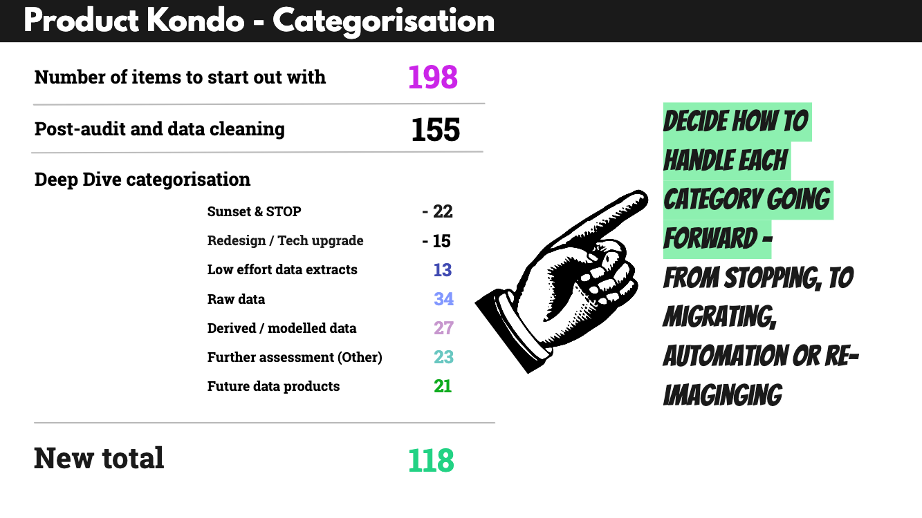
We used the following five buckets to enable sorting, with the intention of keeping the “other” category as small as possible.

Aside from simplifying the terminology used, this categorization meant that each category could be handled differently in terms of future work.

For example, all raw data items would be automated, while the process around “low effort” data items didn’t have to be changed going forward, once it was clear how low the manual effort actually was. Notably, the categorization included a “Sunset/Stop” category to allow stakeholders to already move items there during the deep dives of their own volition, rather than through top-down decision making.

4. Getting Buy-in: Building Product Trees

To get buy-in and allow for active contributions from subject matter experts, we planned workshops per customer segment (as defined by the user segmentation matrix — the initial starting point). Aside from organizing the portfolio items, these workshops allowed key people to be actively involved and thereby act as advocates for the future success of this work.

Using Miro boards to share all audit findings, goals, and the purpose of the clean-up, we conducted seven workshops overall. With 4–6 participants, we spent 3 hours categorizing all items per customer segment. In order to avoid groupthink, all participants were asked to cluster their part of the portfolio as part of the preparation.

The “product tree” concept, developed as an innovation game called “prune the product tree” by Luke Hohmann to organize features around customer needs, helped create a shared mental model among participants. In contrast to Hohmann, we applied the product tree concept here to organize the current portfolio logically and actively reduce it, rather than imagine new products.

In this context, the roots of the tree signified raw data, the tree trunk equated to modeled or derived data, with the crown of the tree signifying data products, and the outer branches were left for “other” items — to capture what could not be easily grouped but had to be included.

Grouping items in this way served a second purpose: to guide how to handle them in the future transformation effort. The plan was to automate raw data first, based on priority. While modeled or derived data would have to be checked for complexity to determine future handling. The actual data products identified would be crucial for the company’s future strategy and were to be reimagined with a product mindset going forward.

The tree metaphor worked well here, despite being used in a different way from its original context, as it provided a mental model for categorization. By clustering items, it was possible to better determine their value for each customer segment in the portfolio. According to the feedback gathered after each workshop, the joint mapping and visualization helped teams trust the process and feel actively involved.

Findings

Analyzing the findings from the workshops revealed the complexity of this effort, with many different factors playing into the prioritization. To visualize this complexity, we used the following approach:

  • Mapping out the product tree by swimlanes (as introduced in the workshops).
  • Layering in usage across multiple segments (through color-coding).
  • Adding the level of dependencies (through the type of frame around each item).
  • Then, add the quantitative assessment and ranking through numbering and color-coding.

For each workshop, we cleaned up the boards, making sure to include crucial comments, especially those about future treatment, such as when a legal obligation to deliver would end.

Using swimlanes helped participants organize data items, while the tree metaphor clarified the interconnectedness and dependencies between items. Especially in the context of data products, this makes a lot of sense, e.g., with raw data being at the root of all other possible versions of “products” derived from them, whether these might be scores, modelled data, automated reports, or more advanced products.

Doing this Product Kondo exercise also helped the teams and all stakeholders gain a shared understanding of how the portfolio was structured for each customer segment. The visualization in swimlanes and with colour-coding and various different frames provided a way to illustrate the complex reality that the initial ranked list format wasn’t able to clarify.

Only once this portfolio mapping was in place, and once quantitative as well as qualitative insights were combined, was it possible to make good decisions about how to handle each item going forward.

For example, all items in the “raw data” category would be automated as part of the wider transformation effort, while all items in the “sunset” category would definitely not be considered for migrating over to the new tech platform. Moreover, the items grouped under “low effort” would continue to be handled manually, while all items grouped under “derived & modelled” would have to be assessed further by a team of tech leads to determine whether or not they might be automated in the future. The items most relevant for the future business strategy of this organization were those grouped under “data products”, i.e., those products that would have to be re-imagined with clear customer needs in mind, based on the user segmentation matrix.

Learnings

In total, we achieved a portfolio reduction of 67.8% from 198 items initially to 118 post clean-up. However, what matters here is not simply the reduction but the categorization, i.e., separating and organizing the portfolio into different swimlanes and introducing the product tree metaphor. The product tree visualisation helped all stakeholders understand the interconnectedness of the portfolio, where the roots signify the core product and the branches different, more advanced products or features built on top of that core.

Similarly, the categorization into swimlanes helped to organize and cluster similar items, getting away from comparing apples and oranges in the initial big portfolio audit table. It illustrated very clearly that not all items are alike and can’t be judged and rated in the same way.

It is worth mentioning that there is no one best way to label your swimlanes, but a good starting point is to think of naming different clusters, e.g., from basic to most complex, and to always include a “sunset/stop” cluster and potentially one that covers “redesign/tech upgrade” items. Having these two buckets allows contributors to actively shape the decision-making around the quick-win items, usually the most obviously outdated or clunky parts of the portfolio.

Whether or not you categorize your products in order to determine how to handle them in an organizational transformation, e.g., to assess automation potential, will largely depend on why and when you’re cleaning up your product portfolio. Even outside of a transformation effort, clustering your portfolio into different categories, understanding interconnectedness, and whether or not each customer segment has a well-rounded product tree, with solid roots and future-looking branches, is a useful exercise in sense-making and keeping your organization lean.

Shared Terminology Matters

In all this, our biggest learning was that

Terminology matters because simply referring to things as “products” doesn’t make them so. Comparing like for like is a key factor when assessing a product portfolio.

Correct categorization was the biggest challenge that had to be dealt with first, to enable the organization to iterate and focus on where to play and re-imagine products to match the future business strategy.

When Theory Meets Reality

This portfolio clean-up had to pivot and expand to include a mapping exercise because we hadn’t factored in the unclear terminology used across the organization, and that, instead of simply gathering and ranking, the biggest task was to correctly categorize and structure. And this is likely to be different from organization to organization. So I would always recommend checking which categories of items you’re comparing in your portfolio. If you’re not entirely sure, you should always include a clustering or mapping exercise right from the start.

Product Kondo: The Groundwork For Transformation

If you’re struggling with a large legacy portfolio and no longer confident that everything in it serves a purpose and brings joy to users and the business, it’s time to clean up.

It’s often necessary and needed to focus on the next shiny thing, but if you don’t balance that with cleaning up your existing portfolio, your organization will eventually become slow. Overgrown product portfolios can’t be sustained forever.

Particularly in organizations bound by various contractual obligations, this is the groundwork that enables product teams to iterate.

Moreover, doing this clean-up and clearing out effort across teams is a highly transparent way to include teams in change. And it is a useful way for getting teams to contribute and actively shape a transformation effort. Business decisions have to be taken, but taking them with transparency and in an evidence-guided way ensures that you are bringing people along.

Last but not least — if you don’t have the capacity to do the full portfolio clean-up (which took us about 4 months, with a core team of roughly 4 people) — start smaller. And start with including these considerations in your day-to-day, for example, by always checking if products or features should be stopped or sunset every time you’re launching new products. Or start by mapping out the different categories of items in your portfolio — with swimlanes and the product tree metaphor in mind. What is core, and what is the future state of play?

Upside: Once you’ve got that big picture overview and worked out what to sunset or where to slim down, you have more capacity to focus on current and future priorities strategically.

Reality check: Of course, the work doesn’t stop there. The next step is to align it all back to your user segments and check how your portfolio serves each of these, particularly the primary segments.

Further Reading

  •  

Boosting Up Your Creativity Without Endless Reference Scrolling

The work of a designer largely consists of inventing new things, which requires creativity that is generally believed to depend on inspiration, making it unpredictable and difficult to control. Many designers, as well as those who would like to try their hand at design, are wondering: what to do if inspiration does not come at the right moment?

There are many practical recommendations from experienced designers and design managers on how to work without inspiration. These mainly rely on discipline, planning, and working with references. I would like to suggest an alternative approach: how to boost creativity and “lure” inspiration with the help of neuroscience.

I’m Marina, and I have been deeply interested in neuroscience for a long time. I have tried many methods from my own experience and observed the experience of my colleagues. In this article, I want to share the ways that seemed to me the most effective in luring creativity, which I eventually built into my life routine on an ongoing basis.

How Our Brain Works

The brain has been and remains an important topic that is underexplored, especially in the context of design and design thinking. No other profession represents the blend of creativity and logic quite like design, in my opinion. This raises a fair question: which part of the brain is more important, the left or the right? To start with, let’s briefly refresh which part of the brain is responsible for what:

Left Hemisphere Right Hemisphere
Language and Speech: Language-related activities like speaking, writing, and comprehension Creativity and Artistic Abilities: Imagination, creative thinking, music, visual arts, etc.
Analytical Thinking: Mathematical operations, sequential processing, and problem-solving Emotional Processing: Emotion recognition, facial expressions, tone of voice, gestures
Linear Thinking: Step-by-step way of information processing Holistic Thinking: Looking at the big picture rather than focusing on details

While each part of the brain is responsible for certain functions, they work together to process information. For some activities (analyzing data, solving equations, and working with precise calculations), it might be more important to rely on the left hemisphere, while for others (composing music, acting), the right hemisphere.

However, when it comes to the design process and design thinking, it’s essential to stimulate both hemispheres and not limit the role of a product designer to being either predominantly left- or right-brained.

Interhemispheric Interaction In Product Design: Why Are Both Equally Important?

In product design, the need for well-established interhemispheric interaction is especially noticeable since this work requires a balance between logic and creativity. The left hemisphere’s logical functions help designers break down complex problems, analyze user needs, and organize structured workflows, ensuring the product’s functionality and usability.

For example, logical processes are crucial in creating wireframes and user flows and adhering to technical constraints. On the other side, the right hemisphere’s creative and spatial abilities play a critical role in developing visually appealing designs and innovative user experiences. It’s extremely important for a designer to think outside the box and solve user problems without forgetting about the balanced and attractive visual part at the same time.

A harmonious interaction between the two hemispheres allows product designers to seamlessly integrate both practical functionality and creative innovation. This balance results in products that not only meet technical and user requirements but also deliver an enjoyable, intuitive, and visually captivating user experience.

The Relevance Of This Subject

The idea that two parts of the brain are interconnected and complement each other during creative tasks isn’t new, nor is it my invention. One of the most influential works for product designers is Experiences in Visual Thinking by Robert H. McKim, an Emeritus Professor of Mechanical Engineering. The value of this book lies in the author’s attempt to explain visual thinking through the lenses of psychology, neurology, semantics, art, and perception. This work was later included in Stanford University’s list of recommended readings for engineering and art design students, further highlighting its significance beyond the field of design.

In the context of the brain’s left and right hemispheres, the author explains and demonstrates through a range of experiments that, to achieve productive thinking — the kind that leads to creative actions — we need to achieve an “internal transfer” between the so-called rational and intuitive halves of the brain. In our thinking process, to achieve creativity, we need to build bridges to “integrate the artist and scientist within each one of us.”

He offers a series of exercises (“3-1/Food for Thought,” “3-2/Dominant Eye,” “3-3/Internal Transfer”) that demonstrate that both brain hemispheres complement each other in cognition and creativity, and he offers to practice them to achieve the so-called “internal transfer”.

One of the simplest exercises offered by McKim is the “3-2/Dominant Eye”. Look at the picture and try to describe what you see:

If you see a duck first (most people see it first) — your left hemisphere is more active. This is because the left hemisphere was activated before reading. If you see a rabbit — often after it’s mentioned — your right hemisphere is more active. This exercise shows that we can consciously choose to shift between hemispheres, training ourselves to engage either side more effectively.

In his work, Professor H. McKim not only demonstrates how to activate the left or right hemisphere but also explains the complementary modes of thought, which consist of two stages. The first stage involves generating an array of ideas, often through a visual thinking process, while the second stage focuses on selecting and refining these ideas (or objects) for further development. Creativity is born during the first stage, but to be executed tangibly, it requires the second stage. Even mathematicians do not only think in terms of mathematical symbols; many, particularly creative ones, use vague images and visuals as part of their thought processes.

According to McKim, creativity requires a balanced development of both hemispheres, as creative thinkers are ambidextrous and capable of transferring ideas into actionable steps. Another important aspect of visual thinking is the right environment, which leads to creativity. McKim describes it as “relaxed attention” — a mental state where ideas emerge spontaneously. Relaxed attention is often achieved through side activities like meditation, taking breaks, physical relaxation, and engaging in non-linear thinking, such as doodling or daydreaming.

I will further share my perspective on enhancing creativity through side activities and present my top three mental and physical occupations. However, it’s important to understand the complementary nature of our brain and how visual thinking often stems from diverse activities and practices.

What Helps Creativity

While it is clear that creativity is driven by both the left and right hemispheres, an important question remains: how can we boost creativity while keeping the process enjoyable? It may not be obvious, but non-design-related activities can, in fact, be an opportunity to enhance creativity.

Physical Activity

The interconnection between our body, mind, and thinking process might be key to awakening creativity. Motor skills are controlled by both hemispheres, with the right hemisphere controlling the left side of the body and the left hemisphere controlling the right side. But it also works in the opposite direction — movements trigger active brain activity.

Sports that combine the need to develop a strategy while also requiring active movement may work best for turning up creativity.

Understanding the intricacies of the brain highlights the importance of integrating all parts of the brain. In order to learn, you must first have a sensory experience, then reflect and make connections. Finally, you must take action based on the experience. The knowledge that your first movements, even inside the womb, help build your brain underscores the fact that you actually move to learn. In other words, movement is essential to learning. (Source: Anne Green Gilbert. Brain-Compatible Dance Education, 2019)

Here are the top activities that positively impact creativity, and I will explain why they have this effect.

Tennis

The basis of a good game is a well-thought-out and trained strategy. Tennis requires a quick analysis of the situation, prompt decisions, and maximum involvement. No wonder this sport is called “chess in motion”: in the process, it is developing memory, concentration, and strategic thinking. At the same time, working in a group and communicating during workouts help reduce stress levels and improve mood.

Table tennis also develops concentration. The need to memorize combinations, develop motor skills, visual and motor types of memory, and compare the opponent’s movements, speed, angle of flight of the ball, and its rotational force form the basis of a successful game. It is suitable for those who do not have the opportunity to play lawn tennis.

I asked several designers if they do any of these things in their free time and how they think it affects their productivity and professional skills. Here is what they’ve shared:

“I started playing tennis a couple of years ago. I work out once or twice a week individually with a coach or in a group. This is a sport that requires high concentration during the game. It seems to me that this skill helped me in my work as well; before that, I was often distracted, and it was difficult for me to do the same task for a long time.

At the same time, due to the fact that I have to fully concentrate during the game, I manage to switch from everyday problems and unload my brain. I prefer to play in the morning or afternoon and take a break from work. Therefore, I return to work more energetically and can take a fresh look at my tasks.”

— Ilia Kanazin, Product Designer with 7+ years of experience working in SaaS

Dance

Dance challenges the brain by requiring the integration of movement, rhythm, coordination, and memory, which promotes neuroplasticity, or the brain’s ability to form new neural connections. The more varied the movement patterns and rhythmic complexities, the more the brain is stimulated to adapt and reorganize. Neuroplasticity has a positive effect on memory capacity, learning abilities, and problem-solving skills, which are good for the design process.

At the same time, cognitive flexibility supports the developed design because you always need to adjust your decisions, getting new data from user testing and feedback from the stakeholders. Dancers often have to improvise or adapt to changes in the rhythm and conditions. Also, they constantly learn new movements and combinations of them. Such experience in choreography and expression develops connections between hemispheres, which influences a person’s ability to think creatively in general.

Balance Exercises

In my opinion, the balance board is one of the most convenient and affordable home simulators. With its help, you can do a short workout at any time to take a break from long work and return to work with a fresh look.

Board balance exercises can be quite diverse. It can be added to your usual exercises and diversified with squats, exercises with a slight weight on the upper body, or shoulder and neck warm-up, which will increase cognitive activity as a result.

You can also just stand on the balance board while listening to work calls, which don’t require active participation, watching TV shows, or chatting on the phone with friends.

Case Study

“By training your body to move more creatively, you train your mind to think more creatively.”

— Jennifer Heisz. Move The Body, Heal The Mind, 2022

While it may be challenging to find documented real-life cases that provide clear examples of famous designs fueled by sport and physical activity, there are historically backed examples and research studies demonstrating that physical activity positively influences creativity.

For example, Charles Darwin’s “Thinking Path”. The scientist developed his most famous works, “On the Origin of Species” and “The Descent of Man,” at Down House, where he took daily walks. This activity is known as Darwin’s Thinking Path, and it is well-documented how his walking routine influenced the way he contemplated his scientific theories.

With the emergence of neuroscience as a science in the mid-20th century, we have gained a new perspective on what drives creative thinking, which is ultimately beneficial for design. Neuroscience provides insights into how various activities influence the brain, which, as a result, leads to changes in other fields.

For example, tennis is recognized for its benefits to brain health. It enhances the ability to process sensory information rapidly, improving overall cognitive processing speed and reaction time. In addition, strategic thinking is required in this game and engages the prefrontal cortex — the brain’s hub for decision-making and strategic planning. And we can see how this single activity demonstrates the far-reaching cognitive benefits of physical exercise.

Nowadays, researchers in neuroscience are united in their opinion on what unleashes creativity — physical activity unlocks it. There are even experiments that measure it: Marily Oppezzo, a behavioral and learning scientist at Stanford, studied how walking affects creativity. Her experiment compared walking on a treadmill, walking outdoors, sitting indoors and outdoors, and being pushed in a wheelchair. Surprisingly, even treadmill walking in a dull room boosted creativity by 60% compared to sitting.

“It’s not specific activities but individuals’ experiences of them that determine their effect.”

Amir-Homayoun Javadi, Associate Professor at the University of Kent

Another study goes further, explaining that not all sports impact creativity to the same extent.

“It may surprise you — it wasn’t artistic sports but net and combat sports. Why? Because cultivating a creative mind depends on how we train. In artistic sports (figure skating, gymnastics, synchronized swimming), athletes memorize a series of predefined steps. Although creating these routines may involve creativity, the training itself is structured, predictable, and planned.”

Training that is mostly predictable makes our brain less mentally flexible, in contrast to net and combat sports (such as badminton, tennis, volleyball, and fencing), which make us learn to act instinctively. As we train physically, our brain also adapts, becoming more flexible — particularly in terms of cognitive flexibility. This, in turn, enhances our creativity. (Source: Jennifer Heisz. Move The Body, Heal The Mind, 2022)

Mental Activity

However, physical activity is not the only way to achieve a ‘relaxed attention’ state and learn to balance the left and right hemispheres of the brain. Mental activities also trigger the same process. I have selected the top 3 activities that will enhance your creativity at work.

Learning Foreign Languages

As we discussed above, during the design process, both brain hemispheres are used, and when you’re learning foreign languages, it leads to similar processes in your brain, so you train it through similar activities.

Language processing primarily occurs in the left hemisphere, but emotional intonation and context (e.g., sarcasm, tone) are understood by the right hemisphere. When someone says “Oh, great!” after receiving bad news, the left hemisphere processes the words and grammar, understanding the literal meaning, while the right hemisphere interprets the tone and context, allowing the person to get the real point of the message.

Learning a second language exposes people to new methods of expressing the same thoughts, which promotes creativity. Finding synonyms, understanding idiomatic terms, and gaining the ability to flip between languages all promote divergent thinking, which is the ability to generate several solutions to a given problem.

In parallel, learning foreign languages helps to develop storytelling and self-presentation skills, which are also very useful in a designer’s work.

“I’ve lived in several countries for a long time, so in addition to my native language, I speak three other foreign languages as well. It helps me to build communication with different people, which is very important in the designer’s work.

I think because I know how to say the same thing in different languages, I also use this approach in design. To solve the same problem, I can offer several solutions and choose the most appropriate one together with the stakeholders.

Now I am a Senior Growth Designer, and this job requires constantly looking for non-standard solutions and implementing them quickly. I think the use of different languages contributes to this from the point of view of brain function.

Speaking multiple languages also comes really handy when you are dealing with personas from different nationalities. For example, Western Saas products use a more minimalist approach, whereas Saas from Asia or China, for example, more information is better than less.”

— Maxence Akodjenou, Senior Growth Designer (working on complex B2B apps)

Board Games

Table games develop strategic thinking, require players to anticipate opponents’ moves, solve problems in real-time, and sometimes think outside the box. Traditional games like chess encourage critical thinking, as players must analyze the current situation, weigh potential outcomes, and decide on the best course of action. This improves the brain’s executive functions, including decision-making, planning, and strategic thinking.

Some tabletop games are based on role-playing or storytelling, such as Dungeons & Dragons or Dixit. These games encourage players to invent stories, create characters, and navigate imaginative scenarios, fostering creative thinking and imagination.

Board games also train communication skills, which product designers have to use a lot in their jobs. Playing table games, especially in groups, encourages the participants to convince their teammates of their decisions and carefully listen to others. The games that involve cooperation help the players develop their collaboration skills, such as finding compromises, negotiating, and making concessions.

Music Lessons

Playing a musical instrument has been a widely researched topic in neuroscience in recent decades. It has been proven that music lessons improve cognitive abilities by improving the neural connection between the left and right hemispheres of the brain, which leads to a positive effect on memory, learning ability, and non-verbal thinking, as a result of which the brain as a whole works much more productively in other areas of life.

The brain learns to hear and interpret sounds, which happens only while playing an instrument and is impossible while simply listening to music. As a result, a person is better able to process complex information. Playing musical instruments involves the relationship between the motor, sensory, auditory, visual, and emotional components of the central and peripheral nervous systems. Such brain training includes artistic and aesthetic aspects of learning, which is a unique feature of playing a musical instrument. The combination of linguistic and mathematical activity in the left hemisphere gets used to working in coordination with creative functions in the right hemisphere.

An interesting fact: Albert Einstein often played the violin during moments of deep thinking, claiming that music was an extension of his thought process and helped him solve particularly difficult problems.

A Lesson From Paul Klee

It is worth noting that it works both ways — both your music lessons enhance your creativity in design, and design pushes your success in music.

In the book Enchanted Neurons, Pierre Boulez, French composer and conductor, talks about the lessons that Paul Klee (Swiss-born German artist. His highly individual style was influenced by movements in art that included expressionism, cubism, and surrealism) taught at the Bauhaus (German art school which became famous for its approach to design based on unifying individual artistic vision with the principles of mass production and emphasis on function).

“Theoretical reflection is particularly interesting to me when it is applied to something that is completely foreign to music because it then makes it possible to discover solutions that you would never have found if you had remained bound by the limits of your art.

I’ll give you a personal example: the discovery not only of Klee’s painting but also the lessons that he gave at the Bauhaus, which we spoke about earlier, was extremely important to me, especially from the point of view of composition. I understood how using very simple elements like two motifs made it possible to think about the way in which these two motifs could interact. I remember, in particular, an exercise given by Klee to his students: a straight line and a circle. That’s it. The exercise consisted of trying to invent something, a meeting of this line and this circle.”

— Pierre Boulez, Jean-Pierre Changeux, Philippe Manoury. Enchanted Neurons, 2020

This lesson shared by Pierre Boulez demonstrates how interdisciplinary inspiration — such as the course of visual artist Paul Klee — shaped his creative process and how concepts from outside music can lead to new solutions.

In my opinion, the reverse can also be true: music and its principles can inspire creativity in other disciplines.

“I started composing music even earlier than I started designing. Music has a composition and rhythm-like design. And development in one area also entails a boost in another. It works both ways; success in music develops my design skills. Design helps me make more complex music.

In addition, there is also a practical benefit; I make my own covers for my tracks and use my tracks for my showcases. Plus, I listen to a lot of different music, and it develops my world perception, fills me with energy, and creates the right mood for working on projects.”

— Sergei Diuzhev, Design Leader at MuseScore

Tips For Incorporating A Routine That Sustains Designer’s Creativity

Whenever you feel stuck in your work or overly critical of your designs or prototype, think about the strategies from the above that might help your creative process.

  1. Find something you genuinely enjoy or have always wanted to try and implement in small steps.
    It doesn’t need to be a completely new hobby. For example, you could dance to your favorite music at home, stand on a balance board between work calls, or try something new once a month or quarter with friends, like skating, rock climbing, or other activities. This year, I plan to go skiing for the first time.
  2. Constantly explore new things, even small ones.
    Take different routes to work, cook new dishes, or listen to unfamiliar music. Even if you don’t end up loving it, it’s still valuable because your brain is enriched by the experience.
  3. Meet new people.
    As I mentioned earlier, communication skills are essential for designers, but beyond that, new people can inspire you in unexpected ways. They might introduce you to a new sport, hobby, or activity that you could even try together.

I shared examples of designers who have rebuilt their creativity through activities like tennis, music, and languages, and I feel the impact in my own daily routine when I try new things and hobbies. Whatever approach you decide to follow, I guarantee your brain will feel the difference and reward you with fresh ideas and inspiration.

Conclusion

Creativity may be developed in a variety of ways, including browsing reference sites and putting in a lot of practice — both of which are important. Outside these classic ways, you can engage in activities that not only promote creativity but also improve your mental and physical health.

There are many possibilities for increasing brain activity, and you can develop your own entertaining and useful ways of spending time. Finally, trying something new will generate new thoughts and break down the monotony.

When you experience virtual reality, read poetry or fiction, see a film, listen to a piece of music, or move your body to dance, to name a few of the many arts, you are biologically changed. There is a neurochemical exchange that can lead to what Aristotle called catharsis, or a release of emotion that leaves you feeling more connected to yourself and others afterward. (Source: Susan Magsamen, Ivy Ross. Your Brain on Art, 2023)

Further Reading on Smashing Magazine

  •  

Building An Offline-Friendly Image Upload System

So, you’re filling out an online form, and it asks you to upload a file. You click the input, select a file from your desktop, and are good to go. But something happens. The network drops, the file disappears, and you’re stuck having to re-upload the file. Poor network connectivity can lead you to spend an unreasonable amount of time trying to upload files successfully.

What ruins the user experience stems from having to constantly check network stability and retry the upload several times. While we may not be able to do much about network connectivity, as developers, we can always do something to ease the pain that comes with this problem.

One of the ways we can solve this problem is by tweaking image upload systems in a way that enables users to upload images offline — eliminating the need for a reliable network connection, and then having the system retry the upload process when the network becomes stable, without the user intervening.

This article is going to focus on explaining how to build an offline-friendly image upload system using PWA (progressive web application) technologies such as IndexedDB, service workers, and the Background Sync API. We will also briefly cover tips for improving the user experience for this system.

Planning The Offline Image Upload System

Here’s a flow chart for an offline-friendly image upload system.

As shown in the flow chart, the process unfolds as follows:

  1. The user selects an image.
    The process begins by letting the user select their image.
  2. The image is stored locally in IndexedDB.
    Next, the system checks for network connectivity. If network connectivity is available, the system uploads the image directly, avoiding unnecessary local storage usage. However, if the network is not available, the image will be stored in IndexedDB.
  3. The service worker detects when the network is restored.
    With the image stored in IndexedDB, the system waits to detect when the network connection is restored to continue with the next step.
  4. The background sync processes pending uploads.
    The moment the connection is restored, the system will try to upload the image again.
  5. The file is successfully uploaded.
    The moment the image is uploaded, the system will remove the local copy stored in IndexedDB.
Implementing The System

The first step in the system implementation is allowing the user to select their images. There are different ways you can achieve this:

  • You can use a simple <input type="file"> element;
  • A drag-and-drop interface.

I would advise that you use both. Some users prefer to use the drag-and-drop interface, while others think the only way to upload images is through the <input type="file"> element. Having both options will help improve the user experience. You can also consider allowing users to paste images directly in the browser using the Clipboard API.

Registering The Service Worker

At the heart of this solution is the service worker. Our service worker is going to be responsible for retrieving the image from the IndexedDB store, uploading it when the internet connection is restored, and clearing the IndexedDB store when the image has been uploaded.

To use a service worker, you first have to register one:

if ('serviceWorker' in navigator) {
  navigator.serviceWorker.register('/service-worker.js')
    .then(reg => console.log('Service Worker registered', reg))
    .catch(err => console.error('Service Worker registration failed', err));
}

Checking For Network Connectivity

Remember, the problem we are trying to solve is caused by unreliable network connectivity. If this problem does not exist, there is no point in trying to solve anything. Therefore, once the image is selected, we need to check if the user has a reliable internet connection before registering a sync event and storing the image in IndexedDB.

function uploadImage() {
  if (navigator.onLine) {
    // Upload Image
  } else {
    // register Sync Event
    // Store Images in IndexedDB
  }
}

Note: I’m only using the navigator.onLine property here to demonstrate how the system would work. The navigator.onLine property is unreliable, and I would suggest you come up with a custom solution to check whether the user is connected to the internet or not. One way you can do this is by sending a ping request to a server endpoint you’ve created.

Registering The Sync Event

Once the network test fails, the next step is to register a sync event. The sync event needs to be registered at the point where the system fails to upload the image due to a poor internet connection.

async function registerSyncEvent() {
  if ('SyncManager' in window) {
    const registration = await navigator.serviceWorker.ready;
    await registration.sync.register('uploadImages');
    console.log('Background Sync registered');
  }
}

After registering the sync event, you need to listen for it in the service worker.

self.addEventListener('sync', (event) => {
  if (event.tag === 'uploadImages') {
    event.waitUntil(sendImages());
  }
});

The sendImages function is going to be an asynchronous process that will retrieve the image from IndexedDB and upload it to the server. This is what it’s going to look like:

async function sendImages() {
  try {
    // await image retrieval and upload
  } catch (error) {
    // throw error
  }
}

Opening The Database

The first thing we need to do in order to store our image locally is to open an IndexedDB store. As you can see from the code below, we are creating a global variable to store the database instance. The reason for doing this is that, subsequently, when we want to retrieve our image from IndexedDB, we wouldn’t need to write the code to open the database again.

let database; // Global variable to store the database instance

function openDatabase() {
  return new Promise((resolve, reject) => {
    if (database) return resolve(database); // Return existing database instance 

    const request = indexedDB.open("myDatabase", 1);

    request.onerror = (event) => {
      console.error("Database error:", event.target.error);
      reject(event.target.error); // Reject the promise on error
    };

    request.onupgradeneeded = (event) => {
        const db = event.target.result;
        // Create the "images" object store if it doesn't exist.
        if (!db.objectStoreNames.contains("images")) {
          db.createObjectStore("images", { keyPath: "id" });
        }
        console.log("Database setup complete.");
    };

    request.onsuccess = (event) => {
      database = event.target.result; // Store the database instance globally
      resolve(database); // Resolve the promise with the database instance
    };
  });
}

Storing The Image In IndexedDB

With the IndexedDB store open, we can now store our images.

Now, you may be wondering why an easier solution like localStorage wasn’t used for this purpose.

The reason for that is that IndexedDB operates asynchronously and doesn’t block the main JavaScript thread, whereas localStorage runs synchronously and can block the JavaScript main thread if it is being used.

Here’s how you can store the image in IndexedDB:

async function storeImages(file) {
  // Open the IndexedDB database.
  const db = await openDatabase();
  // Create a transaction with read and write access.
  const transaction = db.transaction("images", "readwrite");
  // Access the "images" object store.
  const store = transaction.objectStore("images");
  // Define the image record to be stored.
  const imageRecord = {
    id: IMAGE_ID,   // a unique ID
    image: file     // Store the image file (Blob)
  };
  // Add the image record to the store.
  const addRequest = store.add(imageRecord);
  // Handle successful addition.
  addRequest.onsuccess = () => console.log("Image added successfully!");
  // Handle errors during insertion.
  addRequest.onerror = (e) => console.error("Error storing image:", e.target.error);
}

With the images stored and the background sync set, the system is ready to upload the image whenever the network connection is restored.

Retrieving And Uploading The Images

Once the network connection is restored, the sync event will fire, and the service worker will retrieve the image from IndexedDB and upload it.

async function retrieveAndUploadImage(IMAGE_ID) {
  try {
    const db = await openDatabase(); // Ensure the database is open
    const transaction = db.transaction("images", "readonly");
    const store = transaction.objectStore("images");
    const request = store.get(IMAGE_ID);
    request.onsuccess = function (event) {
      const image = event.target.result;
      if (image) {
        // upload Image to server here
      } else {
        console.log("No image found with ID:", IMAGE_ID);
      }
    };
    request.onerror = () => {
        console.error("Error retrieving image.");
    };
  } catch (error) {
    console.error("Failed to open database:", error);
  }
}

Deleting The IndexedDB Database

Once the image has been uploaded, the IndexedDB store is no longer needed. Therefore, it should be deleted along with its content to free up storage.

function deleteDatabase() {
  // Check if there's an open connection to the database.
  if (database) {
    database.close(); // Close the database connection
    console.log("Database connection closed.");
  }

  // Request to delete the database named "myDatabase".
  const deleteRequest = indexedDB.deleteDatabase("myDatabase");

  // Handle successful deletion of the database.
  deleteRequest.onsuccess = function () {
    console.log("Database deleted successfully!");
  };

  // Handle errors that occur during the deletion process.
  deleteRequest.onerror = function (event) {
    console.error("Error deleting database:", event.target.error);
  };

  // Handle cases where the deletion is blocked (e.g., if there are still open connections).
  deleteRequest.onblocked = function () {
    console.warn("Database deletion blocked. Close open connections and try again.");
  };
}

With that, the entire process is complete!

Considerations And Limitations

While we’ve done a lot to help improve the experience by supporting offline uploads, the system is not without its limitations. I figured I would specifically call those out because it’s worth knowing where this solution might fall short of your needs.

  • No Reliable Internet Connectivity Detection
    JavaScript does not provide a foolproof way to detect online status. For this reason, you need to come up with a custom solution for detecting online status.
  • Chromium-Only Solution
    The Background Sync API is currently limited to Chromium-based browsers. As such, this solution is only supported by Chromium browsers. That means you will need a more robust solution if you have the majority of your users on non-Chromium browsers.
  • IndexedDB Storage Policies
    Browsers impose storage limitations and eviction policies for IndexedDB. For instance, in Safari, data stored in IndexedDB has a lifespan of seven days if the user doesn’t interact with the website. This is something you should bear in mind if you do come up with an alternative for the background sync API that supports Safari.
Enhancing The User Experience

Since the entire process happens in the background, we need a way to inform the users when images are stored, waiting to be uploaded, or have been successfully uploaded. Implementing certain UI elements for this purpose will indeed enhance the experience for the users. These UI elements may include toast notifications, upload status indicators like spinners (to show active processes), progress bars (to show state progress), network status indicators, or buttons to provide retry and cancel options.

Wrapping Up

Poor internet connectivity can disrupt the user experience of a web application. However, by leveraging PWA technologies such as IndexedDB, service workers, and the Background Sync API, developers can help improve the reliability of web applications for their users, especially those in areas with unreliable internet connectivity.

  •  

What Does It Really Mean For A Site To Be Keyboard Navigable

Efficient navigation is vital for a functional website, but not everyone uses the internet the same way. While most visitors either scroll on mobile or click through with a mouse, many people only use their keyboards. Up to 10 million American adults have carpal tunnel syndrome, which may cause pain when holding a mouse, and vision problems can make it difficult to follow a cursor. Consequently, you should keep your site keyboard navigable to achieve universal appeal and accessibility.

Understanding Keyboard Navigation

Keyboard navigation allows users to engage with your website solely through keyboard input. That includes using shortcuts and selecting elements with the Tab and Enter keys.

There are more than 500 keyboard shortcuts among operating systems and specific apps your audience may use. Standard ones for web navigation include Ctrl + F to find words or resources, Shift + Arrow to select text, and Ctrl + Tab to move between browser tabs. While these are largely the responsibilities of the software companies behind the specific browser or OS, you should still consider them.

Single-button navigation is another vital piece of keyboard navigability. Users may move between clickable items with the Tab and Shift keys, use the Arrow keys to scroll, press Enter or Space to “click” a link, and exit pop-ups with Esc.

The Washington Post homepage goes further. Pressing Tab highlights clickable elements as it should, but the first button press brings up a link to the site’s accessibility statement first. Users can navigate past this, but including it highlights how the design understands how keyboard navigability is a matter of accessibility.

You should understand how people may use these controls so you can build a site that facilitates them. These navigation options are generally standard, so any deviation or lack of functionality will stand out. Ensuring keyboard navigability, especially in terms of enabling these specific shortcuts and controls, will help you meet such expectations and avoid turning users away.

Why Keyboard Navigation Matters In Web Design

Keyboard navigability is crucial for a few reasons. Most notably, it makes your site more accessible. In the U.S. alone, over one in four people have a disability, and many such conditions affect technology use. For instance, motor impairments make it challenging for someone to use a standard mouse, and users with vision problems typically require keyboard and screen reader use.

Beyond accounting for various usage needs, enabling a wider range of control methods makes a site convenient. Using a keyboard rather than a mouse is faster when it works as it should and may feel more comfortable. Considering how workers spend nearly a third of their workweek looking for information, any obstacles to efficiency can be highly disruptive.

Falling short in these areas may lead to legal complications. Regulations like the Americans with Disabilities Act necessitate tech accessibility. While the ADA has no binding rules for what constitutes an accessible website, it specifically mentions keyboard navigation in its nonbinding guidance. Failing to support such functionality does not necessarily mean you’ll face legal penalties, but courts can use these standards to inform their decision on whether your site is reasonably accessible.

In 2023, Kitchenaid faced a class-action lawsuit for failing to meet such standards. Plaintiffs alleged that the company’s site didn’t support alt text or keyboard navigation, making it inaccessible to users with visual impairments. While the case ultimately settled out of court, it’s a reminder of the potential legal and financial repercussions of overlooking inclusivity.

Outside the law, an inaccessible site presents ethical concerns, as it shows preferential treatment for those who can use a mouse, even if that’s unintentional. Even without legal action, public recognition of this bias may lead to a drop in visitors and a tainted public image.

Elements Of A Keyboard-Navigable Site

Thankfully, ensuring keyboard navigability is a straightforward user experience design practice. Because navigation is standard across OSes and browsers, keyboard-accessible sites employ a few consistent elements.

Focus Indicators

Web Accessibility In Mind states that sites must provide a visual indicator of elements currently in focus when users press Tab. Focus indicators are typically a simple box around the highlighted icon.

These are standard in CSS, but some designers hide them, so avoid using outline:0 or outline:none to limit their visibility. You can also increase the contrast or change the indicator’s color in CSS.

The CNN Breaking News homepage is a good example of a strong focus indicator. Pressing Tab immediately brings up the box, which is bold enough to see easily and even uses a white border when necessary to stand out against black or dark-colored site elements.

Logical Tab Order

The order in which the focus indicator moves between elements also matters. Generally speaking, pressing the Tab key should move it from left to right and top to bottom — the same way people read in English.

A few errors can stand in the way. Disabled buttons disrupt keyboard navigation flow by skipping an element with no explanation or highlighting it without making it clickable. Similarly, an interface where icons don’t fall in a predictable left-to-right, top-to-bottom order will make logical tab movement difficult.

The Sutton Maddock Vehicle Rental site is a good example of what not to do. When you press Tab, the focus indicator jumps from “Contact” to the Facebook link before going backward to the Twitter link. It starts at the right and moves left when it goes to the next line — the opposite order of what feels natural.

Skip Navigation Links

Skip links are also essential. These interactive elements let keyboard users jump to specific content without repeated keystrokes. Remember, these skips must be one of the first areas highlighted when you press Tab so they work as intended.

The HSBC Group homepage has a few skip navigation links. Pressing Tab pulls up three options, letting users quickly jump to whichever part of the site interests them.

Keyboard-Accessible Interactive Elements

Finally, all interactive elements on a keyboard-navigable site should be accessible via keystrokes. Anything people can click on or drag with a cursor should also support navigation and interaction. Enabling this is as simple as letting users select all items with the Tab or Arrow keys and press them with Space or Enter.

Appropriately, this Arizona State University page on keyboard accessibility showcases this concept well. All drop-down menus are possible to open by navigating to them via Tab and pressing Enter, so users don’t need a mouse to interact with them.

How to Test for Keyboard Navigability

After designing a keyboard-accessible UX, you should test it to ensure that it works properly. The easiest way to do this is to explore the site solely with your keyboard. The chart below outlines the criteria to look for when determining whether your site is legitimately keyboard navigable.

Keyboard Navigable Not Keyboard Navigable
Clickable Elements All elements are reachable through the keyboard and open when you press Enter. Only some elements are possible to reach through the keyboard. Some links may be broken or not open when you press Enter.
Focus Indicators Pressing Tab, Space, or Enter brings up a focus indicator that is easy to see in all browsers. Focus indicators may not appear when pressing all buttons. The box may be hard to see or only appear in some browsers.
Skip Navigation Links Pressing Tab for the first time pulls up at least one skip link to take users to much-visited content or menus. Continuing to press Tab moves the focus indicator past these links to highlight elements on the page as normal. No skip links appear when pressing Tab for the first time. Alternatively, they appear after moving through all other elements. Skip links may not be functional.
Screen Reader Support Screen readers can read each element when highlighted with the focus indicator. Some elements may not encourage any action from screen readers when highlighted.

The Web Content Accessibility Guidelines outline two test rules to verify keyboard navigability:

  1. The first ensures all interactive elements are accessible via the Tab key,
  2. The second checks for keyboard scroll functionality.

Employ both standards to review your UX before making a site live.

Typical issues include the inability to highlight elements with the Tab key or things that don’t fall in a natural order. You can discover both problems by trying to access everything with your keyboard. However, you may prefer to conduct a navigability audit through a third party. Many private companies offer these services, but you can also use the Bureau of Internet Accessibility for a basic WCAG audit.

Make Your Site Keyboard Navigable Today

Keyboard navigability ensures you cater to all needs and preferences for an inclusive, accessible website design. While it’s straightforward to implement, it’s also easy to miss, so remember these principles when designing your UX and testing your site.

WCAG provides several techniques you can employ to meet keyboard accessibility standards and enhance your users’ experience:

Follow these guidelines and use WCAG’s test rules to create an accessible site. Remember to re-check it every time you add elements or change your UX.

Additionally, consider the following recommended reads to learn more about keyboards and their role in accessibility:

User-friendliness is an industry best practice that demonstrates your commitment to inclusivity for all. Even users without disabilities will appreciate intuitive, efficient keyboard navigation.

  •  

Fostering An Accessibility Culture

A year ago, I learned that my role as an accessibility engineer was at risk of redundancy. It was a tough moment, both professionally and personally. For quite some time, my mind raced with guilt, self-doubt, plain sadness... But as I sat with these emotions, I found one line of thought that felt productive: reflection. What did I do well? What could I have done better? What did I learn?

Looking back, I realized that as part of a small team in a massive organization, we focused on a long-term goal that we also believed was the most effective and sustainable path: gradually shaping the organization’s culture to embrace accessibility.

Around the same time, I started listening to “Atomic Habits” by James Clear. The connection was immediate. Habits and culture are tightly linked concepts, and fostering an accessibility culture was really about embedding accessibility habits into everyone’s processes. That’s what we focused on. It took us time (and plenty of trial and error) to figure this out, and while there’s no definitive playbook for creating an accessibility program at a large organization, I thought it might help others if I shared my experiences.

Before we dive in, here’s a quick note: This is purely my personal perspective, and you’ll find a bias towards culture and action in big organizations. I’m not speaking on behalf of any employer, past or present. The progress we made was thanks to the incredible efforts of every member of the team and beyond. I hope these reflections resonate with those looking to foster an accessibility culture at their own companies.

Goals Vs. Systems

To effectively shape habits, it’s crucial to focus on systems and processes (who we want to become) rather than obsessing over a final goal (or what we want to achieve). This perspective is especially relevant in accessibility.

Take the goal of making your app accessible. If you focus solely on achieving compliance without changing your systems (embedding accessibility into processes and culture), progress will be temporary.

For example, you might request an accessibility audit and fix the flagged issues to achieve compliance. While this can provide “quick” results, it’s often a short-lived solution.

Software evolves constantly: features are rewritten, old code is removed, and new functionality is added. Without an underlying system in place, accessibility issues can quickly resurface. Worse, this approach may reinforce the idea that accessibility is something external, checked by someone else, and fixed only when flagged. Not to mention that it becomes increasingly expensive the later accessibility issues are addressed in the process. It can also feel demoralizing when accessibility becomes synonymous with a long list of last-minute tickets when you are busiest.

Despite this, companies constantly focus on the goal rather than the systems.

“Accessibility is both a state and a practice.”

— Sommer Panage, SwiftTO talk, “Building Accessibility into Your Company, Team, and Culture

I’ll take the liberty of tweaking that to an aspirational state. Without recognizing the importance of the practice, any progress made is at risk of regression.

Instead, I encourage organizations to focus on building habits and embedding good accessibility practices into their workflows. A strong system not only ensures lasting progress but also fosters a culture where accessibility becomes second nature.

What Is Your Actual Goal?

That doesn’t mean goals are useless — they’re very effective in setting up direction.

In my team, we often said (only half-jokingly) that our ultimate goal was to put ourselves out of a job. This mindset reflects an important principle: accessibility is a cross-organizational responsibility, not the task of a single person or team.

That’s why, in my opinion, focusing solely on compliance rather than culture transformation (or prioritizing the “state” of accessibility over the “practice”) is a flawed strategy.

The real goal should be to build a user-centric culture where accessibility is embedded in every workflow, decision, and process. By doing so, companies can create products where accessibility is not about checking boxes and closing tickets but delivering meaningful and inclusive experiences to all users.

How Do We Get There?

Different companies (of various sizes, structures, and cultures) will approach accessibility differently, depending on where they are in their journey. I still have to meet, though, an accessibility team that ever felt they had enough resources. This makes careful resource allocation a cornerstone of your strategy. And while there’s no one-size-fits-all solution, shifting left (addressing issues earlier in the development process) tends to be the most effective approach in most cases.

Design Systems

If your company has a design system, partnering with the team that owns it can be one of your biggest wins. Fixing a single component used across dozens of places improves the experience everywhere it’s used. This approach scales beautifully.

Involvement in foundational decisions and discussions, like choosing color palettes, typography, and component interactions, and so on, can also be very valuable. Contributing to documentation and guidelines tailored to accessibility can help teams across the organization make informed decisions.

For a deeper dive, I recommend Feli Bernutz’s excellent talk, “Designing APIs: How to Ensure Accessibility in Design Systems.”

Still, I would encourage everyone to strive to change that mindset.

Doing accessibility for economic or legal reasons is valid, but it can lead to perverse incentives, where the bare minimum and compliance become the strategy, or where teams constantly need to prove their return on investment.

It is better to do it for the “wrong” reasons than not to do it at all. But ultimately, those aren’t the reasons we should be doing it.

The “13 Letters” podcast opened with an incredibly interesting two-part episode featuring Mike Shebanek. In it, Mike explains how Apple eventually renewed its commitment to accessibility because, in the state of Maine, schools were providing Macs and needed a screen reader for students who required one. It seems like a somewhat business-driven decision. But years later, Tim Cook famously stated, “When we work on making our devices accessible by the blind, I don’t consider the bloody ROI.” He also remarked, “Accessibility rights are human rights.

That’s the mindset I wish more CEOs and leaders had. It is a story of how a change of mindset from “we have to do it” to “it is a core part of what we do” leads to a lasting and successful accessibility culture. Going beyond the bare minimum, Apple has become a leader in accessibility. An innovative company that consistently makes products more accessible and pushes the entire industry forward.

The Good News

Once good habits are established, they tend to stick around. When I was let go, some people (I’m sure trying to comfort me) said the accessibility of the app would quickly regress and that the company would soon realize their mistake. Unexpectedly for them, I responded that I actually hoped it wouldn’t regress anytime soon. That, to me, would be the sign that I had done my job well.

And honestly, I felt confident it wouldn’t. Incredible people with deep knowledge and a passion for accessibility and building high-quality products stayed at the company. I knew the app was in good hands.

But it’s important not to fall into complacency. Cultures can be taken for granted, but they need constant nurturing and protection. A company that hires too fast, undergoes a major layoff, gets acquired, experiences high turnover, or sees changes in leadership or priorities… Any of these can pretty quickly destabilize something that took years to build.

Wrapping Up

This might not be your experience, and what we did may not work for you, but I hope you find this insight useful. I have, as they say, strong opinions, but loosely held. So I’m looking forward to knowing what you think and learning about your experiences too.

There’s no easy way or silver bullet! It’s actually very hard! The odds are against you. And we tend to constantly be puzzled about why the world is against us doing something that seems so obviously the right thing to do: to invite and include as many people as possible to use your product, to remove barriers, to avoid exclusion. It is important to talk about exclusion, too, when we talk about accessibility.

“Even though we were all talking about inclusion, we each had a different understanding of that word. Exclusion, on the other hand, is unanimously understood as being left out (...) Once we learn how to recognize exclusion, we can begin to see where a product or experience that works well for some might have barriers for someone else. Recognizing exclusion sparks a new kind of creativity on how a solution can be better.”

Kat Holmes

Something that might help: always assume goodwill and try to meet people where they are. I need to remind myself of this quite often.

“It is all about understanding where people are, meeting them where they’re at (...) People want to fundamentally do the right thing (...) They might not know what they don’t know (...) It might mean stepping back and going to the fundamentals (...) I know some people get frustrated about having to re-explain accessibility over and over again, but I believe that if we are not willing to do that, then how are we gonna change the hearts and minds of people?”

Jennison Asuncion

I’d encourage you to:

  • If you haven’t, just start. No matter what.
  • Play the long game, and focus more on systems and processes than just goals.
  • Build a network: rally allies around you and secure buy-in from leadership by showing that accessibility is not extra work; if considered after the fact, they’re actually missed steps.
  • Shift left and be strategic: reflect on where your limited resources can have the biggest, most lasting impact.
  • Be persistent. Be resilient.

But honestly, anything you can do is progress. And progress is all we need, just for things to be a little better every day. Your job is incredibly important. Thanks for all you do!

Accessibility: This is the way!

  •  

Inclusive Dark Mode: Designing Accessible Dark Themes For All Users

Dark mode, a beloved feature in modern digital interfaces, offers a visually striking alternative to traditional light themes. Its allure lies in the striking visual contrast it provides, a departure from the light themes that have dominated our screens for decades.

However, its design often misses the mark on an important element — accessibility. For users with visual impairments or sensitivities, dark mode can introduce significant challenges if not thoughtfully implemented.

Hence, designing themes with these users in mind can improve user comfort in low-light settings while creating a more equitable digital experience for everyone. Let’s take a look at exactly how this can be done.

The Pros And Cons Of Dark Modes In Terms Of Accessibility

Dark mode can offer tangible accessibility benefits when implemented with care. For many users, especially those who experience light sensitivity, a well-calibrated dark theme can reduce eye strain and provide a more comfortable reading experience. In low-light settings, the softer background tones and reduced glare may help lessen fatigue and improve visual focus.

However, these benefits are not universal. For some users, particularly those with conditions such as astigmatism or low contrast sensitivity, dark mode can actually compromise readability. Light text on a dark background may lead to blurred edges or halo effects around characters, making it harder to distinguish content.

The Role Of Contrast In Dark Mode Accessibility

When you’re designing, contrast isn’t just another design element, it’s a key player in dark mode’s overall readability and accessibility. A well-designed dark mode, with the right contrast, can also enhance user engagement, creating a more immersive experience and drawing users into the content.

First and foremost, cleverly executing your site’s dark mode will result in a lower bounce rate (as much as 70%, according to one case study from Brazil). You can then further hack this statistic and greet visitors with a deep black, reinforcing your rankings in organic search results by sending positive signals to Google.

How is this possible? Well, the darker tones can hold attention longer, especially in low-light settings, leading to higher interaction rates while making your design more accessible. The point is, without proper contrast, even the sleekest dark mode design can become difficult to navigate and uncomfortable to use.

Designing For Contrast In Dark Mode

Instead of using pure black backgrounds, which can cause eye strain and make text harder to read, opt for dark grays. These softer tones help reduce harsh contrast and provide a modern look.

However, it’s important to note that color adjustments alone don’t solve technical challenges like anti-aliasing. In dark mode, anti-aliasing has the problem of halo effects, where the edges of the text appear blurred or overly luminous. To mitigate these issues, designers should test their interfaces on various devices and browsers and consider CSS properties to improve text clarity.

Real-world user testing, especially with individuals who have visual impairments, is essential to fine-tune these details and ensure an accessible experience for all users.

For individuals with low vision or color blindness, the right contrast can mean the difference between a frustrating and a seamless user experience. To keep your dark mode design looking its best, don’t forget to also:

  • Try to choose high-contrast color combinations for improved readability.
  • Make sure you avoid overly saturated colors, as they can strain the eyes in dark mode.
  • Use contrast checker tools like WebAIM to evaluate your design choices and ensure accessibility.

These simple adjustments make a big difference in creating a dark mode that everyone can use comfortably.

The Importance Of Readability In Dark Themes

While dark themes provide a sleek and visually appealing interface, some features still require lighter colors to remain functional and readable.

Certain interactive elements like buttons or form fields need to be easily distinguishable, especially if it involves transactions or providing personal information. Simply put, no one wants to sign documents digitally if they have to look for the right field, nor do they want to make a transaction if there is friction.

In addition to human readability, machine readability is equally important in an age of increased automation. Machine readability refers to how effective computers and bots are at extracting and processing data from the interface without human intervention. It’s important for pretty much any type of interface that has automation built into the workflows. For example, if the interface utilizes machine learning, machine readability is essential. Machine learning relies on accurate, quality data and effective interaction between different modules and systems, which makes machine readability critical to make it effective.

You can help ensure your dark mode interface is machine-readable in the following ways:

  • Use clear, semantic markup.
    Write your HTML so that it naturally describes the structure of the page. This means using proper tags (like <header>, <nav>, <main>, and <footer>) and ARIA roles. When your code is organized this way, machines can read and understand your page better, regardless of whether it's in dark or light mode.
  • Keep the structure consistent across themes.
    Whether users choose dark mode or light mode, the underlying structure of your content should remain the same. This consistency ensures that screen readers and other accessibility tools can interpret the page without confusion.
  • Maintain good color contrast.
    In dark mode, use color choices that meet accessibility standards. This not only helps people with low vision but also ensures that automated tools can verify your design’s accessibility.
  • Implement responsive styles with media queries.
    Use CSS media queries like ‘prefers-color-scheme’ to automatically adjust the interface based on the user’s system settings. This makes sure that the switch between dark and light modes happens smoothly and predictably, which helps both users and assistive technologies process the content correctly.

Making sure that data, especially in automated systems, is clear and accessible prevents functionality breakdowns and guarantees seamless workflows.

Best Strategies For Designing Accessible Dark Themes

Although we associate visual accessibility with visual impairments, the truth is that it’s actually meant for everyone. Easier access is something we all strive for, right? But more than anything, practicality is what matters. Fortunately, the strategies below fit the description to a tee.

Strengthen Contrast For Usability

Contrast is the backbone of dark mode design. Without proper implementation, elements blend together, creating a frustrating user experience. Instead of looking at contrast as just a relationship between colors, try to view it in the context of other UI elements:

  • Rethink background choices.
    Instead of pure black, which can cause harsh contrast and eye strain, use dark gray shades like #121212. These tones offer a softer, more adaptable visual experience.
  • Prioritize key elements.
    Ensure interactive elements like buttons and links have contrast ratios exceeding 4.5:1. This not only aids readability but also emphasizes functionality.
  • Test in real environments.
    Simulate low-light and high-glare conditions to see how contrast performs in real-life scenarios.

Pay Special Attention To Typography In Dark Themes

The use of effective typography is vital for preserving readability in dark mode. In particular, the right font choice can make your design both visually appealing and functional, while the wrong one can cause strain and confusion for users.

Thus, when designing dark themes, it’s essential to prioritize text clarity without sacrificing aesthetics. You can do this by prioritizing:

  • Sans-serif fonts
    They are often the best option for dark mode, as they offer a clean, modern look and remain highly readable when paired with a well-balanced contrast.
  • Strategic use of light elements
    Consider incorporating subtle, lighter accents to emphasize key elements, such as headings, call-to-action buttons, or critical information, without fully shifting to a light mode. These accents act as visual cues, drawing attention to important content.
  • Proper font metrics and stylization
    It’s important to consider font size and weight—larger, bolder fonts tend to stand out better against dark backgrounds, ensuring that your text is easy to read.

Make Sure Your Color Integration Is Thoughtful

Colors in dark mode require a delicate balance to ensure accessibility. It’s not as simple as looking at a list of complimentary color pairs and basing your designs around them. Instead, you must think about how users with visual impairments will experience the dark theme design.

While avoiding color combinations like red and green for the sake of colorblind users is a widely known rule, visual impairment is more than just color blindness. In particular, you have to pay attention to:

  • Low vision: Ensure text is clear with strong contrast and scalable fonts. Avoid thin typefaces and cluttered layouts for better readability.
  • Light sensitivity (photophobia): Minimize bright elements against dark backgrounds to reduce eye strain. Provide brightness and contrast adjustment options for comfort.
  • Glaucoma: Use bold, clear fonts and simplify layouts to minimize visual confusion. Focus on reducing clutter and enhancing readability.
  • Macular degeneration: Provide large text and high-contrast visuals to aid users with central vision loss. Refrain from relying on centrally aligned, intricate elements.
  • Diabetic retinopathy: Keep designs simple, avoiding patterns or textures that obscure content. Use high-contrast and well-spaced elements for clarity.
  • Retinitis pigmentosa: Place essential elements centrally with high contrast for those with peripheral vision loss. Avoid spreading critical information across wide areas.
  • Cataracts: Reduce glare by using dark gray backgrounds instead of pure black. Incorporate soft, muted colors, and avoid sharp contrasts.
  • Night blindness: Provide bright, legible text with balanced contrast against dark themes. Steer clear of overly dim elements that can strain vision.

As you can see, there are a lot of different considerations. Something you need to account for is that it’s nigh-on impossible to have a solution that will fix all the issues. You can’t test an interface for every single individual who uses it. The best you can do is make it as accessible as possible for as many users as possible, and you can always make adjustments in later iterations if there are major issues for a segment of users.

Understanding Color Perception And Visual Impairments To Get The Ideal Dark Mode

Even though dark mode doesn’t target only users with visual impairments, their input and ease of use are perhaps the most important.

The role of color perception in dark mode varies significantly among users, especially for those with visual impairments like color blindness or low vision. These conditions can make it challenging to distinguish certain colors on dark backgrounds, which can affect how users navigate and interact with your design.

In particular, some colors that seem vibrant in light mode may appear muted or blend into the background, making it difficult for users to see or interact with key elements. This is exactly why testing your color palette across different displays and lighting conditions is essential to ensure consistency and accessibility. However, you probably won’t be able to test for every single screen type, device, or environmental condition. Once again, make the dark mode interface as accessible as possible, and make adjustments in later iterations based on feedback.

For users with visual impairments, accessible color palettes can make a significant difference in their experience. Interactive elements, such as buttons or links, need to stand out clearly from the rest of the design, using colors that provide strong contrast and clear visual cues.

In the example above, Slack did an amazing job providing users with visual impairments with premade options. That way, someone can save hours of valuable time. If it wasn’t obvious by now, apps that do this find much more success in customer attraction (and retention) than those that don’t.

Making Dark Mode A User Choice

Dark mode is often celebrated for its ability to reduce screen glare and blue light, making it more comfortable for users who experience certain visual sensitivities, like eye strain or discomfort from bright screens.

For many, this creates a more pleasant browsing experience, particularly in low-light environments. However, dark mode isn’t a perfect solution for everyone.

Users with astigmatism, for instance, may find it difficult to read light text on a dark background. The contrast can cause the text to blur or create halos, making it harder to focus. Likewise, some users prefer dark mode for its reduced eye strain, while others may find it harder to read or simply prefer light mode.

These different factors mean that adaptability is important to better accommodate users who may have certain visual sensitivities. You can allow users to toggle between dark and light modes based on their preferences. For even greater comfort, think of providing options to customize text colors and background shades.

Switching between dark and light modes should also be smooth and unobtrusive. Whether you’re working in a bright office or relaxing in a dimly lit room, the transition should never disrupt your workflow.

On top of that, remembering your preferences automatically for future sessions creates a consistent and thoughtful user experience. These adjustments turn dark mode into a truly personalized feature, tailored to elevate every interaction you have with the interface.

Conclusion

While dark mode offers benefits like reduced eye strain and energy savings, it still has its limits. Focusing on key elements like contrast, readability, typography, and color perception helps guarantee that your designs are inclusive and user-friendly for all of your users.

Offering dark mode as an optional, customizable feature empowers users to interact with your interface in a way that best suits their needs. Meanwhile, prioritizing accessibility in dark mode design creates a more equitable digital experience for everyone, regardless of their abilities or preferences.

  •  

Gild Just One Lily

The phrase “gild the lily” implies unnecessary ornamentation, the idea being that adorning a lily with superficial decoration only serves to obscure its natural beauty. Well, I’m here to tell you that a little touch of what might seem like unnecessary ornamentation in design is exactly what you need.

When your design is solid, and you’ve nailed the fundamentals, adding one layer of decoration can help communicate a level of care and attention.

First, You Need A Lily

Let’s break down the “gild the lily” metaphor. First, you need a lily. Lilies are naturally beautiful, and each is unique. They don’t need further decoration. To play in this metaphor, let’s assume your design is already great. If not, you don’t have a lily. Get back to work on the fundamentals and check back in later (or keep reading anyhow).

Now that you’ve got a lily, let’s talk gilding. To “gild” is to cover it with a thin layer of gold. We’re not talking about the inner beauty baked into the very soul of your product (that’s the lily part of the metaphor). A touch of metaphorical gold foil on the surface can send a message of delight with a hint of decadence.

This gilding might come in the form of a subtle, animated transition or through a hint of colour and added depth in a drop shadow. Before we get into specifics, let’s make sure our metaphor doesn’t carry us too far.

Gild Sparingly
If we go too far with our gilding, we can communicate indulgence and excess rather than a hint of decadence.

An over-the-top design can be particularly irritating, depending on the state of mind of the person you’re designing for. For example, a flashy animation bragging about your new AI chat feature may not sit so well with a frustrated customer who can’t get their password reset to use it in the first place.

Wink At The Audience (Once)

Not every great product design can be so obviously beautiful as a lily. Even if you have a great design, it may not be noticeable to those enjoying the benefits of that design. Our designs shouldn’t always be noticeable, but sometimes it’s fun to notice and appreciate a great design.

If you’re Apple, you don’t need to worry about your design going unnoticed. Nobody thinks the background color of the Apple website is white (#FFFFFF) because they forgot to specify one in their stylesheet (though I’m old enough to remember a time when the default background of the web was a battleship gray, #CCCCCC). It’s so clear from the general level of refinement and production quality on the Apple site that the white background is a deliberate choice.

You and I are not Apple. Your client is (probably) not Apple. You don’t have an army of world-class product photographers and motion designers working in a glass spaceship in Cupertino. You’re on a small team pushing up against budget and schedule constraints. Even with these limitations, you’re managing to make great products.

The great design behind your products might be so well done that it is invisible. The door handle is so well-shaped that you don’t notice how well-shaped it is. That button is so well-placed that no one thinks about where it is positioned.

When you’re nailing the fundamentals, it’s ok to wink at the audience once in a while. Not only is it ok, but it can even augment your design.

By calling just a touch of attention to the thoughtfulness of your design, you may make it even more delightful to experience. Take it one inch too far, though, and you’re distracting from the experience and begging for applause. Walk this line carefully.

Digital Lilies

A metaphor — even one with gold and lilies — only takes us so far. Let’s consider some concrete examples of gilding a digital product. When it comes to the web, a few touches of polish to reach for can include the following:

Not-quite black and not-quite white: Instead of solid black (#000000) and solid white (#FFFFFF) colors on the web, find subtle variations. They may look black/white on a first glance, but there’s a subtle implication of care and customization. An off-white background also allows you to have pure white elements, like form inputs, that stand out nicely against the backdrop. Be careful to preserve enough contrast to ensure accessible text.

Layered and color-hinted shadows: Josh Comeau writes about bringing color into shadows, including a tool to help generate shadows that just feel better.

Comfortable lettering: Find a comfortable line height and letter spacing for the font family you’re using. A responsive type system like Utopia can help define spacing that looks and feels comfortable across a variety of device sizes.

A touch of color: When you don’t want your brand colors to overwhelm your design or you would like a complementary color to accent an otherwise monotone site, consider adding a single, simple stripe of solid color along the top of the viewport. Even something a few pixels tall can add a nice splash of color without complicating the rest of the design. The site for the One React web framework does this nicely and goes further with a uniquely shaped yellow accent at the top of the site. It’s even more subtle if you’re seeing their dark-mode design, but it’s still there.

Illustration and photography: It’s easier than ever to find whimsical and fun illustrations for your site, but no stock image can replace a relevant illustration or photo so apt that it must have been crafted just for this case. A List Apart has commissioned a unique illustration in a consistent style for each of their articles for decades. You don’t have to be a gifted illustrator. There may be charm in your amateur scribbles. If not, hire a great artist.

Beware, Cheap Gilding

Symbols of decadence are valued because they are precious in some way. This is why we talk about gilding with gold and not brass. This is also why a business card with rounded corners may feel more premium than a simple rectangle. It feels more expensive because it is.

Printing has gotten pretty cheap, though, even with premium touches. Printing flourishes like rounded corners or a smooth finish don’t convey the same value and care as they did before they became quick up-sell options from your local (or budget online) print shop.

A well-worded and thoughtful cover letter used to be a great way to stand out from a pile of similar resumes. Now, it takes a whole different approach to stand out from a wall of AI-LLM-generated cover letters that say everything an employer might want to hear.

On the web, a landing page where new page sections slide and fade in with animation is used to imply that someone spent extra time on the implementation. Now, a page with too much motion feels more like a million other templates enabled by site-building tools like Wix, Squarespace, and Webflow.

Custom fonts have also become so easy and ubiquitous on the web that sticking to system default fonts can be as strong a statement as a stylish typeface.

Does Anyone Care?

Is everyone going to notice that the drop shadows on your website have a hint of color? No. Is anyone going to notice? Maybe not. If you get the details right, though, people will feel it. These levels of polish are cumulative, contributing one percent here and there to the overall experience. They may not notice the hue of your drop shadow, but they may impart some trust from a sense of the care that went into the design.

Most people aren’t web developers or designers. They don’t know the implementation details of CSS animations and box-shadows. Similarly, I’m not a car expert — far from it. I value reliability and affordability more than performance and luxury in a car. Even so, when I close the door on a high-quality vehicle, I can feel the difference.

On that next project, allow yourself to gild just one lily.

  •  

Using Manim For Making UI Animations

Say you are learning to code for the first time, in Python, for example, which is a great starting point for getting into development. You are likely to come across some information like “a variable stores a value.” That sounds straightforward, but if you are a beginner just starting, then it can also be a bit confusing. How does a variable store or hold something? What happens when we assign a new value to it?

To figure things out, you could read a bunch and watch tutorials, but sometimes, resources like these don’t help the concept fully click. That’s where animation helps. It has the power to take complex programming concepts and turn them into something visual, dynamic, and easy to grasp.

Let’s break it down with an example: Say we have a box labeled X, first empty, then fill with a value 5, for this example, then update to 12, then 8, then 20, then 3.

2. Click “Create App”

You’ll see three options:

  1. “Create With Replit Agent”,
  2. “Choose a Template”,
  3. “Import from GitHub”.

3. Select “Choose a Template”

Then, search for Manim and create your app. At this point, you don’t have to do anything else because this sets up everything for you (including the main.py file, a media folder, and all of the required dependencies).

Voilà! Now you can start coding your animations right away!

Using Manim For Math, Code, And UI/UX Visuals

Okay, you know Manim. Whether it’s for math, programming, physics, or even prototyping UI concepts, it’s all about making complex concepts easier to grasp through animation. But how does that work in practice? Let’s go through some ways Manim makes things clearer and more engaging.

1. Math & Geometry Visuals

Sometimes, math can feel a bit like a puzzle with missing pieces. But with Manim, numbers, shapes, and graphs move, making patterns and relationships easier to grasp. Take graphs, for example. When you tweak a parameter, Manim instantly updates the visualization so you can watch how a function changes over time. And that’s a game-changer for understanding concepts like derivatives or transformations.

(Large preview)

Geometry concepts also come easier and become even more fun when you can see those shapes move, giving you a clear understanding of rotation or reflection. If you’re drawing a triangle with a compass and straightedge, for example, Manim can animate each step, making it easier to follow along and understand the idea.

2. Coding & Algorithms

As you may already know, coding is a process that runs step by step, and Manim makes that easy to see. Whether you are working on the front end or the back end, logic flows in a way that’s not always clear from just reading or writing code. With Manim, you can, for example, watch how a sorting algorithm moves numbers around or simply how a loop runs.

The same goes for data structures like linked lists, trees, and more. A binary tree makes more sense when you can see it grow and balance itself. Even complex algorithms like Dijkstra’s shortest path become clearer when you watch the path being calculated in real time, even if you may not have a background in math.

3. UI/UX Concepts & Motion Design

Although Manim is not a UI/UX design tool, it can be useful for demonstrating designs. Static images can’t always show the full picture, but with Manim, before-and-after comparisons become more dynamic, and of course, it makes it easier to highlight why a new navigation menu, for example, is more intuitive or how a checkout flow reduces friction.

Animated heatmaps can show click patterns over time, helping to spot trends more easily. Conversion funnels become clearer when each stage is animated, revealing exactly where users drop off.

Let’s Manim!

Well, that’s a lot we covered! By now, you should have Manim installed in whatever way works best for you. But before we jump into the coding part, let’s quickly go over Manim’s core building blocks. Manim’s animations are made of three main concepts:

  • Mobjects,
  • Animations,
  • Scenes.

1. Mobjects (Mathematical Objects)

Everything you display in Manim is a Mobject (short for “mathematical object”). There are different types:

  • Basic shapes like Circle(), Rectangle(), and Arrow(),
  • Text elements for adding labels, and
  • Advanced structures like graphs, axes, and bar charts.

A mobject is more like a blueprint, and it won’t show up unless you add it to a scene. Here’s a brief example:

from manim import *

class MobjectExample(Scene):
  def construct(self):
    circle = Circle()  # Create a circle
    circle.set_fill(BLUE, opacity=0.5)  # Set color and transparency
    self.add(circle)  # Add to the scene
    self.wait(2)

A blue circle will appear for about two seconds when you run this:

2. Animations

Animations in Manim, on the other hand, are all about changing these objects over time. Rather than just displaying a sharp edge, we can make it move, rotate, fade, or transform into something else. Really, we do have this much control through the Animation class.

If we use the same circle example from earlier, we can add animations to see how it works and compare the visual differences:

from manim import *

class AnimationExample(Scene):
  def construct(self):
    circle = Circle()
    circle.set_fill(BLUE, opacity=0.5) 

    self.play(FadeIn(circle))
    self.play(circle.animate.shift(RIGHT * 2))
    self.play(circle.animate.scale(1.5)) 
    self.play(Rotate(circle, angle=PI/4))  
    self.wait(2)

Here, we are making a move, scaling up, and rotating. The play() method is what makes animations run. For example, FadeIn(circle) makes the circle gradually appear, and circle.animate.shift(RIGHT * 2) moves it two units to the right. If you want to slow things down, you can add run_time to control the duration, like the following:

self.play(circle.animate.scale(2), run_time=3),

This makes the scaling take three more seconds instead of the default amount of time:

3. Scenes

Scenes are what hold everything together. A scene defines what appears, how it animates, and in what order. Every Manim script has a class that is inherited from a Scene, and it contains a construct() method. This is where we write our animation logic. For example,

class SimpleScene(Scene):
  def construct(self):
    text = Text("Hello, Manim!")
    self.play(Write(text))
    self.wait(2)

This creates a simple text animation where the words appear as if being written.

Bringing Manim To Design

As we discussed earlier, Manim is a great tool for UI/UX designers and front-end developers to visualize user interactions or to explain UI concepts. Think about how users navigate through a website or an app: they click buttons, move between pages, and interact with elements. With Manim, we can animate these interactions and see them play out step by step.

With this in mind, let’s create a simple flow where a user clicks a button, leading to a new page:

from manim import *

class UIInteraction(Scene):
  def construct(self):
    # Create a homepage screen
    homepage = Rectangle(width=6, height=3, color=BLUE)
    homepage_label = Text("Home Page").scale(0.8)
    homepage_group = VGroup(homepage, homepage_label)

    # Create a button
    button = RoundedRectangle(width=1.5, height=0.6, color=RED).shift(DOWN * 1)
    button_label = Text("Click Me").scale(0.5).move_to(button)
    button_group = VGroup(button, button_label)

    # Add homepage and button
    self.add(homepage_group, button_group)

    # Simulating a button click
    self.play(button.animate.set_fill(RED, opacity=0.5))  # Button press effect
    self.wait(0.5)  # Pause to simulate user interaction

    # Create a new page (simulating navigation)
    new_page = Rectangle(width=6, height=3, color=GREEN)
    new_page_label = Text("New Page").scale(0.8)
    new_page_group = VGroup(new_page, new_page_label)

    # Animate transition to new page
    self.play(FadeOut(homepage_group, shift=UP),  # Move old page up
      FadeOut(button_group, shift=UP),  # Move button up
      FadeIn(new_page_group, shift=DOWN))  # Bring new page from top
    self.wait(2)

The code creates a simple UI animation for a homepage displaying a button. When the button is clicked, it fades slightly to simulate pressing, and then the homepage and button fade out while a new page fades in, creating a transition effect.

If you think of it, scrolling is one of the most natural interactions in modern web and app design. Whether moving between sections on a landing page or smoothly revealing content, well-designed scroll animations make the experience feel fluid. Let me show you:

from manim import *

class ScrollEffect(Scene):
  def construct(self):
    # Create three sections to simulate a webpage
    section1 = Rectangle(width=6, height=3, color=BLUE).shift(UP*3)
    section2 = Rectangle(width=6, height=3, color=GREEN)
    section3 = Rectangle(width=6, height=3, color=RED).shift(DOWN*3)

    # Add text to each section
    text1 = Text("Welcome", font_size=32).move_to(section1)
    text2 = Text("About Us", font_size=32).move_to(section2)
    text3 = Text("Contact", font_size=32).move_to(section3)

    self.add(section1, section2, section3, text1, text2, text3)
    self.wait(1)

    # Simulate scrolling down
    self.play(
      section1.animate.shift(DOWN*6),
      section2.animate.shift(DOWN*6),
      section3.animate.shift(DOWN*6),
      text1.animate.shift(DOWN*6),
      text2.animate.shift(DOWN*6),
      text3.animate.shift(DOWN*6),
      run_time=3
    )
    self.wait(1)

This animation shows a scrolling effect by moving sections of a webpage upward, simulating how content shifts as a user scrolls. It is a simple way to visualize transitions that make the UI feel smooth and engaging.

Wrapping Up

Manim makes it easier to show how users interact with a design. You can animate navigations, interactions, and user behaviors to understand better how design works in action. Is there more to explore? Definitely! You can take these simple examples and build on them by adding more complex features.

But what I hope you take away from all of this is that subtle animations can help communicate and clarify concepts and that Manim is a library for making those sorts of animations. Traditionally, it’s used to help explain mathematical and scientific concepts, but you can see just how useful it can be to working in front-end development, particularly when it comes to highlighting and visualizing UI changes.

  •  

How To Build A Business Case To Promote Accessibility In Your B2B Products

When I started working on promoting accessibility, I was fully convinced of its value and was determined to bring it to the business stakeholders. I thought that the moment I started pushing for it inside the company, my key stakeholders would be convinced, committed, and enlightened, and everyone would start working to make it possible.

I prepared a lovely presentation about the benefits of accessibility. I made sure my presentation reflected that accessibility is the right thing to do: it is good for everyone, including those who don’t have a disability; it improves usability, makes the code more robust, and, of course, promotes inclusivity. I confidently shared it with my stakeholders. I was so excited. Aaaaaand BOOM… I hit a wall. They didn’t show much interest. I repetitively got comments, such as:

  • It doesn’t bring much value to us.
  • It doesn’t impact the revenue.
  • The regulation doesn’t apply to us, so there is no reason.
  • Accessibility is just for a few people with disabilities.
  • It would cost too much.

“People don’t manage to understand the real value. How can they say it has no impact?” I thought. After some time of processing my frustration and thinking about it, I realized that maybe I was not communicating the value correctly. I was not speaking the same language, and I was just approaching it from my perspective. It was just a presentation, not a business case.

If there is something I had to learn when working that I didn’t in university, it is that if you want to move things forward in a company, you have to have a business case. I never thought that being a UX Designer would imply building so many of them. The thing with business cases, and that I neglected on my first attempts, is that they put the focus on, well, “the business”.

The ultimate goal is to build a powerful response to the question “Why should WE spend money and resources on this and not on something else?” not “Why is it good?” in general.

After some trial and error, I understood a bit better how to tackle the main comments and answer this question to move the conversation forward. Of course, the business case and strategy you build will depend a lot on the specific situation of your company and your product, but here is my contribution, hoping it can help.

In this article, I will focus on two of the most common situations: pushing for accessibility in a new product or feature and starting to bring accessibility to existing products that didn’t consider it before.

Implementing accessibility has a cost. Everything in a project has a cost. If developers are solving accessibility issues, they are not working on new features, so at the very least, you have to consider the opportunity cost. You have to make sure that you transform that cost into an investment and that that investment provides good results. You need to provide some more details on how you do it, so here are the key questions that help me to build my case:

  • Why should we spend money and resources on this and not on something else?
  • What exactly do we want to do?
  • What are the expected results?
  • How much would it cost?
  • How can I make a decision?
Why Should We Spend Money And Resources On This And Not On Something Else?

Risk Prevention

There is a good chance that your stakeholders have heard about accessibility due to the regulations. In the past years, accessibility has become a hot topic, mainly motivated by the European Accessibility Act (EAA), the Web Accessibility Directive (WAD) in Europe or the Americans with Disabilities Act (ADA), and the Section 508 of the Rehabilitation Act in the US and equivalent regulations on other countries. They should definitely be aware of them. However, unless they are from the legal department, they may not need to know every detail; just having an overview should be enough to understand the landscape. You can simplify it a bit, so no one panics.

One of the most useful slides I use is a summary table of the regulations with some key information:

  • What is the goal of the regulation?
  • Who is it targeting?
  • Relevant deadlines.
  • How does it affect us?
    This is essential information that you have to adapt to your business context. If you have some B2C or supply to the government, you may be affected. Even if you are pure private B2B, you will be partly affected, as more and more clients may include accessibility as a requirement for all the software they purchase.
  • If your company operates only in one country, it would be a good idea to include a summary of your country-specific regulations.

In addition, explain how the WCAG relates to the regulation. In the end, it is a third-party international standard used as the baseline for most official laws and directives and comes up in conversations quite often.

Keep in mind that using the regulation to motivate your case can work, but only to some point. We are aware that the regulation about accessibility is getting stronger and the requirements are affecting a good number of companies, especially big companies, but still not everyone. If you only base your case on it, the easy answer is, “Yeah, well, but we are not required to do it”.

If we start working now we will have time to prepare. If we consider accessibility for all the new features and projects, the cost won’t be affected much, and we will be prepared for the future.

However, many companies still don’t see the urgency of working on it if they are not directly required to do so by the regulation yet, and it is not certain that they will need to do it in the future. They prefer not to focus on it until that moment arrives. It is not necessarily a problem to be prioritized now, and there may be more urgent matters.

They should be aware of the regulations and the situation. We should show them how they could be affected, but if we don’t show the real value that accessibility brings to the products and the company, the conversation may end there.

Explore If It Can Be A Competitive Advantage

Big companies are starting to consider accessibility as part of their procurement process, which means that it is a hard requirement to become a provider, a checkbox in the selection process. You can try reaching out to your sales department to see if any clients are asking about your plans regarding accessibility compliance. If so, make sure you document them in the business case. Include some rough background research about those clients:

  • Are they strategic clients?
  • Are they clients who already have one of our products and want to expand?
  • How much revenue can they potentially bring?
  • Are they important companies in the industry that others may use as a reference?
  • Was it a one-time question?
  • Did they try to push for it?

The potential revenue and interest from important clients can be a good motivation.

In addition, try to find out if your competitors care about accessibility or are compliant. You can go to their website and see if they have an accessibility statement, if they have any certification by external parties (normally on the footer), if they include their accessibility level on their sales materials, or just try basic keyboard navigation and run an automatic checker to see what their situation is. If none of them are compliant or their accessibility level is really low, becoming compliant or implementing accessibility may be a competitive advantage for you, a differentiator. On the other hand, if they are compliant and you are not, you may lose some deals because of it.

To sum up, check clients’ interest in the topic, compare the situation of different competitors, and see if accessibility could be a potential revenue generator.

Showcase The Value It Brings To Your Users

Depending on the industries your product focuses on, the assumption may be that you don’t have a big user base of people with disabilities, and therefore, your users won’t benefit much from accessibility.

Accessibility helps everyone, and if you are reading this article, it is probably because you agree with it. But that statement sounds too generic and a bit theoretical, so it is important to provide specific and accurate examples around your users, in particular, that help people visualize it.

Think of your user base. What characteristics do they have? In which situations do they use your software? Maybe most of your users don’t have a disability, or you don’t even have the data about it, but they are office workers who use your software a lot, and having good keyboard navigation would help them to be more efficient. Maybe most of them are over fifty years old and can benefit from adapting the font size. They might have to use the software in the open air and are affected by sun glare, so they need high contrast between elements, or they have to wear gloves and prefer larger target sizes.

And I would say you always have to account for neurodiversity. The idea is to identify in which everyday situations your users face they can benefit from accessibility, even if they don’t have a disability.

Another key thing is to look for specific feedback from your users and customers on accessibility. If you are lucky enough to have an insight repository, look for anything related. Keep in mind that people can be asking about accessibility without knowing that they are asking for accessibility, so don’t expect to find all the insights directly with an “accessibility” tag, but rather search for related keywords in the “user’s vocabulary” (colors, hard to click, mobile devices, zoom, keyboard, error, and so on).

If you don’t have access to a repository, you can contact customer service and try to find out help requests or feedback about it with them. Anything you find is evidence that your users, your specific users, benefit from accessibility.

Highlight The Overlap With Good Practices

Accessibility overlaps heavily with best practices for usability, design, and development. Working on it helps us improve the overall product quality without, in some cases, adding extra effort.

In terms of design, the overlap between accessibility improvements and usability improvements is really huge. Things like writing precise error messages, having a clear page structure, relying on consistency, including clear labels and instructions, or keeping the user in control are some examples of the intersection. To visualize it, I like taking the 10 usability heuristics of Nielsen Norman and relating them to design-related success criteria from the WCAG.

For the developers, the work on accessibility creates a more structured code that is easier to understand. Some of the key aspects are the use of markup and the proper order of the code. In addition, the use of landmarks is key for managing responsive interfaces and, of course, choosing the most adequate component for the specific functionality needed and identifying it correctly with unique labels prevents the product from having unexpected behaviors.

As for the QA team, the test that they perform can vary a lot based on the product, but testing the responsiveness is normally a must, as well as keyboard navigation since it increases the efficiency of repetitive tasks.

Considering accessibility implies having clear guidelines that help you to work in the correct direction and overlap with things that we should already be doing.

What Exactly Do We Want To Do?

As we said, we are going to focus on two of the most common situations: pushing for accessibility in a new product or feature and starting to incorporate accessibility into existing products that didn’t consider it before.

New Products Or Features

If you are about to build a product from scratch, you have a wonderful opportunity to apply an accessibility-first approach and consider accessibility by default from the very beginning. This approach allows you to minimize the number of accessibility issues that end up reaching the user and reduces the cost of rework when trying to fix them or when looking for compliance.

One of the key things you need to successfully apply this approach is considering accessibility as a shared responsibility. The opposite of an accessibility-first approach is the retroactive consideration of accessibility. When you only care for accessibility after the implementation and run an audit on the released product, you will find all the issues that accumulated. Plenty of them could have been easily solvable if you knew them when you were designing or coding, but solving them afterward becomes complicated.

For example, if you only considered drag and drop for rearranging a list of items, now you have to rethink the interaction process and make sure it works in all the cases, devices, and so on. If single-point interactions were a requirement from the beginning, you would just implement them naturally and save time.

Applying an accessibility-first approach means that everyone has to contribute.

  • The POs have to make sure that accessibility is included as a requirement and that people have the time and resources to cover it.
  • Designers have to follow best practices and guidelines to make sure the design itself is accessible.
  • The devs should do the same, include markup and proper semantics, and follow the guidelines for accessible code.
  • QAs are the final filter before the product reaches the user. They should try to pick as much as possible so it can get fixed.

If everyone shares the ownership and spends a bit more time on including accessibility in their task, the overall result will have a good base. Of course, you may still need to tackle some specific issues with an expert, and when auditing the final product, you will probably still find some issues that escaped the process, but the number will be drastically lower.

In addition, the process of auditing your product can get much lighter. Running an accessibility audit means first defining who will do it: is it internal or external? If it is external, which providers? How long would it take to negotiate the contract?

Afterward, you have to set the scope of the audit. It is impossible to check the full product, so you start by checking the most important workflows and key pages. Then, you will do the analysis. The result is normally a list of issues prioritized based on the user impact and some recommendations for remediating it.

Once you have the issues, you have to plan the remediation and figure out how much capacity from the teams we have to allocate to it based on when we want to have the fixes ready. You also have to group similar issues together to prevent the change of context during remediation, increase efficiency, and eliminate all duplicated issues (the auditors may not know the architecture of the product, so you may find several issues documented that, in reality, are just one because you are using the same component).

Considering this full process, for a large product, you can easily spend three months just before you start the actual remediation of the issues. Applying an accessibility-first approach means that the number of issues that reach the audit of the released product is much lower, so the process of auditing and fixing goes much faster.

If you can apply this approach, you should definitely consider the need for educational resources and their impact. You don’t want people just to work on accessibility but to understand the value they are creating when doing it (I am preparing another article that focuses on this). You want them to feel comfortable with the topic and understand what their responsibilities are and which things they have to pay attention to. Check if you already have accessibility resources inside the company that you can use. The important thing for the business is that those resources are going to contribute to reducing the effort.

The implementation of an accessibility-first approach has a very clear learning curve. In the beginning, people will take a bit of extra time to consider accessibility as part of their task, but after they have done it for several tasks, it comes naturally, and the effort needed to implement it really drops.

Think of “not relying on color only for conveying information”, as a designer, the first two times you have to figure something out instead of just changing the color of a text or icon to convey a status, you spend some time looking for solutions, afterward, you already have in mind a bunch of strategies that allow you to directly chose a valid option almost automatically.

Using an accessibility-first approach for new products is a clear strategy, but it is also valid for new features in an existing product. If you include it by default in anything new you create, you are preventing new issues from accumulating.

To sum up, applying an accessibility-first approach is really beneficial.

Considering accessibility from the beginning can help you to largely reduce the number of issues that may appear in audits after the release since it prevents the issues from accumulating, distributes the effort across the full product team, and substantially reduces the cost, as there will be less need for retroactive remediation of the issues that appear.

If you can implement an accessibility-first approach, do it.

Existing Products Or Features

If you try to bring accessibility to legacy products that have been running for many years, an accessibility-first approach may not be enough. In these cases, there are a million topics competing for priority and resources. Accessibility may be perceived as a massive effort that brings reduced value.

You may face a product that can have a big technical debt, that may not have a big user base of people with disabilities, or in which the number of existing accessibility issues is so overwhelming that you would need five years to solve them. You won´t be able to move forward if you try to solve all the problems at once. Here are some of the strategies that have worked for me to kick off the work on accessibility.

Start by checking the Design System. If the Design System has accessibility issues, they are going to be inherited by all the products that use them, so it is better to solve them at a higher level than to have each product team solving the exact same issue in all their products. You can begin by taking a quick look at it:

  • Does it consider color contrast?
  • And target size?
  • Does the documentation include any accessibility considerations or guidelines?
  • Are there color-dependent components?

If you have a dedicated team for the Design System, you can also reach out to them. You can find out what is their level of awareness on the topic. If they don’t have much knowledge, you can give them an introduction or help them identify and fix the knowledge gaps they have.

If you notice some issues, you can organize a proper audit of the design system from the design and development perspective and pair up with them to fix as much as you can. It is a good way of getting some extra hands to help you while tackling strategic issues.

When working on the Design System, you can also spot which components or areas are more complex and create guidelines and documentation together with them to help the teams reuse those components and patterns, leveraging accessibility.

If the Design System is in good shape, you don’t have one, or you prefer to focus only on the product, you need to start by analyzing and fixing the most relevant part. You have to set a manageable scope. I recommend taking the most relevant workflows and the ones the users use the most. Two or three of them could be a good start. Inside the workflows, try picking the pages that have different structures so you can have a representative sample, for instance, one with a form, a table, plain text, lots of images, and so on. In many cases, the pages that share the same structure share the same problems, so having more variety in the sample helps you to pick more critical issues.

Once you have chosen the workflows and screens, you can audit them, but with a reduced scope. If your product has never considered accessibility, it is likely to have way too many issues. When doing an audit, you normally test compliance with all the success criteria (59 if we consider levels A and AA) and do manual testing with different browsers, screen readers, and devices. Then, document each of the issues, prioritize them, and include the remediation in the planning.

It takes a lot of time, and you may get hundreds of issues, or even thousands, which makes you feel like “I will never get this done” and if you even get there like “I am finally done with this I don’t want to hear about it for a long time”. If this is the situation you are forecasting for the business, most likely, you will not get the green light for the project. It is too much of an investment. So unless they have hard requirements for compliance coming from some really strategic customers, you are going to get stuck.

As we said, ideally, we would do a complete audit and fix everything, but delivering some value is better than delivering nothing, so instead, you can propose a reduced first audit to get you on the move. Rather than doing a detailed audit of all 59 criteria, I normally focus on these three things:

  • Running an automatic check. It is very fast and prepares the report by itself. Though it is only capable of finding around 30% of the issues, it is a good start.
  • Doing basic manual keyboard testing, checking that all the interactive elements are focusable, in the logical order, and following the expected keyboard command interactions.
  • Doing a quick responsive test. Basically, what breaks when I change the viewport? Do I have information on top of each other when I zoom in? Can I still use the functionalities?

With these three tests, you will already have a large number of critical issues and blockers to solve while staying close to the overlapping area between accessibility and good design and development practices and not taking too much time.

Remember, the goal of this first audit is to get easy-to-identify critical issues to have a starting point, not to solve all the problems. In this way, you can start delivering value while building the idea that accessibility is not a one-time fix but a continuous process. In addition, it gives you a lot of insights into the aspects in which the teams need guidelines and training, as well as defining the minimum things that the different roles have to consider when working to reduce the number of future accessibility issues. You want to take it as a learning opportunity.

Note: Accessibility insights is a good tool for auditing by yourself as it includes explanations and visual helpers and guides you through the process.
Screen reader testing should be added to the audit scope if you can, but it can be hard to do it if you have never done it before, and some of the issues will already be highlighted during the automatic check and the keyboard testing.

What Are The Expected Results?

The results you want to achieve are going to have a huge impact on the strategy.

Are you aiming for compliance or bringing value to the users and preparing for the future?

This is a key question you have to ask yourself.

Compliance with the regulation is pretty much a binary option. To be compliant with the WCAG at a certain level, let’s say AA, you should pass all the success criteria for that level and the previous ones. Each success criterion intends to help people with a specific disability. If you try to be compliant only with some of them, you would be leaving people out. Of course, in reality, there are always going to be some minor issues and violations of a success criterion that reach the user. But the idea is that you are either compliant or not. With this in mind, you have to make sure that you consider several audits, ideally by a certified external party that can reassure your compliance.

Trying to become compliant with a product that has never considered accessibility can become quite a large task, so it may not be the best first step. But, in general, if you are aiming for full compliance, it may be because you have strong motivations coming from the risk reduction and competitive advantage categories.

On the other hand, if your goal is to start including accessibility in the product to prepare for the future and help users, you will probably target a lighter result. Rather than looking for perfection, you want to start to have a level that is good enough as soon as possible.

Compliance is binary, but accessibility is a spectrum. You can have a pretty good level of accessibility even if you are not fully compliant.

You can focus on identifying and solving the most critical issues for the users and on applying an accessibility-first approach to new developments. The result is probably not compliant and not perfect, but it eliminates critical barriers without a huge effort. It will have basic accessibility to help users, and you can apply an iterative approach to improve the level.

Keep in mind that it is impossible to have a 100% accessible product. As the product evolves, there are always going to be some issues that escape the test and reach the user. The important thing is to work to ensure that these issues are minor ones and not blockers or critical ones. If you can get the resources to fix the most important problems, you are already bringing value, even if you don’t reach compliance.

How Much Would It Cost?

An accessibility-first approach typically means you have to assign 5 to 10% of the product capacity to apply it (the number goes down to 5% due to the learning curve). The underlying risk, though, is that the business still considers these percentages to be too high. To prevent this from happening, you have to highlight strongly the side value of accessibility and the huge overlap it has with the design and development best practices we mentioned above.

In addition, to help justify the cost, you can look for examples inside your company that allow you to compare it with the cost of retroactive fitting accessibility. If there are not any, you can look for some basic issue, such as the lack of structure of a page, and use it to illustrate that in order to add the structure afterward, once the product is released you would need to do a substantial rework or ask a developer to help you to estimate the effort of adding a heading structure to 40 different pages after released.

As for introducing accessibility in existing products, the cost can be quite hard to estimate. Having a rough audit can help you understand how many critical issues you have at the start, and you can ask developers to help you estimate some of the changes to get a rough idea.

The most interesting approach that helps you to reduce the “cost of accessibility” is exploiting the overlap between accessibility and usability or product features.

If you attach accessibility improvements to usability or UX ones, then it doesn’t really need dedicated capacity. For example, if some of the inputs are lacking labels or instructions and your users get confused, it is a usability problem that overlaps with accessibility. Normally, accessibility issues related to the Reflow criteria are quite time-consuming, as they rely on a proper responsive design. But isn’t it just good design?

I recommend checking the list of features in the product backlog and the feedback from the users to find out which accessibility improvements can you combine with them, especially with features that have priority according to the product strategy (such us, enabling the product on mobile devices, or improving efficiency by promoting keyboard navigation).

The bigger the overlap, the more you can reduce the effort. This said, I would say it is better not to make it too ambitious when you are starting. It is better to start moving, even if it is slowly, than to hit a wall. When you manage to start with it, you will spark curiosity in other people, gain allies, and have results that can help you to expand the project and the scope.

You can also consider an alternative approach, define an affordable capacity that you could dedicate based on your product situation (maybe 10 or 15%), and set the scope to match it.

Finally, it is also important to gather the existing resources you have access to, internal or external. If there are guidelines, if the Design System is accessible, if there are related company goals, educational sessions… Whatever is there already is something you can use, and that doesn’t add to the total cost of the project. If the Design System is accessible, it would be a waste if we don’t leverage it and make sure we implement the components in an accessible way. You can put together an overview to show the support you have.

How Can I Make A Decision?

Business stakeholders are short on time and have many things in mind. If you want them to make a decision and consider all the factors when making it, you have to help them visualize them together in an executive summary.

If there is a single direction that you are trying to promote, for example, implementing an accessibility-first approach for new products and features, you can put on a slide the three key questions we mentioned above and the answers to those questions:

  • What exactly do we want to do?
  • What are the expected results?
  • How much would it cost?

If there are different directions you can take, for example, you want to start to incorporate accessibility into products that meet certain conditions, or you can afford different capacities dedicated to accessibility for different products, you can use a decision-making diagram or a decision-making matrix. The idea is to visualize the different criteria that can affect the strategy and the adapted result for each of them.

For example,

  • Do I have clients inquiring about accessibility?
  • Is the product already using an accessible design system?
  • Are we considering opening part of the product to B2C?
  • Is the product going to take responsiveness and mobile interactions as a priority?
  • Do we want to expand the product target market to governmental institutions?

Mapping out the factors and possible directions can help you and decision-makers understand which products can be a better starting point for accessibility, where it makes sense to allocate more capacity, and which possibilities are open. This becomes especially relevant when you are trying to bring accessibility to several products at the same time.

Whatever representation you choose for your conditions, make sure it visualizes the answers to those questions to facilitate the decision-making process and get approval. I generally include it at the end of the presentation, or even at the beginning and the end.

Keep It Up!

Even if your business case is really good, sometimes you don’t get to have a big impact due to circumstances. It may be that there is a big shift in priorities, that the stakeholders change, that your contract ends (if you are a consultant), or that the company just doesn’t have the resources to work on it at that moment, and it gets postponed.

I know it can be very frustrating, but don´t lose the motivation. Change can move quite slowly, especially in big companies, but if you have put the topic into people’s minds, it will be back on the table. In the meantime, you can try organizing evangelization sessions for the teams to find new allies and share your passion. You may need to wait a bit more, but there will be more opportunities to push the topic again, and since people already know about it, you will probably get more support. You have initiated the change, and your effort will not be lost.

Key Points
  • Highlight the specific impact of accessibility on your specific products and users.
  • Check if accessibility could be a competitive differentiator.
  • Leverage the overlap between accessibility and good practices or product features to reduce the effort.
  • Include the existing resources and how you can benefit from them.
  • Clarify the expected result based on the effort.
  • Visualize the key points of the strategy to help the decision-making and approval process.
  • It is better to start with a small scope and iterate than not start at all.

  •  

Building A Drupal To Storyblok Migration Tool: An Engineering Perspective

This article is a sponsored by Storyblok

Content management is evolving. The traditional monolithic CMS approach is giving way to headless architectures, where content management and presentation are decoupled. This shift brings new challenges, particularly when organizations need to migrate from legacy systems to modern headless platforms.

Our team encountered this scenario when creating a migration path from Drupal to Storyblok. These systems handle content architecture quite differently — Drupal uses an entity-field model integrated with PHP, while Storyblok employs a flexible Stories and Blocks structure designed for headless delivery.

If you just need to use a script to do a simple — yet extensible — content migration from Drupal to Storyblok, I already shared step-by-step instructions on how to download and use it. If you’re interested in the process of creating such a script so that you can write your own (possibly) better version, stay here!

We observed that developers sometimes struggle with manual content transfers and custom scripts when migrating between CMSs. This led us to develop and share our migration approach, which we implemented as an open-source tool that others could use as a reference for their migration needs.

Our solution combines two main components: a custom Drush command that handles content mapping and transformation and a new PHP client for Storyblok’s Management API that leverages modern language features for improved developer experience.

We’ll explore the engineering decisions behind this tool’s development, examining our architectural choices and how we addressed real-world migration challenges using modern PHP practices.

Note: You can find the complete source code of the migration tool in the Drupal exporter repo.

Planning The Migration Architecture

The journey from Drupal to Storyblok presents unique architectural challenges. The fundamental difference lies in how these systems conceptualize content: Drupal structures content as entities with fields, while Storyblok uses a component-based approach with Stories and Blocks.

Initial Requirements Analysis

A successful migration tool needs to understand both systems intimately. Drupal’s content model relies heavily on its Entity API, storing content as structured field collections within entities. A typical Drupal article might contain fields for the title, body content, images, and taxonomies. Storyblok, on the other hand, structures content as stories that contain blocks, reusable components that can be nested and arranged in a flexible way. It’s a subtle difference that shaped our technical requirements, particularly around content mapping and data transformation, but ultimately, it’s easy to see the relationships between the two content models.

Technical Constraints

Early in development, we identified several key constraints. Storyblok’s Management API enforces rate limits that affect how quickly we can transfer content. Media assets must first be uploaded and then linked. Error recovery becomes essential when migrating hundreds of pieces of content.

The brand-new Management API PHP client handles these constraints through built-in retry mechanisms and response validation, so in writing a migration script, we don’t need to worry about them.

Tool Selection

We chose Drush as our command-line interface for several reasons. First, it’s deeply integrated with Drupal’s bootstrap process, providing direct access to the Entity API and field data. Second, Drupal developers are already familiar with its conventions, making our tool more accessible.

The decision to develop a new Management API client came from our experience with the evolution of PHP since we developed the first PHP client, and our goal to provide developers with a dedicated tool for this specific API that offered an improved DX and a tailored set of features.

This groundwork shaped how we approached the migration workflow.

The Building Blocks: A New Management API Client

A content migration tool interacts heavily with Storyblok’s Management API &mdash, creating stories, uploading assets, and managing tags. Each operation needs to be reliable and predictable. Our brand-new client simplifies these interactions through intuitive method calls: The client handles authentication, request formatting, and response parsing behind the scenes, letting devs focus on content operations rather than API mechanics.

Design For Reliability

Content migrations often involve hundreds of API calls. Our client includes built-in mechanisms for handling common scenarios like rate limiting and failed requests. The response handling pattern provides clear feedback about operation success: A logger can be injected into the client class, as we did using the Drush logger in our migration script from Drupal.

Improving The Development Experience

Beyond basic API operations, the client reduces cognitive load through predictable patterns. Data objects provide a structured way to prepare content for Storyblok: This pattern validates data early in the process, catching potential issues before they reach the API.

Designing The Migration Workflow

Moving from Drupal’s entity-based structure to Storyblok’s component model required careful planning of the migration workflow. Our goal was to create a process that would be both reliable and adaptable to different content structures.

Command Structure

The migration leverages Drupal’s entity query system to extract content systematically. By default, access checks were disabled (a reversible business decision) to focus solely on migrating published nodes.

Key Steps And Insights

  • Text Fields

    • Required minimal effort: values like value() mapped directly to Storyblok fields.
    • Rich text posed no encoding challenges, enabling straightforward 1:1 transfers.
  • Handling Images

    1. Upload: Assets were sent to an AWS S3 bucket.
    2. Link: Storyblok’s Asset API upload() method returned an object_id, simplifying field mapping.
    3. Assign: The asset ID and filename were attached to the story.
  • Managing Tags

    • Tags extracted from Drupal were pre-created via Storyblok’s Tag API (optional but ensures consistency).
    • When assigning tags to stories, Storyblok automatically creates missing ones, streamlining the process.

Why Staged Workflows Matter

The migration avoids broken references by prioritizing dependencies (assets first, tags next, content last). While pre-creating tags add control, teams can adapt this logic—for example, letting Storyblok auto-generate tags to save time.

Flexibility is key: every decision (access checks, tag workflows) can be adjusted to align with project goals.

Real-World Implementation Challenges

Migrating content between Drupal and Storyblok presents challenges that you, as the implementer, may encounter.

For example, when dealing with large datasets, you may find that Drupal sites with thousands of nodes can quickly hit the rate limits enforced by Storyblok’s management API. In such cases, a batching mechanism for your requests is worth considering. Instead of processing every node at once, you can process a subset of records, wait for a short period of time, and then continue.

Alternatively, you could use the createBulk method of the Story API in the Management API, which allows you to handle multiple story creations with built-in rate limit handling and retries. Another potential hurdle is the conversion of complex field types, especially when Drupal’s nested structures or Paragraph fields need to be mapped to Storyblok’s more flexible block-based model.

One approach is first to analyze the nesting depth and structure of the Drupal content, then flatten deeply nested elements into reusable Storyblok components while maintaining the correct hierarchy. For example, a paragraph field with embedded media and text can be split into blocks within Storyblok, with each component representing a logical section of content. By structuring data this way before migration, you ensure that content remains editable and properly structured in the new system.

Data consistency is another aspect that you need to manage carefully. When migrating hundreds of records, partial failures are always risky. One approach to managing this is to log detailed information for each migration operation and implement a retry mechanism for failed operations.

For example, wrapping API calls in a try-catch block and logging errors can be a practical way to ensure that no records are silently dropped. When dealing with fields such as taxonomy terms or tags created on the fly in Storyblok, you may run into duplication issues. A good practice is to perform a check before creating a new tag. This could involve maintaining a local cache of previously created tags and checking against them before sending a create request to the API.

The same goes for images; a check could ensure you don’t upload the same asset twice.

Lessons Learned And Looking Forward

A dedicated API client for Storyblok streamlined interactions, abstracting backend complexity while improving code maintainability. Early use of structured data objects to prepare content proved critical, enabling pre-emptive error detection and reducing API failures.

We also ran into some challenges and see room for improvement:

  • Encoding issues in rich text (e.g., HTML entities) were resolved with a pre-processing step
  • Performance bottlenecks with large text/images required memory optimization and refined request handling

Enhancements could include support for Drupal Layout Builder, advanced validation layers, or dynamic asset management systems.

💡 For deeper dives into our Management API client or migration strategies, reach out via Discord, explore the PHP Client repo, or connect with me on Mastodon. Feedback and contributions are welcome!

  •  

Blossoms, Flowers, And The Magic Of Spring (April 2025 Wallpapers Edition)

Starting the new month with a little inspiration boost — that’s the idea behind our monthly wallpapers series which has been going on for more than fourteen years already. Each month, the wallpapers are created by the community for the community, and everyone who has an idea for a design is welcome to join in — experienced designers just like aspiring artists. Of course, it wasn’t any different this time around.

For this edition, creative folks from all across the globe once again got their ideas flowing to bring some good vibes to your screens. You’ll find their wallpapers compiled below, along with a selection of timeless April favorites from our archives that are just too good to be forgotten. A huge thank-you to everyone who shared their designs with us this month — you’re smashing!

If you too would like to get featured in one of our upcoming wallpapers posts, please don’t hesitate to submit your design. We can’t wait to see what you’ll come up with! Happy April!

  • You can click on every image to see a larger preview.
  • We respect and carefully consider the ideas and motivation behind each and every artist’s work. This is why we give all artists the full freedom to explore their creativity and express emotions and experience through their works. This is also why the themes of the wallpapers weren’t anyhow influenced by us but rather designed from scratch by the artists themselves.

April Blooms And Easter Joy

“April bursts with color, joy, and the magic of new beginnings. As spring awakens, Easter fills the air with wonder — bunnies paint playful masterpieces on eggs, and laughter weaves through cherished traditions. It’s a season to embrace warmth, kindness, and the simple beauty of blooming days.” — Designed by LibraFire from Serbia.

Walking Among Chimpanzees

“It’s April, and we’re heading to Tanzania with Jane Goodall, her chimpanzees, and her reflection that we are all important: ‘Every individual matters. Every individual has a role to play. Every individual makes a difference.” — Designed by Veronica Valenzuela from Spain.

Eggcited

Designed by Ricardo Gimenes from Spain.

2001

Designed by Ricardo Gimenes from Spain.

Swing Into Spring

“Our April calendar needs not mark any special occasion — April itself is a reason to celebrate. It was a breeze creating this minimal, pastel-colored calendar design with a custom lettering font and plant pattern for the ultimate spring feel.” — Designed by PopArt Studio from Serbia.

Spring Awakens

“We all look forward to the awakening of a life that spreads its wings after a dormant winter and opens its petals to greet us. Long live spring, long live life.” — Designed by LibraFire from Serbia.

Inspiring Blossom

“‘Sweet spring is your time is my time is our time for springtime is lovetime and viva sweet love,’ wrote E. E. Cummings. And we have a question for you: Is there anything more refreshing, reviving, and recharging than nature in blossom? Let it inspire us all to rise up, hold our heads high, and show the world what we are made of.” — Designed by PopArt Studio from Serbia.

Dreaming

“The moment when you just walk and your imagination fills up your mind with thoughts.” — Designed by Gal Shir from Israel.

Clover Field

Designed by Nathalie Ouederni from France.

Rainy Day

Designed by Xenia Latii from Berlin, Germany.

A Time For Reflection

“‘We’re all equal before a wave.’ (Laird Hamilton)” — Designed by Shawna Armstrong from the United States.

Purple Rain

“This month is International Guitar Month! Time to get out your guitar and play. As a graphic designer/illustrator seeing all the variations of guitar shapes begs to be used for a fun design. Search the guitar shapes represented and see if you see one similar to yours, or see if you can identify some of the different styles that some famous guitarists have played (BTW, Prince’s guitar is in there and purple is just a cool color).” — Designed by Karen Frolo from the United States.

Wildest Dreams

“We love the art direction, story, and overall cinematography of the ‘Wildest Dreams’ music video by Taylor Swift. It inspired us to create this illustration. Hope it will look good on your desktops.” — Designed by Kasra Design from Malaysia.

Sakura

“Spring is finally here with its sweet Sakura flowers, which remind me of my trip to Japan.” — Designed by Laurence Vagner from France.

April Fox

Designed by MasterBundles from the United States.

Fairytale

“A tribute to Hans Christian Andersen. Happy Birthday!” — Designed by Roxi Nastase from Romania.

Coffee Morning

Designed by Ricardo Gimenes from Spain.

The Loneliest House In The World

“March 26 was Solitude Day. To celebrate it, here is the picture about the loneliest house in the world. It is a real house, I found it on Youtube.” — Designed by Vlad Gerasimov from Georgia.

The Perpetual Circle

“Inspired by the Black Forest, which is beginning right behind our office windows, so we can watch the perpetual circle of nature when we take a look outside.” — Designed by Nils Kunath from Germany.

Ready For April

“It is very common that it rains in April. This year, I am not sure… But whatever… we are just prepared!” — Designed by Verónica Valenzuela from Spain.

Happy Easter

Designed by Tazi Design from Australia.

In The River

“Spring is here! Crocodiles search the hot and stay in the river.” — Designed by Veronica Valenzuela from Spain.

Springtime Sage

“Spring and fresh herbs always feel like they compliment each other. Keeping it light and fresh with this wallpaper welcomes a new season!” — Designed by Susan Chiang from the United States.

Citrus Passion

Designed by Nathalie Ouederni from France.

Walking To The Wizard

“We walked to Oz with our friends. The road is long, but we follow the yellow bricks. Are you coming with us?” — Designed by Veronica Valenzuela from Spain.

Hello!

Designed by Rachel from the United States.

Oceanic Wonders

“Celebrate National Dolphin Day on April 14th by acknowledging the captivating beauty and importance of dolphins in our oceans!” — Designed by PopArt Studio from Serbia.

Playful Alien

“Everything would be more fun if a little alien had the controllers.” — Designed by Maria Keller from Mexico.

Good Day

“Some pretty flowers and spring time always make for a good day.” — Designed by Amalia Van Bloom from the United States.

April Showers

Designed by Ricardo Gimenes from Spain.

Fusion

Designed by Rio Creativo from Poland.

Do Doodling

Designed by Design Studio from India.

Ipoh Hor Fun

“Missing my hometown’s delicious ‘Kai See Hor Fun’ (in Cantonese) that literally translates to ‘Shredded Chicken Flat Rice Noodles’. It is served in a clear chicken and prawn soup with chicken shreds, prawns, spring onions, and noodles.” — Designed by Lew Su Ann from Brunei.

  •  

How To Argue Against AI-First Research

With AI upon us, companies have recently been turning their attention to “synthetic” user testing — AI-driven research that replaces UX research. There, questions are answered by AI-generated “customers,” human tasks “performed” by AI agents.

However, it’s not just for desk research or discovery that AI is used for; it’s an actual usability testing with “AI personas” that mimic human behavior of actual customers within the actual product. It’s like UX research, just… well, without the users.

If this sounds worrying, confusing, and outlandish, it is — but this doesn’t stop companies from adopting AI “research” to drive business decisions. Although, unsurprisingly, the undertaking can be dangerous, risky, and expensive and usually diminishes user value.

This article is part of our ongoing series on UX. You can find more details on design patterns and UX strategy in Smart Interface Design Patterns 🍣 — with live UX training coming up soon. Free preview.

Fast, Cheap, Easy… And Imaginary

Erika Hall famously noted that “design is only as ‘human-centered’ as the business model allows.” If a company is heavily driven by hunches, assumptions, and strong opinions, there will be little to no interest in properly-done UX research in the first place.

But unlike UX research, AI research (conveniently called synthetic testing) is fast, cheap, and easy to re-run. It doesn’t raise uncomfortable questions, and it doesn’t flag wrong assumptions. It doesn’t require user recruitment, much time, or long-winded debates.

And: it can manage thousands of AI personas at once. By studying AI-generated output, we can discover common journeys, navigation patterns, and common expectations. We can anticipate how people behave and what they would do.

Well, that’s the big promise. And that’s where we start running into big problems.

LLMs Are People Pleasers

Good UX research has roots in what actually happened, not what might have happened or what might happen in the future.

By nature, LLMs are trained to provide the most “plausible” or most likely output based on patterns captured in its training data. These patterns, however, emerge from expected behaviors by statistically “average” profiles extracted from content on the web. But these people don’t exist, they never have.

By default, user segments are not scoped and not curated. They don’t represent the customer base of any product. So to be useful, we must eloquently prompt AI by explaining who users are, what they do, and how they behave. Otherwise, the output won’t match user needs and won’t apply to our users.

When “producing” user insights, LLMs can’t generate unexpected things beyond what we’re already asking about.

In comparison, researchers are only able to define what’s relevant as the process unfolds. In actual user testing, insights can help shift priorities or radically reimagine the problem we’re trying to solve, as well as potential business outcomes.

Real insights come from unexpected behavior, from reading behavioral clues and emotions, from observing a person doing the opposite of what they said. We can’t replicate it with LLMs.

AI User Research Isn’t “Better Than Nothing”

Pavel Samsonov articulates that things that sound like customers might say them are worthless. But things that customers actually have said, done, or experienced carry inherent value (although they could be exaggerated). We just need to interpret them correctly.

AI user research isn’t “better than nothing” or “more effective.” It creates an illusion of customer experiences that never happened and are at best good guesses but at worst misleading and non-applicable. Relying on AI-generated “insights” alone isn’t much different than reading tea leaves.

The Cost Of Mechanical Decisions

We often hear about the breakthrough of automation and knowledge generation with AI. Yet we often forget that automation often comes at a cost: the cost of mechanical decisions that are typically indiscriminate, favor uniformity, and erode quality.

As Maria Rosala and Kate Moran write, the problem with AI research is that it most certainly will be misrepresentative, and without real research, you won't catch and correct those inaccuracies. Making decisions without talking to real customers is dangerous, harmful, and expensive.

Beyond that, synthetic testing assumes that people fit in well-defined boxes, which is rarely true. Human behavior is shaped by our experiences, situations, habits that can’t be replicated by text generation alone. AI strengthens biases, supports hunches, and amplifies stereotypes.

Triangulate Insights Instead Of Verifying Them

Of course AI can provide useful starting points to explore early in the process. But inherently it also invites false impressions and unverified conclusions — presented with an incredible level of confidence and certainty.

Starting with human research conducted with real customers using a real product is just much more reliable. After doing so, we can still apply AI to see if we perhaps missed something critical in user interviews. AI can enhance but not replace UX research.

Also, when we do use AI for desk research, it can be tempting to try to “validate” AI “insights” with actual user testing. However, once we plant a seed of insight in our head, it’s easy to recognize its signs everywhere — even if it really isn’t there.

Instead, we study actual customers, then triangulate data: track clusters or most heavily trafficked parts of the product. It might be that analytics and AI desk research confirm your hypothesis. That would give you a much stronger standing to move forward in the process.

Wrapping Up

I might sound like a broken record, but I keep wondering why we feel the urgency to replace UX work with automated AI tools. Good design requires a good amount of critical thinking, observation, and planning.

To me personally, cleaning up after AI-generated output takes way more time than doing the actual work. There is an incredible value in talking to people who actually use your product.

I would always choose one day with a real customer instead of one hour with 1,000 synthetic users pretending to be humans.

Useful Resources New: How To Measure UX And Design Impact

Meet Measure UX & Design Impact (8h), a new practical guide for designers and UX leads to measure and show your UX impact on business. Use the code 🎟 IMPACT to save 20% off today. Jump to the details.

Video + UX Training

$ 495.00 $ 799.00 Get Video + UX Training

25 video lessons (8h) + Live UX Training.
100 days money-back-guarantee.

Video only

$ 250.00$ 395.00
Get the video course

25 video lessons (8h). Updated yearly.
Also available as a UX Bundle with 2 video courses.

  •  

Adaptive Video Streaming With Dash.js In React

I was recently tasked with creating video reels that needed to be played smoothly under a slow network or on low-end devices. I started with the native HTML5 <video> tag but quickly hit a wall — it just doesn’t cut it when connections are slow or devices are underpowered.

After some research, I found that adaptive bitrate streaming was the solution I needed. But here’s the frustrating part: finding a comprehensive, beginner-friendly guide was so difficult. The resources on MDN and other websites were helpful but lacked the end-to-end tutorial I was looking for.

That’s why I’m writing this article: to provide you with the step-by-step guide I wish I had found. I’ll bridge the gap between writing FFmpeg scripts, encoding video files, and implementing the DASH-compatible video player (Dash.js) with code examples you can follow.

Going Beyond The Native HTML5 <video> Tag

You might be wondering why you can’t simply rely on the HTML <video> element. There’s a good reason for that. Let’s compare the difference between a native <video> element and adaptive video streaming in browsers.

Progressive Download

With progressive downloading, your browser downloads the video file linearly from the server over HTTP and starts playback as long as it has buffered enough data. This is the default behavior of the <video> element.

<video src="rabbit320.mp4" />

When you play the video, check your browser’s network tab, and you’ll see multiple requests with the 206 Partial Content status code.

It uses HTTP 206 Range Requests to fetch the video file in chunks. The server sends specific byte ranges of the video to your browser. When you seek, the browser will make more range requests asking for new byte ranges (e.g., “Give me bytes 1,000,000–2,000,000”).

In other words, it doesn’t fetch the entire file all at once. Instead, it delivers partial byte ranges from the single MP4 video file on demand. This is still considered a progressive download because only a single file is fetched over HTTP — there is no bandwidth or quality adaptation.

If the server or browser doesn’t support range requests, the entire video file will be downloaded in a single request, returning a 200 OK status code. In that case, the video can only begin playing once the entire file has finished downloading.

The problems? If you’re on a slow connection trying to watch high-resolution video, you’ll be waiting a long time before playback starts.

Adaptive Bitrate Streaming

Instead of serving one single video file, adaptive bitrate (ABR) streaming splits the video into multiple segments at different bitrates and resolutions. During playback, the ABR algorithm will automatically select the highest quality segment that can be downloaded in time for smooth playback based on your network connectivity, bandwidth, and other device capabilities. It continues adjusting throughout to adapt to changing conditions.

This magic happens through two key browser technologies:

  • Media Source Extension (MSE)
    It allows passing a MediaSource object to the src attribute in <video>, enabling sending multiple SourceBuffer objects that represent video segments.
  • Media Capabilities API
    It provides information on your device’s video decoding and encoding abilities, enabling ABR to make informed decisions about which resolution to deliver.

Together, they enable the core functionality of ABR, serving video chunks optimized for your specific device limitations in real time.

Streaming Protocols: MPEG-DASH Vs. HLS

As mentioned above, to stream media adaptively, a video is split into chunks at different quality levels across various time points. We need to facilitate the process of switching between these segments adaptively in real time. To achieve this, ABR streaming relies on specific protocols. The two most common ABR protocols are:

  • MPEG-DASH,
  • HTTP Live Streaming (HLS).

Both of these protocols utilize HTTP to send video files. Hence, they are compatible with HTTP web servers.

This article focuses on MPEG-DASH. However, it’s worth noting that DASH isn’t supported by Apple devices or browsers, as mentioned in Mux’s article.

MPEG-DASH

MPEG-DASH enables adaptive streaming through:

  • A Media Presentation Description (MPD) file
    This XML manifest file contains information on how to select and manage streams based on adaptive rules.
  • Segmented Media Files
    Video and audio files are divided into segments at different resolutions and durations using MPEG-DASH-compliant codecs and formats.

On the client side, a DASH-compliant video player reads the MPD file and continuously monitors network bandwidth. Based on available bandwidth, the player selects the appropriate bitrate and requests the corresponding video chunk. This process repeats throughout playback, ensuring smooth, optimal quality.

Now that you understand the fundamentals, let’s build our adaptive video player!

Steps To Build an Adaptive Bitrate Streaming Video Player

Here’s the plan:

  1. Transcode the MP4 video into audio and video renditions at different resolutions and bitrates with FFmpeg.
  2. Generate an MPD file with FFmpeg.
  3. Serve the output files from the server.
  4. Build the DASH-compatible video player to play the video.

Install FFmpeg

For macOS users, install FFmpeg using Brew by running the following command in your terminal:

brew install ffmpeg

For other operating systems, please refer to FFmpeg’s documentation.

Generate Audio Rendition

Next, run the following script to extract the audio track and encode it in WebM format for DASH compatibility:

ffmpeg -i "input_video.mp4" -vn -acodec libvorbis -ab 128k "audio.webm"
  • -i "input_video.mp4": Specifies the input video file.
  • -vn: Disables the video stream (audio-only output).
  • -acodec libvorbis: Uses the libvorbis codec to encode audio.
  • -ab 128k: Sets the audio bitrate to 128 kbps.
  • "audio.webm": Specifies the output audio file in WebM format.

Generate Video Renditions

Run this script to create three video renditions with varying resolutions and bitrates. The largest resolution should match the input file size. For example, if the input video is 576×1024 at 30 frames per second (fps), the script generates renditions optimized for vertical video playback.

ffmpeg -i "input_video.mp4" -c:v libvpx-vp9 -keyint_min 150 -g 150 \
-tile-columns 4 -frame-parallel 1 -f webm \
-an -vf scale=576:1024 -b:v 1500k "input_video_576x1024_1500k.webm" \
-an -vf scale=480:854 -b:v 1000k "input_video_480x854_1000k.webm" \
-an -vf scale=360:640 -b:v 750k "input_video_360x640_750k.webm"
  • -c:v libvpx-vp9: Uses the libvpx-vp9 as the VP9 video encoder for WebM.
  • -keyint_min 150 and -g 150: Set a 150-frame keyframe interval (approximately every 5 seconds at 30 fps). This allows bitrate switching every 5 seconds.
  • -tile-columns 4 and -frame-parallel 1: Optimize encoding performance through parallel processing.
  • -f webm: Specifies the output format as WebM.

In each rendition:

  • -an: Excludes audio (video-only output).
  • -vf scale=576:1024: Scales the video to a resolution of 576x1024 pixels.
  • -b:v 1500k: Sets the video bitrate to 1500 kbps.

WebM is chosen as the output format, as they are smaller in size and optimized yet widely compatible with most web browsers.

Generate MPD Manifest File

Combine the video renditions and audio track into a DASH-compliant MPD manifest file by running the following script:

ffmpeg \
  -f webm_dash_manifest -i "input_video_576x1024_1500k.webm" \
  -f webm_dash_manifest -i "input_video_480x854_1000k.webm" \
  -f webm_dash_manifest -i "input_video_360x640_750k.webm" \
  -f webm_dash_manifest -i "audio.webm" \
  -c copy \
  -map 0 -map 1 -map 2 -map 3 \
  -f webm_dash_manifest \
  -adaptation_sets "id=0,streams=0,1,2 id=1,streams=3" \
  "input_video_manifest.mpd"
  • -f webm_dash_manifest -i "…": Specifies the inputs so that the ASH video player will switch between them dynamically based on network conditions.
  • -map 0 -map 1 -map 2 -map 3: Includes all video (0, 1, 2) and audio (3) in the final manifest.
  • -adaptation_sets: Groups streams into adaptation sets:
    • id=0,streams=0,1,2: Groups the video renditions into a single adaptation set.
    • id=1,streams=3: Assigns the audio track to a separate adaptation set.

The resulting MPD file (input_video_manifest.mpd) describes the streams and enables adaptive bitrate streaming in MPEG-DASH.

<?xml version="1.0" encoding="UTF-8"?>
<MPD
  xmlns:xsi="http://www.w3.org/2001/XMLSchema-instance"
  xmlns="urn:mpeg:DASH:schema:MPD:2011"
  xsi:schemaLocation="urn:mpeg:DASH:schema:MPD:2011"
  type="static"
  mediaPresentationDuration="PT81.166S"
  minBufferTime="PT1S"
  profiles="urn:mpeg:dash:profile:webm-on-demand:2012">

  <Period id="0" start="PT0S" duration="PT81.166S">
    <AdaptationSet
      id="0"
      mimeType="video/webm"
      codecs="vp9"
      lang="eng"
      bitstreamSwitching="true"
      subsegmentAlignment="false"
      subsegmentStartsWithSAP="1">

      <Representation id="0" bandwidth="1647920" width="576" height="1024">
        <BaseURL>input_video_576x1024_1500k.webm</BaseURL>
        <SegmentBase indexRange="16931581-16931910">
          <Initialization range="0-645" />
        </SegmentBase>
      </Representation>

      <Representation id="1" bandwidth="1126977" width="480" height="854">
        <BaseURL>input_video_480x854_1000k.webm</BaseURL>
        <SegmentBase indexRange="11583599-11583986">
          <Initialization range="0-645" />
        </SegmentBase>
      </Representation>

      <Representation id="2" bandwidth="843267" width="360" height="640">
        <BaseURL>input_video_360x640_750k.webm</BaseURL>
        <SegmentBase indexRange="8668326-8668713">
          <Initialization range="0-645" />
        </SegmentBase>
      </Representation>

    </AdaptationSet>

    <AdaptationSet
      id="1"
      mimeType="audio/webm"
      codecs="vorbis"
      lang="eng"
      audioSamplingRate="44100"
      bitstreamSwitching="true"
      subsegmentAlignment="true"
      subsegmentStartsWithSAP="1">

      <Representation id="3" bandwidth="89219">
        <BaseURL>audio.webm</BaseURL>
        <SegmentBase indexRange="921727-922055">
          <Initialization range="0-4889" />
        </SegmentBase>
      </Representation>

    </AdaptationSet>
  </Period>
</MPD>

After completing these steps, you’ll have:

  1. Three video renditions (576x1024, 480x854, 360x640),
  2. One audio track, and
  3. An MPD manifest file.
input_video.mp4
audio.webm
input_video_576x1024_1500k.webm
input_video_480x854_1000k.webm
input_video_360x640_750k.webm
input_video_manifest.mpd

The original video input_video.mp4 should also be kept to serve as a fallback video source later.

Serve The Output Files

These output files can now be uploaded to cloud storage (e.g., AWS S3 or Cloudflare R2) for playback. While they can be served directly from a local folder, I highly recommend storing them in cloud storage and leveraging a CDN to cache the assets for better performance. Both AWS and Cloudflare support HTTP range requests out of the box.

Building The DASH-Compatible Video Player In React

There’s nothing like a real-world example to help understand how everything works. There are different ways we can implement a DASH-compatible video player, but I’ll focus on an approach using React.

First, install the Dash.js npm package by running:

npm i dashjs

Next, create a component called <DashVideoPlayer /> and initialize the Dash MediaPlayer instance by pointing it to the MPD file when the component mounts.

The ref callback function runs upon the component mounting, and within the callback function, playerRef will refer to the actual Dash MediaPlayer instance and be bound with event listeners. We also include the original MP4 URL in the <source> element as a fallback if the browser doesn’t support MPEG-DASH.

If you’re using Next.js app router, remember to add the ‘use client’ directive to enable client-side hydration, as the video player is only initialized on the client side.

Here is the full example:

import dashjs from 'dashjs'
import { useCallback, useRef } from 'react'

export const DashVideoPlayer = () => {
  const playerRef = useRef()

  const callbackRef = useCallback((node) => {
    if (node !== null) {
playerRef.current = dashjs.MediaPlayer().create() playerRef.current.initialize(node, "https://example.com/uri/to/input_video_manifest.mpd", false) playerRef.current.on('canPlay', () => { // upon video is playable }) playerRef.current.on('error', (e) => { // handle error }) playerRef.current.on('playbackStarted', () => { // handle playback started }) playerRef.current.on('playbackPaused', () => { // handle playback paused }) playerRef.current.on('playbackWaiting', () => { // handle playback buffering }) } },[]) return ( <video ref={callbackRef} width={310} height={548} controls> <source src="https://example.com/uri/to/input_video.mp4" type="video/mp4" /> Your browser does not support the video tag. </video> ) }

Result

Observe the changes in the video file when the network connectivity is adjusted from Fast 4G to 3G using Chrome DevTools. It switches from 480p to 360p, showing how the experience is optimized for more or less available bandwidth.

Conclusion

That’s it! We just implemented a working DASH-compatible video player in React to establish a video with adaptive bitrate streaming. Again, the benefits of this are rooted in performance. When we adopt ABR streaming, we’re requesting the video in smaller chunks, allowing for more immediate playback than we’d get if we needed to fully download the video file first. And we’ve done it in a way that supports multiple versions of the same video, allowing us to serve the best format for the user’s device.

References

  •  

Previewing Content Changes In Your Work With document.designMode

So, you just deployed a change to your website. Congrats! Everything went according to plan, but now that you look at your work in production, you start questioning your change. Perhaps that change was as simple as a new heading and doesn’t seem to fit the space. Maybe you added an image, but it just doesn’t feel right in that specific context.

What do you do? Do you start deploying more changes? It’s not like you need to crack open Illustrator or Figma to mock up a small change like that, but previewing your changes before deploying them would still be helpful.

Enter document.designMode. It’s not new. In fact, I just recently came across it for the first time and had one of those “Wait, this exists?” moments because it’s a tool we’ve had forever, even in Internet Explorer 6. But for some reason, I’m only now hearing about it, and it turns out that many of my colleagues are also hearing about it for the first time.

What exactly is document.designMode? Perhaps a little video demonstration can help demonstrate how it allows you to make direct edits to a page.

At its simplest, document.designMode makes webpages editable, similar to a text editor. I’d say it’s like having an edit mode for the web — one can click anywhere on a webpage to modify existing text, move stuff around, and even delete elements. It’s like having Apple’s “Distraction Control” feature at your beck and call.

I think this is a useful tool for developers, designers, clients, and regular users alike.

You might be wondering if this is just like contentEditable because, at a glance, they both look similar. But no, the two serve different purposes. contentEditable is more focused on making a specific element editable, while document.designMode makes the whole page editable.

How To Enable document.designMode In DevTools

Enabling document.designMode can be done in the browser’s developer tools:

  1. Right-click anywhere on a webpage and click Inspect.
  2. Click the Console tab.
  3. Type document.designMode = "on" and press Enter.

To turn it off, refresh the page. That’s it.

Another method is to create a bookmark that activates the mode when clicked:

  1. Create a new bookmark in your browser.
  2. You can name it whatever, e.g., “EDIT_MODE”.
  3. Input this code in the URL field:
javascript:(function(){document.designMode = document.designMode === 'on' ? 'off' : 'on';})();

And now you have a switch that toggles document.designMode on and off.

Use Cases

There are many interesting, creative, and useful ways to use this tool.

Basic Content Editing

I dare say this is the core purpose of document.designMode, which is essentially editing any text element of a webpage for whatever reason. It could be the headings, paragraphs, or even bullet points. Whatever the case, your browser effectively becomes a “What You See Is What You Get” (WYSIWYG) editor, where you can make and preview changes on the spot.

Landing Page A/B Testing

Let’s say we have a product website with an existing copy, but then you check out your competitors, and their copy looks more appealing. Naturally, you’d want to test it out. Instead of editing on the back end or taking notes for later, you can use document.designMode to immediately see how that copy variation would fit into the landing page layout and then easily compare and contrast the two versions.

This could also be useful for copywriters or solo developers.

SEO Title And Meta Description

Everyone wants their website to rank at the top of search results because that means more traffic. However, as broad as SEO is as a practice, the <title> tag and <meta> description is a website’s first impression in search results, both for visitors and search engines, as they can make or break the click-through rate.

The question that arises is, how do you know if certain text gets cut off in search results? I think document.designMode can fix that before pushing it live.

With this tool, I think it’d be a lot easier to see how different title lengths look when truncated, whether the keywords are instantly visible, and how compelling it’d be compared to other competitors on the same search result.

Developer Workflows

To be completely honest, developers probably won’t want to use document.designMode for actual development work. However, it can still be handy for breaking stuff on a website, moving elements around, repositioning images, deleting UI elements, and undoing what was deleted, all in real time.

This could help if you’re skeptical about the position of an element or feel a button might do better at the top than at the bottom; document.designMode sure could help. It sure beats rearranging elements in the codebase just to determine if an element positioned differently would look good. But again, most of the time, we’re developing in a local environment where these things can be done just as effectively, so your mileage may vary as far as how useful you find document.designMode in your development work.

Client And Team Collaboration

It is a no-brainer that some clients almost always have last-minute change requests — stuff like “Can we remove this button?” or “Let’s edit the pricing features in the free tier.”

To the client, these are just little tweaks, but to you, it could be a hassle to start up your development environment to make those changes. I believe document.designMode can assist in such cases by making those changes in seconds without touching production and sharing screenshots with the client.

It could also become useful in team meetings when discussing UI changes. Seeing changes in real-time through screen sharing can help facilitate discussion and lead to quicker conclusions.

Live DOM Tutorials

For beginners learning web development, I feel like document.designMode can help provide a first look at how it feels to manipulate a webpage and immediately see the results — sort of like a pre-web development stage, even before touching a code editor.

As learners experiment with moving things around, an instructor can explain how each change works and affects the flow of the page.

Social Media Content Preview

We can use the same idea to preview social media posts before publishing them! For instance, document.designMode can gauge the effectiveness of different call-to-action phrases or visualize how ad copy would look when users stumble upon it when scrolling through the platform. This would be effective on any social media platform.

Memes

I didn’t think it’d be fair not to add this. It might seem out of place, but let’s be frank: creating memes is probably one of the first things that comes to mind when anyone discovers document.designMode.

You can create parody versions of social posts, tweak article headlines, change product prices, and manipulate YouTube views or Reddit comments, just to name a few of the ways you could meme things. Just remember: this shouldn’t be used to spread false information or cause actual harm. Please keep it respectful and ethical!

Conclusion

document.designMode = "on" is one of those delightful browser tricks that can be immediately useful when you discover it for the first time. It’s a raw and primitive tool, but you can’t deny its utility and purpose.

So, give it a try, show it to your colleagues, or even edit this article. You never know when it might be exactly what you need.

Further Reading

  •  

Web Components Vs. Framework Components: What’s The Difference?

It might surprise you that a distinction exists regarding the word “component,” especially in front-end development, where “component” is often used and associated with front-end frameworks and libraries. A component is a code that encapsulates a specific functionality and presentation. Components in front-end applications have a similar function: building reusable user interfaces. However, their implementations are different.

Web — or “framework-agnostic” — components are standard web technologies for building reusable, self-sustained HTML elements. They consist of Custom Elements, Shadow DOM, and HTML template elements. On the other hand, framework components are reusable UIs explicitly tailored to the framework in which they are created. Unlike Web Components, which can be used in any framework, framework components are useless outside their frameworks.

Some critics question the agnostic nature of Web Components and even go so far as to state that they are not real components because they do not conform to the agreed-upon nature of components. This article comprehensively compares web and framework components, examines the arguments regarding Web Components agnosticism, and considers the performance aspects of Web and framework components.

What Makes A Component?

Several criteria could be satisfied for a piece of code to be called a component, but only a few are essential:

  • Reusability,
  • Props and data handling,
  • Encapsulation.

Reusability is the primary purpose of a component, as it emphasizes the DRY (don’t repeat yourself) principle. A component should be designed to be reused in different parts of an application or across multiple applications. Also, a component should be able to accept data (in the form of props) from its parent components and optionally pass data back through callbacks or events. Components are regarded as self-contained units; therefore, they should encapsulate their logic, styles, and state.

If there’s one thing we are certain of, framework components capture these criteria well, but what about their counterparts, Web Components?

Understanding Web Components
Web Components are a set of web APIs that allow developers to create custom, reusable HTML tags that serve a specific function. Based on existing web standards, they permit developers to extend HTML with new elements, custom behaviour, and encapsulated styling.

Web Components are built based on three web specifications:

  • Custom Elements,
  • Shadow DOM,
  • HTML templates.

Each specification can exist independently, but when combined, they produce a web component.

Custom Element

The Custom Elements API makes provision for defining and using new types of DOM elements that can be reused.

// Define a Custom Element
class MyCustomElement extends HTMLElement {
  constructor() {
    super();
  }

  connectedCallback() {
    this.innerHTML = `
      <p>Hello from MyCustomElement!</p>
    `;
  }
}

// Register the Custom Element
customElements.define('my-custom-element', MyCustomElement);

Shadow DOM

The Shadow DOM has been around since before the concept of web components. Browsers have used a nonstandard version for years for default browser controls that are not regular DOM nodes. It is a part of the DOM that is at least less reachable than typical light DOM elements as far as JavaScript and CSS go. These things are more encapsulated as standalone elements.

// Create a Custom Element with Shadow DOM
class MyShadowElement extends HTMLElement {
  constructor() {
    super();
    this.attachShadow({ mode: 'open' });
  }

  connectedCallback() {
    this.shadowRoot.innerHTML = `
      <style>
        p {
          color: green;
        }
      </style>
      <p>Content in Shadow DOM</p>
    `;
  }
}

// Register the Custom Element
customElements.define('my-shadow-element', MyShadowElement);

HTML Templates

HTML Templates API enables developers to write markup templates that are not loaded at the start of the app but can be called at runtime with JavaScript. HTML templates define the structure of Custom Elements in Web Components.

// my-component.js
export class MyComponent extends HTMLElement {
  constructor() {
    super();
    this.attachShadow({ mode: 'open' });
  }

  connectedCallback() {
    this.shadowRoot.innerHTML = `
      <style>
        p {
          color: red;
        }
      </style>
      <p>Hello from ES Module!</p>
    `;
  }
}

// Register the Custom Element
customElements.define('my-component', MyComponent);

<!-- Import the ES Module -->
<script type="module">
  import { MyComponent } from './my-component.js';
</script>

Web Components are often described as framework-agnostic because they rely on native browser APIs rather than being tied to any specific JavaScript framework or library. This means that Web Components can be used in any web application, regardless of whether it is built with React, Angular, Vue, or even vanilla JavaScript. Due to their supposed framework-agnostic nature, they can be created and integrated into any modern front-end framework and still function with little to no modifications. But are they actually framework-agnostic?

The Reality Of Framework-Agnosticism In Web Components

Framework-agnosticism is a term describing self-sufficient software — an element in this case — that can be integrated into any framework with minimal or no modifications and still operate efficiently, as expected.

Web Components can be integrated into any framework, but not without changes that can range from minimal to complex, especially the styles and HTML arrangement. Another change Web Components might experience during integration includes additional configuration or polyfills for full browser support. This drawback is why some developers do not consider Web Components to be framework-agnostic. Notwithstanding, besides these configurations and edits, Web Components can easily fit into any front-end framework, including but not limited to React, Angular, and Vue.

Framework Components: Strengths And Limitations

Framework components are framework-specific reusable bits of code. They are regarded as the building blocks of the framework on which they are built and possess several benefits over Web Components, including the following:

  • An established ecosystem and community support,
  • Developer-friendly integrations and tools,
  • Comprehensive documentation and resources,
  • Core functionality,
  • Tested code,
  • Fast development,
  • Cross-browser support, and
  • Performance optimizations.

Examples of commonly employed front-end framework elements include React components, Vue components, and Angular directives. React supports a virtual DOM and one-way data binding, which allows for efficient updates and a component-based model. Vue is a lightweight framework with a flexible and easy-to-learn component system. Angular, unlike React, offers a two-way data binding component model with a TypeScript focus. Other front-end framework components include Svelte components, SolidJS components, and more.

Framework layer components are designed to operate under a specific JavaScript framework such as React, Vue, or Angular and, therefore, reside almost on top of the framework architecture, APIs, and conventions. For instance, React components use JSX and state management by React, while Angular components leverage Angular template syntax and dependency injection. As far as benefits, it has excellent developer experience performance, but as far as drawbacks are concerned, they are not flexible or reusable outside the framework.

In addition, a state known as vendor lock-in is created when developers become so reliant on some framework or library that they are unable to switch to another. This is possible with framework components because they are developed to be operational only in the framework environment.

Comparative Analysis

Framework and Web Components have their respective strengths and weaknesses and are appropriate to different scenarios. However, a comparative analysis based on several criteria can help deduce the distinction between both.

Encapsulation And Styling: Scoped Vs. Isolated

Encapsulation is a trademark of components, but Web Components and framework components handle it differently. Web Components provide isolated encapsulation with the Shadow DOM, which creates a separate DOM tree that shields a component’s styles and structure from external manipulation. That ensures a Web Component will look and behave the same wherever it is used.

However, this isolation can make it difficult for developers who need to customize styles, as external CSS cannot cross the Shadow DOM without explicit workarounds (e.g., CSS custom properties). Scoped styling is used by most frameworks, which limit CSS to a component using class names, CSS-in-JS, or module systems. While this dissuades styles from leaking outwards, it does not entirely prevent external styles from leaking in, with the possibility of conflicts. Libraries like Vue and Svelte support scoped CSS by default, while React often falls back to libraries like styled-components.

Reusability And Interoperability

Web Components are better for reusable components that are useful for multiple frameworks or vanilla JavaScript applications. In addition, they are useful when the encapsulation and isolation of styles and behavior must be strict or when you want to leverage native browser APIs without too much reliance on other libraries.

Framework components are, however, helpful when you need to leverage some of the features and optimisations provided by the framework (e.g., React reconciliation algorithm, Angular change detection) or take advantage of the mature ecosystem and tools available. You can also use framework components if your team is already familiar with the framework and conventions since it will make your development process easier.

Performance Considerations

Another critical factor in determining web vs. framework components is performance. While both can be extremely performant, there are instances where one will be quicker than the other.

For Web Components, implementation in the native browser can lead to optimised rendering and reduced overhead, but older browsers may require polyfills, which add to the initial load. While React and Angular provide specific optimisations (e.g., virtual DOM, change detection) that will make performance improvements on high-flow, dynamic applications, they add overhead due to the framework runtime and additional libraries.

Developer Experience

Developer experience is another fundamental consideration regarding Web Components versus framework components. Ease of use and learning curve can play a large role in determining development time and manageability. Availability of tooling and community support can influence developer experience, too.

Web Components use native browser APIs and, therefore, are comfortable to developers who know HTML, CSS, and JavaScript but have a steeper learning curve due to additional concepts like the Shadow DOM, custom elements, and templates that have a learning curve attached to them. Also, Web Components have a smaller community and less community documentation compared to famous frameworks like React, Angular, and Vue.

Side-by-Side Comparison

Web Components Benefits Framework Components Benefits
Native browser support can lead to efficient rendering and reduced overhead. Frameworks like React and Angular provide specific optimizations (e.g., virtual DOM, change detection) that can improve performance for large, dynamic applications.
Smaller bundle sizes and native browser support can lead to faster load times. Frameworks often provide tools for optimizing bundle sizes and lazy loading components.
Leverage native browser APIs, making them accessible to developers familiar with HTML, CSS, and JavaScript. Extensive documentation, which makes it easier for developers to get started.
Native browser support means fewer dependencies and the potential for better performance. Rich ecosystem with extensive tooling, libraries, and community support.
Web Components Drawbacks Framework Components Drawbacks
Older browsers may require polyfills, which can add to the initial load time. Framework-specific components can add overhead due to the framework’s runtime and additional libraries.
Steeper learning curve due to additional concepts like Shadow DOM and Custom Elements. Requires familiarity with the framework’s conventions and APIs.
Smaller ecosystem and fewer community resources compared to popular frameworks. Tied to the framework, making it harder to switch to a different framework.

To summarize, the choice between Web Components and framework components depends on the specific need of your project or team, which can include cross-framework reusability, performance, and developer experience.

Conclusion

Web Components are the new standard for agnostic, interoperable, and reusable components. Although they need further upgrades and modifications in terms of their base technologies to meet framework components standards, they are entitled to the title “components.” Through a detailed comparative analysis, we’ve explored the strengths and weaknesses of Web Components and framework components, gaining insight into their differences. Along the way, we also uncovered useful workarounds for integrating web components into front-end frameworks for those interested in that approach.

References

  •  

How To Prevent WordPress SQL Injection Attacks

Did you know that your WordPress site could be a target for hackers right now? That’s right! Today, WordPress powers over 43% of all websites on the internet. That kind of public news makes WordPress sites a big target for hackers.

One of the most harmful ways they attack is through an SQL injection. A SQL injection may break your website, steal data, and destroy your content. More than that, they can lock you out of your website! Sounds scary, right? But don’t worry, you can protect your site. That is what this article is about.

What Is SQL?

SQL stands for Structured Query Language. It is a way to talk to databases, which store and organize a lot of data, such as user details, posts, or comments on a website. SQL helps us ask the database for information or give it new data to store.

When writing an SQL query, you ask the database a question or give it a task. For example, if you want to see all users on your site, an SQL query can retrieve that list.

SQL is powerful and vital since all WordPress sites use databases to store content.

What Is An SQL Injection Attack?

WordPress SQL injection attacks try to gain access to your site’s database. An SQL injection (SQLi) lets hackers exploit a vulnerable SQL query to run a query they made. The attack occurs when a hacker tricks a database into running harmful SQL commands.

Hackers can send these commands via input fields on your site, such as those in login forms or search bars. If the website does not check input carefully, a command can grant access to the database. Imagine a hacker typing an SQL command instead of typing a username. It may fool the database and show private data such as passwords and emails. The attacker could use it to change or delete database data.

Your database holds all your user-generated data and content. It stores pages, posts, links, comments, and users. For the “bad” guys, it is a goldmine of valuable data.

SQL injections are dangerous as they let hackers steal data or take control of a website. A WordPress firewall prevents SQL injection attacks. Those attacks can compromise and hack sites very fast.

SQL Injections: Three Main Types

There are three main kinds of SQL injection attacks. Every type works in various ways, but they all try to fool the database. We’re going to look at every single type.

In-Band SQLi

This is perhaps the most common type of attack. A hacker sends the command and gets the results using the same communication method. It is to make a request and get the answer right away.

There are two types of In-band SQLi injection attacks:

  • Error-based SQLi,
  • Union-based SQLi.

With error-based SQLi, the hacker causes the database to give an error message. This message may reveal crucial data, such as database structure and settings.

What about union-based SQLi attacks? The hacker uses the SQL UNION statement to combine their request with a standard query. It can give them access to other data stored in the database.

Inferential SQLi

With inferential SQLi, the hacker will not see the results at once. Instead, they ask for database queries that give “yes” and “no” answers. Hackers can reveal the database structure or data by how the site responds.

They do that in two common ways:

  • Boolean-based SQLi,
  • Time-based SQLi.

Through Boolean-based SQLi, the hacker sends queries that can only be “true” or “false.” For example, is this user ID more than 100? This allows hackers to gather more data about the site based on how it reacts.

In time-based SQLi, the hacker asks a query that makes the database take longer to reply if the answer is “yes.” They can figure out what they need to know due to the delay.

Out-of-band SQLi

Out-of-band SQLi is a less common but equally dangerous type of attack. Hackers use various ways to get results. Usually, they connect the database to a server they control.

The hacker does not see the results all at once. However, they can get the data sent somewhere else via email or a network connection. This method applies when the site blocks ordinary SQL injection methods.

Why Preventing SQL Injection Is Crucial

SQL injections are a giant risk for websites. They can lead to various harms — stolen data, website damage, legal issues, loss of trust, and more.

Hackers can steal data like usernames, passwords, and emails. They may cause damage by deleting and changing your data. Besides, it messes up your site structure, making it unusable.

Is your user data stolen? You might face legal troubles if your site treats sensitive data. People may lose trust in you if they see that your site gets hacked. As a result, the reputation of your site can suffer.

Thus, it is so vital to prevent SQL injections before they occur.

11 Ways To Prevent WordPress SQL Injection Attacks

OK, so we know what SQL is and that WordPress relies on it. We also know that attackers take advantage of SQL vulnerabilities. I’ve collected 11 tips for keeping your WordPress site free of SQL injections. The tips limit your vulnerability and secure your site from SQL injection attacks.

1. Validate User Input

SQL injection attacks usually occur via forms or input fields on your site. It could be inside a login form, a search box, a contact form, or a comment section. Does a hacker enter bad SQL commands into one of these fields? They may fool your site, giving them access to your database by running those commands.

Hence, always sanitize and validate all input data on your site. Users should not be able to submit data if it does not follow a specific format. The easiest way to avoid this is to use a plugin like Formidable Forms, an advanced builder for adding forms. That said, WordPress has many built-in functions to sanitize and validate input on your own. It includes sanitize_text_field(), sanitize_email(), and sanitize_url().

The validation cleans up user inputs before they get sent to your database. These functions strip out unwanted characters and ensure the data is safe to store.

2. Avoid Dynamic SQL

Dynamic SQL allows you to create SQL statements on the fly at runtime. How does dynamic SQL work compared to static SQL? You can create flexible and general SQL queries adjusted to various conditions. As a result, dynamic SQL is typically slower than static SQL, as it demands runtime parsing.

Dynamic SQL can be more vulnerable to SQL injection attacks. It occurs when the bad guy alters a query by injecting evil SQL code. The database may respond and run this harmful code. As a result, the attacker can access data, corrupt it, or even hack your entire database.

How do you keep your WordPress site safe? Use prepared statements, stored procedures or parameterized queries.

3. Regularly Update WordPress Themes And Plugins

Keeping WordPress and all plugins updated is the first step in keeping your site safe. Hackers often look for old software versions with known security issues.

There are regular security updates for WordPress, themes, and plugins. They fix security issues. You leave your site open to attacks as you ignore these updates.

To stay safe, set up automatic updates for minor WordPress versions. Check for theme and plugin updates often. Only use trusted plugins from the official WordPress source or well-known developers.

By updating often, you close many ways hackers could attack.

4. Add A WordPress Firewall

A firewall is one of the best ways to keep your WordPress website safe. It is a shield for your WordPress site and a security guard that checks all incoming traffic. The firewall decides who can enter your site and who gets blocked.

There are five main types of WordPress firewalls:

  • Plugin-based firewalls,
  • Web application firewalls,
  • Cloud-based firewalls,
  • DNS-level firewalls,
  • Application-level firewalls.

Plugin-based firewalls you install on your WordPress site. They work from within your website to block the bad traffic. Web application firewalls filter, check and block the traffic to and from a web service. They detect and defend against risky security flaws that are most common in web traffic. Cloud-based firewalls work from outside your site. They block the bad traffic before it even reaches your site. DNS-level firewalls send your site traffic via their cloud proxy servers, only letting them direct real traffic to your web server. Finally, application-level firewalls check the traffic as it reaches your server. That means before loading most of the WordPress scripts.

Stable security plugins like Sucuri and Wordfence can also act as firewalls.

5. Hide Your WordPress Version

Older WordPress versions display the WordPress version in the admin footer. It’s not always a bad thing to show your version of WordPress. But revealing it does provide virtual ammo to hackers. They want to exploit vulnerabilities in outdated WordPress versions.

Are you using an older WordPress version? You can still hide your WordPress version:

  • With a security plugin such as Sucuri or Wordfence to clear the version number or
  • By adding a little bit of code to your functions.php file.
function hide_wordpress_version() {
  return '';
}
add_filter('the_generator', 'hide_wordpress_version');

This code stops your WordPress version number from showing in the theme’s header.php file and RSS feeds. It adds a small but helpful layer of security. Thus, it becomes more difficult for hackers to detect.

6. Make Custom Database Error Notices

Bad guys can see how your database is set up via error notices. Ensure creating a custom database error notice that users see to stop it. Hackers will find it harder to detect weak spots in your site when you hide error details. The site will stay much safer when you show less data on the front end.

To do that, copy and paste the code into a new db-error.php file. Jeff Starr has a classic article on the topic from 2009 with an example:

<?php // Custom WordPress Database Error Page
  header('HTTP/1.1 503 Service Temporarily Unavailable');
  header('Status: 503 Service Temporarily Unavailable');
  header('Retry-After: 600'); // 1 hour = 3600 seconds

// If you want to send an email to yourself upon an error
// mail("[email protected]", "Database Error", "There is a problem with the database!", "From: Db Error Watching");
?>
<!DOCTYPE HTML> <html> <head> <title>Database Error</title> <style> body { padding: 50px; background: #04A9EA; color: #fff; font-size: 30px; } .box { display: flex; align-items: center; justify-content: center; } </style> </head> <body> <div class="box"> <h1>Something went wrong</h1> </div> </body> </html>

Now save the file in the root of your /wp-content/ folder for it to take effect.

7. Set Access And Permission Limits For User Roles

Assign only the permissions that each role demands to do its tasks. For example, Editors may not need access to the WordPress database or plugin settings. Improve site security by giving only the admin role full dashboard access. Limiting access to features for fewer roles reduces the odds of an SQL injection attack.

8. Enable Two-factor Authentication

A great way to protect your WordPress site is to apply two-factor authentication (2FA). Why? Since it adds an extra layer of security to your login page. Even if a hacker cracks your password, they still won’t be able to log in without getting access to the 2FA code.

Setting up 2FA on WordPress goes like this:

  1. Install a two-factor authentication plugin.
    Google Authenticator by miniOrange, Two-Factor, and WP 2FA by Melapress are good options.
  2. Pick your authentication method.
    The plugins often have three choices: SMS codes, authentication apps, or security keys.
  3. Link your account.
    Are you using Google Authenticator? Start and scan the QR code inside the plugin settings to connect it. If you use SMS, enter your phone number and get codes via text.
  4. Test it.
    Log out of WordPress and try to log in again. First, enter your username and password as always. Second, you complete the 2FA step and type in the code you receive via SMS or email.
  5. Enable backup codes (optional).
    Some plugins let you generate backup codes. Save these in a safe spot in case you lose access to your phone or email.

9. Delete All Unneeded Database Functions

Assure erasing tables you no longer use and delete junk or unapproved comments. Your database will be more resistant to hackers who try to exploit sensitive data.

10. Monitor Your Site For Unusual Activity

Watch for unusual activity on your site. You can check for actions like many failed login attempts or strange traffic spikes. Security plugins such as Wordfence or Sucuri alert you when something seems odd. That helps to catch issues before they get worse.

11. Backup Your Site Regularly

Running regular backups is crucial. With a backup, you can quickly restore your site to its original state if it gets hacked. You want to do this anytime you execute a significant update on your site. Also, it regards updating your theme and plugins.

Begin to create a plan for your backups so it suits your needs. For example, if you publish new content every day, then it may be a good idea to back up your database and files daily.

Many security plugins offer automated backups. Of course, you can also use backup plugins like UpdraftPlus or Solid Security. You should store backup copies in various locations, such as Dropbox and Google Drive. It will give you peace of mind.

How To Remove SQL Injection From Your Site

Let’s say you are already under attack and are dealing with an active SQL injection on your site. It’s not like any of the preventative measures we’ve covered will help all that much. Here’s what you can do to fight back and defend your site:

  • Check your database for changes. Look for strange entries in user accounts, content, or plugin settings.
  • Erase evil code. Scan your site with a security plugin like Wordfence or Sucuri to find and erase harmful code.
  • Restore a clean backup. Is the damage vast? Restoring your site from an existing backup could be the best option.
  • Change all passwords. Alter your passwords for the WordPress admin, the database, and the hosting account.
  • Harden your site security. After cleaning your site, take the 11 steps we covered earlier to prevent future attacks.
Conclusion

Hackers love weak sites. They look for easy ways to break in, steal data, and cause harm. One of the tricks they often use is SQL injection. If they find a way in, they can steal private data, alter your content, or even take over your site. That’s bad news both for you and your visitors.

But here is the good news: You can stop them! It is possible to block these attacks before they happen by taking the correct steps. And you don’t need to be a tech freak.

Many people ignore website security until it’s too late. They think, “Why would a hacker target my site?” But hackers don’t attack only big sites. They attack any site with weak security. So, even small blogs and new websites are in danger. Once a hacker gets in, this person can cause you lots of damage. Fixing a hacked site takes time, effort, and money. But stopping an attack before it happens? That’s much easier.

Hackers don’t sit and wait, so why should you? Thousands of sites get attacked daily, so don’t let yours be the next one. Update your site, add a firewall, enable 2FA, and check your security settings. These small steps can help prevent giant issues in the future.

Your site needs protection against the bad guys. You have worked hard to build it. Never neglect to update and protect it. After that, your site will be safer and sounder.

  •  

How To Build Confidence In Your UX Work

When I start any UX project, typically, there is very little confidence in the successful outcome of my UX initiatives. In fact, there is quite a lot of reluctance and hesitation, especially from teams that have been burnt by empty promises and poor delivery in the past.

Good UX has a huge impact on business. But often, we need to build up confidence in our upcoming UX projects. For me, an effective way to do that is to address critical bottlenecks and uncover hidden deficiencies — the ones that affect the people I’ll be working with.

Let’s take a closer look at what this can look like.

This article is part of our ongoing series on UX. You can find more details on design patterns and UX strategy in Smart Interface Design Patterns 🍣 — with live UX training coming up soon. Free preview.

UX Doesn’t Disrupt, It Solves Problems

Bottlenecks are usually the most disruptive part of any company. Almost every team, every unit, and every department has one. It’s often well-known by employees as they complain about it, but it rarely finds its way to senior management as they are detached from daily operations.

The bottleneck can be the only senior developer on the team, a broken legacy tool, or a confusing flow that throws errors left and right — there’s always a bottleneck, and it’s usually the reason for long waiting times, delayed delivery, and cutting corners in all the wrong places.

We might not be able to fix the bottleneck. But for a smooth flow of work, we need to ensure that non-constraint resources don’t produce more than the constraint can handle. All processes and initiatives must be aligned to support and maximize the efficiency of the constraint.

So before doing any UX work, look out for things that slow down the organization. Show that it’s not UX work that disrupts work, but it’s internal disruptions that UX can help with. And once you’ve delivered even a tiny bit of value, you might be surprised how quickly people will want to see more of what you have in store for them.

The Work Is Never Just “The Work”

Meetings, reviews, experimentation, pitching, deployment, support, updates, fixes — unplanned work blocks other work from being completed. Exposing the root causes of unplanned work and finding critical bottlenecks that slow down delivery is not only the first step we need to take when we want to improve existing workflows, but it is also a good starting point for showing the value of UX.

To learn more about the points that create friction in people’s day-to-day work, set up 1:1s with the team and ask them what slows them down. Find a problem that affects everyone. Perhaps too much work in progress results in late delivery and low quality? Or lengthy meetings stealing precious time?

One frequently overlooked detail is that we can’t manage work that is invisible. That’s why it is so important that we visualize the work first. Once we know the bottleneck, we can suggest ways to improve it. It could be to introduce 20% idle times if the workload is too high, for example, or to make meetings slightly shorter to make room for other work.

The Theory Of Constraints

The idea that the work is never just “the work” is deeply connected to the Theory of Constraints discovered by Dr. Eliyahu M. Goldratt. It showed that any improvements made anywhere beside the bottleneck are an illusion.

Any improvement after the bottleneck is useless because it will always remain starved, waiting for work from the bottleneck. And any improvements made before the bottleneck result in more work piling up at the bottleneck.

Wait Time = Busy ÷ Idle

To improve flow, sometimes we need to freeze the work and bring focus to one single project. Just as important as throttling the release of work is managing the handoffs. The wait time for a given resource is the percentage of time that the resource is busy divided by the percentage of time it’s idle. If a resource is 50% utilized, the wait time is 50/50, or 1 unit.

If the resource is 90% utilized, the wait time is 90/10, or 9 times longer. And if it’s 99% of time utilized, it’s 99/1, so 99 times longer than if that resource is 50% utilized. The critical part is to make wait times visible so you know when your work spends days sitting in someone’s queue.

The exact times don’t matter, but if a resource is busy 99% of the time, the wait time will explode.

Avoid 100% Occupation

Our goal is to maximize flow: that means exploiting the constraint but creating idle times for non-constraint to optimize system performance.

One surprising finding for me was that any attempt to maximize the utilization of all resources — 100% occupation across all departments — can actually be counterproductive. As Goldratt noted, “An hour lost at a bottleneck is an hour out of the entire system. An hour saved at a non-bottleneck is worthless.”

Recommended Read: “The Phoenix Project”

I can only wholeheartedly recommend The Phoenix Project, an absolutely incredible book that goes into all the fine details of the Theory of Constraints described above.

It’s not a design book but a great book for designers who want to be more strategic about their work. It’s a delightful and very real read about the struggles of shipping (albeit on a more technical side).

Wrapping Up

People don’t like sudden changes and uncertainty, and UX work often disrupts their usual ways of working. Unsurprisingly, most people tend to block it by default. So before we introduce big changes, we need to get their support for our UX initiatives.

We need to build confidence and show them the value that UX work can have — for their day-to-day work. To achieve that, we can work together with them. Listening to the pain points they encounter in their workflows, to the things that slow them down.

Once we’ve uncovered internal disruptions, we can tackle these critical bottlenecks and suggest steps to make existing workflows more efficient. That’s the foundation to gaining their trust and showing them that UX work doesn’t disrupt but that it’s here to solve problems.

New: How To Measure UX And Design Impact

Meet Measure UX & Design Impact (8h), a practical guide for designers and UX leads to measure and show your UX impact on business. Watch the free preview or jump to the details.

Video + UX Training

$ 495.00 $ 799.00 Get Video + UX Training

25 video lessons (8h) + Live UX Training.
100 days money-back-guarantee.

Video only

$ 250.00$ 395.00
Get the video course

25 video lessons (8h). Updated yearly.
Also available as a UX Bundle with 2 video courses.

  •  

How To Fix Largest Contentful Paint Issues With Subpart Analysis

This article is a sponsored by DebugBear

The Largest Contentful Paint (LCP) in Core Web Vitals measures how quickly a website loads from a visitor’s perspective. It looks at how long after opening a page the largest content element becomes visible. If your website is loading slowly, that’s bad for user experience and can also cause your site to rank lower in Google.

When trying to fix LCP issues, it’s not always clear what to focus on. Is the server too slow? Are images too big? Is the content not being displayed? Google has been working to address that recently by introducing LCP subparts, which tell you where page load delays are coming from. They’ve also added this data to the Chrome UX Report, allowing you to see what causes delays for real visitors on your website!

Let’s take a look at what the LCP subparts are, what they mean for your website speed, and how you can measure them.

The Four LCP Subparts

LCP subparts split the Largest Contentful Paint metric into four different components:

  1. Time to First Byte (TTFB): How quickly the server responds to the document request.
  2. Resource Load Delay: Time spent before the LCP image starts to download.
  3. Resource Load Time: Time spent downloading the LCP image.
  4. Element Render Delay: Time before the LCP element is displayed.

The resource timings only apply if the largest page element is an image or background image. For text elements, the Load Delay and Load Time components are always zero.

How To Measure LCP Subparts

One way to measure how much each component contributes to the LCP score on your website is to use DebugBear’s website speed test. Expand the Largest Contentful Paint metric to see subparts and other details related to your LCP score.

Here, we can see that TTFB and image Load Duration together account for 78% of the overall LCP score. That tells us that these two components are the most impactful places to start optimizing.

What’s happening during each of these stages? A network request waterfall can help us understand what resources are loading through each stage.

The LCP Image Discovery view filters the waterfall visualization to just the resources that are relevant to displaying the Largest Contentful Paint image. In this case, each of the first three stages contains one request, and the final stage finishes quickly with no new resources loaded. But that depends on your specific website and won’t always be the case.

Time To First Byte

The first step to display the largest page element is fetching the document HTML. We recently published an article about how to improve the TTFB metric.

In this example, we can see that creating the server connection doesn’t take all that long. Most of the time is spent waiting for the server to generate the page HTML. So, to improve the TTFB, we need to speed up that process or cache the HTML so we can skip the HTML generation entirely.

Resource Load Delay

The “resource” we want to load is the LCP image. Ideally, we just have an <img> tag near the top of the HTML, and the browser finds it right away and starts loading it.

But sometimes, we get a Load Delay, as is the case here. Instead of loading the image directly, the page uses lazysize.js, an image lazy loading library that only loads the LCP image once it has detected that it will appear in the viewport.

Part of the Load Delay is caused by having to download that JavaScript library. But the browser also needs to complete the page layout and start rendering content before the library will know that the image is in the viewport. After finishing the request, there’s a CPU task (in orange) that leads up to the First Contentful Paint milestone, when the page starts rendering. Only then does the library trigger the LCP image request.

How do we optimize this? First of all, instead of using a lazy loading library, you can use the native loading="lazy" image attribute. That way, loading images no longer depends on first loading JavaScript code.

But more specifically, the LCP image should not be lazily loaded. That way, the browser can start loading it as soon as the HTML code is ready. According to Google, you should aim to eliminate resource load delay entirely.

Resources Load Duration

The Load Duration subpart is probably the most straightforward: you need to download the LCP image before you can display it!

In this example, the image is loaded from the same domain as the HTML. That’s good because the browser doesn’t have to connect to a new server.

Other techniques you can use to reduce load delay:

Element Render Delay

The fourth and final LCP component, Render Delay, is often the most confusing. The resource has loaded, but for some reason, the browser isn’t ready to show it to the user yet!

Luckily, in the example we’ve been looking at so far, the LCP image appears quickly after it’s been loaded. One common reason for render delay is that the LCP element is not an image. In that case, the render delay is caused by render-blocking scripts and stylesheets. The text can only appear after these have loaded and the browser has completed the rendering process.

Another reason you might see render delay is when the website preloads the LCP image. Preloading is a good idea, as it practically eliminates any load delay and ensures the image is loaded early.

However, if the image finishes downloading before the page is ready to render, you’ll see an increase in render delay on the page. And that’s fine! You’ve improved your website speed overall, but after optimizing your image, you’ve uncovered a new bottleneck to focus on.

LCP Subparts In Real User CrUX Data

Looking at the Largest Contentful Paint subparts in lab-based tests can provide a lot of insight into where you can optimize. But all too often, the LCP in the lab doesn’t match what’s happening for real users!

That’s why, in February 2025, Google started including subpart data in the CrUX data report. It’s not (yet?) included in PageSpeed Insights, but you can see those metrics in DebugBear’s “Web Vitals” tab.

One super useful bit of info here is the LCP resource type: it tells you how many visitors saw the LCP element as a text element or an image.

Even for the same page, different visitors will see slightly different content. For example, different elements are visible based on the device size, or some visitors will see a cookie banner while others see the actual page content.

To make the data easier to interpret, Google only reports subpart data for images.

If the LCP element is usually text on the page, then the subparts info won’t be very helpful, as it won’t apply to most of your visitors.

But breaking down text LCP is relatively easy: everything that’s not part of the TTFB score is render-delayed.

Track Subparts On Your Website With Real User Monitoring

Lab data doesn’t always match what real users experience. CrUX data is superficial, only reported for high-traffic pages, and takes at least 4 weeks to fully update after a change has been rolled out.

That’s why a real-user monitoring tool like DebugBear comes in handy when fixing your LCP scores. You can track scores across all pages on your website over time and get dedicated dashboards for each LCP subpart.

You can also review specific visitor experiences, see what the LCP image was for them, inspect a request waterfall, and check LCP subpart timings. Sign up for a free trial.

Conclusion

Having more granular metric data available for the Largest Contentful Paint gives web developers a big leg up when making their website faster.

Including subparts in CrUX provides new insight into how real visitors experience your website and can tell if the optimizations you’re considering would really be impactful.

  •  

The Case For Minimal WordPress Setups: A Contrarian View On Theme Frameworks

When it comes to custom WordPress development, theme frameworks like Sage and Genesis have become a go-to solution, particularly for many agencies that rely on frameworks as an efficient starting point for client projects. They promise modern standards, streamlined workflows, and maintainable codebases. At face value, these frameworks seem to be the answer to building high-end, bespoke WordPress websites. However, my years of inheriting these builds as a freelance developer tell a different story — one rooted in the reality of long-term maintenance, scalability, and developer onboarding.

As someone who specializes in working with professional websites, I’m frequently handed projects originally built by agencies using these frameworks. This experience has given me a unique perspective on the real-world implications of these tools over time. While they may look great in an initial pitch, their complexities often create friction for future developers, maintenance teams, and even the businesses they serve.

This is not to say frameworks like Sage or Genesis are without merit, but they are far from the universal “best practice” they’re often touted to be.

Below, I’ll share the lessons I’ve learned from inheriting and working with these setups, the challenges I’ve faced, and why I believe a minimal WordPress approach often provides a better path forward.

Why Agencies Use Frameworks

Frameworks are designed to make WordPress development faster, cleaner, and optimized for current best practices. Agencies are drawn to these tools for several reasons:

  • Current code standards
    Frameworks like Sage adopt PSR-2 standards, composer-based dependency management, and MVC-like abstractions.
  • Reusable components
    Sage’s Blade templating encourages modularity, while Genesis relies on hooks for extensive customization.
  • Streamlined design tools
    Integration with Tailwind CSS, SCSS, and Webpack (or newer tools like Bud) allows rapid prototyping.
  • Optimized performance
    Frameworks are typically designed with lightweight, bloat-free themes in mind.
  • Team productivity
    By creating a standardized approach, these frameworks promise efficiency for larger teams with multiple contributors.

On paper, these benefits make frameworks an enticing choice for agencies. They simplify the initial build process and cater to developers accustomed to working with modern PHP practices and JavaScript-driven tooling. But whenever I inherit these projects years later, the cracks in the foundation begin to show.

The Reality of Maintaining Framework-Based Builds

While frameworks have their strengths, my firsthand experience reveals recurring issues that arise when it’s time to maintain or extend these builds. These challenges aren’t theoretical — they are issues I’ve encountered repeatedly when stepping into an existing framework-based site.

1. Abstraction Creates Friction

One of the selling points of frameworks is their use of abstractions, such as Blade templating and controller-to-view separation. While these patterns make sense in theory, they often lead to unnecessary complexity in practice.

For instance, Blade templates abstract PHP logic from WordPress’s traditional theme hierarchy. This means errors like syntax issues don’t provide clear stack traces pointing to the actual view file — rather, they reference compiled templates. Debugging becomes a scavenger hunt, especially for developers unfamiliar with Sage’s structure.

One example is a popular news outlet with millions of monthly visitors. When I first inherited their Sage-based theme, I had to bypass their Lando/Docker environment to use my own minimal Nginx localhost setup. The theme was incompatible with standard WordPress workflows, and I had to modify build scripts to support a traditional installation. Once I resolved the environment issues, I realized their build process was incredibly slow, with hot module replacement only partially functional (Blade template changes wouldn’t reload). Each save took 4–5 seconds to compile.

Faced with a decision to either upgrade to Sage 10 or rebuild the critical aspects, I opted for the latter. We drastically improved performance by replacing the Sage build with a simple Laravel Mix process. The new build process was reduced from thousands of lines to 80, significantly improving developer workflow. Any new developer could now understand the setup quickly, and future debugging would be far simpler.

2. Inflexible Patterns

While Sage encourages “best practices,” these patterns can feel rigid and over-engineered for simple tasks. Customizing basic WordPress features — like adding a navigation menu or tweaking a post query — requires following the framework’s prescribed patterns. This introduces a learning curve for developers who aren’t deeply familiar with Sage, and slows down progress for minor adjustments.

Traditional WordPress theme structures, by contrast, are intuitive and widely understood. Any WordPress developer, regardless of background, can jump into a classic theme and immediately know where to look for templates, logic, and customizations. Sage’s abstraction layers, while well-meaning, limit accessibility to a smaller, more niche group of developers.

3. Hosting Compatibility Issues

When working with Sage, issues with hosting environments are inevitable. For example, Sage’s use of Laravel Blade compiles templates into cached PHP files, often stored in directories like /wp-content/cache. Strict file system rules on managed hosting platforms, like WP Engine, can block these writes, leading to white screens or broken templates after deployment.

This was precisely the issue I faced with a custom agency-built theme using the Sage theme on WPEngine." Every Git deployment resulted in a white screen of death due to PHP errors caused by Blade templates failing to save in the intended cache directory. The solution, recommended by WP Engine support, was to use the system’s /tmp directory. While this workaround prevented deployment errors, it undermined the purpose of cached templates, as temporary files are cleared by PHP’s garbage collection. Debugging and implementing this solution consumed significant time — time that could have been avoided had the theme been designed with hosting compatibility in mind.

4. Breaking Changes And Upgrade Woes

Upgrading from Sage 9 to Sage 10 — or even from older versions of Roots — often feels like a complete rebuild. These breaking changes create friction for businesses that want long-term stability. Clients, understandably, are unwilling to pay for what amounts to refactoring without a visible return on investment. As a result, these sites stagnate, locked into outdated versions of the framework, creating problems with dependency management (e.g., Composer packages, Node.js versions) and documentation mismatches.

One agency subcontract I worked on recently gave me insight into Sage 10’s latest approach. Even on small microsites with minimal custom logic, I found the Bud-based build system sluggish, with watch processes taking over three seconds to reload.

For developers accustomed to faster workflows, this is unacceptable. Additionally, Sage 10 introduced new patterns and directives that departed significantly from Sage 9, adding a fresh learning curve. While I understand the appeal of mirroring Laravel’s structure, I couldn’t shake the feeling that this complexity was unnecessary for WordPress. By sticking to simpler approaches, the footprint could be smaller, the performance faster, and the maintenance much easier.

The Cost Of Over-Engineering

The issues above boil down to one central theme: over-engineering.

Frameworks like Sage introduce complexity that, while beneficial in theory, often outweighs the practical benefits for most WordPress projects.

When you factor in real-world constraints — like tight budgets, frequent developer turnover, and the need for intuitive codebases — the case for a minimal approach becomes clear.

Minimal WordPress setups embrace simplicity:

  • No abstraction for abstraction’s sake
    Traditional WordPress theme hierarchy is straightforward, predictable, and accessible to a broad developer audience.
  • Reduced tooling overhead
    Avoiding reliance on tools like Webpack or Blade removes potential points of failure and speeds up workflows.
  • Future-proofing
    A standard theme structure remains compatible with WordPress core updates and developer expectations, even a decade later.

In my experience, minimal setups foster easier collaboration and faster problem-solving. They focus on solving the problem rather than adhering to overly opinionated patterns.

Real World Example

Like many things, this all sounds great and makes sense in theory, but what does it look like in practice? Seeing is believing, so I’ve created a minimal theme that exemplifies some of the concepts I’ve described here. This theme is a work in progress, and there are plenty of areas where it needs work. It provides the top features that custom WordPress developers seem to want most in a theme framework.

Modern Features

Before we dive in, I’ll list out some of the key benefits of what’s going on in this theme. Above all of these, working minimally and keeping things simple and easy to understand is by far the largest benefit, in my opinion.

  • A watch task that compiles and reloads in under 100ms;
  • Sass for CSS preprocessing coupled with CSS written in BEM syntax;
  • Native ES modules;
  • Composer package management;
  • Twig view templating;
  • View-controller pattern;
  • Namespaced PHP for isolation;
  • Built-in support for the Advanced Custom Fields plugin;
  • Global context variables for common WordPress data: site_url, site_description, site_url, theme_dir, theme_url, primary_nav, ACF custom fields, the_title(), the_content().

Templating Language

Twig is included with this theme, and it is used to load a small set of commonly used global context variables such as theme URL, theme directory, site name, site URL, and so on. It also includes some core functions as well, like the_content(), the_title(), and others you’d routinely often use during the process of creating a custom theme. These global context variables and functions are available for all URLs.

While it could be argued that Twig is an unnecessary additional abstraction layer when we’re trying to establish a minimal WordPress setup, I chose to include it because this type of abstraction is included in Sage. But it’s also for a few other important reasons:

  • Old,
  • Dependable, and
  • Stable.

You won’t need to worry about any future breaking changes in future versions, and it’s widely in use today. All the features I commonly see used in Sage Blade templates can easily be handled with Twig similarly. There really isn’t anything you can do with Blade that isn’t possible with Twig.

Blade is a great templating language, but it’s best suited for Laravel, in my opinion. BladeOne does provide a good way to use it as a standalone templating engine, but even then, it’s still not as performant under pressure as Twig. Twig’s added performance, when used with small, efficient contexts, allows us to avoid the complexity that comes with caching view output. Compile-on-the-fly Twig is very close to the same speed as raw PHP in this use case.

Most importantly, Twig was built to be portable. It can be installed with composer and used within the theme with just 55 lines of code.

Now, in a real project, this would probably be more than 55 lines, but either way, it is, without a doubt, much easier to understand and work with than Blade. Blade was built for use in Laravel, and it’s just not nearly as portable. It will be significantly easier to identify issues, track them down with a direct stack trace, and fix them with Twig.

The view context in this theme is deliberately kept sparse, during a site build you’ll add what you specifically need for a particular site. A lean context for your views helps with performance and workflow.

Models & Controllers

The template hierarchy follows the patterns of good ol’ WordPress, and while some developers don’t like this, it is undoubtedly the most widely accepted and commonly understood standard. Each standard theme file uses a model where you define your data structures with PHP and hand off the theme as the context to a .twig view file.

Developers like the structure of separating server-side logic from a template, and in a classic MVC/MVVC pattern, we have our model, view, and controller. Here, I’m using the standard WordPress theme templates as models.

Currently, template files include some useful basics. You’re likely familiar with these standard templates, but I’ll list them here for posterity:

  • 404.php: Displays a custom “Page Not Found” message when a visitor tries to access a page that doesn’t exist.
  • archive.php: Displays a list of posts from a particular archive, such as a category, date, or tag archive.
  • author.php: Displays a list of posts by a specific author, along with the author’s information.
  • category.php: Displays a list of posts from a specific category.
  • footer.php: Contains the footer section of the theme, typically including closing HTML tags and widgets or navigation in the footer area.
  • front-page.php: The template used for the site’s front page, either static or a blog, depending on the site settings.
  • functions.php: Adds custom functionality to the theme, such as registering menus and widgets or adding theme support for features like custom logos or post thumbnails.
  • header.php: Contains the header section of the theme, typically including the site’s title, meta tags, and navigation menu.
  • index.php: The fallback template for all WordPress pages is used if no other more specific template (like category.php or single.php) is available.
  • page.php: Displays individual static pages, such as “About” or “Contact” pages.
  • screenshot.png: An image of the theme’s design is shown in the WordPress theme selector to give users a preview of the theme’s appearance.
  • search.php: Displays the results of a search query, showing posts or pages that match the search terms entered by the user.
  • single.php: Displays individual posts, often used for blog posts or custom post types.
  • tag.php: Displays a list of posts associated with a specific tag.

Extremely Fast Build Process For SCSS And JavaScript

The build is curiously different in this theme, but out of the box, you can compile SCSS to CSS, work with native JavaScript modules, and have a live reload watch process with a tiny footprint. Look inside the bin/*.js files, and you’ll see everything that’s happening.

There are just two commands here, and all web developers should be familiar with them:

  1. Watch
    While developing, it will reload or inject JavaScript and CSS changes into the browser automatically using a Browsersync.
  2. Build
    This task compiles all top-level *.scss files efficiently. There’s room for improvement, but keep in mind this theme serves as a concept.

Now for a curveball: there is no compile process for JavaScript. File changes will still be injected into the browser with hot module replacement during watch mode, but we don’t need to compile anything.

WordPress will load theme JavaScript as native ES modules, using WordPress 6.5’s support for ES modules. My reasoning is that many sites now pass through Cloudflare, so modern compression is handled for JavaScript automatically. Many specialized WordPress hosts do this as well. When comparing minification to GZIP, it’s clear that minification provides trivial gains in file reduction. The vast majority of file reduction is provided by CDN and server compression. Based on this, I believe the benefits of a fast workflow far outweigh the additional overhead of pulling in build steps for webpack, Rollup, or other similar packaging tools.

We’re fortunate that the web fully supports ES modules today, so there is really no reason why we should need to compile JavaScript at all if we’re not using a JavaScript framework like Vue, React, or Svelte.

A Contrarian Approach

My perspective and the ideas I’ve shared here are undoubtedly contrarian. Like anything alternative, this is bound to ruffle some feathers. Frameworks like Sage are celebrated in developer circles, with strong communities behind them. For certain use cases — like large-scale, enterprise-level projects with dedicated development teams — they may indeed be the right fit.

For the vast majority of WordPress projects I encounter, the added complexity creates more problems than it solves. As developers, our goal should be to build solutions that are not only functional and performant but also maintainable and approachable for the next person who inherits them.

Simplicity, in my view, is underrated in modern web development. A minimal WordPress setup, tailored to the specific needs of the project without unnecessary abstraction, is often the leaner, more sustainable choice.

Conclusion

Inheriting framework-based projects has taught me invaluable lessons about the real-world impact of theme frameworks. While they may impress in an initial pitch or during development, the long-term consequences of added complexity often outweigh the benefits. By adopting a minimal WordPress approach, we can build sites that are easier to maintain, faster to onboard new developers, and more resilient to change.

Modern tools have their place, but minimalism never goes out of style. When you choose simplicity, you choose a codebase that works today, tomorrow, and years down the line. Isn’t that what great web development is all about?

  •  

Sunshine And March Vibes (2025 Wallpapers Edition)

With the days getting noticeably longer in the northern hemisphere, the sun coming out, and the flowers blooming, March fuels us with fresh energy. And even if spring is far away in your part of the world, you might feel that 2025 has gained full speed by now — the perfect opportunity to put all those plans you’ve made and ideas you’ve been carrying around to action!

To cater for some extra inspiration this March, artists and designers from across the globe once again challenged their creative skills and designed a new batch of desktop wallpapers to accompany you through the month. As every month, you’ll find their artworks compiled below — together with some timeless March favorites from our archives that are just too good to be forgotten.

This post wouldn’t exist without the kind support of our wonderful community who diligently contributes their designs each month anew to keep the steady stream of wallpapers flowing. So, a huge thank-you to everyone who shared their artwork with us this time around! If you, too, would like to get featured in one of our upcoming wallpapers posts, please don’t hesitate to join in. We can’t wait to see what you’ll come up with! Happy March!

  • You can click on every image to see a larger preview.
  • We respect and carefully consider the ideas and motivation behind each and every artist’s work. This is why we give all artists the full freedom to explore their creativity and express emotions and experience through their works. This is also why the themes of the wallpapers weren’t anyhow influenced by us but rather designed from scratch by the artists themselves.
  • Submit your wallpaper design! 👩‍🎨
    Feeling inspired? We are always looking for creative talent and would love to feature your desktop wallpaper in one of our upcoming posts. Join in ↬

Bee-utiful Smile

Designed by Doreen Bethge from Germany.

Coffee Break

Designed by Ricardo Gimenes from Spain.

Rosa Parks

“March, the month of transition between winter and spring, is dedicated to Rosa Parks and her great phrase: ‘You must never be fearful about what you are doing when it is right.’” — Designed by Veronica Valenzuela from Spain.

So Tire

Designed by Ricardo Gimenes from Spain.

Time To Wake Up

“Rays of sunlight had cracked into the bear’s cave. He slowly opened one eye and caught a glimpse of nature in blossom. Is it spring already? Oh, but he is so sleepy. He doesn’t want to wake up, not just yet. So he continues dreaming about those sweet sluggish days while everything around him is blooming.” — Designed by PopArt Studio from Serbia.

Music From The Past

Designed by Ricardo Gimenes from Spain.

Northern Lights

“Spring is getting closer, and we are waiting for it with open arms. This month, we want to enjoy discovering the northern lights. To do so, we are going to Alaska, where we have the faithful company of our friend White Fang.” — Designed by Veronica Valenzuela Jimenez from Spain.

Queen Bee

“Spring is coming! Birds are singing, flowers are blooming, bees are flying… Enjoy this month!” — Designed by Melissa Bogemans from Belgium.

Botanica

Designed by Vlad Gerasimov from Georgia.

Let’s Spring

“After some freezing months, it’s time to enjoy the sun and flowers. It’s party time, colours are coming, so let’s spring!” — Designed by Colorsfera from Spain.

Spring Bird

Designed by Nathalie Ouederni from France.

Explore The Forest

“This month, I want to go to the woods and explore my new world in sunny weather.” — Designed by Zi-Cing Hong from Taiwan.

Tacos To The Moon And Back

Designed by Ricardo Gimenes from Spain.

Daydreaming

“Daydreaming of better things, of lovely things, of saddening things.” — Designed by Bhabna Basak from India.

Ballet

“A day, even a whole month, isn’t enough to show how much a woman should be appreciated. Dear ladies, any day or month are yours if you decide so.” — Designed by Ana Masnikosa from Belgrade, Serbia.

Awakening

“I am the kind of person who prefers the cold but I do love spring since it’s the magical time when flowers and trees come back to life and fill the landscape with beautiful colors.” — Designed by Maria Keller from Mexico.

MARCHing Forward

“If all you want is a little orange dinosaur MARCHing (okay, I think you get the pun) across your monitor, this wallpaper was made just for you! This little guy is my design buddy at the office and sits by (and sometimes on top of) my monitor. This is what happens when you have designer’s block and a DSLR.” — Designed by Paul Bupe Jr from Statesboro, GA.

Jingzhe

“Jīngzhé is the third of the 24 solar terms in the traditional East Asian calendars. The word 驚蟄 means ‘the awakening of hibernating insects’. 驚 is ‘to start’ and 蟄 means ‘hibernating insects’. Traditional Chinese folklore says that during Jingzhe, thunderstorms will wake up the hibernating insects, which implies that the weather is getting warmer.” — Designed by Sunny Hong from Taiwan.

Fresh Lemons

Designed by Nathalie Ouederni from France.

Pizza Time

“Who needs an excuse to look at pizza all month?” — Designed by James Mitchell from the United Kingdom.

Questions

“Doodles are slowly becoming my trademark, so I just had to use them to express this phrase I’m fond of recently. A bit enigmatic, philosophical. Inspiring, isn’t it?” — Designed by Marta Paderewska from Poland.

The Unknown

“I made a connection, between the dark side and the unknown lighted and catchy area.” — Designed by Valentin Keleti from Romania.

Waiting For Spring

“As days are getting longer again and the first few flowers start to bloom, we are all waiting for spring to finally arrive.” — Designed by Naioo from Germany.

St. Patrick’s Day

“On the 17th March, raise a glass and toast St. Patrick on St. Patrick’s Day, the Patron Saint of Ireland.” — Designed by Ever Increasing Circles from the United Kingdom.

Spring Is Coming

“This March, our calendar design epitomizes the heralds of spring. Soon enough, you’ll be waking up to the singing of swallows, in a room full of sunshine, filled with the empowering smell of daffodil, the first springtime flowers. Spring is the time of rebirth and new beginnings, creativity and inspiration, self-awareness, and inner reflection. Have a budding, thriving spring!” — Designed by PopArt Studio from Serbia.

Happy Birthday Dr. Seuss!

“March 2nd marks the birthday of the most creative and extraordinary author ever, Dr. Seuss! I have included an inspirational quote about learning to encourage everyone to continue learning new things every day.” — Designed by Safia Begum from the United Kingdom.</p

Wake Up!

“Early spring in March is for me the time when the snow melts, everything isn’t very colorful. This is what I wanted to show. Everything comes to life slowly, as this bear. Flowers are banal, so instead of a purple crocus we have a purple bird-harbinger.” — Designed by Marek Kedzierski from Poland.

Spring Is Inevitable

“Spring is round the corner. And very soon plants will grow on some other planets too. Let’s be happy about a new cycle of life.” — Designed by Igor Izhik from Canada.

Traveling To Neverland

“This month we become children and we travel with Peter Pan. Let’s go to Neverland!” — Designed by Veronica Valenzuela from Spain.

Let’s Get Outside

Designed by Lívia Lénárt from Hungary.

  •