Normal view

Received yesterday — 11 July 2025Smashing Magazine

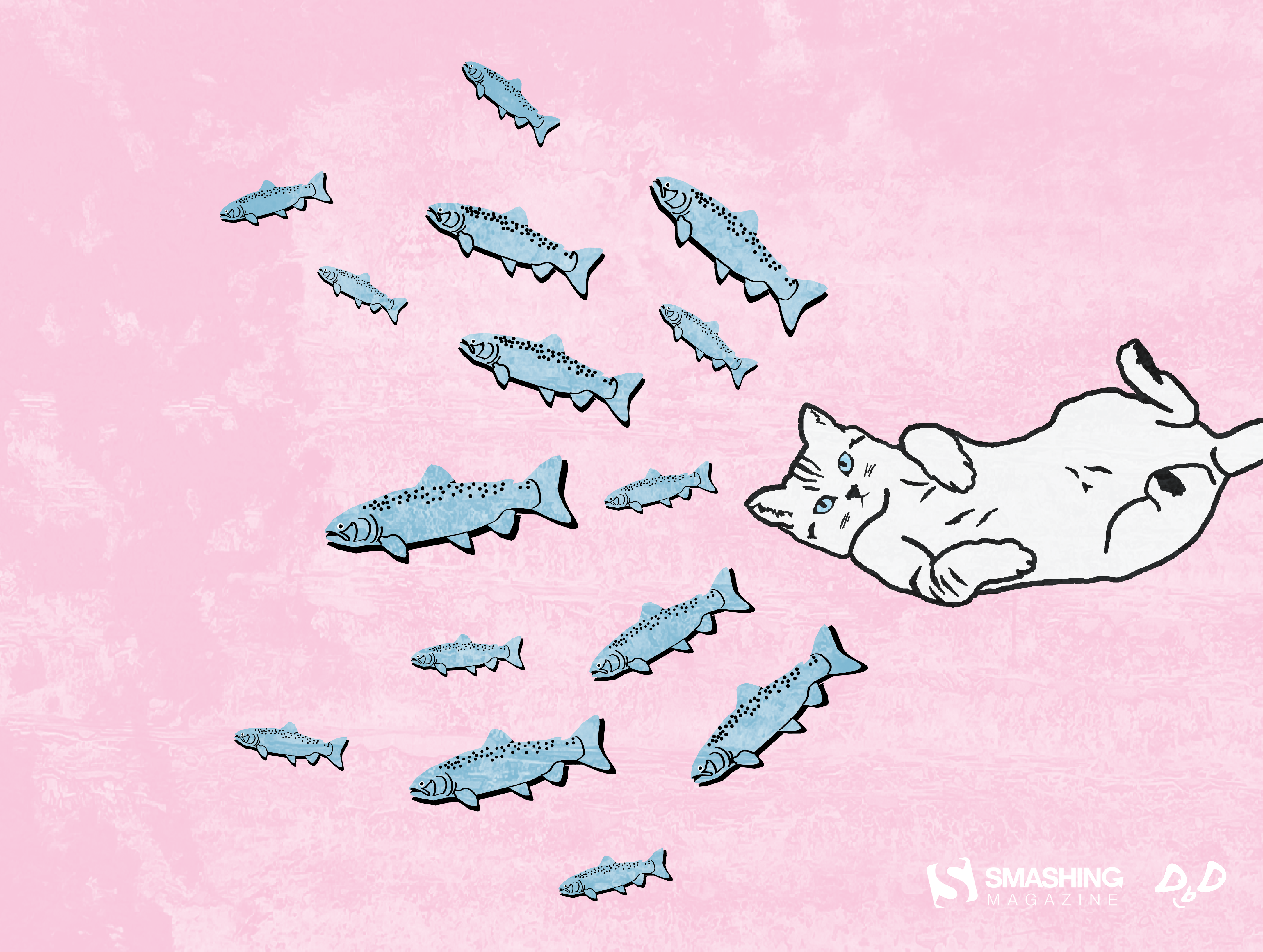
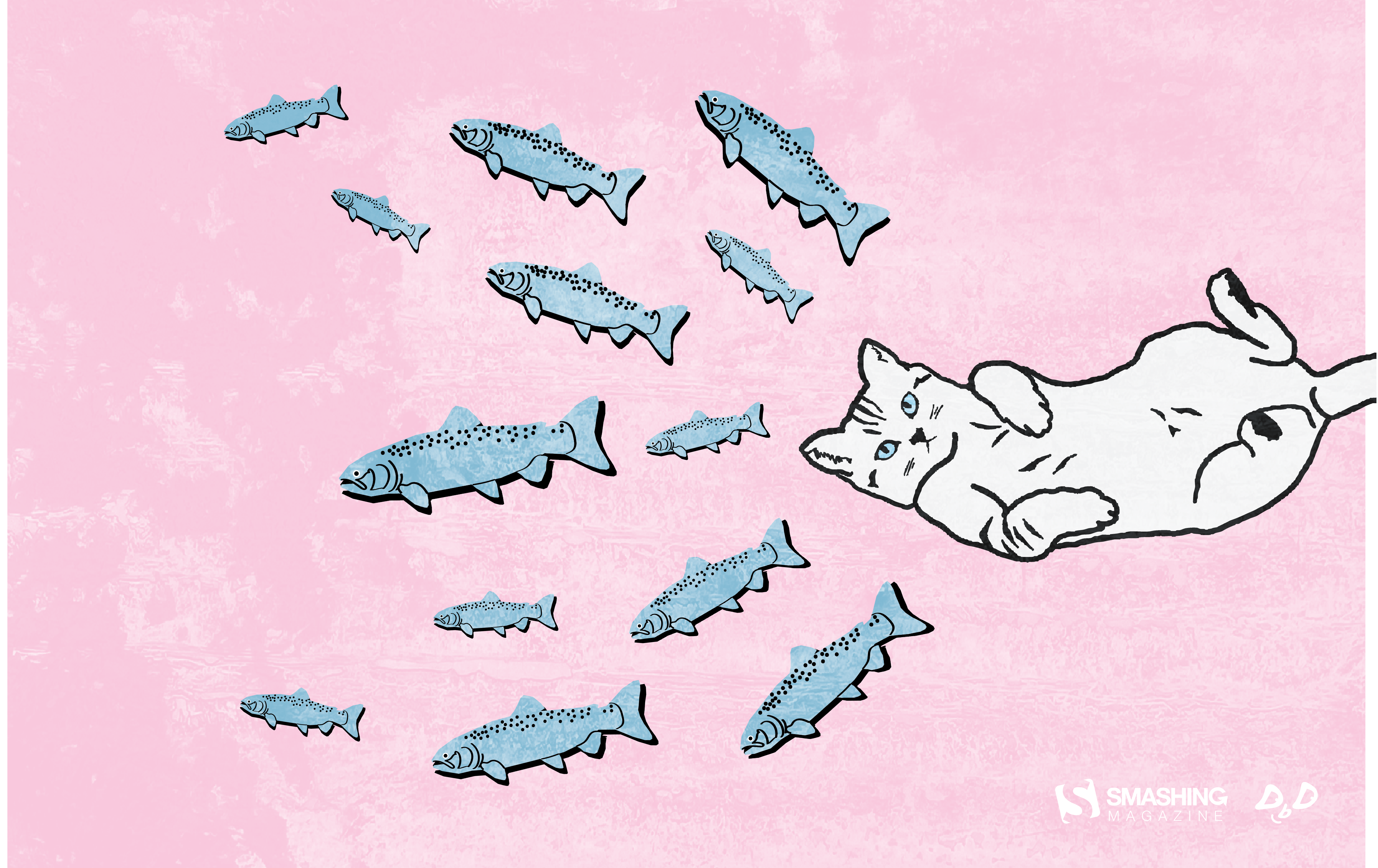
Unmasking The Magic: The Wizard Of Oz Method For UX Research

New technologies and innovative concepts frequently enter the product development lifecycle, promising to revolutionize user experiences. However, even the most ingenious ideas risk failure without a fundamental grasp of user interaction with these new experiences.

Consider the plight of the Nintendo Power Glove. Despite being a commercial success (selling over 1 million units), its release in late 1989 was followed by its discontinuation less than a full year later in 1990. The two games created solely for the Power Glove sold poorly, and there was little use for the Glove with Nintendo’s already popular traditional console games.

A large part of the failure was due to audience reaction once the product (which allegedly was developed in 8 weeks) was cumbersome and unintuitive. Users found syncing the glove to the moves in specific games to be extremely frustrating, as it required a process of coding the moves into the glove’s preset move buttons and then remembering which buttons would generate which move. With the more modern success of Nintendo’s WII and other movement-based controller consoles and games, we can see the Power Glove was a concept ahead of its time.

If Power Glove’s developers wanted to conduct effective research prior to building it out, they would have needed to look beyond traditional methods, such as surveys and interviews, to understand how a user might truly interact with the Glove. How could this have been done without a functional prototype and slowing down the overall development process?

Enter the Wizard of Oz method, a potent tool for bridging the chasm between abstract concepts and tangible user understanding, as one potential option. This technique simulates a fully functional system, yet a human operator (“the Wizard”) discreetly orchestrates the experience. This allows researchers to gather authentic user reactions and insights without the prerequisite of a fully built product.

The Wizard of Oz (WOZ) method is named in tribute to the similarly named book by Frank L. Baum. In the book, the Wizard is simply a man hidden behind a curtain, manipulating the reality of those who travel the land of Oz. Dorothy, the protagonist, exposes the Wizard for what he is, essentially an illusion or a con who is deceiving those who believe him to be omnipotent. Similarly, WOZ takes technologies that may or may not currently exist and emulates them in a way that should convince a research participant they are using an existing system or tool.

WOZ enables the exploration of user needs, validation of nascent concepts, and mitigation of development risks, particularly with complex or emerging technologies.

The product team in our above example might have used this method to have users simulate the actions of wearing the glove, programming moves into the glove, and playing games without needing a fully functional system. This could have uncovered the illogical situation of asking laypeople to code their hardware to be responsive to a game, show the frustration one encounters when needing to recode the device when changing out games, and also the cumbersome layout of the controls on the physical device (even if they’d used a cardboard glove with simulated controls drawn in crayon on the appropriate locations.

Jeff Kelley credits himself (PDF) with coining the term WOZ method in 1980 to describe the research method he employed in his dissertation. However, Paula Roe credits Don Norman and Allan Munro for using the method as early as 1973 to conduct testing on an airport automated travel assistant. Regardless of who originated the method, both parties agree that it gained prominence when IBM later used it to conduct studies on a speech-to-text tool known as The Listening Typewriter (see Image below).

In this article, I’ll cover the core principles of the WOZ method, explore advanced applications taken from practical experience, and demonstrate its unique value through real-world examples, including its application to the field of agentic AI. UX practitioners can use the WOZ method as another tool to unlock user insights and craft human-centered products and experiences.

The Yellow Brick Road: Core Principles And Mechanics

The WOZ method operates on the premise that users believe they are interacting with an autonomous system while a human wizard manages the system’s responses behind the scenes. This individual, often positioned remotely (or off-screen), interprets user inputs and generates outputs that mimic the anticipated functionality of the experience.

Cast Of Characters

A successful WOZ study involves several key roles:

  • The User
    The participant who engages with what they perceive as the functional system.
  • The Facilitator
    The researcher who guides the user through predefined tasks and observes their behavior and reactions.
  • The Wizard
    The individual manipulates the system’s behavior in real-time, providing responses to user inputs.
  • The Observer (Optional)
    An additional researcher who observes the session without direct interaction, allowing for a secondary perspective on user behavior.

Setting The Stage For Believability: Leaving Kansas Behind

Creating a convincing illusion is key to the success of a WOZ study. This necessitates careful planning of the research environment and the tasks users will undertake. Consider a study evaluating a new voice command system for smart home devices. The research setup might involve a physical mock-up of a smart speaker and predefined scenarios like “Play my favorite music” or “Dim the living room lights.” The wizard, listening remotely, would then trigger the appropriate responses (e.g., playing a song, verbally confirming the lights are dimmed).

Or perhaps it is a screen-based experience testing a new AI-powered chatbot. You have users entering commands into a text box, with another member of the product team providing responses simultaneously using a tool like Figma/Figjam, Miro, Mural, or other cloud-based software that allows multiple users to collaborate simultaneously (the author has no affiliation with any of the mentioned products).

The Art Of Illusion

Maintaining the illusion of a genuine system requires the following:

  • Timely and Natural Responses
    The wizard must react to user inputs with minimal delay and in a manner consistent with expected system behavior. Hesitation or unnatural phrasing can break the illusion.
  • Consistent System Logic
    Responses should adhere to a predefined logic. For instance, if a user asks for the weather in a specific city, the wizard should consistently provide accurate information.
  • Handling the Unexpected
    Users will inevitably deviate from planned paths. The wizard must possess the adaptability to respond plausibly to unforeseen inputs while preserving the perceived functionality.

Ethical Considerations

Transparency is crucial, even in a method that involves a degree of deception. Participants should always be debriefed after the session, with a clear explanation of the Wizard of Oz technique and the reasons for its use. Data privacy must be maintained as with any study, and participants should feel comfortable and respected throughout the process.

Distinguishing The Method

The WOZ method occupies a unique space within the UX research toolkit:

  • Unlike usability testing, which evaluates existing interfaces, Wizard of Oz explores concepts before significant development.
  • Distinct from A/B testing, which compares variations of a product’s design, WOZ assesses entirely new functionalities that might otherwise lack context if shown to users.
  • Compared to traditional prototyping, which often involves static mockups, WOZ offers a dynamic and interactive experience, enabling observation of real-time user behavior with a simulated system.

This method proves particularly valuable when exploring truly novel interactions or complex systems where building a fully functional prototype is premature or resource-intensive. It allows researchers to answer fundamental questions about user needs and expectations before committing significant development efforts.

Let’s move beyond the foundational aspects of the WOZ method and explore some more advanced techniques and critical considerations that can elevate its effectiveness.

Time Savings: WOZ Versus Crude Prototyping

It’s a fair question to ask whether WOZ is truly a time-saver compared to even cruder prototyping methods like paper prototypes or static digital mockups.

While paper prototypes are incredibly fast to create and test for basic flow and layout, they fundamentally lack dynamic responsiveness. Static mockups offer visual fidelity but cannot simulate complex interactions or personalized outputs.

The true time-saving advantage of the WOZ emerges when testing novel, complex, or AI-driven concepts. It allows researchers to evaluate genuine user interactions and mental models in a seemingly live environment, collecting rich behavioral data that simpler prototypes cannot. This fidelity in simulating a dynamic experience, even with a human behind the curtain, often reveals critical usability or conceptual flaws far earlier and more comprehensively than purely static representations, ultimately preventing costly reworks down the development pipeline.

Additional Techniques And Considerations

While the core principle of the WOZ method is straightforward, its true power lies in nuanced application and thoughtful execution. Seasoned practitioners may leverage several advanced techniques to extract richer insights and address more complex research questions.

Iterative Wizardry

The WOZ method isn’t necessarily a one-off endeavor. Employing it in iterative cycles can yield significant benefits. Initial rounds might focus on broad concept validation and identifying fundamental user reactions. Subsequent iterations can then refine the simulated functionality based on previous findings.

For instance, after an initial study reveals user confusion with a particular interaction flow, the simulation can be adjusted, and a follow-up study can assess the impact of those changes. This iterative approach allows for a more agile and user-centered exploration of complex experiences.

Managing Complexity

Simulating complex systems can be difficult for one wizard. Breaking complex interactions into smaller, manageable steps is crucial. Consider researching a multi-step onboarding process for a new software application. Instead of one person trying to simulate the entire flow, different aspects could be handled sequentially or even by multiple team members coordinating their responses.

Clear communication protocols and well-defined responsibilities are essential in such scenarios to maintain a seamless user experience.

Measuring Success Beyond Observation

While qualitative observation is a cornerstone of the WOZ method, defining clear metrics can add a layer of rigor to the findings. These metrics should match research goals. For example, if the goal is to assess the intuitiveness of a new navigation pattern, you might track the number of times users express confusion or the time it takes them to complete specific tasks.

Combining these quantitative measures with qualitative insights provides a more comprehensive understanding of the user experience.

Integrating With Other Methods

The WOZ method isn’t an island. Its effectiveness can be amplified by integrating it with other research techniques. Preceding a WOZ study with user interviews can help establish a deeper understanding of user needs and mental models, informing the design of the simulated experience. Following a WOZ study, surveys can gather broader quantitative feedback on the concepts explored. For example, after observing users interact with a simulated AI-powered scheduling tool, a survey could gauge their overall trust and perceived usefulness of such a system.

When Not To Use WOZ

WOZ, as with all methods, has limitations. A few examples of scenarios where other methods would likely yield more reliable findings would be:

  • Detailed Usability Testing
    Humans acting as wizards cannot perfectly replicate the exact experience a user will encounter. WOZ is often best in the early stages, where prototypes are rough drafts, and your team is looking for guidance on a solution that is up for consideration. Testing on a more detailed wireframe or prototype would be preferable to WOZ when you have entered the detailed design phase.
  • Evaluating extremely complex systems with unpredictable outputs
    If the system’s responses are extremely varied, require sophisticated real-time calculations that exceed human capacity, or are intended to be genuinely unpredictable, a human may struggle to simulate them convincingly and consistently. This can lead to fatigue, errors, or improvisations that don’t reflect the intended system, thereby compromising the validity of the findings.

Training And Preparedness

The wizard’s skill is critical to the method’s success. Training the individual(s) who will be simulating the system is essential. This training should cover:

  • Understanding the Research Goals
    The wizard needs to grasp what the research aims to uncover.
  • Consistency in Responses
    Maintaining consistent behavior throughout the sessions is vital for user believability.
  • Anticipating User Actions
    While improvisation is sometimes necessary, the wizard should be prepared for common user paths and potential deviations.
  • Remaining Unbiased
    The wizard must avoid leading users or injecting their own opinions into the simulation.
  • Handling Unexpected Inputs
    Clear protocols for dealing with unforeseen user actions should be established. This might involve having a set of pre-prepared fallback responses or a mechanism for quickly consulting with the facilitator.

All of this suggests the need for practice in advance of running the actual session. We shouldn’t forget to have a number of dry runs in which we ask our colleagues or those who are willing to assist to not only participate but also think about possible responses that could stump the wizard or throw things off if the user might provide them during a live session.

I suggest having a believable prepared error statement ready to go for when a user throws a curveball. A simple response from the wizard of “I’m sorry, I am unable to perform that task at this time” might be enough to move the session forward while also capturing a potentially unexpected situation your team can address in the final product design.

Was This All A Dream? The Art Of The Debrief

The debriefing session following the WOZ interaction is an additional opportunity to gather rich qualitative data. Beyond asking “What did you think?” effective debriefing involves sharing the purpose of the study and the fact that the experience was simulated.

Researchers should then conduct psychological probing to understand the reasons behind user behavior and reactions. Asking open-ended questions like “Why did you try that?” or “What were you expecting to happen when you clicked that button?” can reveal valuable insights into user mental models and expectations.

Exploring moments of confusion, frustration, or delight in detail can uncover key areas for design improvement. Think about the potential information the Power Gloves’ development team could have uncovered if they’d asked participants what the experience of programming the glove and trying to remember what they’d programmed into which set of keys had been.

Case Studies: Real-World Applications

The value of the WOZ method becomes apparent when examining its application in real-world research scenarios. Here is an in-depth review of one scenario and a quick summary of another study involving WOZ, where this technique proved invaluable in shaping user experiences.

Unraveling Agentic AI: Understanding User Mental Models

A significant challenge in the realm of emerging technologies lies in user comprehension. This was particularly evident when our team began exploring the potential of Agentic AI for enterprise HR software.

Agentic AI refers to artificial intelligence systems that can autonomously pursue goals by making decisions, taking actions, and adapting to changing environments with minimal human intervention. Unlike generative AI that primarily responds to direct commands or generates content, Agentic AI is designed to understand user intent, independently plan and execute multi-step tasks, and learn from its interactions to improve performance over time. These systems often combine multiple AI models and can reason through complex problems. For designers, this signifies a shift towards creating experiences where AI acts more like a proactive collaborator or assistant, capable of anticipating needs and taking the initiative to help users achieve their objectives rather than solely relying on explicit user instructions for every step.

Preliminary research, including surveys and initial interviews, suggested that many HR professionals, while intrigued by the concept of AI assistance, struggled to grasp the potential functionality and practical implications of truly agentic systems — those capable of autonomous action and proactive decision-making. We saw they had no reference point for what agentic AI was, even after we attempted relevant analogies to current examples.

Building a fully functional agentic AI prototype at this exploratory stage was impractical. The underlying algorithms and integrations were complex and time-consuming to develop. Moreover, we risked building a solution based on potentially flawed assumptions about user needs and understanding. The WOZ method offered a solution.

Setup

We designed a scenario where HR employees interacted with what they believed was an intelligent AI assistant capable of autonomously handling certain tasks. The facilitator presented users with a web interface where they could request assistance with tasks like “draft a personalized onboarding plan for a new marketing hire” or “identify employees who might benefit from proactive well-being resources based on recent activity.”

Behind the scenes, a designer acted as the wizard. Based on the user’s request and the (simulated) available data, the designer would craft a response that mimicked the output of an agentic AI. For the onboarding plan, this involved assembling pre-written templates and personalizing them with details provided by the user. For the well-being resource identification, the wizard would select a plausible list of employees based on the general indicators discussed in the scenario.

Crucially, the facilitator encouraged users to interact naturally, asking follow-up questions and exploring the system’s perceived capabilities. For instance, a user might ask, “Can the system also schedule the initial team introductions?” The wizard, guided by pre-defined rules and the overall research goals, would respond accordingly, perhaps with a “Yes, I can automatically propose meeting times based on everyone’s calendars” (again, simulated).

As recommended, we debriefed participants following each session. We began with transparency, explaining the simulation and that we had another live human posting the responses to the queries based on what the participant was saying. Open-ended questions explored initial reactions and envisioned use. Task-specific probing, like “Why did you expect that?” revealed underlying assumptions. We specifically addressed trust and control (“How much trust...? What level of control...?”). To understand mental models, we asked how users thought the “AI” worked. We also solicited improvement suggestions (“What features...?”).

By focusing on the “why” behind user actions and expectations, these debriefings provided rich qualitative data that directly informed subsequent design decisions, particularly around transparency, human oversight, and prioritizing specific, high-value use cases. We also had a research participant who understood agentic AI and could provide additional insight based on that understanding.

Key Insights

This WOZ study yielded several crucial insights into user mental models of agentic AI in an HR context:

  • Overestimation of Capabilities
    Some users initially attributed near-magical abilities to the “AI”, expecting it to understand highly nuanced or ambiguous requests without explicit instruction. This highlighted the need for clear communication about the system’s actual scope and limitations.
  • Trust and Control
    A significant theme revolved around trust and control. Users expressed both excitement about the potential time savings and anxiety about relinquishing control over important HR processes. This indicated a need for design solutions that offered transparency into the AI’s decision-making and allowed for human oversight.
  • Value in Proactive Assistance
    Users reacted positively to the AI proactively identifying potential issues (like burnout risk), but they emphasized the importance of the AI providing clear reasoning and allowing human HR professionals to review and approve any suggested actions.
  • Need for Tangible Examples
    Abstract explanations of agentic AI were insufficient. Users gained a much clearer understanding through these simulated interactions with concrete tasks and outcomes.

Resulting Design Changes

Based on these findings, we made several key design decisions:

  • Emphasis on Transparency
    The user interface would need to clearly show the AI’s reasoning and the data it used to make decisions.
  • Human Oversight and Review
    Built-in approval workflows would be essential for critical actions, ensuring HR professionals retain control.
  • Focus on Specific, High-Value Use Cases
    Instead of trying to build a general-purpose agent, we prioritized specific use cases where agentic capabilities offered clear and demonstrable benefits.
  • Educational Onboarding
    The product onboarding would include clear, tangible examples of the AI’s capabilities in action.

Exploring Voice Interaction for In-Car Systems

In another project, we used the WOZ method to evaluate user interaction with a voice interface for controlling in-car functions. Our research question focused on the naturalness and efficiency of voice commands for tasks like adjusting climate control, navigating to points of interest, and managing media playback.

We set up a car cabin simulator with a microphone and speakers. The wizard, located in an adjacent room, listened to the user’s voice commands and triggered the corresponding actions (simulated through visual changes on a display and audio feedback). This allowed us to identify ambiguous commands, areas of user frustration with voice recognition (even though it was human-powered), and preferences for different phrasing and interaction styles before investing in complex speech recognition technology.

These examples illustrate the versatility and power of the method in addressing a wide range of UX research questions across diverse product types and technological complexities. By simulating functionality, we can gain invaluable insights into user behavior and expectations early in the design process, leading to more user-centered and ultimately more successful products.

The Future of Wizardry: Adapting To Emerging Technologies

The WOZ method, far from being a relic of simpler technological times, retains relevance as we navigate increasingly sophisticated and often opaque emerging technologies.

The WOZ method’s core strength, the ability to simulate complex functionality with human ingenuity, makes it uniquely suited for exploring user interactions with systems that are still in their nascent stages.

WOZ In The Age Of AI

Consider the burgeoning field of AI-powered experiences. Researching user interaction with generative AI, for instance, can be effectively done through WOZ. A wizard could curate and present AI-generated content (text, images, code) in response to user prompts, allowing researchers to assess user perceptions of quality, relevance, and trust without needing a fully trained and integrated AI model.

Similarly, for personalized recommendation systems, a human could simulate the recommendations based on a user’s stated preferences and observed behavior, gathering valuable feedback on the perceived accuracy and helpfulness of such suggestions before algorithmic development.

Even autonomous systems, seemingly the antithesis of human control, can benefit from WOZ studies. By simulating the autonomous behavior in specific scenarios, researchers can explore user comfort levels, identify needs for explainability, and understand how users might want to interact with or override such systems.

Virtual And Augmented Reality

Immersive environments like virtual and augmented reality present new frontiers for user experience research. WOZ can be particularly powerful here.

Imagine testing a novel gesture-based interaction in VR. A researcher tracking the user’s hand movements could trigger corresponding virtual events, allowing for rapid iteration on the intuitiveness and comfort of these interactions without the complexities of fully programmed VR controls. Similarly, in AR, a wizard could remotely trigger the appearance and behavior of virtual objects overlaid onto the real world, gathering user feedback on their placement, relevance, and integration with the physical environment.

The Human Factor Remains Central

Despite the rapid advancements in artificial intelligence and immersive technologies, the fundamental principles of human-centered design remain as relevant as ever. Technology should serve human needs and enhance human capabilities.

The WOZ method inherently focuses on understanding user reactions and behaviors and acts as a crucial anchor in ensuring that technological progress aligns with human values and expectations.

It allows us to inject the “human factor” into the design process of even the most advanced technologies. Doing this may help ensure these innovations are not only technically feasible but also truly usable, desirable, and beneficial.

Conclusion

The WOZ method stands as a powerful and versatile tool in the UX researcher’s toolkit. The WOZ method’s ability to bypass limitations of early-stage development and directly elicit user feedback on conceptual experiences offers invaluable advantages. We’ve explored its core mechanics and covered ways of maximizing its impact. We’ve also examined its practical application through real-world case studies, including its crucial role in understanding user interaction with nascent technologies like agentic AI.

The strategic implementation of the WOZ method provides a potent means of de-risking product development. By validating assumptions, uncovering unexpected user behaviors, and identifying potential usability challenges early on, teams can avoid costly rework and build products that truly resonate with their intended audience.

I encourage all UX practitioners, digital product managers, and those who collaborate with research teams to consider incorporating the WOZ method into their research toolkit. Experiment with its application in diverse scenarios, adapt its techniques to your specific needs and don’t be afraid to have fun with it. Scarecrow costume optional.

Received before yesterdaySmashing Magazine

Droip: The Modern Website Builder WordPress Needed

This article is a sponsored by Droip

Traditional WordPress page builders had their moment. Builders like Elementor, Divi, and Oxygen have been around for years. So long, in fact, that many of us just accepted their limitations as the cost of using WordPress.

But Droip, a relatively new no-code website builder, steps in with a completely different philosophy. It is built to provide Webflow and Framer-level power in WordPress, complete design freedom, built-in performance, and no reliance on third-party plugins.

In this review, we’re putting Droip head-to-head with traditional builders according to all the things that matter when choosing a website builder:

  • Price,
  • Affect on website performance,
  • User-friendliness vs flexibility,
  • Features,
  • Theme and layout options.
What Is Droip?

Droip is a no-code visual website builder for WordPress, designed to bridge the gap where other page builders fall short.

Unlike other page builders, Droip is an all-in-one solution that aims to provide everything you need to build websites without any third-party dependencies, shifting from the norm in WordPress!

And the best part? It’s all included in your subscription, so you won’t be hit with surprise upgrades.

Pricing: A Smarter Investment with All Features Included

While most page builders upsell critical features or require multiple add-ons, Droip keeps it simple: one platform, all features, no hidden costs.

It’s surprisingly affordable for the value it delivers. The Starter plan is just $34.50/year (currently at 50% off) for one site and includes all premium features.

If you compare it with Elementor, that’s almost half the cost of Elementor Pro’s Essential plan, which starts at $60/year and still keeps several essentials behind paywalls.

Droip also has a Lifetime plan. For a one-time payment of $299.50, you get unlimited use, forever. No renewals, no upcharges.

All Droip Pro plans are fully featured from the start. You don’t need to stack plugins or pay extra to unlock dynamic content support, pop-up builders, or submission forms. You also get access to the entire growing template library from day one.

Note: Explore Droip pricing.

Website Performance Comparison

Performance directly impacts user experience, SEO, and conversion rates. So, to get a clear picture of how different page builders impact performance, we put Droip and Elementor to the test under identical conditions to see how each builder stacks up.

We installed both on a clean WordPress setup using the default Twenty Twenty-Five theme to ensure a fair comparison. Then, we created identical layouts using comparable design elements and ran Lighthouse performance audits to measure load time, responsiveness, and Core Web Vitals.

Test Conditions:

  • Clean WordPress installation.
  • Same theme: Twenty Twenty-Five.
  • Same layout structure and design elements.
  • Lighthouse is used for performance scoring.

Sample Layout

Droip’s Performance

Elementor’s Performance

Droip’s Code Output

Elementor’s Code Output

The difference was immediately clear. Droip generated a much cleaner DOM with significantly fewer <div>s and no unnecessary wrappers, resulting in faster load times and higher scores across all boards.

Elementor, on the other hand, added heavily nested markup and extra scripts, even on this simple layout, which dragged down its performance.

If clean code, fast loading, and technical efficiency are priorities for you, Droip clearly comes out ahead.

Exploring The Features

Now that we’ve seen how Droip outperforms the competition and does it at a highly competitive price, let’s dive into the features to see what makes it such a powerful all-in-one builder.

Freeform Visual Canvas For True Design Freedom

What makes Droip different from the existing page builders is its freeform visual canvas.

With Droip, you finally get the layout flexibility modern design demands and no longer need to place elements into rigid structures.

The editor is powerful, modern, and feels more like designing in a modern interface tool like Figma.

You can place elements exactly where you want, overlap sections, layer backgrounds, and create complex animations & interactions all visually. Every element’s layout behavior is editable on canvas, giving you pixel-level control without touching code.

The editor supports both light and dark modes for a more comfortable, focused workspace.

If you've used Figma or Webflow, you'll feel instantly at home. If you haven't, this is the most natural way to design websites you've ever tried.

Instant Figma to Droip Handoff

Talking about Figma, if you have a design ready in Figma, you can instantly import it into Droip to a functional website with no need to rebuild from scratch.

Seamless import of Figma designs directly into Droip for fast development. (Large preview)

Your imported design comes in fully responsive by default, adapting to all screen sizes, including any custom breakpoints you define.

And it supports unlimited breakpoints, too. You can define layout behavior exactly how you want it, and styles will cascade intelligently across smaller screens.

No Third-Party Plugins Needed For Dynamic Content

In traditional WordPress, handling dynamic content means installing the ACF or other third-party plugins.

But with Droip, all of that is natively integrated. It comes with a powerful Dynamic Content Manager that lets you:

  • Create custom content types and fields.
  • Use reference and multi-reference relationships.
  • Build dynamic templates visually.
  • Add dynamic SEO to template pages.
  • Apply advanced filtering to Collection elements.

All without writing a single line of code or relying on external plugins.

Reusable Styling With Class-Based Editing

Droip also has an efficient way to manage design at scale without repetitive work.

It uses a class-based styling system that brings structure and scalability to your design process. When you style an element, those styles are automatically saved as reusable CSS classes.

Here’s what that means for you:

  • You can create global classes for common components like buttons, cards, or headings.
  • Reuse those styles across pages and projects with consistency.
  • Update a class once, and every instance updates instantly.
  • You can also create subclasses to make slight variations, like secondary buttons, while still inheriting styles from the parent.

CSS Variables For Global Styling

Droip takes styling even further with Global Variables, allowing you to define design tokens like colors, fonts, spacing, and sizing that can be reused across your entire site.

You can pair these global variables with your class-based structure to:

  • Maintain visual consistency;
  • Update values globally with a single change;
  • Easily manage themes like switching between light and dark modes with one click.

And while Droip offers a fully visual experience, it doesn’t limit advanced users. You can write custom CSS for any class or element, and even inject JavaScript at the page or element level when needed.

Build Complex Interactions and Animations Visually

When it comes to modern animations and interactive design, Droip leaves traditional WordPress page builders far behind.

Its fully visual interaction builder lets you create dynamic, immersive experiences.

You can build scroll-based animations, hover and click effects, interactive sections that respond across devices, and control visibility, motion, and behavior all within a visual interface.

For advanced users, Droip includes a timeline-based editor where you can:

  • Create multi-step animations;
  • Fine-tune transitions with precise timing, easing, delays, and sequencing.

Even text animations get special attention.

You can animate text by character, word, or full element. Choose custom triggers (scroll, hover, load, and so on) and select from various transition styles or create your own.

Droip's no-code website builder truly helps you move past generic and create unique animations and complex interactions.

Seamless Integration Management With Droip Apps

Droip takes the hassle out of connecting third-party tools with its intuitive Droip Apps system. You can install and manage essential integrations such as analytics, CRMs, email marketing platforms, support widgets, and more, all from within the Droip editor itself.

This centralized approach means you never have to leave your workspace. The clean, user-friendly interface guides you through the connection process visually, making setup fast and straightforward even if you’re not a technical expert.

Accessibility Is Core To The Experience

One of Droip’s standout features is its built-in focus on accessibility from day one.

Unlike many platforms that rely on third-party plugins for accessibility, Droip integrates it directly into the core experience.

Whether you need to enlarge editor text, reduce motion effects, use a larger cursor, or work with color-blind–friendly palettes, Droip ensures an inclusive editing environment.

But it doesn’t stop at editor settings. Droip actively helps you follow best accessibility practices, enforcing semantic HTML, prompting for proper alt text, and supporting ARIA labels. Plus, its built-in contrast checker ensures your designs aren’t just visually appealing, they’re easy to read and use for everyone.

Team Collaboration Made Easy

Collaboration is also a core part of the experience, thoughtfully designed to support teams, clients, and developers alike. With Droip’s Role Manager, you can define exactly what each role can view, edit, or manage within the builder.

You can assign custom roles to team members based on their responsibilities, like designers, developers, content editors, clients, and so on.

For handling client reviews, it also generates a shareable view-only link that gives clients access to preview the site without giving them edit permissions or exposing the backend. Perfect for gathering feedback and approvals while maintaining full control.

Built-in Quality Control

Before you publish your site, Droip helps ensure your site is technically sound with its built-in Page Audit tool.

It automatically scans your layout for:

  • Missing alt text on images,
  • Broken links,
  • Unassigned or duplicate classes,
  • Accessibility issues,
  • And more.

So you’re not just building beautiful pages, you’re shipping fast, accessible, SEO-ready websites with confidence.

Theme & Layout Options

Droip has a growing library of high-quality templates and modular layout options, so you’re never out of options.

Template Kits: Full Website Packs

Droip’s Template Kits include complete multi-page website designs for every industry. Pick a template, update the content, and you’re ready to launch.

New template kits are added regularly, so you're always equipped with the latest design trends. And the best part? At no additional cost. You get access to the finest designs without ever paying extra.

Pre-Designed Pages

Do you need just a landing page or a pricing page? Droip also offers standalone pre-designed pages you can drop into your project and customize instantly.

Pre-Made Sections

Prefer to build from scratch but don’t want to start with a blank canvas? It also has ready-made sections like hero banners, testimonials, pricing blocks, and FAQs. You can visually assemble your layout in minutes using these.

Wireframes

You can also map out your layout using wireframes before applying any styling. It’s a great way to get your content and structure right without distractions, perfect for planning UX and content flow.

How Easy Is Droip to Use?

If you want something dead simple and just need to build a basic site fast, there are other options like Elementor that can do that, but at the cost of power, performance, and flexibility.

Droip, on the other hand, has a bit of a learning curve. That’s because it’s way more powerful and is built for those who care about design control, clean output, and scalability.

If you’re someone who wants to fine-tune every pixel, build advanced layouts, and doesn’t mind a learning curve, you’ll appreciate the level of control it offers.

Having said that, it’s not hard to use once you understand how it works.

The learning curve, especially for complete beginners, mostly comes from understanding its powerful features like dynamic content, reusable components (called Symbols), styling logic using classes, global variables, and breakpoints, advanced interactions using custom animation timelines, etc.

But to help you get up to speed quickly, Droip includes:

  • Guided onboarding to walk you through the essentials.
  • A growing library of templates, pages, UI components, and wireframes to kickstart your projects.
  • An AI Generator that can scaffold entire pages and layouts in seconds.
  • Detailed documentation and video tutorials (with more added regularly).
What Users Are Saying

For many users, Droip is more than just a builder. It’s the all-in-one tool WordPress has been waiting for. They are calling it the future of WordPress, a truly great alternative to tools like Framer and Webflow.

TL;DR: Why Droip Outshines Traditional Builders
  • All-in-one builder with no third-party bloat.
  • Clean, performance-optimized code output.
  • Figma integration + modern visual canvas.
  • Dynamic content, advanced interactions, and global styling.
  • One price, all features, no hidden costs.
Overall Verdict: Is Droip Really Better Than Alternatives?

After putting Droip through its paces, the answer is a clear yes. Droip not only matches traditional WordPress page builders where it counts, but it surpasses them in nearly every critical area.

From its cleaner, faster code output and outstanding performance to its unparalleled design freedom and powerful built-in features, Droip solves many of the pain points that users have accepted for years. Its all-in-one approach eliminates the need for multiple plugins, saving time, money, and technical headaches.

While there is a learning curve for beginners, the payoff is huge for those who want full control, scalability, and a truly modern web design experience inside WordPress.

If you’re serious about building high-quality, scalable, and visually stunning websites, Droip isn’t just an alternative; it’s the future of WordPress site building.

Ready to experience the difference yourself? Try Droip today and start building faster, cleaner, and smarter.

Design Guidelines For Better Notifications UX

In many products, setting notification channels on mute is a default, rather than an exception. The reason for that is their high frequency, which creates disruptions and eventually notification fatigue, when any popping messages get dismissed instantly.

There is a good reason for it: high frequency of notifications. In usability testing, it’s the most frequent complaint, yet every app desperately tries to capture a glimpse of our attention, sending more notifications our way. Let’s see how we could make the notifications UX slightly better.

This article is part of our ongoing series on UX. You can find more details on design patterns and UX strategy in Smart Interface Design Patterns 🍣 — with live UX training coming up soon. Jump to table of contents.

The Many Faces Of Notifications

Notifications are distractions by nature; they bring a user’s attention to a (potentially) significant event they aren’t aware of or might want to be reminded of. As such, they can be very helpful and relevant, providing assistance and bringing structure and order to the daily routine. Until they are not.

Not every communication option is a notification. As Kim Salazar rightfully noted,

“Status communication often relies on validation, status indicators, and notifications. While they are often considered to be similar, they are actually quite different.”

In general, notifications can be either informational (calendar reminders, delay notifications, election night results) or encourage action (approve payment, install an update, confirm a friend request). They can stream from various sources and have various impacts.

  • UI notifications appear as subtle cards in UIs as users interact with the web interface — as such, they are widely accepted and less invasive than some of their counterparts.
  • In-browser push notifications are more difficult to dismiss, and draw attention to themselves even if the user isn’t accessing the UI.
  • In-app notifications live within desktop and mobile apps, and can be as humble as UI notifications, but can take a more central role with messages pushed to the home screen or the notifications center.
  • OS notifications such as software updates or mobile carrier changes also get in the mix, often appearing together with a wide variety of notes, calendar updates, and everything in between.
  • Finally, notifications can find their way into email, SMS, and social messaging apps, coming from chatbots, recommendation systems, and actual humans.

But we don’t pay the same amount of attention to every notification. It can take weeks until they eventually install a software update prompted by their OS notification, or just a few hours to confirm or decline a new LinkedIn request.

Not Every Notification Is Equal

The level of attention users grant to notifications depends on their nature, or, more specifically, how and when notifications are triggered. People care more about new messages from close friends and relatives, bank transactions and important alerts, calendar notifications, and any actionable and awaited confirmations or releases.

People care less about news updates, social feed updates, announcements, new features, crash reports, promotional and automated messages in general. Most importantly, a message from another human being is always valued much higher than any automated notification.

Design For Levels Of Severity

As Sara Vilas suggests, we can break down notification design across three levels of severity: high, medium, and low attention. And then, notification types need to be further defined by specific attributes on those three levels, whether they are alerts, warnings, confirmations, errors, success messages, or status indicators.

High Attention

  • Alerts (immediate attention required),
  • Errors (immediate action required),
  • Exceptions (system anomalies, something didn’t work),
  • Confirmations (potentially destructive actions that need user confirmation to proceed).

Medium Attention

  • Warnings (no immediate action required),
  • Acknowledgments (feedback on user actions),
  • Success messages.

Low Attention

  • Informational messages (aka passive notifications, something is ready to view),
  • Badges (typically on icons, signifying something new since last interaction),
  • Status indicators (system feedback).

Taking it one step further, we can map the attention against the type of messaging we are providing — very similar to Zendesk's mapping tone above, which plots impact against the type of messaging, and shows how the tone should adjust — becoming more humble, real, distilled or charming.

So, notifications can be different, and different notifications are perceived differently; however, the more personal, relevant, and timely notifications are, the higher engagement we should expect.

Start Sending Notifications Slowly But Steadily

It’s not uncommon to sign up, only to realize a few moments later that the inbox is filling up with all kinds of irrelevant messages. That’s exactly the wrong thing to do. A study by Facebook showed that sending fewer notifications improved user satisfaction and long-term usage of a product.

Initially, once the notification rate was reduced, there was indeed a loss of traffic, but it has “gradually recovered over time”, and after an extended period, it had fully recovered and even turned out to be a gain.

A good starting point is to set up a slow default notification frequency for different types of customers. As the customer keeps using the interface, we could ask them to decide on the kind of notifications they’d prefer and their frequency.

Send notifications slowly, and over time slowly increase and/or decrease the number of notifications per type of customer. This might work much better for our retention rates.

Don’t Rely On Generic Defaults: Set Up Notification Modes

Typically, users can opt in and opt out of every single type of notification in their settings. In general, it’s a good idea, but it can also be very overwhelming — and not necessarily clear how important each notification is. Alternatively, we could provide predefined recommended options, perhaps with a “calm mode” (low frequency), a “regular mode” (medium frequency), and a “power-user mode” (high frequency).

As time passes, the format of notifications might need adjustments as well. Rather than having notifications sent one by one as events occur, users could choose a “summary mode,” with all notifications grouped into a single standalone message delivered at a particular time each day or every week.

That’s one of the settings that Slack provides when it comes to notifications; in fact, the system adapts the frequency of notifications over time, too. Initially, as Slack channels can be quite silent, the system sends notifications for every posted message.

As activities become more frequent, Slack recommends reducing the notification level so the user will be notified only when they are actually mentioned.

Make Notification Settings A Part Of Onboarding

We could also include frequency options in our onboarding design. A while back Basecamp, for example, has introduced “Always On” and “Work Can Wait” options as a part of their onboarding, so new customers can select if they wish to receive notifications as they occur (at any time), or choose specific time ranges and days when notifications can be sent.

Or, the other way around, we could ask users when they don’t want to be disturbed, and suspend notifications at that time. Not every customer wants to receive work-related notifications outside of business hours or on the weekend, even if their colleagues might be working extra hours on Friday night on the other side of the planet.

Allow Users To Snooze Or Pause Notifications

User’s context changes continuously. If you notice an unusual drop in engagement rate, or if you’re anticipating an unusually high volume of notifications coming up (a birthday, wedding anniversary, or election night, perhaps), consider providing an option to mute, snooze, or pause notifications, perhaps for the next 24 hours.

This might go very much against our intuition, as we might want to re-engage the customer if they’ve gone silent all of a sudden, or we might want to maximize their engagement when important events are happening. However, it’s easy to reach a point when a seemingly harmless notification will steer a customer away, long term.

Another option would be to suggest a change of medium used to consume notifications. Users tend to associate different levels of urgency with different channels of communication.

In-app notifications, push notifications, and text messages are considered to be much more intrusive than good ol’ email, so when frequency exceeds a certain threshold, you might want to nudge users towards a switch from push notifications to daily email summaries.

Wrapping Up

As always in design, timing matters, and so do timely notifications. Start slowly, and evolve your notification frequency depending on how exactly a user actually uses the product. For every type of user, set up notification profiles: frequent users, infrequent users, one-week-experience users, one-month-experience users, and so on.

And whenever possible, allow your users to snooze and mute notifications for a while. Eventually, you might even want to suggest a change in the medium used to consume notifications. And when in doubt, postpone, rather than sending through.

Meet “Smart Interface Design Patterns”

You can find more details on design patterns and UX in Smart Interface Design Patterns, our 15h-video course with 100s of practical examples from real-life projects — with a live UX training later this year. Everything from mega-dropdowns to complex enterprise tables — with 5 new segments added every year. Jump to a free preview. Use code BIRDIE to save 15% off.

Meet Smart Interface Design Patterns, our video course on interface design & UX.

Video + UX Training

$ 495.00 $ 699.00 Get Video + UX Training

25 video lessons (15h) + Live UX Training.
100 days money-back-guarantee.

Video only

$ 300.00$ 395.00
Get the video course

40 video lessons (15h). Updated yearly.
Also available as a UX Bundle with 2 video courses.

CSS Intelligence: Speculating On The Future Of A Smarter Language

Once upon a time, CSS was purely presentational. It imperatively handled the fonts, colors, backgrounds, spacing, and layouts, among other styles, for markup languages. It was a language for looks, doing what it was asked to, never thinking or making decisions. At least, that was what it was made for when Håkon Wium Lie proposed CSS in 1994, and the World Wide Web Consortium (W3C) adopted it two years later.

Fast-forward to today, a lot has changed with the addition of new features, and more are on the way that shift the style language to a more imperative paradigm. CSS now actively powers complex responsive and interactive user interfaces. With recent advancements like container queries, relational pseudo-classes, and the if() function, the language once within the domains of presentations has stepped foot into the territory of logic, reducing its reliance on the language that had handled its logical aspect to date, JavaScript.

This shift presents interesting questions about CSS and its future for developers. CSS has deliberately remained within the domains of styling alone for a while now, but is it time for that to change? Also, is CSS still a presentational language as it started, or is it becoming something more and bigger? This article explores how smart CSS has become over the years, where it is heading, the problems it is solving, whether it is getting too complex, and how developers are reacting to this shift.

Historical Context: CSS’s Intentional Simplicity

A glimpse into CSS history shows a language born to separate content from presentation, making web pages easier to manage and maintain. The first official version of CSS, CSS1, was released in 1996, and it introduced basic styling capabilities like font properties, colors, box model (padding, margin, and border), sizes (width and height), a few simple displays (none, block, and inline), and basic selectors.

Two years later, CSS2 was launched and expanded what CSS could style in HTML with features like positioning, z-index, enhanced selectors, table layouts, and media types for different devices. However, there were inconsistencies within the style language, an issue CSS2.1 resolved in 2011, becoming the standard for modern CSS. It simplified web authoring and site maintenance.

CSS was largely static and declarative during the years between CSS1 and CSS2.1. Developers experienced a mix of frustrations and breakthroughs for their projects. Due to the absence of intuitive layouts like Flexbox and CSS Grid, developers relied on hacky alternatives with table layouts, positioning, or floats to get around complex designs, even though floats were originally designed for text to wrap around an obstacle on a webpage, usually a media object. As a result, developers faced issues with collapsing containers and unexpected wrapping behaviour. Notwithstanding, basic styling was intuitive. A newbie could easily pick up web development today and add basic styling the next day. CSS was separated from content and logic, and as a result, it was highly performant and lightweight.

CSS3: The First Step Toward Context Awareness

Things changed when CSS3 rolled out. Developers had expected a single monolithic update like the previous versions, but their expectations and the reality of the latest release were unmatched. The CSS3 red carpet revealed a modular system with powerful layout tools like Flexbox, CSS Grid, and media queries, defining for the first time how developers establish responsive designs. With over 20 modules, CSS3 marked the inception of a “smarter CSS”.

Flexbox’s introduction around 2012 provided a flexible, one-dimensional layout system, while CSS Grid, launched in 2017, took layout a step further by offering a two-dimensional layout framework, making complex designs with minimal code possible. These advancements, as discussed by Chris Coyier, reduced reliance on hacks like floats.

It did not stop there. There’s media queries, a prominent release of CSS3, that is one of the major contributors to this smart CSS. With media queries, CSS can react to different devices’ screens, adjusting its styles to fit the screen dimensions, aspect ratio, and orientation, a feat that earlier versions could not easily achieve. In the fifth level, it added user preference media features such as prefers-color-scheme and prefers-reduced-motion, making CSS more user-centric by adapting styles to user settings, enhancing accessibility.

CSS3 marked the beginning of a context-aware CSS.

Context-awareness means the ability to understand and react to the situation around you or in your environment accordingly. It means systems and devices can sense critical information, like your location, time of day, and activity, and adjust accordingly.

In web development, the term “context-awareness” has always been used with components, but what drives a context-aware component? If you mentioned anything other than the component’s styles, you would be wrong! For a component to be considered context-aware, it needs to feel its environment’s presence and know what happens in it. For instance, for your website to update its styles to accommodate a dark mode interface, it needs to be aware of the user’s preferences. Also, to change its layout, a website needs to know the device a user is accessing it on — and thanks to user preference media queries, that is possible.

Despite these features, CSS remained largely reactive. It responded to external factors like screen size (via media queries) or input states (like :hover, :focus, or :checked), but it never made decisions based on the changes in its environment. Developers typically turn to JavaScript for that level of interaction.

However, not anymore.

For example, with container queries and, more recently, container style queries, CSS now responds not only to layout constraints but to design intent. It can adjust based on a component’s environment and even its parent’s theme or state. And that’s not all. The recently specced if() function promises inline conditional logic, allowing styles to change based on conditions, all of which can be achieved without scripting.

These developments suggest CSS is moving beyond presentation to handle behaviour, challenging its traditional role.

New CSS Features Driving Intelligence

Several features are currently pushing CSS towards a dynamic and adaptive edge, thereby making it smarter, but these two are worth mentioning: container style queries and the if() function.

What Are Container Style Queries, And Why Do They Matter?

To better understand what container style queries are, it makes sense to make a quick stop at a close cousin: container size queries introduced in the CSS Containment Module Level 3.

Container size queries allow developers to style elements based on the dimensions of their parent container. This is a huge win for component-based designs as it eliminates the need to shoehorn responsive styles into global media queries.

/* Size-based container query */
@container (min-width: 500px) {
  .card {
    flex-direction: row;
  }
}

Container style queries take it a step further by allowing you to style elements based on custom properties (aka CSS variables) set on the container.

/* Style-based container query */
@container style(--theme: dark) {
  .button {
    background: black;
    color: white;
  }
}

These features are a big deal in CSS because they unlock context-aware components. A button can change appearance based on a --theme property set by a parent without using JavaScript or hardcoded classes.

The if() Function: A Glimpse Into The Future

The CSS if() function might just be the most radical shift yet. When implemented (Chrome is the only one to support it, as of version 137), it would allow developers to write inline conditional logic directly in property declarations. Think of the ternary operator in CSS.

padding: if(style(--theme: dark): 2rem; else: 3rem);

This hypothetical line or pseudo code, not syntax, sets the text color to white if the --theme variable equals dark, or black otherwise. Right now, the if() function is not supported in any browser, but it is on the radar of the CSS Working Group, and influential developers like Lea Verou are already exploring its possibilities.

The New CSS: Is The Boundary Between CSS And JavaScript Blurring?

Traditionally, the separation of concerns concerning styling was thus: CSS for how things look and JavaScript for how things behave. However, features like container style queries and the specced if() function are starting to blur the line. CSS is beginning to behave, not in the sense of API calls or event listeners, but in the ability to conditionally apply styles based on logic or context.

As web development evolved, CSS started encroaching on JavaScript territory. CSS3 brought in animations and transitions, a powerful combination for interactive web development, which was impossible without JavaScript in the earlier days. Today, research proves that CSS has taken on several interactive tasks previously handled by JavaScript. For example, the :hover pseudo-class and transition property allow for visual feedback and smooth animations, as discussed in “Bringing Interactivity To Your Website With Web Standards”.

That’s not all. Toggling accordions and modals existed within the domains of JavaScript before, but today, this is possible with new powerful CSS combos like the <details> and <summary> HTML tags for accordions or modals with the :target pseudo-class. CSS can also handle tooltips using aria-label with content: attr(aria-label), and star ratings with radio inputs and labels, as detailed in the same article.

Another article, “5 things you can do with CSS instead of JavaScript”, lists features like scroll-behavior: smooth for smooth scrolling and @media (prefers-color-scheme: dark) for dark mode, tasks that once required JavaScript. In the same article, you can also see that it’s possible to create a carousel without JavaScript by using the CSS scroll snapping functionality (and we’re not even talking about features designed specifically for creating carousels solely in CSS, recently prototyped in Chrome).

These extensions of CSS into the JavaScript domain have now left the latter with handling only complex, crucial interactions in a web application, such as user inputs, making API calls, and managing state. While the CSS pseudo-classes like :valid and :invalid can help as error or success indicators in input elements, you still need JavaScript for dynamic content updates, form validation, and real-time data fetching.

CSS now solves problems that many developers never knew existed. With JavaScript out of the way in many style scenarios, developers now have simplified codebases. The dependencies are fewer, the overheads are lower, and website performance is better, especially on mobile devices. In fact, this shift leans CSS towards a more accessible web, as CSS-driven designs are often easier for browsers and assistive technologies to process.

While the new features come with a lot of benefits, they also introduce complexities that did not exist before:

  • What happens when logic is spread across both CSS and JavaScript?
  • How do we debug conditional styles without a clear view of what triggered them?
  • CSS only had to deal with basic styling like colors, fonts, layouts, and spacing, which were easier for new developers to onboard. How hard does the learning curve become as these new features require understanding concepts once exclusive to JavaScript?

Developers are split. While some welcome the idea of a natural evolution of a smarter, more component-aware web, others worry CSS is becoming too complex — a language originally designed for formatting documents now juggling logic trees and style computation.

Divided Perspective: Is Logic In CSS Helpful Or Harmful?

While the evidence in the previous section leans towards boundary-blurring, there’s significant controversy among developers. Many modern developers argue that logic in CSS is long overdue. As web development grows more componentized, the limitations of declarative styling have become more apparent, causing proponents to see logic as a necessary evolution for a once purely styling language.

For instance, in frontend libraries like React, components often require conditional styles based on props or states. Developers have had to make do with JavaScript or CSS-in-JS solutions for such cases, but the truth remains that these solutions are not right. They introduce complexity and couple styles and logic. CSS and JavaScript are meant to have standalone concerns in web development, but libraries like CSS-in-JS have ignored the rules and combined both.

We have seen how preprocessors like SASS and LESS proved the usefulness of conditionals, loops, and variables in styling. Developers who do not accept the CSS in JavaScript approach have settled for these preprocessors. Nevertheless, like Adam Argyle, they voice their need for native CSS solutions. With native conditionals, developers could reduce JavaScript overhead and avoid runtime class toggling to achieve conditional presentation.

“It never felt right to me to manipulate style settings in JavaScript when CSS is the right tool for the job. With CSS custom properties, we can send to CSS what needs to come from JavaScript.”

Chris Heilmann

Also, Bob Ziroll dislikes using JavaScript for what CSS is meant to handle and finds it unnecessary. This reflects a preference for using CSS for styling tasks, even when JavaScript is involved. These developers embrace CSS’s new capabilities, seeing it as a way to reduce JavaScript dependency for performance reasons.

Others argue against it. Introducing logic into CSS is a slippery slope, and CSS could lose its core strengths — simplicity, readability, and accessibility — by becoming too much like a programming language. The fear is that developers run the risk of complicating the web more than it is supposed to be.

“I’m old-fashioned. I like my CSS separated from my HTML; my HTML separated from my JS; my JS separated from my CSS.”

Sara Soueidan

This view emphasises the traditional separation of concerns, arguing that mixing roles can complicate maintenance. Additionally, Brad Frost has also expressed skepticism when talking specifically about CSS-in-JS, stating that it, “doesn’t scale to non-JS-framework environments, adds more noise to an already-noisy JS file, and the demos/examples I have seen haven’t embodied CSS best practices.” This highlights concerns about scalability and best practices, suggesting that the blurred boundary might not always be beneficial.

Community discussions, such as on Stack Overflow, also reflect this divide. A question like “Is it always better to use CSS when possible instead of JS?” receives answers favouring CSS for performance and simplicity, but others argue JavaScript is necessary for complex scenarios, illustrating the ongoing debate. Don’t be fooled. It might seem convenient to agree that CSS performs better than JavaScript in styling, but that’s not always the case.

A Smarter CSS Without Losing Its Soul

CSS has always stood apart from full-blown programming languages, like JavaScript, by being declarative, accessible, and purpose-driven.

If CSS is to grow more intelligent, the challenge lies not in making it more powerful for its own sake but in evolving it without compromising its major concern.

So, what might a logically enriched but still declarative CSS look like? Let’s find out.

Conditional Rules (if, @when@else) With Carefully Introduced Logic

A major frontier in CSS evolution is the introduction of native conditionals via the if() function and the @when@else at-rules, which are part of the CSS Conditional Rules Module Level 5 specification. While still in the early draft stages, this would allow developers to apply styles based on evaluated conditions without turning to JavaScript or a preprocessor. Unlike JavaScript’s imperative nature, these conditionals aim to keep logic ingrained in CSS’s existing flow, aligned with the cascade and specificity.

More Powerful, Intentional Selectors

Selectors have always been one of the major strengths of CSS, and expanding them in a targeted way would make it easier to express relationships and conditions declaratively without needing classes or scripts. Currently, :has() lets developers style a parent based on a child, and :nth-child(An+B [of S]?) (in Selectors Level 4) allows for more complex matching patterns. Together, they allow greater precision without altering CSS’s nature.

Scoped Styling Without JavaScript

One of the challenges developers face in component-based frameworks like React or Vue is style scoping. Style scoping ensures styles apply only to specific elements or components and do not leak out. In the past, to achieve this, you needed to implement BEM naming conventions, CSS-in-JS, or build tools like CSS Modules. Native scoped styling in CSS, via the new experimental @scope rule, allows developers to encapsulate styles in a specific context without extra tooling. This feature makes CSS more modular without tying it to JavaScript logic or complex class systems.

A fundamental design question now is whether we could empower CSS without making it like JavaScript. The truth is, to empower CSS with conditional logic, powerful selectors, and scoped rules, we don’t need it to mirror JavaScript’s syntax or complexity. The goal is declarative expressiveness, giving CSS more awareness and control while retaining its clear, readable nature, and we should focus on that. When done right, smarter CSS can amplify the language’s strengths rather than dilute them.

The real danger is not logic itself but unchecked complexity that obscures the simplicity with which CSS was built.

Cautions And Constraints: Why Smart Isn’t Always Better

The push for a smarter CSS comes with significant trade-offs alongside control and flexibility. Over the years, history has shown that adding a new feature to a language or framework, or library, most likely introduces complexity, not just for newbies, but also for expert developers. The danger is not in CSS gaining power but in how that power is implemented, taught, and used.

One of CSS’s greatest strengths has always been its approachability. Designers and beginners could learn the basics quickly: selectors, properties, and values. With more logic, scoping, and advanced selectors being introduced, that learning curve steepens. The risk is a widening gap between “basic CSS” and “real-world CSS”, echoing what happened with JavaScript and its ecosystem.

As CSS becomes more powerful, developers increasingly lean on tooling to manage and abstract that power, like building systems (e.g., webpack, Vite), linters and formatters, and component libraries with strict styling conventions. This creates dependencies that are hard to escape. Tooling becomes a prerequisite, not an option, further complicating onboarding and increasing setup time for projects that used to work with a single stylesheet.

Also, more logic means more potential for unexpected outcomes. New issues might arise that are harder to spot and fix. Resources like DevTools will then need to evolve to visualise scope boundaries, conditional applications, and complex selector chains. Until then, debugging may remain a challenge. All of these are challenges experienced with CSS-in-JS; how much more Native CSS?

We’ve seen this before. CSS history is filled with overcomplicated workarounds, like tables for the layout before Flexbox, relying on floats with clear fix hacks, and overly rigid grid systems before native CSS Grid. In each case, the hacky solution eventually became the problem. CSS got better not by mimicking other languages but by standardising thoughtful, declarative solutions. With the right power, we can make CSS better at the end of the day.

Conclusion

We just took a walk down the history lane of CSS, explored its presence, and peeked into what its future could be. We can all agree that CSS has come a long way from a simple, declarative language to a dynamic, context-aware, and, yes, smarter language. The evolution, of course, comes with tension: a smarter styling language with fewer dependencies on scripts and a complex one with a steeper learning curve.

This is what I conclude:

The future of CSS shouldn’t be a race to add logic for its own sake. Instead, it should be a thoughtful expansion, power balanced by clarity and innovation grounded in accessibility.

That means asking tough questions before shipping new features. It means ensuring that new capabilities help solve actual problems without introducing new barriers.

Turning User Research Into Real Organizational Change

This article is a sponsored by Lyssna

We’ve all been there: you pour your heart and soul into conducting meticulous user research. You gather insightful data, create detailed reports, and confidently deliver your findings. Yet, months later, little has changed. Your research sits idle on someone’s desk, gathering digital dust. It feels frustrating, like carefully preparing a fantastic meal, only to have it left uneaten.

There are so many useful tools (like Lysnna) to help us run incredible user research, and articles about how to get the most from them. However, there’s much less guidance about ensuring our user research gets adopted and brings about real change. So, in this post, I want to answer a simple question: How can you make sure your user research truly transforms your organization?

Introduction
User research is only as valuable as the impact it has.

When research insights fail to make their way into decisions, teams miss out on opportunities to improve products, experiences, and ultimately, business results. In this post, we’ll look at:

  • Why research often fails to influence organizational change;
  • How to ensure strategic alignment so research matters from day one;
  • Ways to communicate insights clearly so stakeholders stay engaged;
  • How to overcome practical implementation barriers;
  • Strategies for realigning policies and culture to support research-driven changes.

By covering each of these areas, you’ll have a clear roadmap for turning your hard-won research into genuine action.

Typical Reasons For Failure

If you’ve ever felt your research get stuck, it probably came down to one (or more) of these issues.

Strategic Misalignment

When findings aren’t tied to business objectives or ROI, they struggle to gain traction. Sharing a particular hurdle that users face will fall on deaf ears if stakeholders cannot see how that problem will impact their bottom line.

Research arriving too late is another hurdle. If you share insights after key decisions are made, stakeholders assume your input won’t change anything. Finally, research often competes with other priorities. Teams might have limited resources and focus on urgent deadlines rather than long-term user improvements.

Communication Issues

Even brilliant research can get lost in translation if it’s buried in dense reports. I’ve seen stakeholders glaze over when handed 30-page documents full of jargon. When key takeaways aren’t crystal clear, decision-makers can’t quickly act on your findings.

Organizational silos can make communication worse. Marketing might have valuable insights that product managers never see, or designers may share findings that customer support doesn’t know how to use. Without a way to bridge those gaps, research lives in a vacuum.

Implementation Challenges

Great insights require a champion. Without a clear owner, research often lives with the person who ran it, and no one else feels responsible. Stakeholder skepticism also plays a role. Some teams doubt the methods or worry the findings don’t apply to real customers.

Even if there is momentum, insufficient follow-up or progress tracking can stall things. I’ve heard teams say, “We started down that path but ran out of time.” Without regular check-ins, good ideas fade away.

Policy And Cultural Barriers

Legal, compliance, or tech constraints can limit what you propose. I once suggested a redesign to comply with new accessibility standards, but the existing technical stack couldn’t support it. Resistance due to established culture is also common. If a company’s used to launching fast and iterating later, they might see research-driven change as slowing them down.

Now that we understand what stands in the way of effective research implementation, let’s explore practical solutions to overcome these challenges and drive real organizational change.

Ensuring Strategic Alignment

When research ties directly to business goals, it becomes impossible to ignore. Here’s how to do it.

Early Stakeholder Engagement

Invite key decision-makers into the research planning phase. I like to host a kickoff session where we map research objectives to specific KPIs, like increasing conversions by 10% or reducing support tickets by 20%. When your stakeholders help shape those objectives, they’re more invested in the results.

Research Objectives Aligned With Business KPIs

While UX designers often focus on user metrics like satisfaction scores or task completion rates, it’s crucial to connect our research to business outcomes that matter to stakeholders. Start by identifying the key business metrics that will demonstrate the value of your research:

  • Identify which metrics matter most to the organization (e.g., conversion rate, churn, average order value).
  • Frame research questions to directly address those metrics.
  • Make preliminary hypotheses about how insights may affect the bottom line.

Develop Stakeholder-Specific Value Propositions

When presenting user research to groups, it’s easy to fall into the trap of delivering a one-size-fits-all message that fails to truly resonate with anyone. Instead, we need to carefully consider how different stakeholders will receive and act on our findings.

The real power of user research emerges when we can connect our insights directly to what matters most for each specific audience:

  • For the product team: Show how insights can reduce development time by eliminating guesswork.
  • For marketing: Demonstrate how understanding user language can boost ad copy effectiveness.
  • For executives: Highlight potential cost savings or revenue gains.

ROI Framework Development

Stakeholders want to see real numbers. Develop simple templates to estimate potential cost savings or revenue gains. For example, if you uncover a usability issue that’s causing a 5% drop-off in the signup flow, translate that into lost revenue per month.

I also recommend documenting success stories from similar projects within your own organization or from case studies. When a stakeholder sees that another company boosted revenue by 15% after addressing a UX flaw, they’re more likely to pay attention.

Research Pipeline Integration

Integrate research tasks directly into your product roadmap. Schedule user interviews or usability tests just before major feature sprints. That way, findings land at the right moment — when teams are making critical decisions.

Regular Touchpoints with Strategic Teams

It’s essential to maintain consistent communication with strategic teams through regular research review meetings. These sessions provide a dedicated space to discuss new insights and findings. To keep everyone aligned, stakeholders should have access to a shared calendar that clearly marks key research milestones. Using collaborative tools like Trello boards or shared calendars ensures the entire team stays informed about the research plan and progress.

Resource Optimization

Research doesn’t have to be a massive, months-long effort each time. Build modular research plans that can scale. If you need quick, early feedback, run a five-user usability test rather than a full survey. For deeper analysis, you can add more participants later.

Addressing Communication Issues

Making research understandable is almost as important as the research itself. Let’s explore how to share insights so they stick.

Create Research One-Pagers

Condense key findings into a scannable one-pager. No more than a single sheet. Start with a brief summary of the problem, then highlight three to five top takeaways. Use bold headings and visual elements (charts, icons) to draw attention.

Implement Progressive Disclosure

Avoid dumping all details at once. Start with a high-level executive summary that anyone can read in 30 seconds. Then, link to a more detailed section for folks who want the full methodology or raw data. This layered approach helps different stakeholders absorb information at their own pace.

Use Visual Storytelling

Humans are wired to respond to stories. Transform data into a narrative by using journey maps, before/after scenarios, and user stories. For example, illustrate how a user feels at each step of a signup process, then show how proposed changes could improve their experience.

Regular Stakeholder Updates

Keep the conversation going. Schedule brief weekly or biweekly “research highlights” emails or meetings. These should be no more than five minutes and focus on one or two new insights. When stakeholders hear snippets of progress regularly, research stays top of mind.

Interactive Presentations

Take research readouts beyond slide decks. Host workshop-style sessions where stakeholders engage with findings hands-on. For instance, break them into small groups to discuss a specific persona and brainstorm solutions. When people physically interact with research (sticky notes, printed journey maps), they internalize it better.

Overcome Implementation Challenges

Now that stakeholders understand and value your research, let’s make sure they turn insights into action.

Establish Clear Ownership

Assign a dedicated owner for each major recommendation. Use a RACI matrix to clarify who’s Responsible, Accountable, Consulted, and Informed. I like to share a simple table listing each initiative, the person driving it, and key milestones.

When everyone knows who’s accountable, progress is more likely.

RACI Matrix Example

Initiative Responsible Accountable Consulted Informed
Redesign Signup Flow UX Lead Product Manager Engineering, Legal Marketing, Support
Create One-Pager Templates UX Researcher Design Director Stakeholder Team All Departments

Build Implementation Roadmaps

Break recommendations down into phases. For example,

  • Phase 1: Quick usability tweaks (1–2 weeks).
  • Phase 2: Prototype new design (3–4 weeks).
  • Phase 3: Launch A/B test (2–3 weeks).

Each phase needs clear timelines, success metrics, and resources identified upfront.

Address Stakeholder Skepticism

Be transparent about your methods. Share your recruitment screeners, interview scripts, and a summary of analysis steps. Offer validation sessions where stakeholders can ask questions about how the data was collected and interpreted. When they understand the process, they trust the findings more.

Create Support Systems

Even when stakeholders agree, they need help executing. Establish mentorship or buddy programs where experienced researchers or designers guide implementation. Develop training materials, like short “how-to” guides on running usability tests or interpreting survey data. Set up feedback channels (Slack channels, shared docs) where teams can ask questions or share roadblocks.

Monitor And Track Progress

Establish regular progress reviews weekly or biweekly. Use dashboards to track metrics such as A/B test performance, error rates, or user satisfaction scores. Even a more complicated dashboard can be built using no-code tools and AI, so you no longer need to rely on developer support.

Realign Policies and Culture

Even the best strategic plans and communication tactics can stumble if policies and culture aren’t supportive. Here’s how to address systemic barriers.

Create a Policy Evolution Framework

First, audit existing policies for anything that blocks research-driven changes. Maybe your data security policy requires months of legal review before you can recruit participants. Document those barriers and work with legal or compliance teams to create flexible guidelines. Develop a process for policy exception requests — so if you need a faster path for a small study, you know how to get approval without massive delays.

Technical Infrastructure Adaptation

Technology can be a silent killer of good ideas. Before proposing changes, work with IT to understand current limitations. Document technical requirements clearly so teams know what’s feasible. Propose a phased approach to any necessary infrastructure updates. Start with small changes that have an immediate impact, then plan for larger upgrades over time.

Build Cultural Buy-In

Culture shift doesn’t happen overnight. Share quick wins and success stories from early adopters in your organization. Recognize and reward change pioneers. Send a team-wide shout-out when someone successfully implements a research-driven improvement. Create a champions network across departments, so each area has at least one advocate who can spread best practices and encourage others.

Develop a Change Management Strategy

Change management is about clear, consistent communication. Develop tailored communication plans for different stakeholder groups. For example, executives might get a one-page impact summary, while developers get technical documentation and staging environments to test new designs. Establish feedback channels so teams can voice concerns or suggestions. Finally, provide change management training for team leaders so they can guide their direct reports through transitions.

Measure Cultural Impact

Culture can be hard to quantify, but simple pulse surveys go a long way. Ask employees how they feel about recent changes and whether they are more confident using data to make decisions. Track employee engagement metrics like survey participation or forum activity in research channels. Monitor resistance patterns (e.g., repeated delays or rejections) and address the root causes proactively.

Conclusions

Transforming user research into organizational change requires a holistic approach. Here’s what matters most:

  • Strategic Alignment: Involve stakeholders early, tie research to KPIs, and integrate research into decision cycles.
  • Effective Communication: Use one-pagers, progressive disclosure, visual storytelling, regular updates, and interactive presentations to keep research alive.
  • Implementation Frameworks: Assign clear ownership, build phased roadmaps, address skepticism, offer support systems, and track progress.
  • Culture and Policy: Audit and update policies, adapt infrastructure gradually, foster cultural buy-in, and employ change management techniques.

When you bring all of these elements together, research stops being an isolated exercise and becomes a driving force for real, measurable improvements. Keep in mind:

  • Early stakeholder engagement drives buy-in.
  • Clear research-to-ROI frameworks get attention.
  • Ongoing, digestible communication keeps momentum.
  • Dedicated ownership and phased roadmaps prevent stalls.
  • Policy flexibility and cultural support enable lasting change.

This is an iterative, ongoing process. Each success builds trust and opens doors for more ambitious research efforts. Be patient, stay persistent, and keep adapting. When your organization sees research as a core driver of decisions, you’ll know you’ve truly succeeded.

Never Stop Exploring (July 2025 Wallpapers Edition)

For many of us, July is the epitome of summer. The time for spending every free minute outside to enjoy the sun and those seemingly endless summer days, whether it’s in a nearby park, by a lake, or on a trip exploring new places. So why not bring a bit of that summer joy to your desktop, too?

For this wallpapers post, artists and designers from across the globe once again tickled their creativity and designed desktop wallpapers that capture that very special July feeling — just like it has been a monthly tradition here at Smashing Magazine for more then 14 years already. You’ll find their artworks compiled below, along with a selection of summery favorites from our wallpapers archives that are just too good to be forgotten. A huge thank-you to everyone who shared their designs with us this month — this post wouldn’t exist without you!

If you, too, would like to get featured in one of our upcoming wallpapers posts, please don’t hesitate to submit your design. We can’t wait to see what you’ll come up with! Happy July!

  • You can click on every image to see a larger preview.
  • We respect and carefully consider the ideas and motivation behind each and every artist’s work. This is why we give all artists the full freedom to explore their creativity and express emotions and experience through their works. This is also why the themes of the wallpapers weren’t anyhow influenced by us but rather designed from scratch by the artists themselves.

Stamped In Summer

“Moments of July marked in sunlight, sea breeze, and sky — a quiet snapshot of summer, worn at the edges like a well-traveled postcard.” — Designed by Libra Fire from Serbia.

Fried To Perfection

“This egg knows what July is all about. Soaking up the sun, relaxing without a care, and letting the warmth do its magic. Whether it’s a full vacation or just a quiet afternoon, take a moment to pause and recharge. You deserve it.” — Designed by Ginger IT Solutions from Serbia.

Attack Of The Summer Snack

Designed by Ricardo Gimenes from Spain.

Not For Messy Desks

“Before going on holidays, let’s clean up your desk! Choose this wallpaper with shapes in disorder, and then you will have to reorder your desktop shortcuts.” — Designed by Philippe Brouard from France.

The Tiny Mermaid

Designed by Ricardo Gimenes from Spain.

Coastal Summer

“I was inspired by the Italian summer aesthetic when creating this wallpaper.” — Designed by Dylan Pugh from the United States.

Enjoy The Little Things

“Sometimes the smallest things take up the most room in your heart — pause, notice, and smile.” — Designed by Hitesh Puri from Delhi, India.

Summer With Virginia

“Summer is here, and this month we share it with Virginia Apgar, a great woman who, thanks to her famous Apgar test applied to newborns, has reduced infant mortality worldwide.” — Designed by Veronica Valenzuela from Spain.

Birdie July

Designed by Lívi Lénárt from Hungary.

Diving Among Corals

“The long-awaited vacation is coming closer. After working all year, we find ourselves with months that, although we don’t stop completely, are lived differently. We enjoy the days and nights more, and if we can, the beach will keep us company. Therefore, we’ll spend this month in Australia, enjoying the coral reefs and diving without limits.” — Designed by Veronica Valenzuela from Spain.

Summer Cannonball

“Summer is coming in the northern hemisphere and what better way to enjoy it than with watermelons and cannonballs.” — Designed by Maria Keller from Mexico.

Day Turns To Night

Designed by Xenia Latii from Germany.

A Flamboyance Of Flamingos

“July in South Africa is dreary and wintery so we give all the southern hemisphere dwellers a bit of color for those gray days. And for the northern hemisphere dwellers a bit of pop for their summer!” — Designed by Wonderland Collective from South Africa.

In Space

Designed by Lieke Dol from the Netherlands.

Eternal Summer

“And once you let your imagination go, you find yourself surrounded by eternal summer, unexplored worlds, and all-pervading warmth, where there are no rules of physics and colors tint the sky under your feet.” — Designed by Ana Masnikosa from Belgrade, Serbia.

Road Trip In July

“July is the middle of summer, when most of us go on road trips, so I designed a calendar inspired by my love of traveling and summer holidays.” — Designed by Patricia Coroi from Romania.

DJ Little Bird

Designed by Ricardo Gimenes from Spain.

July Flavor

Designed by Natalia Szendzielorz from Poland.

Heated Mountains

“Warm summer weather inspired the color palette.” — Designed by Marijana Pivac from Croatia.

Hotdog

Designed by Ricardo Gimenes from Spain.

Sweet Summer

“In summer, everything inspires me.” — Designed by Maria Karapaunova from Bulgaria.

The Ancient Device

Designed by Ricardo Gimenes from Spain.

Riding In The Drizzle

“Rain has come, showering the existence with new seeds of life. Everywhere life is blooming, as if they were asleep and the falling music of raindrops have awakened them. Feel the drops of rain. Feel this beautiful mystery of life. Listen to its music, melt into it.” — Designed by DMS Software from India.

Taste Like Summer

“In times of clean eating and the world of superfoods there is one vegetable missing. An old, forgotten one. A flower actually. Rare and special. Once it had a royal reputation (I cheated a bit with the blue). The artichocke — this is my superhero in the garden! I am a food lover — you too? Enjoy it, dip it!” — Designed by Alexandra Tamgnoué from Germany.

Island River

“Make sure you have a refreshing source of ideas, plans, and hopes this July. Especially if you are to escape from urban life for a while.” — Designed by Igor Izhik from Canada.

Captain Amphicar

“My son and I are obsessed with the Amphicar right now, so why not have a little fun with it?” — Designed by 3 Bicycles Creative from the United States.

An Intrusion Of Cockroaches

“Ever watched Joe’s Apartment when you were a kid? Well, that movie left a soft spot in my heart for the little critters. Don’t get me wrong: I won’t invite them over for dinner, but I won’t grab my flip flop and bring the wrath upon them when I see one running in the house. So there you have it… three roaches… bringing the smack down on that pesky human… ZZZZZZZAP!!” — Designed by Wonderland Collective from South Africa.

Tropical Lilies

“I enjoy creating tropical designs. They fuel my wanderlust and passion for the exotic, instantaneously transporting me to a tropical destination.” — Designed by Tamsin Raslan from the United States.

Frogs In The Night

“July is coming and the nights are warmer. Frogs look at the moon while they talk about their day.” — Designed by Veronica Valenzuela from Spain.

Summer Never Ends

“July is a very special month to me — it’s the month of my birthday and of the best cherries.” — Designed by Igor Izhik from Canada.

Fire Camp

“What’s better than a starry summer night with an (unexpected) friend around a fire camp with some marshmallows? Happy July!” — Designed by Etienne Mansard from the UK.

Cactus Hug

Designed by Ilaria Bagnasco from Italy.

Melting July

“July often brings summer heat and we all wish for something cold to take it away… If you take a closer look, you will see an ice cream melting from the sunset. Bon appetit!” — Designed by PopArt Studio from Serbia.

Summer Essentials

“A few essential items for the summertime weather at the beach, park, and everywhere in-between.” — Designed by Zach Vandehey from the United States.

Can Good UX Protect Older Users From Digital Scams?

A few years ago, my mum, who is in her 80s and not tech-savvy, almost got scammed. She received an email from what appeared to be her bank. It looked convincing, with a professional logo, clean formatting, and no obvious typos. The message said there was a suspicious charge on her account and presented a link asking her to “verify immediately.”

She wasn’t sure what to do. So she called me.

That hesitation saved her. The email was fake, and if she’d clicked on the link, she would’ve landed on a counterfeit login page, handing over her password details without knowing it.

That incident shook me. I design digital experiences for a living. And yet, someone I love almost got caught simply because a bad actor knew how to design well. That raised a question I haven’t stopped thinking about since: Can good UX protect people from online scams?

Quite apart from this incident, I see my Mum struggle with most apps on her phone. For example, navigating around her WhatsApp and YouTube apps seems to be very awkward for her. She is not used to accessing the standard app navigation at the bottom of the screen. What’s “intuitive” for many users is simply not understood by older, non-tech users.

Brief Overview Of How Scams Are Evolving Online

Online scams are becoming increasingly sophisticated, leveraging advanced technologies like artificial intelligence and deepfake videos to create more convincing yet fraudulent content. Scammers are also exploiting new digital platforms, including social media and messaging apps, to reach victims more directly and personally.

Phishing schemes have become more targeted, often using personal information taken from social media to craft customised attacks. Additionally, scammers are using crypto schemes and fake investment opportunities to lure those seeking quick financial gains, making online scams more convincing, diverse, and harder to detect.

The Rise In Fraud Targeting Older, Less Tech-savvy Users

In 2021, there were more than 90,000 older victims of fraud, according to the FBI. These cases resulted in US$1.7 billion in losses, a 74% increase compared with 2020. Even so, that may be a significant undercount since embarrassment or lack of awareness keeps some victims from reporting.

In Australia, the ACCC’s 2023 “Targeting Scams” report revealed that Australians aged 65 and over were the only age group to experience an increase in scam losses compared to the previous year. Their losses rose by 13.3% to $120 million, often following contact with scammers on social media platforms.

In the UK, nearly three in five (61%) people aged over 65 have been the target of fraud or a scam. On average, older people who have been scammed have lost nearly £4,000 each.

According to global consumer protection agencies, people over 60 are more likely to lose money to online scams than any other group. That’s a glaring sign: we need to rethink how we’re designing experiences for them.

Older users are disproportionately targeted by scammers for several reasons:

  • They’re perceived as having more savings or assets.
  • They’re less likely to be digital natives, so they may not spot the red flags others do.
  • They tend to trust authority figures and brands, especially when messages appear “official.”

Scammers exploit trust. They impersonate banks, government agencies, health providers, and even family members. The one that scares me the most is the ability to use AI to mimic a loved one’s voice — anyone can be tricked by this.

Cognitive Load And Decision Fatigue In Older Users

Imagine navigating a confusing mobile app after a long day. Now imagine you’re in your 70s or 80s; your eyesight isn’t as sharp, your finger tapping isn’t as accurate, and every new screen feels like a puzzle.

As people age, they may experience slower processing speeds, reduced working memory, and lower tolerance for complexity. That means:

  • Multistep processes are harder to follow.
  • Unexpected changes in layout or behaviour can cause anxiety.
  • Vague language increases confusion.

Decision fatigue hits harder, too. If a user has already made five choices on an app, they may click the 6th button without fully understanding what it does, especially if it seems to be part of the flow.

Scammers rely on these factors. However, good UX can help to reduce it.

The Digital Literacy Gap And Common Pain Points

There’s a big difference between someone who grew up with the internet and someone who started using it in their 60s. Older users often struggle with:

  • Recognising safe vs. suspicious links;
  • Differentiating between ads and actual content;
  • Knowing how to verify sources;
  • Understanding terms like “multi-factor authentication” or “phishing”.

They may also be more likely to blame themselves when something goes wrong, leading to underreporting and repeat victimization.

Design can help to bridge some of that gap. But only if we build with their experience in mind.

The Role UX Designers Can Play In Preventing Harm

As UX designers, we focus on making things easy, intuitive, and accessible. But we can also shape how people understand risk.

Every choice, from wording to layout to colour, can affect how users interpret safety cues. When we design for the right cues, we help users avoid mistakes. When we get them wrong or ignore them altogether, we leave people vulnerable.

The good news? We have tools. We have influence. And in a world where digital scams are rising, we can use both to design for protection, not just productivity.

UX As The First Line Of Defence

The list below describes some UX design improvements that we can consider as designers:

1. Clear, Simple Design As A Defence Mechanism

  • Simple interfaces reduce user errors and scam risks.
  • Use linear flows, fewer input fields, and clear, consistent instructions.
  • Helps users feel confident and spot unusual activity.

2. Make Security Cues Obvious And Consistent

  • Users rely on visible indicators: padlocks, HTTPS, and verification badges.

  • Provide clear warnings for risky actions and unambiguous button labels.

3. Prioritize Clarity In Language

  • Use plain, direct language for critical actions (e.g., “Confirm $400 transfer”).
  • Avoid vague CTAs like “Continue” or playful labels like “Let’s go!”
  • Clear language reduces uncertainty, especially for older users.

4. Focus On Accessibility And Readability

  • Use minimum 16px fonts and high-contrast colour schemes.
  • Provide clear spacing and headings to improve scanning.
  • Accessibility benefits everyone, not just older users.

5. Use Friction To Protect, Not Hinder

  • Intentional friction (e.g., verification steps or warnings) can prevent mistakes.
  • Thoughtfully applied, it enhances safety without frustrating users.

6. Embed Contextual Education

  • Include just-in-time tips, tooltips, and passive alerts.
  • Help users understand risks within the flow, not after the fact.

What Can’t UX Fix?

Let’s be realistic: UX isn’t magic. We can’t stop phishing emails from landing in someone’s inbox. We can’t rewrite bad policies, and we can’t always prevent users from clicking on a well-disguised trap.

I personally think that even good UX may be limited in helping people like my mother, who will never be tech-savvy. To help those like her, ultimately, additional elements like support contact numbers, face-to-face courses on how to stay safe on your phone, and, of course, help from family members as required. These are all about human contact touch points, which can never be replaced by any kind of digital or AI support that may be available.

What we can do as designers is build systems that make hesitation feel natural. We can provide visual clarity, reduce ambiguity, and inject small moments of friction that nudge users to double-check before proceeding, especially in financial and banking apps and websites.

That hesitation might be the safeguard we need.

Other Key Tips To Help Seniors Avoid Online Scams

1. Be Skeptical Of Unsolicited Communications

Scammers often pose as trusted entities like banks, government agencies, or tech support to trick individuals into revealing personal information. Avoid clicking on links or downloading attachments from unknown sources, and never share personal details like your Medicare number, passwords, or banking information unless you’ve verified the request independently.

2. Use Strong, Unique Passwords And Enable Two-Factor Authentication

Create complex passwords that combine letters, numbers, and symbols, and avoid reusing passwords across different accounts. Whenever possible, enable two-factor authentication (2FA) to add an extra layer of security to your online accounts.

3. Stay Informed About Common Scams

Educate yourself on prevalent scams targeting seniors, such as phishing emails, romance scams, tech support fraud, and investment schemes. Regularly consult trusted resources like the NCOA and Age UK for updates on new scam tactics and prevention strategies.

4. Verify Before You Act

If you receive a request for money or personal information, especially if it's urgent, take a moment to verify its legitimacy. Contact the organization directly using official contact information, not the details provided in the suspicious message. Be particularly cautious with unexpected requests from supposed family members or friends.

5. Report Suspected Scams Promptly

If you believe you've encountered a scam, report it to the appropriate authorities. Reporting helps protect others and contributes to broader efforts to combat fraud.

For more comprehensive information and resources, consider exploring the following:

Examples Of Good Alert/Warning UX In Banking Platforms

I recall my mother not recognising a transaction in her banking app, and she thought that money was being taken from her account. It turns out that it was a legitimate transaction made in a local cafe, but the head office was located in a suburb she was not familiar with, which caused her to think it was fraudulent.

This kind of scenario could easily be addressed with a feature I have seen in the ING banking app (International Netherlands Group). You tap on the transaction to view more information about your transaction.

  • ING bank: You can now select a transaction to get more information on the business.
ING Banking App: click on the transaction to view more details. (Source: ING Help Hub)
  • Banking apps like NAB (National Australia Bank) now interrupt suspicious transfers with messages like, “Have you spoken to this person on the phone? Scammers often pose as trusted contacts.” NAB said that December was the biggest month in 2024 for abandoned payments, with customers scrapping $26 million worth of payments after receiving a payment alert.

  • Macquarie Bank has introduced additional prompts for bank transactions to confirm the user’s approval of all transactions.

  • Monzo Bank has added three security elements to reduce online fraud for banking transactions:
    • Verified Locations: Sending or moving large amounts of money from locations that the account holder has marked as safe. This helps block fraudsters from accessing funds if they’re not near these trusted places.
    • Trusted Approvers: For large transactions, a trusted contact must give the green light. This adds protection if their phone is stolen or if they want to safeguard someone who may be more vulnerable.
    • Secure QR Codes: Account holders can generate a special QR code and keep it stored in a safe place. They scan it when needed to unlock extra layers of security.

  • Email platforms like Gmail highlight spoofed addresses or impersonation attempts with yellow banners and caution icons.

These interventions are not aimed at stopping users, but they can give them one last chance to rethink their transactions. That’s powerful.

Finally, here’s an example of clear UX cues that streamline the experience and guide users through their journey with greater confidence and clarity.

Conclusion

Added security features in banking apps, like the examples above, aren’t just about preventing fraud; they’re examples of thoughtful UX design. These features are built to feel natural, not burdensome, helping users stay safe without getting overwhelmed. As UX professionals, we have a responsibility to design with protection in mind, anticipating threats and creating experiences that guide users away from risky actions. Good UX in financial products isn’t just seamless; it’s about security by design.

And in a world where digital deception is on the rise, protection is usability. Designers have the power and the responsibility to make interfaces that support safer choices, especially for older users, whose lives and life savings may depend on a single click.

Let’s stop thinking of security as a backend concern or someone else’s job. Let’s design systems that are scam-resistant, age-inclusive, and intentionally clear. And don’t forget to reach out with the additional human touch to help your older family members.

When it comes down to it, good UX isn’t just helpful — it can be life-changing.

Decoding The SVG <code>path</code> Element: Curve And Arc Commands

In the first part of decoding the SVG path pair, we mostly dealt with converting things from semantic tags (line, polyline, polygon) into the path command syntax, but the path element didn’t really offer us any new shape options. This will change in this article as we’re learning how to draw curves and arcs, which just refer to parts of an ellipse.

TL;DR On Previous Articles

If this is your first meeting with this series, I recommend you familiarize yourself with the basics of hand-coding SVG, as well as how the <marker> works and have a basic understanding of animate, as this guide doesn’t explain them. I also recommend knowing about the M/m command within the <path> d attribute (I wrote the aforementioned article on path line commands to help).

Note: This article will solely focus on the syntax of curve and arc commands and not offer an introduction to path as an element.

Before we get started, I want to do a quick recap of how I code SVG, which is by using JavaScript. I don’t like dealing with numbers and math, and reading SVG code that has numbers filled into every attribute makes me lose all understanding of it. By giving coordinates names and having all my math easy to parse and all written out, I have a much better time with this type of code, and I think you will, too.

As the goal of this article is about understanding path syntax and not about doing placement or how to leverage loops and other more basic things, I will not run you through the entire setup of each example. I’ll share some snippets of the code, but please note that it may be slightly adjusted from the CodePen or simplified to make the article easier to read. However, if there are specific questions about code not part of the text that’s in the CodePen demos — the comment section is open, as always.

To keep this all framework-agnostic, the code is written in vanilla JavaScript, though, in practice, TypeScript comes highly recommended when dealing with complex images.

Drawing Bézier Curves

Being able to draw lines, polygons, polylines, and compounded versions of them is all fun and nice, but path can also do more than just offer more cryptic implementations of basic semantic SVG tags.

One of those additional types is Bézier curves.

There are multiple different curve commands. And this is where the idea of points and control points comes in.

Bézier math plotting is out of scope for this article.
But, there is a visually gorgeous video by Freya Holmér called The Beauty of Bézier Curves which gets into the construction of cubic and quadratic bézier curves that features beautiful animation and the math becomes a lot easier to digest.

Luckily, SVG allows us to draw quadratic curves with one control point and cubic curves with two control points without having to do any additional math.

So, what is a control point? A control point is the position of the handle that controls the curve. It is not a point that is drawn.

I found the best way to understand these path commands is to render them like a GUI, like Affinity and Illustrator would. Then, draw the “handles” and draw a few random curves with different properties, and see how they affect the curve. Seeing that animation also really helps to see the mechanics of these commands.

This is what I’ll be using markers and animation for in the following visuals. You will notice that the markers I use are rectangles and circles, and since they are connected to lines, I can make use of marker and then save myself a lot of animation time because these additional elements are rigged to the system. (And animating a single d command instead of x and y attributes separately makes the SVG code also much shorter.)

Quadratic Bézier Curves: Q & T Commands

The Q command is used to draw quadratic béziers. It takes two arguments: the control point and the end point.

So, for a simple curve, we would start with M to move to the start point, then Q to draw the curve.

const path = M${start.x} ${start.y} Q${control.x} ${control.y} ${end.x} ${end.y};

Since we have the Control Point, the Start Point, and the End Point, it’s actually quite simple to render the singular handle path like a graphics program would.

Funny enough, you probably have never interacted with a quadratic Bézier curve like with a cubic one in most common GUIs! Most of the common programs will convert this curve to a cubic curve with two handles and control points as soon as you want to play with it.

For the drawing, I created a couple of markers, and I’m drawing the handle in red to make it stand out a bit better.

I also stroked the main path with a gradient and gave it a crosshatch pattern fill. (We looked at pattern in my first article, linearGradient is fairly similar. They’re both def elements you can refer to via id.) I like seeing the fill, but if you find it distracting, you can modify the variable for it.

I encourage you to look at the example with and without the rendering of the handle to see some of the nuance that happens around the points as the control points get closer to them.

See the Pen SVG Path Quadratic Bézier Curve Visual [forked] by Myriam.

Quadratic Béziers are the “less-bendy” ones.
These curves always remain somewhat related to “u” or “n” shapes and can’t be manipulated to be contorted. They can be squished, though.

Connected Bézier curves are called “Splines”. And there is an additional command when chaining multiple quadratic curves, which is the T command.

The T command is used to draw a curve that is connected to the previous curve, so it always has to follow a Q command (or another T command). It only takes one argument, which is the endpoint of the curve.

const path = M${p1.x} ${p1.y} Q${cP.x} ${cP.y} ${p2.x} ${p2.y} T${p3.x} ${p3.y}

The T command will actually use information about our control Point cP within the Q command.

To see how I created the following example. Notice that the inferred handles are drawn in green, while our specified controls are still rendered in red.

See the Pen SVG Path Quadratic Curve T Command [forked] by Myriam.

OK, so the top curve takes two Q commands, which means, in total, there are three control points. Using a separate control point to create the scallop makes sense, but the third control point is just a reflection of the second control point through the preceding point.

This is what the T command does. It infers control points by reflecting them through the end point of the preceding Q (or T) command. You can see how the system all links up in the animation below, where all I’ve manipulated is the position of the main points and the first control points. The inferred control points follow along.

See the Pen SVG Path Quadratic Bézier Spline T Command Visual [forked] by Myriam.

The q and t commands also exist, so they will use relative coordinates.

Before I go on, if you do want to interact with a cubic curve, SVG Path Editor allows you to edit all path commands very nicely.

Cubic Bézier Curves: C And S

Cubic Bézier curves work basically like quadratic ones, but instead of having one control point, they have two. This is probably the curve you are most familiar with.

The order is that you start with the first control point, then the second, and then the end point.

const path = M${p1.x} ${p1.y} C${cP1.x} ${cP1.y} ${cP2.x} ${cP2.y} ${p2.x} ${p2.y};

Let’s look at a visual to see it in action.

See the Pen SVG Path Cubic Bézier Curve Animation [forked] by Myriam.

Cubic Bézier curves are contortionists.
Unlike the quadratic curve, this one can curl up and form loops and take on completely different shapes than any other SVG element. It can split the filled area into two parts, while the quadratic curve can not.

Just like with the T command, a reflecting command is available for cubic curves S.

When using it, we get the first control point through the reflection, while we can define the new end control point and then the end point. Like before, this requires a spline, so at least one preceding C (or S) command.

const path = `    
  M ${p0.x} ${p0.y}
  C ${c0.x} ${c0.y} ${c1.x} ${c1.y} ${p1.x} ${p1.y}
  S ${c2.x} ${c2.y} ${p2.x} ${p2.y}
`;

I created a living visual for that as well.

See the Pen SVG Path Cubic Bézier Spline S Command Visual [forked] by Myriam.

When to use T and S:
The big advantage of using these chaining reflecting commands is if you want to draw waves or just absolutely ensure that your spline connection is smooth.

If you can’t use a reflection but want to have a nice, smooth connection, make sure your control points form a straight line. If you have a kink in the handles, your spline will get one, too.

Arcs: A Command

Finally, the last type of path command is to create arcs. Arcs are sections of circles or ellipses.

It’s my least favorite command because there are so many elements to it. But it is the secret to drawing a proper donut chart, so I have a bit of time spent with it under my belt.

Let’s look at it.

Like with any other path command, lowercase implies relative coordinates. So, just as there is an A command, there’s also an a.

So, an arc path looks like this:

const path = M${start.x} ${start.y} A${radius.x} ${radius.y} ${xAxisRotation} ${largeArcFlag} ${sweepFlag} ${end.x} ${end.y};

And what the heck are xAxisRotation, largeArcFlag, and sweepFlag supposed to be? In short:

  • xAxisRotation is the rotation of the underlying ellipse’s axes in degrees.
  • largeArcFlag is a boolean value that determines if the arc is greater than 180°.
  • sweepFlag is also a boolean and determines the arc direction, so does it go clockwise or counter-clockwise?

To better understand these concepts, I created this visual.

See the Pen SVG Path Arc Command Visuals [forked] by Myriam.

Radius Size

You’ll notice in that CodePen that there are ellipses drawn for each command. In the top row, they are overlapping, while in the bottom row, they are stacked up. Both rows actually use the same radius.x and radius.y values in their arc definitions, while the distance between the start and end points increases for the second row.

The reason why the stacking happens is that the radius size is only taken into consideration if the start and end points fit within the specified ellipse. That behavior surprised me, and thus, I dug into the specs and found the following information on how the arc works:

“Arbitrary numerical values are permitted for all elliptical arc parameters (other than the boolean flags), but user agents must make the following adjustments for invalid values when rendering curves or calculating their geometry:

If the endpoint (x, y) of the segment is identical to the current point (e.g., the endpoint of the previous segment), then this is equivalent to omitting the elliptical arc segment entirely.

If either rx or ry is 0, then this arc is treated as a straight line segment (a “lineto”) joining the endpoints.

If either rx or ry have negative signs, these are dropped; the absolute value is used instead.

If rx, ry and x-axis-rotation are such that there is no solution (basically, the ellipse is not big enough to reach from the current point to the new endpoint) then the ellipse is scaled up uniformly until there is exactly one solution (until the ellipse is just big enough).

See the appendix section Correction of out-of-range radii for the mathematical formula for this scaling operation.”

9.5.1 Out-of-range elliptical arc parameters

So, really, that stacking is just nice and graceful error-handling and not how it was intended. Because the top row is how arcs should be used.

When plugging in logical values, the underlying ellipses and the two points give us four drawing options for how we could connect the two points along an elliptical path. That’s what the boolean values are for.

xAxisRotation

Before we get to the booleans, the crosshatch pattern shows the xAxisrotation. The ellipse is rotated around its center, with the degree value being in relation to the x-direction of the SVG.

So, if you work with a circular ellipse, the rotation won’t have any effect on the arc (except if you use it in a pattern like I did there).

Sweep Flag

Notice the little arrow marker to show the arc drawing direction. If the value is 0, the arc is drawn clockwise. If the value is 1, the arc is drawn counterclockwise.

Large Arc Flag

The large Arc Flag tells the path if you want the smaller or the larger arc from the ellipse. If we have a scaled case, we get exactly 180° of our ellipse.

Arcs usually require a lot more annoying circular number-wrangling than I am happy doing (As soon as radians come to play, I tend to spiral into rabbit holes where I have to relearn too much math I happily forget.)

They are more reliant on values being related to each other for the outcome to be as expected and there’s just so much information going in.

But — and that’s a bit but — arcs are wonderfully powerful!
Conclusion

Alright, that was a lot! However, I do hope that you are starting to see how path commands can be helpful. I find them extremely useful to illustrate data.

Once you know how easy it is to set up stuff like grids, boxes, and curves, it doesn’t take many more steps to create visualizations that are a bit more unique than what the standard data visualization libraries offer.

With everything you’ve learned in this series of articles, you’re basically fully equipped to render all different types of charts — or other types of visualizations.

Like, how about visualizing the underlying cubic-bezier of something like transition-timing-function: ease; in CSS? That’s the thing I made to figure out how I could turn those transition-timing-functions into something an <animate> tag understands.

See the Pen CSS Cubic Beziers as SVG Animations & CSS Transition Comparisons [forked] by Myriam.

SVG is fun and quirky, and the path element may be the holder of the most overwhelming string of symbols you’ve ever laid eyes on during code inspection. However, if you take the time to understand the underlying logic, it all transforms into one beautifully simple and extremely powerful syntax.

I hope with this pair of path decoding articles, I managed to expose the underlying mechanics of how path plots work. If you want even more resources that don’t require you to dive through specs, try the MDN tutorial about paths. It’s short and compact, and was the main resource for me to learn all of this.

However, since I wrote my deep dive on the topic, I stumbled into the beautiful svg-tutorial.com, which does a wonderful job visualizing SVG coding as a whole but mostly features my favorite arc visual of them all in the Arc Editor. And if you have a path that you’d like properly decoded without having to store all of the information in these two articles, there’s SVG Path Visualizer, which breaks down path information super nicely.

And now: Go forth and have fun playing in the matrix.

CSS Cascade Layers Vs. BEM Vs. Utility Classes: Specificity Control

CSS is wild, really wild. And tricky. But let’s talk specifically about specificity.

When writing CSS, it’s close to impossible that you haven’t faced the frustration of styles not applying as expected — that’s specificity. You applied a style, it worked, and later, you try to override it with a different style and… nothing, it just ignores you. Again, specificity.

Sure, there’s the option of resorting to !important flags, but like all developers before us, it’s always risky and discouraged. It’s way better to fully understand specificity than go down that route because otherwise you wind up fighting your own important styles.

Specificity 101

Lots of developers understand the concept of specificity in different ways.

The core idea of specificity is that the CSS Cascade algorithm used by browsers determines which style declaration is applied when two or more rules match the same element.

Think about it. As a project expands, so do the specificity challenges. Let’s say Developer A adds .cart-button, then maybe the button style looks good to be used on the sidebar, but with a little tweak. Then, later, Developer B adds .cart-button .sidebar, and from there, any future changes applied to .cart-button might get overridden by .cart-button .sidebar, and just like that, the specificity war begins.

I’ve written CSS long enough to witness different strategies that developers have used to manage the specificity battles that come with CSS.

/* Traditional approach */
#header .nav li a.active { color: blue; }

/* BEM approach */
.header__nav-item--active { color: blue; }

/* Utility classes approach */
.text-blue { color: blue; }

/* Cascade Layers approach */
@layer components {
  .nav-link.active { color: blue; }
}

All these methods reflect different strategies on how to control or at least maintain CSS specificity:

  • BEM: tries to simplify specificity by being explicit.
  • Utility-first CSS: tries to bypass specificity by keeping it all atomic.
  • CSS Cascade Layers: manage specificity by organizing styles in layered groups.

We’re going to put all three side by side and look at how they handle specificity.

My Relationship With Specificity

I actually used to think that I got the whole picture of CSS specificity. Like the usual inline greater than ID greater than class greater than tag. But, reading the MDN docs on how the CSS Cascade truly works was an eye-opener.

There’s a code I worked on in an old codebase provided by a client, which looked something like this:

/* Legacy code */
#main-content .product-grid button.add-to-cart {
  background-color: #3a86ff;
  color: white;
  padding: 10px 15px;
  border-radius: 4px;
}

/* 100 lines of other code here */

/* My new CSS */
.btn-primary {
  background-color: #4361ee; /* New brand color */
  color: white;
  padding: 12px 20px;
  border-radius: 4px;
  box-shadow: 0 2px 5px rgba(0,0,0,0.1);
}

Looking at this code, no way that the .btn-primary class stands a chance against whatever specificity chain of selectors was previously written. As far as specification goes, CSS gives the first selector a specificity score of 1, 2, 1: one point for the ID, two points for the two classes, and one point for the element selector. Meanwhile, the second selector is scored as 0, 1, 0 since it only consists of a single class selector.

Sure, I had some options:

  • I could use !important on the properties in .btn-primary to override the ones declared in the stronger selector, but the moment that happens, be prepared to use it everywhere. So, I’d rather avoid it.
  • I could try going more specific, but personally, that’s just being cruel to the next developer (who might even be me).
  • I could change the styles of the existing code, but that’s adding to the specificity problem:
#main-content .product-grid .btn-primary {
  /* edit styles directly */
}

Eventually, I ended up writing the whole CSS from scratch.

When nesting was introduced, I tried it to control specificity that way:

.profile-widget {
  // ... other styles
  .header {
    // ... header styles
    .user-avatar {
      border: 2px solid blue;
      &.is-admin {
        border-color: gold; // This becomes .profile-widget .header .user-avatar.is-admin
      }
    }
  }
}

And just like that, I have unintentionally created high-specificity rules. That’s how easily and naturally we can drift toward specificity complexities.

So, to save myself a lot of these issues, I have one principle I always abide by: keep specificity as low as possible. And if the selector complexity is becoming a complex chain, I rethink the whole thing.

BEM: The OG System

The Block-Element-Modifier (BEM, for short) has been around the block (pun intended) for a long time. It is a methodological system for writing CSS that forces you to make every style hierarchy explicit.

/* Block */
.panel {}

/* Element that depends on the Block */
.panel__header {}
.panel__content {}
.panel__footer {}

/* Modifier that changes the style of the Block */
.panel--highlighted {}
.panel__button--secondary {}

When I first experienced BEM, I thought it was amazing, despite contrary opinions that it looked ugly. I had no problems with the double hyphens or underscores because they made my CSS predictable and simplified.

How BEM Handles Specificity

Take a look at these examples. Without BEM:

/* Specificity: 0, 3, 0 */
.site-header .main-nav .nav-link {
  color: #472EFE;
  text-decoration: none;
}

/* Specificity: 0, 2, 0 */
.nav-link.special {
  color: #FF5733;
}

With BEM:

/* Specificity: 0, 1, 0 */
.main-nav__link {
  color: #472EFE;
  text-decoration: none;
}

/* Specificity: 0, 1, 0 */
.main-nav__link--special {
  color: #FF5733;
}

You see how BEM makes the code look predictable as all selectors are created equal, thus making the code easier to maintain and extend. And if I want to add a button to .main-nav, I just add .main-nav__btn, and if I need a disabled button (modifier), .main-nav__btn--disabled. Specificity is low, as I don’t have to increase it or fight the cascade; I just write a new class.

BEM’s naming principle made sure components lived in isolation, which, for a part of CSS, the specificity part, it worked, i.e, .card__title class will never accidentally clash with a .menu__title class.

Where BEM Falls Short

I like the idea of BEM, but it is not perfect, and a lot of people noticed it:

  • The class names can get really long.
<div class="product-carousel__slide--featured product-carousel__slide--on-sale">
  <!-- yikes -->
</div>
  • Reusability might not be prioritized, which somewhat contradicts the native CSS ideology. Should a button inside a card be .card__button or reuse a global .button class? With the former, styles are being duplicated, and with the latter, the BEM strict model is being broken.
  • One of the core pains in software development starts becoming a reality — naming things. I’m sure you know the frustration of that already.

BEM is good, but sometimes you may need to be flexible with it. A hybrid system (maybe using BEM for core components but simpler classes elsewhere) can still keep specificity as low as needed.

/* Base button without BEM */
.button {
  /* Button styles */
}

/* Component-specific button with BEM */
.card__footer .button {
  /* Minor overrides */
}
Utility Classes: Specificity By Avoidance

This is also called Atomic CSS. And in its entirety, it avoids specificity.

<button class="bg-red-300 hover:bg-red-500 text-white py-2 px-4 rounded">
  A button
</button>
The idea behind utility-first classes is that every utility class has the same specificity, which is one class selector. Each class is a tiny CSS property with a single purpose.

p-2? Padding, nothing more. text-red? Color red for text. text-center? Text alignment. It’s like how LEGOs work, but for styling. You stack classes on top of each other until you get your desired appearance.

How Utility Classes Handle Specificity

Utility classes do not solve specificity, but rather, they take the BEM ideology of low specificity to the extreme. Almost all utility classes have the same lowest possible specificity level of (0, 1, 0). And because of this, overrides become easy; if more padding is needed, bump .p-2 to .p-4.

Another example:

<button class="bg-orange-300 hover:bg-orange-700">
  This can be hovered
</button>

If another class, hover:bg-red-500, is added, the order matters for CSS to determine which to use. So, even though the utility classes avoid specificity, the other parts of the CSS Cascade come in, which is the order of appearance, with the last matching selector declared being the winner.

Utility Class Trade-Offs

The most common issue with utility classes is that they make the code look ugly. And frankly, I agree. But being able to picture what a component looks like without seeing it rendered is just priceless.

There’s also the argument of reusability, that you repeat yourself every single time. But once one finds a repetition happening, just turn that part into a reusable component. It also has its genuine limitations when it comes to specificity:

  • If your brand color changes, which is a global change, and you’re deep in the codebase, you can’t just change one and have others follow like native CSS.
  • The parent-child relationship that happens naturally in native CSS is out the window due to how atomic utility classes behave.
  • Some argue the HTML part should be left as markup and the CSS part for styling. Because now, there’s more markup to scan, and if you decide to clean up:
<!-- Too long -->
<div class="p-4 bg-yellow-100 border border-yellow-300 text-yellow-800 rounded">

<!-- Better? -->
<div class="alert-warning">

Just like that, we’ve ended up writing CSS. Circle of life.

In my experience with utility classes, they work best for:

  • Speed
    Writing the markup, styling it, and seeing the result swiftly.
  • Predictability
    A utility class does exactly what it says it does.
Cascade Layers: Specificity By Design

Now, this is where it gets interesting. BEM offers structure, utility classes gain speed, and CSS Cascade Layers give us something paramount: control.

Anyways, Cascade Layers (@layers) groups styles and declares what order the groups should be, regardless of the specificity scores of those rules.

Looking at a set of independent rulesets:

button {
  background-color: orange; /* Specificity: 0, 0, 1 */
}

.button {
  background-color: blue; //* Specificity: 0, 1, 0*/
}

#button {
  background-color: red; /* Specificity: 1, 0, 0 */
}

/* No matter what, the button is red */

But with @layer, let’s say, I want to prioritize the .button class selector. I can shape how the specificity order should go:

@layer utilities, defaults, components;

@layer defaults {
  button {
    background-color: orange; /* Specificity: 0, 0, 1 */
  }
}

@layer components {
  .button {
    background-color: blue; //* Specificity: 0, 1, 0*/
  }
}

@layer utilities {
  #button {
    background-color: red; /* Specificity: 1, 0, 0 */
  }
}

Due to how @layer works, .button would win because the components layer is the highest priority, even though #button has higher specificity. Thus, before CSS could even check the usual specificity rules, the layer order would first be respected.

You just have to respect the folks over at W3C, because now one can purposely override an ID selector with a simple class, without even using !important. Fascinating.

Cascade Layers Nuances

Here are some things that are worth calling out when we’re talking about CSS Cascade Layers:

  • Specificity is still part of the game.
  • !important acts differently than expected in @layer (they work in reverse!).
  • @layers aren’t selector-specific but rather style-property-specific.
@layer base {
  .button {
    background-color: blue;
    color: white;
  }
}

@layer theme {
  .button {
    background-color: red;
    /* No color property here, so white from base layer still applies */
  }
}
  • @layer can easily be abused. I’m sure there’s a developer out there with over 20+ layer declarations that’s grown into a monstrosity.

Comparing All Three

Now, for the TL;DR folks out there, here’s a side-by-side comparison of the three: BEM, utility classes, and CSS Cascade Layers.

Feature BEM Utility Classes Cascade Layers
Core Idea Namespace components Single purpose classes Control cascade order
Specificity Control Low and flat Avoids entirely Absolute control due to Layer supremacy
Code Readability Clear structure due to naming Unclear if unfamiliar with the class names Clear if layer structure is followed
HTML Verbosity Moderate class names (can get long) Many small classes that adds up quickly No direct impact, stays only in CSS
CSS Organization By component By property By priority order
Learning Curve Requires understanding conventions Requires knowing the utility names Easy to pick up, but requires a deep understanding of CSS
Tools Dependency Pure CSS Often depends of third-party e.g Tailwind Native CSS
Refactoring Ease High Medium Low
Best Use Case Design Systems Fast builds Legacy code or third-party codes that need overrides
Browser Support All All All (except IE)

Among the three, each has its sweet spot:

  • BEM is best when:
    • There’s a clear design system that needs to be consistent,
    • There’s a team with different philosophies about CSS (BEM can be the middle ground), and
    • Styles are less likely to leak between components.
  • Utility classes work best when:
    • You need to build fast, like prototypes or MVPs, and
    • Using a component-based JavaScript framework like React.
  • Cascade Layers are most effective when:
    • Working on legacy codebases where you need full specificity control,
    • You need to integrate third-party libraries or styles from different sources, and
    • Working on a large, complex application or projects with long-term maintenance.

If I had to choose or rank them, I’d go for utility classes with Cascade Layers over using BEM. But that’s just me!

Where They Intersect (How They Can Work Together)

Among the three, Cascade Layers should be seen as an orchestrator, as it can work with the other two strategies. @layer is a fundamental tenet of the CSS Cascade’s architecture, unlike BEM and utility classes, which are methodologies for controlling the Cascade’s behavior.

/* Cascade Layers + BEM */
@layer components {
  .card__title {
    font-size: 1.5rem;
    font-weight: bold;
  }
}

/* Cascade Layers + Utility Classes */
@layer utilities {
  .text-xl {
    font-size: 1.25rem;
  }
  .font-bold {
    font-weight: 700;
  }
}

On the other hand, using BEM with utility classes would just end up clashing:

<!-- This feels wrong -->
<div class="card__container p-4 flex items-center">
  <p class="card__title text-xl font-bold">Something seems wrong</p>
</div>

I’m putting all my cards on the table: I’m a utility-first developer. And most utility class frameworks use @layer behind the scenes (e.g., Tailwind). So, those two are already together in the bag.

But, do I dislike BEM? Not at all! I’ve used it a lot and still would, if necessary. I just find naming things to be an exhausting exercise.

That said, we’re all different, and you might have opposing thoughts about what you think feels best. It truly doesn’t matter, and that’s the beauty of this web development space. Multiple routes can lead to the same destination.

Conclusion

So, when it comes to comparing BEM, utility classes, and CSS Cascade Layers, is there a true “winning” approach for controlling specificity in the Cascade?

First of all, CSS Cascade Layers are arguably the most powerful CSS feature that we’ve gotten in years. They shouldn’t be confused with BEM or utility classes, which are strategies rather than part of the CSS feature set.

That’s why I like the idea of combining either BEM with Cascade Layers or utility classes with Cascade Layers. Either way, the idea is to keep specificity low and leverage Cascade Layers to set priorities on those styles.

Meet Accessible UX Research, A Brand-New Smashing Book

UX research can take so much of the guesswork out of the design process! But it’s easy to forget just how different people are and how their needs and preferences can vary. We can’t predict the needs of every user, but we shouldn’t expect different people using the product in roughly the same way. That’s how we end up with an incomplete, inaccurate, or simply wrong picture of our customers.

There is no shortage of accessibility checklists and guidelines. But accessibility isn’t a checklist. It doesn’t happen by accident. It’s a dedicated effort to include and consider and understand different needs of different users to make sure everyone can use our products successfully. That’s why we’ve teamed up with Michele A. Williams on a shiny new book around just that.

Meet Accessible UX Research, your guide to making UX research more inclusive of participants with different needs — from planning and recruiting to facilitation, asking better questions, avoiding bias, and building trust. Pre-order the book.

About The Book

The book isn’t a checklist for you to complete as a part of your accessibility work. It’s a practical guide to inclusive UX research, from start to finish. If you’ve ever felt unsure how to include disabled participants, or worried about “getting it wrong,” this book is for you. You’ll get clear, practical strategies to make your research more inclusive, effective, and reliable.

Inside, you’ll learn how to:

  • Plan research that includes disabled participants from the start,
  • Recruit participants with disabilities,
  • Facilitate sessions that work for a range of access needs,
  • Ask better questions and avoid unintentionally biased research methods,
  • Build trust and confidence in your team around accessibility and inclusion.

The book also challenges common assumptions about disability and urges readers to rethink what inclusion really means in UX research and beyond. Let’s move beyond compliance and start doing research that reflects the full diversity of your users. Whether you’re in industry or academia, this book gives you the tools — and the mindset — to make it happen.

High-quality hardcover. Written by Dr. Michele A. Williams. Cover art by Espen Brunborg. Print shipping in August 2025. eBook available for download later this summer. Pre-order the book.

Contents
  1. Disability mindset: For inclusive research to succeed, we must first confront our mindset about disability, typically influenced by ableism.
  2. Diversity of disability: Accessibility is not solely about blind screen reader users; disability categories help us unpack and process the diversity of disabled users.
  3. Disability in the stages of UX research: Disabled participants can and should be part of every research phase — formative, prototype, and summative.
  4. Recruiting disabled participants: Recruiting disabled participants is not always easy, but that simply means we need to learn strategies on where to look.
  5. Designing your research: While our goal is to influence accessible products, our research execution must also be accessible.
  6. Facilitating an accessible study: Preparation and communication with your participants can ensure your study logistics run smoothly.
  7. Analyzing and reporting with accuracy and impact: How you communicate your findings is just as important as gathering them in the first place — so prepare to be a storyteller, educator, and advocate.
  8. Disability in the UX research field: Inclusion isn’t just for research participants, it’s important for our colleagues as well, as explained by blind UX Researcher Dr. Cynthia Bennett.
Who This Book Is For

Whether a UX professional who conducts research in industry or academia, or more broadly part of an engineering, product, or design function, you’ll want to read this book if…

  1. You have been tasked to improve accessibility of your product, but need to know where to start to facilitate this successfully.
  2. You want to establish a culture for accessibility in your company, but not sure how to make it work.
  3. You want to move from WCAG/EAA compliance to established accessibility practices and inclusion in research practices and beyond.
  4. You want to improve your overall accessibility knowledge and be viewed as an Accessibility Specialist for your organization.
About the Author

Dr. Michele A. Williams is owner of M.A.W. Consulting, LLC - Making Accessibility Work. Her 20+ years of experience include influencing top tech companies as a Senior User Experience (UX) Researcher and Accessibility Specialist and obtaining a PhD in Human-Centered Computing focused on accessibility. An international speaker, published academic author, and patented inventor, she is passionate about educating and advising on technology that does not exclude disabled users.

Testimonials
Accessible UX Research stands as a vital and necessary resource. In addressing disability at the User Experience Research layer, it helps to set an equal and equitable tone for products and features that resonates through the rest of the creation process. The book provides a solid framework for all aspects of conducting research efforts, including not only process considerations, but also importantly the mindset required to approach the work.

This is the book I wish I had when I was first getting started with my accessibility journey. It is a gift, and I feel so fortunate that Michele has chosen to share it with us all.”

Eric Bailey, Accessibility Advocate
“User research in accessibility is non-negotiable for actually meeting users’ needs, and this book is a critical piece in the puzzle of actually doing and integrating that research into accessibility work day to day.”

Devon Pershing, Author of The Accessibility Operations Guidebook
“Our decisions as developers and designers are often based on recommendations, assumptions, and biases. Usually, this doesn’t work, because checking off lists or working solely from our own perspective can never truly represent the depth of human experience. Michele’s book provides you with the strategies you need to conduct UX research with diverse groups of people, challenge your assumptions, and create truly great products.”

Manuel Matuzović, Author of the Web Accessibility Cookbook
“This book is a vital resource on inclusive research. Michele Williams expertly breaks down key concepts, guiding readers through disability models, language, and etiquette. A strong focus on real-world application equips readers to conduct impactful, inclusive research sessions. By emphasizing diverse perspectives and proactive inclusion, the book makes a compelling case for accessibility as a core principle rather than an afterthought. It is a must-read for researchers, product-makers, and advocates!”

Anna E. Cook, Accessibility and Inclusive Design Specialist
Technical Details
  • ISBN: 978-3-910835-03-0 (print)
  • Quality hardcover, stitched binding, ribbon page marker.
  • Free worldwide airmail shipping from Germany starting in August 2025.
  • eBook available for download as PDF, ePUB, and Amazon Kindle later this summer.
  • Pre-order the book.
Community Matters ❤️

Producing a book takes quite a bit of time, and we couldn’t pull it off without the support of our wonderful community. A huge shout-out to Smashing Members for the kind, ongoing support. The eBook is and always will be free for Smashing Members as soon as it’s out. Plus, Members get a friendly discount when purchasing their printed copy. Just sayin’! ;-)

More Smashing Books & Goodies

Promoting best practices and providing you with practical tips to master your daily coding and design challenges has always been (and will be) at the core of everything we do at Smashing.

In the past few years, we were very lucky to have worked together with some talented, caring people from the web community to publish their wealth of experience as printed books that stand the test of time. Addy, Heather, and Steven are three of these people. Have you checked out their books already?

Success at Scale

A deep dive into how production sites of different sizes tackle performance, accessibility, capabilities, and developer experience at scale.

Add to cart $44

Understanding Privacy

Everything you need to know to put your users first and make a better web.

Add to cart $44

Touch Design for Mobile Interfaces

Learn how touchscreen devices really work — and how people really use them.

Add to cart $44

What I Wish Someone Told Me When I Was Getting Into ARIA

If you haven’t encountered ARIA before, great! It’s a chance to learn something new and exciting. If you have heard of ARIA before, this might help you better understand it or maybe even teach you something new!

These are all things I wish someone had told me when I was getting started on my web accessibility journey. This post will:

  • Provide a mindset for how to approach ARIA as a concept,
  • Debunk some common misconceptions, and
  • Provide some guiding thoughts to help you better understand and work with it.

It is my hope that in doing so, this post will help make an oft-overlooked yet vital corner of web design and development easier to approach.

What This Post Is Not

This is not a recipe book for how to use ARIA to build accessible websites and web apps. It is also not a guide for how to remediate an inaccessible experience. A lot of accessibility work is highly contextual. I do not know the specific needs of your project or organization, so trying to give advice here could easily do more harm than good.

Instead, think of this post as a “know before you go” guide. I’m hoping to give you a good headspace to approach ARIA, as well as highlight things to watch out for when you undertake your journey. So, with that out of the way, let’s dive in!

So, What Is ARIA?
ARIA is what you turn to if there is not a native HTML element or attribute that is better suited for the job of communicating interactivity, purpose, and state.

Think of it like a spice that you sprinkle into your markup to enhance things.

Adding ARIA to your HTML markup is a way of providing additional information to a website or web app for screen readers and voice control software.

  • Interactivity means the content can be activated or manipulated. An example of this is navigating to a link’s destination.
  • Purpose means what something is used for. An example of this is a text input used to collect someone’s name.
  • State means the current status content has been placed in and controlled by states, properties, and values. An example of this is an accordion panel ​​that can either be expanded or collapsed.

Here is an illustration to help communicate what I mean by this:

  • The presence of HTML’s button element will instruct assistive technology to report it as a button, letting someone know that it can be activated to perform a predefined action.
  • The presence of the text string “Mute” will be reported by assistive technology to clue the person into what the button is used for.
  • The presence of aria-pressed="true" means that someone or something has previously activated the button, and it is now in a “pushed in” state that sustains its action.

This overall pattern will let people who use assistive technology know:

  1. If something is interactive,
  2. What kind of interactive behavior it performs, and
  3. Its current state.
ARIA’s History

ARIA has been around for a long time, with the first version published on September 26th, 2006.

ARIA was created to provide a bridge between the limitations of HTML and the need for making interactive experiences understandable by assistive technology.

The latest version of ARIA is version 1.2, published on June 6th, 2023. Version 1.3 is slated to be released relatively soon, and you can read more about it in this excellent article by Craig Abbott.

You may also see it referred to as WAI-ARIA, where WAI stands for “Web Accessibility Initiative.” The WAI is part of the W3C, the organization that sets standards for the web. That said, most accessibility practitioners I know call it “ARIA” in written and verbal communication and leave out the “WAI-” part.

The Spirit Of ARIA Reflects The Era In Which It Was Created

The reason for this is simple: The web was a lot less mature in the past than it is now. The most popular operating system in 2006 was Windows XP. The iPhone didn’t exist yet; it was released a year later.

From a very high level, ARIA is a snapshot of the operating system interaction paradigms of this time period. This is because ARIA recreates them.

The Mindset

Smartphones with features like tappable, swipeable, and draggable surfaces were far less commonplace. Single Page Application “web app” experiences were also rare, with Ajax)-based approaches being the most popular. This means that we have to build the experiences of today using the technology of 2006. In a way, this is a good thing. It forces us to take new and novel experiences and interrogate them.

Interactions that cannot be broken down into smaller, more focused pieces that map to ARIA patterns are most likely inaccessible. This is because they won’t be able to be operated by assistive technology or function on older or less popular devices.

I may be biased, but I also think these sorts of novel interactions that can’t translate also serve as a warning that a general audience will find them to be confusing and, therefore, unusable. This belief is important to consider given that the internet serves:

  • An unknown number of people,
  • Using an unknown number of devices,
  • Each with an unknown amount of personal customizations,
  • Who have their own unique needs and circumstances and
  • Have unknown motivational factors.

Interaction Expectations

Contemporary expectations for keyboard-based interaction for web content — checkboxes, radios, modals, accordions, and so on — are sourced from Windows XP and its predecessor operating systems. These interaction models are carried forward as muscle memory for older people who use assistive technology. Younger people who rely on assistive technology also learn these de facto standards, thus continuing the cycle.

What does this mean for you? Someone using a keyboard to interact with your website or web app will most likely try these Windows OS-based keyboard shortcuts first. This means things like pressing:

  • Enter to navigate to a link’s destination,
  • Space to activate buttons,
  • Home and End to jump to the start or end of a list of items, and so on.

It’s Also A Living Document

This is not to say that ARIA has stagnated. It is constantly being worked on with new additions, removals, and clarifications. Remember, it is now at version 1.2, with version 1.3 arriving soon.

In parallel, HTML as a language also reflects this evolution. Elements were originally created to support a document-oriented web and have been gradually evolving to support more dynamic, app-like experiences. The great bit here is that this is all conducted in the open and is something you can contribute to if you feel motivated to do so.

ARIA Has Rules For Using It

There are five rules included in ARIA’s documentation to help steer how you approach it:

  1. Use a native element whenever possible.
    An example would be using an anchor element (<a>) for a link rather than a div with a click handler and a role of link.
  2. Don’t adjust a native element’s semantics if at all possible.
    An example would be trying to use a heading element as a tab rather than wrapping the heading in a semantically neutral div.
  3. Anything interactive has to be keyboard operable.
    If you can’t use it with a keyboard, it isn’t accessible. Full stop.
  4. Do not use role="presentation" or aria-hidden="true" on a focusable element.
    This makes something intended to be interactive unable to be used by assistive technology.
  5. Interactive elements must be named.
    An example of this is using the text string “Print” for a button element.

Observing these five rules will do a lot to help you out. The following is more context to provide even more support.

ARIA Has A Taxonomy

There is a structured grammar to ARIA, and it is centered around roles, as well as states and properties.

Roles

A Role is what assistive technology reads and then announces. A lot of people refer to this in shorthand as semantics. HTML elements have implied roles, which is why an anchor element will be announced as a link by screen readers with no additional work.

Implied roles are almost always better to use if the use case calls for them. Recall the first rule of ARIA here. This is usually what digital accessibility practitioners refer to when they say, “Just use semantic HTML.”

There are many reasons for favoring implied roles. The main consideration is better guarantees of support across an unknown number of operating systems, browsers, and assistive technology combinations.

Roles have categories, each with its own purpose. The Abstract role category is notable in that it is an organizing supercategory not intended to be used by authors:

Abstract roles are used for the ontology. Authors MUST NOT use abstract roles in content.
<!-- This won't work, don't do it -->
<h2 role="sectionhead">
  Anatomy and physiology
</h2>

<!-- Do this instead -->
<section aria-labeledby="anatomy-and-physiology">
  <h2 id="anatomy-and-physiology">
    Anatomy and physiology
  </h2>
</section>

Additionally, in the same way, you can only declare ARIA on certain things, you can only declare some ARIA as children of other ARIA declarations. An example of this is the the listitem role, which requires a role of list to be present on its parent element.

So, what’s the best way to determine if a role requires a parent declaration? The answer is to review the official definition.

States And Properties

States and properties are the other two main parts of ARIA‘s overall taxonomy.

Implicit roles are provided by semantic HTML, and explicit roles are provided by ARIA. Both describe what an element is. States describe that element’s characteristics in a way that assistive technology can understand. This is done via property declarations and their companion values.

ARIA states can change quickly or slowly, both as a result of human interaction as well as application state. When the state is changed as a result of human interaction, it is considered an “unmanaged state.” Here, a developer must supply the underlying JavaScript logic to control the interaction.

When the state changes as a result of the application (e.g., operating system, web browser, and so on), this is considered “managed state.” Here, the application automatically supplies the underlying logic.

How To Declare ARIA

Think of ARIA as an extension of HTML attributes, a suite of name/value pairs. Some values are predefined, while others are author-supplied:

For the examples in the previous graphic, the polite value for aria-live is one of the three predefined values (off, polite, and assertive). For aria-label, “Save” is a text string manually supplied by the author.

You declare ARIA on HTML elements the same way you declare other attributes:

<!-- 
  Applies an id value of 
  "carrot" to the div
-->
<div id="carrot"></div>

<!-- 
  Hides the content of this paragraph 
  element from assistive technology 
-->
<p aria-hidden="true">
  Assistive technology can't read this
</p>

<!-- 
  Provides an accessible name of "Stop", 
  and also communicates that the button 
  is currently pressed. A type property 
  with a value of "button" prevents 
  browser form submission.
-->
<button 
  aria-label="Stop"
  aria-pressed="true"
  type="button">
  <!-- SVG icon -->
</button>

Other usage notes:

  • You can place more than one ARIA declaration on an HTML element.
  • The order of placement of ARIA when declared on an HTML element does not matter.
  • There is no limit to how many ARIA declarations can be placed on an element. Be aware that the more you add, the more complexity you introduce, and more complexity means a larger chance things may break or not function as expected.
  • You can declare ARIA on an HTML element and also have other non-ARIA declarations, such as class or id. The order of declarations does not matter here, either.

It might also be helpful to know that boolean attributes are treated a little differently in ARIA when compared to HTML. Hidde de Vries writes about this in his post, “Boolean attributes in HTML and ARIA: what's the difference?”.

Not A Whole Lot Of ARIA Is “Hardcoded”

In this context, “hardcoding” means directly writing a static attribute or value declaration into your component, view, or page.

A lot of ARIA is designed to be applied or conditionally modified dynamically based on application state or as a response to someone’s action. An example of this is a show-and-hide disclosure pattern:

<div class="disclosure-container">
  <button 
    aria-expanded="false"
    class="disclosure-toggle"
    type="button">
    How we protect your personal information
  </button>
  <div 
    hidden
    class="disclosure-content">
    <ul>
      <li>Fast, accurate, thorough and non-stop protection from cyber attacks</li>
      <li>Patching practices that address vulnerabilities that attackers try to exploit</li>
      <li>Data loss prevention practices help to ensure data doesn't fall into the wrong hands</li>
      <li>Supply risk management practices help ensure our suppliers adhere to our expectations</li>
    </ul>
    <p>
      <a href="/security/">Learn more about our security best practices</a>.
    </p>
  </div>
</div>

A common example of a hardcoded ARIA declaration you’ll encounter on the web is making an SVG icon inside a button decorative:

<button type="button>
  <svg aria-hidden="true">
    <!-- SVG code -->
  </svg>
  Save
</button>

Here, the string “Save” is what is required for someone to understand what the button will do when they activate it. The accompanying icon helps that understanding visually but is considered redundant and therefore decorative.

Declaring An Aria Role On Something That Already Uses That Role Implicitly Does Not Make It “Extra” Accessible

An implied role is all you need if you’re using semantic HTML. Explicitly declaring its role via ARIA does not confer any additional advantages.

<!-- 
  You don't need to declare role="button" here.
  Using the <button> element will make assistive 
  technology announce it as a button. The 
  role="button" declaration is redundant.
 -->
<button role="button">
  Save
</button>

You might occasionally run into these redundant declarations on HTML sectioning elements, such as <main role="main">, or <footer role="contentinfo">. This isn’t needed anymore, and you can just use the <main> or <footer> elements.

The reason for this is historic. These declarations were done for support reasons, in that it was a stop-gap technique for assistive technology that needed to be updated to support these new-at-the-time HTML elements.

Contemporary assistive technology does not need these redundant declarations. Think of it the same way that we don’t have to use vendor prefixes for the CSS border-radius property anymore.

Note: There is an exception to this guidance. There are circumstances where certain complex and complicated markup patterns don’t work as expected for assistive technology. In these cases, we want to hardcode the implicit role as explicit ARIA to ensure it works. This assistive technology support concern is covered in more detail later in this post.

You Don’t Need To Say What A Control Is; That Is What Roles Are For

Both implicit and explicit roles are announced by screen readers. You don’t need to include that part for things like the interactive element’s text string or an aria-label.

<!-- Don't do this -->
<button 
  aria-label="Save button"
  type="button">
  <!-- Icon SVG -->
</button>

<!-- Do this instead -->
<button 
  aria-label="Save"
  type="button">
  <!-- Icon SVG -->
</button>

Had we used the string value of “Save button” for our Save button, a screen reader would announce it along the lines of, “Save button, button.” That’s redundant and confusing.

ARIA Roles Have Very Specific Meanings

We sometimes refer to website and web app navigation colloquially as menus, especially if it’s an e-commerce-style mega menu.

In ARIA, menus mean something very specific. Don’t think of global or in-page navigation or the like. Think of menus in this context as what appears when you click the Edit menu button on your application’s menubar.

Using a role improperly because its name seems like an appropriate fit at first glance creates confusion for people who do not have the context of the visual UI. Their expectations will be set with the announcement of the role, then subverted when it does not act the way it is supposed to.

Imagine if you click on a link, and instead of taking you to another webpage, it sends something completely unrelated to your printer instead. It’s sort of like that.

Declaring role="menu" is a common example of a misapplied role, but there are others. The best way to know what a role is used for? Go straight to the source and read up on it.

Certain Roles Are Forbidden From Having Accessible Names

These roles are caption, code, deletion, emphasis, generic, insertion, paragraph, presentation, strong, subscript, and superscript.

This means you can try and provide an accessible name for one of these elements — say via aria-label — but it won’t work because it’s disallowed by the rules of ARIA’s grammar.

<!-- This won't work-->
<strong aria-label="A 35% discount!">
  $39.95
</strong>

<!-- Neither will this -->
<code title="let JavaScript example">
  let submitButton = document.querySelector('button[type="submit"]');
</code>

For these examples, recall that the role is implicit, sourced from the declared HTML element.

Note here that sometimes a browser will make an attempt regardless and overwrite the author-specified string value. This overriding is a confusing act for all involved, which led to the rule being established in the first place.

You Can’t Make Up ARIA And Expect It To Work

I’ve witnessed some developers guess-adding CSS classes, such as .background-red or .text-white, to their markup and being rewarded if the design visually updates correctly.

The reason this works is that someone previously added those classes to the project. With ARIA, the people who add the content we can use are the Accessible Rich Internet Applications Working Group. This means each new version of ARIA has a predefined set of properties and values. Assistive technology is then updated to parse those attributes and values, although this isn’t always a guarantee.

Declaring ARIA, which isn’t part of that predefined set, means assistive technology won’t know what it is and consequently won’t announce it.

<!-- 
  There is no "selectpanel" role in ARIA.
  Because of this, this code will be announced 
  as a button and not as a select panel.
-->
<button 
  role="selectpanel"
  type="button">
  Choose resources
</button>
ARIA Fails Silently

This speaks to the previous section, where ARIA won’t understand words spoken to it that exist outside its limited vocabulary.

There are no console errors for malformed ARIA. There’s also no alert dialog, beeping sound, or flashing light for your operating system, browser, or assistive technology. This fact is yet another reason why it is so important to test with actual assistive technology.

You don’t have to be an expert here, either. There is a good chance your code needs updating if you set something to announce as a specific state and assistive technology in its default configuration does not announce that state.

ARIA Only Exposes The Presence Of Something To Assistive Technology

Applying ARIA to something does not automatically “unlock” capabilities. It only sends a hint to assistive technology about how the interactive content should behave.

For assistive technology like screen readers, that hint could be for how to announce something. For assistive technology like refreshable Braille displays, it could be for how it raises and lowers its pins. For example, declaring role="button" on a div element does not automatically make it clickable. You will still need to:

This all makes me wonder why you can’t save yourself some work and use a button element in the first place, but that is a different story for a different day.

Additionally, adjusting an element’s role via ARIA does not modify the element’s native functionality. For example, you can declare role="image" on a div element. However, attempting to declare the alt or src attributes on the div won’t work. This is because alt and src are not supported attributes for div.

Declaring an ARIA Role On Something Will Override Its Semantics, But Not Its Behavior

This speaks to the previous section on ARIA only exposing something’s presence. Don’t forget that certain HTML elements have primary and secondary interactive capabilities built into them.

For example, an anchor element’s primary capability is navigating to whatever URL value is provided for its href attribute. Secondary capabilities for an anchor element include copying the URL value, opening it in a new tab or incognito window, and so on.

These secondary capabilities are still preserved. However, it may not be apparent to someone that they can use them — or use them in the way that they’d expect — depending on what is announced.

The opposite is also true. When an element has no capabilities, having its role adjusted does not grant it any new abilities. Remember, ARIA only announces. This is why that div with a role of button assigned to it won’t do anything when clicked if no companion JavaScript logic is also present.

You Will Need To Declare ARIA To Make Certain Interactions Accessible

A lot of the previous content may make it seem like ARIA is something you should avoid using altogether. This isn’t true. Know that this guidance is written to help steer you to situations where HTML does not offer the capability to describe an interaction out of the box. This space is where you want to use ARIA.

Knowing how to identify this area requires spending some time learning what HTML elements there are, as well as what they are and are not used for. I quite like HTML5 Doctor’s Element Index for upskilling on this.

Certain ARIA States Require Certain ARIA Roles To Be Present

This is analogous to how HTML has both global attributes and attributes that can only be used on a per-element basis. For example, aria-describedby can be used on any HTML element or role. However, aria-posinset can only be used with article, comment, listitem, menuitem, option, radio, row, and tab roles. Remember here that these roles can be provided by either HTML or ARIA.

Learning what states require which roles can be achieved by reading the official reference. Check for the “Used in Roles” portion of each entry’s characteristics:

Automated code scanners — like axe, WAVE, ARC Toolkit, Pa11y, equal-access, and so on — can catch this sort of thing if they are written in error. I’m a big fan of implementing these sorts of checks as part of a continuous integration strategy, as it makes it a code quality concern shared across the whole team.

ARIA Is More Than Web Browsers

Speaking of technology that listens, it is helpful to know that the ARIA you declare instructs the browser to speak to the operating system the browser is installed on. Assistive technology then listens to what the operating system reports. It then communicates that to the person using the computer, tablet, smartphone, and so on.

A person can then instruct assistive technology to request the operating system to take action on the web content displayed in the browser.

This interaction model is by design. It is done to make interaction from assistive technology indistinguishable from interaction performed without assistive technology.

There are a few reasons for this approach. The most important one is it helps preserve the privacy and autonomy of the people who rely on assistive technologies.

Just Because It Exists In The ARIA Spec Does Not Mean Assistive Technology Will Support It

This support issue was touched on earlier and is a difficult fact to come to terms with.

Contemporary developers enjoy the hard-fought, hard-won benefits of the web standards movement. This means you can declare HTML and know that it will work with every major browser out there. ARIA does not have this. Each assistive technology vendor has its own interpretation of the ARIA specification. Oftentimes, these interpretations are convergent. Sometimes, they’re not.

Assistive technology vendors also have support roadmaps for their products. Some assistive technology vendors:

  • Will eventually add support,
  • May never, and some
  • Might do so in a way that contradicts how other vendors choose to implement things.

There is also the operating system layer to contend with, which I’ll cover in more detail in a little bit. Here, the mechanisms used to communicate with assistive technology are dusty, oft-neglected areas of software development.

With these layers comes a scenario where the assistive technology can support the ARIA declared, but the operating system itself cannot communicate the ARIA’s presence, or vice-versa. The reasons for this are varied but ultimately boil down to a historic lack of support, prioritization, and resources. However, I am optimistic that this is changing.

Additionally, there is no equivalent to Caniuse, Baseline, or Web Platform Status for assistive technology. The closest analog we have to support checking resources is a11ysupport.io, but know that it is the painstaking work of a single individual. Its content may not be up-to-date, as the work is both Herculean in its scale and Sisyphean in its scope. Because of this, I must re-stress the importance of manually testing with assistive technology to determine if the ARIA you use works as intended.

How To Determine ARIA Support

There are three main layers to determine if something is supported:

  1. Operating system and version.
  2. Assistive technology and version,
  3. Browser and browser version.

1. Operating System And Version

Each operating system (e.g., Windows, macOS, Linux) has its own way of communicating what content is present to assistive technology. Each piece of assistive technology has to accommodate how to parse that communication.

Some assistive technology is incompatible with certain operating systems. An example of this is not being able to use VoiceOver with Windows, or JAWS with macOS. Furthermore, each version of each operating system has slight variations in what is reported and how. Sometimes, the operating system needs to be updated to “teach” it the updated AIRA vocabulary. Also, do not forget that things like bugs and regressions can occur.

2. Assistive Technology And Version

There is no “one true way” to make assistive technology. Each one is built to address different access needs and wants and is done so in an opinionated way — think how different web browsers have different features and UI.

Each piece of assistive technology that consumes web content has its own way of communicating this information, and this is by design. It works with what the operating system reports, filtered through things like heuristics and preferences.

Like operating systems, assistive technology also has different versions with what each version is capable of supporting. They can also be susceptible to bugs and regressions.

Another two factors worth pointing out here are upgrade hesitancy and lack of financial resources. Some people who rely on assistive technology are hesitant to upgrade it. This is based on a very understandable fear of breaking an important mechanism they use to interact with the world. This, in turn, translates to scenarios like holding off on updates until absolutely necessary, as well as disabling auto-updating functionality altogether.

Lack of financial resources is sometimes referred to as the disability or crip tax. Employment rates tend to be lower for disabled populations, and with that comes less money to spend on acquiring new technology and updating it. This concern can and does apply to operating systems, browsers, and assistive technology.

3. Browser And Browser Version

Some assistive technology works better with one browser compared to another. This is due to the underlying mechanics of how the browser reports its content to assistive technology. Using Firefox with NVDA is an example of this.

Additionally, the support for this reporting sometimes only gets added for newer versions. Unfortunately, it also means support can sometimes accidentally regress, and people don’t notice before releasing the browser update — again, this is due to a historic lack of resources and prioritization.

The Less Commonly-Used The ARIA You Declare, The Greater The Chance You’ll Need To Test It

Common ARIA declarations you’ll come across include, but are not limited to:

  • aria-label,
  • aria-labelledby,
  • aria-describedby,
  • aria-hidden,
  • aria-live.

These are more common because they’re more supported. They are more supported because many of these declarations have been around for a while. Recall the previous section that discussed actual assistive technology support compared to what the ARIA specification supplies.

Newer, more esoteric ARIA, or historically deprioritized declarations, may not have that support yet or may never. An example of how complicated this can get is aria-controls.

aria-controls is a part of ARIA that has been around for a while. JAWS had support for aria-controls, but then removed it after user feedback. Meanwhile, every other screen reader I’m aware of never bothered to add support.

What does that mean for us? Determining support, or lack thereof, is best accomplished by manual testing with assistive technology.

The More ARIA You Add To Something, The Greater The Chance Something Will Behave Unexpectedly

This fact takes into consideration the complexities in preferences, different levels of support, bugs, regressions, and other concerns that come with ARIA’s usage.

Philosophically, it’s a lot like adding more interactive complexity to your website or web app via JavaScript. The larger the surface area your code covers, the bigger the chance something unintended happens.

Consider the amount of ARIA added to a component or discrete part of your experience. The more of it there is declared nested into the Document Object Model (DOM), the more it interacts with parent ARIA declarations. This is because assistive technology reads what the DOM exposes to help determine intent.

A lot of contemporary development efforts are isolated, feature-based work that focuses on one small portion of the overall experience. Because of this, they may not take this holistic nesting situation into account. This is another reason why — you guessed it — manual testing is so important.

Anecdotally, WebAIM’s annual Millions report — an accessibility evaluation of the top 1,000,000 websites — touches on this phenomenon:

Increased ARIA usage on pages was associated with higher detected errors. The more ARIA attributes that were present, the more detected accessibility errors could be expected. This does not necessarily mean that ARIA introduced these errors (these pages are more complex), but pages typically had significantly more errors when ARIA was present.
Assistive Technology May Support Your Invalid ARIA Declaration

There is a chance that ARIA, which is authored inaccurately, will actually function as intended with assistive technology. While I do not recommend betting on this fact to do your work, I do think it is worth mentioning when it comes to things like debugging.

This is due to the wide range of familiarity there is with people who author ARIA.

Some of the more mature assistive technology vendors try to accommodate the lower end of this familiarity. This is done in order to better enable the people who use their software to actually get what they need.

There isn’t an exhaustive list of what accommodations each piece of assistive technology has. Think of it like the forgiving nature of a browser’s HTML parser, where the ultimate goal is to render content for humans.

aria-label Is Tricky

aria-label is one of the most common ARIA declarations you’ll run across. It’s also one of the most misused.

aria-label can’t be applied to non-interactive HTML elements, but oftentimes is. It can’t always be translated and is oftentimes overlooked for localization efforts. Additionally, it can make things frustrating to operate for people who use voice control software, where the visible label differs from what the underlying code uses.

Another problem is when it overrides an interactive element’s pre-existing accessible name. For example:

<!-- Don't do this -->
<a 
  aria-label="Our services"
  href="/services/">
  Services
</a>

This is a violation of WCAG Success Criterion 2.5.3: Label in Name, pure and simple. I have also seen it used as a way to provide a control hint. This is also a WCAG failure, in addition to being an antipattern:

<!-- Also don't do this -->
<a 
  aria-label="Click this link to learn more about our unique and valuable services"
  href="/services/">
  Services
</a>

These factors — along with other considerations — are why I consider aria-label a code smell.

aria-live Is Even Trickier

Live region announcements are powered by aria-live and are an important part of communicating updates to an experience to people who use screen readers.

Believe me when I say that getting aria-live to work properly is tricky, even under the best of scenarios. I won’t belabor the specifics here. Instead, I’ll point you to “Why are my live regions not working?”, a fantastic and comprehensive article published by TetraLogical.

The ARIA Authoring Practices Guide Can Lead You Astray

Also referred to as the APG, the ARIA Authoring Practices Guide should be treated with a decent amount of caution.

The Downsides

The guide was originally authored to help demonstrate ARIA’s capabilities. As a result, its code examples near-exclusively, overwhelmingly, and disproportionately favor ARIA.

Unfortunately, the APG’s latest redesign also makes it far more approachable-looking than its surrounding W3C documentation. This is coupled with demonstrating UI patterns in a way that signals it’s a self-serve resource whose code can be used out of the box.

These factors create a scenario where people assume everything can be used as presented. This is not true.

Recall that just because ARIA is listed in the spec does not necessarily guarantee it is supported. Adrian Roselli writes about this in detail in his post, “No, APG’s Support Charts Are Not ‘Can I Use’ for ARIA”.

Also, remember the first rule of ARIA and know that an ARIA-first approach is counter to the specification’s core philosophy of use.

In my experience, this has led to developers assuming they can copy-paste code examples or reference how it’s structured in their own efforts, and everything will just work. This leads to mass frustration:

  • Digital accessibility practitioners have to explain that “doing the right thing” isn’t going to work as intended.
  • Developers then have to revisit their work to update it.
  • Most importantly, people who rely on assistive technology risk not being able to use something.

This is to say nothing about things like timelines and resourcing, working relationships, reputation, and brand perception.

The Upside

The APG’s main strength is highlighting what keyboard keypresses people will expect to work on each pattern.

Consider the listbox pattern. It details keypresses you may expect (arrow keys, Space, and Enter), as well as less-common ones (typeahead selection and making multiple selections). Here, we need to remember that ARIA is based on the Windows XP era. The keyboard-based interaction the APG suggests is built from the muscle memory established from the UI patterns used on this operating system.

While your tree view component may look visually different from the one on your operating system, people will expect it to be keyboard operable in the same way. Honoring this expectation will go a long way to ensuring your experiences are not only accessible but also intuitive and efficient to use.

Another strength of the APG is giving standardized, centralized names to UI patterns. Is it a dropdown? A listbox? A combobox? A select menu? Something else?

When it comes to digital accessibility, these terms all have specific meanings, as well as expectations that come with them. Having a common vocabulary when discussing how an experience should work goes a long way to ensuring everyone will be on the same page when it comes time to make and maintain things.

macOS VoiceOver Can Also Lead You Astray

VoiceOver on macOS has been experiencing a lot of problems over the last few years. If I could wager a guess as to why this is, as an outsider, it is that Apple’s priorities are focused elsewhere.

The bulk of web development efforts are conducted on macOS. This means that well-intentioned developers will reach for VoiceOver, as it comes bundled with macOS and is therefore more convenient. However, macOS VoiceOver usage has a drastic minority share for desktops and laptops. It is under 10% of usage, with Windows-based JAWS and NVDA occupying a combined 78.2% majority share:

The Problem

The sad, sorry truth of the matter is that macOS VoiceOver, in its current state, has a lot of problems. It should only be used to confirm that it can operate the experience the way Windows-based screen readers can.

This means testing on Windows with NVDA or JAWS will create an experience that is far more accurate to what most people who use screen readers on a laptop or desktop will experience.

Dealing With The Problem

Because of this situation, I heavily encourage a workflow that involves:

  1. Creating an experience’s underlying markup,
  2. Testing it with NVDA or JAWS to set up baseline expectations,
  3. Testing it with macOS VoiceOver to identify what doesn’t work as expected.

Most of the time, I find myself having to declare redundant ARIA on the semantic HTML I write in order to address missed expected announcements for macOS VoiceOver.

macOS VoiceOver testing is still important to do, as it is not the fault of the person who uses macOS VoiceOver to get what they need, and we should ensure they can still have access.

You can use apps like VirtualBox and Windows evaluation Virtual Machines to use Windows in your macOS development environment. Services like AssistivLabs also make on-demand, preconfigured testing easy.

What About iOS VoiceOver?

Despite sharing the same name, VoiceOver on iOS is a completely different animal. As software, it is separate from its desktop equivalent and also enjoys a whopping 70.6% usage share.

With this knowledge, know that it’s also important to test the ARIA you write on mobile to make sure it works as intended.

You Can Style ARIA

ARIA attributes can be targeted via CSS the way other HTML attributes can. Consider this HTML markup for the main navigation portion of a small e-commerce site:

<nav aria-label="Main">
  <ul>
    <li>
      <a href="/home/">Home</a>
      <a href="/products/">Products</a>
      <a aria-current="true" href="/about-us/">About Us</a>
      <a href="/contact/">Contact</a>
    </li>
  </ul>
</nav>

The presence of aria-current="true" on the “About Us” link will tell assistive technology to announce that it is the current part of the site someone is on if they are navigating through the main site navigation.

We can also tie that indicator of being the current part of the site into something that is shown visually. Here’s how you can target the attribute in CSS:

nav[aria-label="Main"] [aria-current="true"] {
  border-bottom: 2px solid #ffffff;
}

This is an incredibly powerful way to tie application state to user-facing state. Combine it with modern CSS like :has() and view transitions and you have the ability to create robust, sophisticated UI with less reliance on JavaScript.

You Can Also Use ARIA When Writing UI Tests

Tests are great. They help guarantee that the code you work on will continue to do what you intended it to do.

A lot of web UI-based testing will use the presence of classes (e.g., .is-expanded) or data attributes (ex, data-expanded) to verify a UI’s existence, position and states. These types of selectors also have a far greater likelihood to be changed as time goes on when compared to semantic code and ARIA declarations.

This is something my coworker Cam McHenry touches on in his great post, “How I write accessible Playwright tests”. Consider this piece of Playwright code, which checks for the presence of a button that toggles open an edit menu:

// Selects an element with a role of button 
// that has an accessible name of "Edit"
const editMenuButton = await page.getByRole('button', { name: "Edit" });

// Requires the edit button to have a property 
// of aria-haspopup with a value of true
expect(editMenuButton).toHaveAttribute('aria-haspopup', 'true');

The test selects UI based on outcome rather than appearance. That’s a far more reliable way to target things in the long-term.

This all helps to create a virtuous feedback cycle. It enshrines semantic HTML and ARIA’s presence in your front-end UI code, which helps to guarantee accessible experiences don’t regress. Combining this with styling, you have a powerful, self-contained system for building robust, accessible experiences.

ARIA Is Ultimately About Caring About People

Web accessibility can be about enabling important things like scheduling medical appointments. It is also about fun things like chatting with your friends. It’s also used for every web experience that lives in between.

Using semantic HTML — supplemented with a judicious application of ARIA — helps you enable these experiences. To sum things up, ARIA:

  • Has been around for a long time, and its spirit reflects the era in which it was first created;
  • Has a governing taxonomy, vocabulary, and rules for use and is declared in the same way HTML attributes are;
  • Is mostly used for dynamically updating things, controlled via JavaScript;
  • Has highly specific use cases in mind for each of its roles;
  • Fails silently if mis-authored;
  • Only exposes the presence of something to assistive technology and does not confer interactivity;
  • Requires input from the web browser, but also the operating system, in order for assistive technology to use it;
  • Has a range of actual support, complicated by the more of it you use;
  • Has some things to watch out for, namely aria-label, the ARIA Authoring Practices Guide, and macOS VoiceOver support;
  • Can also be used for things like visual styling and writing resilient tests;
  • Is best evaluated by using actual assistive technology.

Viewed one way, ARIA is arcane, full of misconceptions, and fraught with potential missteps. Viewed another, ARIA is a beautiful and elegant way to programmatically communicate the interactivity and state of a user interface.

I choose the second view. At the end of the day, using ARIA helps to ensure that disabled people can use a web experience the same way everyone else can.

Thank you to Adrian Roselli and Jan Maarten for their feedback.

Further Reading

Creating The &ldquo;Moving Highlight&rdquo; Navigation Bar With JavaScript And CSS

I recently came across an old jQuery tutorial demonstrating a “moving highlight” navigation bar and decided the concept was due for a modern upgrade. With this pattern, the border around the active navigation item animates directly from one element to another as the user clicks on menu items. In 2025, we have much better tools to manipulate the DOM via vanilla JavaScript. New features like the View Transition API make progressive enhancement more easily achievable and handle a lot of the animation minutiae.

(Large preview)

In this tutorial, I will demonstrate two methods of creating the “moving highlight” navigation bar using plain JavaScript and CSS. The first example uses the getBoundingClientRect method to explicitly animate the border between navigation bar items when they are clicked. The second example achieves the same functionality using the new View Transition API.

The Initial Markup

Let’s assume that we have a single-page application where content changes without the page being reloaded. The starting HTML and CSS are your standard navigation bar with an additional div element containing an id of #highlight. We give the first navigation item a class of .active.

See the Pen Moving Highlight Navbar Starting Markup [forked] by Blake Lundquist.

For this version, we will position the #highlight element around the element with the .active class to create a border. We can utilize absolute positioning and animate the element across the navigation bar to create the desired effect. We’ll hide it off-screen initially by adding left: -200px and include transition styles for all properties so that any changes in the position and size of the element will happen gradually.

#highlight {
  z-index: 0;
  position: absolute;
  height: 100%;
  width: 100px;
  left: -200px;
  border: 2px solid green;
  box-sizing: border-box;
  transition: all 0.2s ease;
}
Add A Boilerplate Event Handler For Click Interactions

We want the highlight element to animate when a user changes the .active navigation item. Let’s add a click event handler to the nav element, then filter for events caused only by elements matching our desired selector. In this case, we only want to change the .active nav item if the user clicks on a link that does not already have the .active class.

Initially, we can call console.log to ensure the handler fires only when expected:

const navbar = document.querySelector('nav');

navbar.addEventListener('click', function (event) {
  // return if the clicked element doesn't have the correct selector
  if (!event.target.matches('nav a:not(active)')) {
    return;
  }

  console.log('click');
});

Open your browser console and try clicking different items in the navigation bar. You should only see "click" being logged when you select a new item in the navigation bar.

Now that we know our event handler is working on the correct elements let’s add code to move the .active class to the navigation item that was clicked. We can use the object passed into the event handler to find the element that initialized the event and give that element a class of .active after removing it from the previously active item.

const navbar = document.querySelector('nav');

navbar.addEventListener('click', function (event) {
  // return if the clicked element doesn't have the correct selector
  if (!event.target.matches('nav a:not(active)')) {
    return;
  }

-  console.log('click');
+  document.querySelector('nav a.active').classList.remove('active');
+  event.target.classList.add('active');

});

Our #highlight element needs to move across the navigation bar and position itself around the active item. Let’s write a function to calculate a new position and width. Since the #highlight selector has transition styles applied, it will move gradually when its position changes.

Using getBoundingClientRect, we can get information about the position and size of an element. We calculate the width of the active navigation item and its offset from the left boundary of the parent element. Then, we assign styles to the highlight element so that its size and position match.

// handler for moving the highlight
const moveHighlight = () => {
  const activeNavItem = document.querySelector('a.active');
  const highlighterElement = document.querySelector('#highlight');

  const width = activeNavItem.offsetWidth;

  const itemPos = activeNavItem.getBoundingClientRect();
  const navbarPos = navbar.getBoundingClientRect()
  const relativePosX = itemPos.left - navbarPos.left;

  const styles = {
    left: ${relativePosX}px,
    width: ${width}px,
  };

  Object.assign(highlighterElement.style, styles);
}

Let’s call our new function when the click event fires:

navbar.addEventListener('click', function (event) {
  // return if the clicked element doesn't have the correct selector
  if (!event.target.matches('nav a:not(active)')) {
    return;
  }

  document.querySelector('nav a.active').classList.remove('active');
  event.target.classList.add('active');

+  moveHighlight();
});

Finally, let’s also call the function immediately so that the border moves behind our initial active item when the page first loads:

// handler for moving the highlight
const moveHighlight = () => {
 // ...
}

// display the highlight when the page loads
moveHighlight();

Now, the border moves across the navigation bar when a new item is selected. Try clicking the different navigation links to animate the navigation bar.

See the Pen Moving Highlight Navbar [forked] by Blake Lundquist.

That only took a few lines of vanilla JavaScript and could easily be extended to account for other interactions, like mouseover events. In the next section, we will explore refactoring this feature using the View Transition API.

Using The View Transition API

The View Transition API provides functionality to create animated transitions between website views. Under the hood, the API creates snapshots of “before” and “after” views and then handles transitioning between them. View transitions are useful for creating animations between documents, providing the native-app-like user experience featured in frameworks like Astro. However, the API also provides handlers meant for SPA-style applications. We will use it to reduce the JavaScript needed in our implementation and more easily create fallback functionality.

For this approach, we no longer need a separate #highlight element. Instead, we can style the .active navigation item directly using pseudo-selectors and let the View Transition API handle the animation between the before-and-after UI states when a new navigation item is clicked.

We’ll start by getting rid of the #highlight element and its associated CSS and replacing it with styles for the nav a::after pseudo-selector:

<nav>
  - <div id="highlight"></div>
  <a href="#" class="active">Home</a>
  <a href="#services">Services</a>
  <a href="#about">About</a>
  <a href="#contact">Contact</a>
</nav>
- #highlight {
-  z-index: 0;
-  position: absolute;
-  height: 100%;
-  width: 0;
-  left: 0;
-  box-sizing: border-box;
-  transition: all 0.2s ease;
- }

+ nav a::after {
+  content: " ";
+  position: absolute;
+  left: 0;
+  top: 0;
+  width: 100%;
+  height: 100%;
+  border: none;
+  box-sizing: border-box;
+ }

For the .active class, we include the view-transition-name property, thus unlocking the magic of the View Transition API. Once we trigger the view transition and change the location of the .active navigation item in the DOM, “before” and “after” snapshots will be taken, and the browser will animate the border across the bar. We’ll give our view transition the name of highlight, but we could theoretically give it any name.

nav a.active::after {
  border: 2px solid green;
  view-transition-name: highlight;
}

Once we have a selector that contains a view-transition-name property, the only remaining step is to trigger the transition using the startViewTransition method and pass in a callback function.

const navbar = document.querySelector('nav');

// Change the active nav item on click
navbar.addEventListener('click', async  function (event) {

  if (!event.target.matches('nav a:not(.active)')) {
    return;
  }

  document.startViewTransition(() => {
    document.querySelector('nav a.active').classList.remove('active');

    event.target.classList.add('active');
  });
});

Above is a revised version of the click handler. Instead of doing all the calculations for the size and position of the moving border ourselves, the View Transition API handles all of it for us. We only need to call document.startViewTransition and pass in a callback function to change the item that has the .active class!

Adjusting The View Transition

At this point, when clicking on a navigation link, you’ll notice that the transition works, but some strange sizing issues are visible.

(Large preview)

This sizing inconsistency is caused by aspect ratio changes during the course of the view transition. We won’t go into detail here, but Jake Archibald has a detailed explanation you can read for more information. In short, to ensure the height of the border stays uniform throughout the transition, we need to declare an explicit height for the ::view-transition-old and ::view-transition-new pseudo-selectors representing a static snapshot of the old and new view, respectively.

::view-transition-old(highlight) {
  height: 100%;
}

::view-transition-new(highlight) {
  height: 100%;
}

Let’s do some final refactoring to tidy up our code by moving the callback to a separate function and adding a fallback for when view transitions aren’t supported:

const navbar = document.querySelector('nav');

// change the item that has the .active class applied
const setActiveElement = (elem) => {
  document.querySelector('nav a.active').classList.remove('active');
  elem.classList.add('active');
}

// Start view transition and pass in a callback on click
navbar.addEventListener('click', async  function (event) {
  if (!event.target.matches('nav a:not(.active)')) {
    return;
  }

  // Fallback for browsers that don't support View Transitions:
  if (!document.startViewTransition) {
    setActiveElement(event.target);
    return;
  }

  document.startViewTransition(() => setActiveElement(event.target));
});

Here’s our view transition-powered navigation bar! Observe the smooth transition when you click on the different links.

See the Pen Moving Highlight Navbar with View Transition [forked] by Blake Lundquist.

Conclusion

Animations and transitions between website UI states used to require many kilobytes of external libraries, along with verbose, confusing, and error-prone code, but vanilla JavaScript and CSS have since incorporated features to achieve native-app-like interactions without breaking the bank. We demonstrated this by implementing the “moving highlight” navigation pattern using two approaches: CSS transitions combined with the getBoundingClientRect() method and the View Transition API.

Resources

Decoding The SVG <code>path</code> Element: Line Commands

In a previous article, we looked at some practical examples of how to code SVG by hand. In that guide, we covered the basics of the SVG elements rect, circle, ellipse, line, polyline, and polygon (and also g).

This time around, we are going to tackle a more advanced topic, the absolute powerhouse of SVG elements: path. Don’t get me wrong; I still stand by my point that image paths are better drawn in vector programs than coded (unless you’re the type of creative who makes non-logical visual art in code — then go forth and create awe-inspiring wonders; you’re probably not the audience of this article). But when it comes to technical drawings and data visualizations, the path element unlocks a wide array of possibilities and opens up the world of hand-coded SVGs.

The path syntax can be really complex. We’re going to tackle it in two separate parts. In this first installment, we’re learning all about straight and angular paths. In the second part, we’ll make lines bend, twist, and turn.

Required Knowledge And Guide Structure

Note: If you are unfamiliar with the basics of SVG, such as the subject of viewBox and the basic syntax of the simple elements (rect, line, g, and so on), I recommend reading my guide before diving into this one. You should also familiarize yourself with <text> if you want to understand each line of code in the examples.

Before we get started, I want to quickly recap how I code SVG using JavaScript. I don’t like dealing with numbers and math, and reading SVG Code with numbers filled into every attribute makes me lose all understanding of it. By giving coordinates names and having all my math easy to parse and write out, I have a much better time with this type of code, and I think you will, too.

The goal of this article is more about understanding path syntax than it is about doing placement or how to leverage loops and other more basic things. So, I will not run you through the entire setup of each example. I’ll instead share snippets of the code, but they may be slightly adjusted from the CodePen or simplified to make this article easier to read. However, if there are specific questions about code that are not part of the text in the CodePen demos, the comment section is open.

To keep this all framework-agnostic, the code is written in vanilla JavaScript (though, really, TypeScript is your friend the more complicated your SVG becomes, and I missed it when writing some of these).

Setting Up For Success

As the path element relies on our understanding of some of the coordinates we plug into the commands, I think it is a lot easier if we have a bit of visual orientation. So, all of the examples will be coded on top of a visual representation of a traditional viewBox setup with the origin in the top-left corner (so, values in the shape of 0 0 ${width} ${height}.

I added text labels as well to make it easier to point you to specific areas within the grid.

Please note that I recommend being careful when adding text within the <text> element in SVG if you want your text to be accessible. If the graphic relies on text scaling like the rest of your website, it would be better to have it rendered through HTML. But for our examples here, it should be sufficient.

So, this is what we’ll be plotting on top of:

See the Pen SVG Viewbox Grid Visual [forked] by Myriam.

Alright, we now have a ViewBox Visualizing Grid. I think we’re ready for our first session with the beast.

Enter path And The All-Powerful d Attribute

The <path> element has a d attribute, which speaks its own language. So, within d, you’re talking in terms of “commands”.

When I think of non-path versus path elements, I like to think that the reason why we have to write much more complex drawing instructions is this: All non-path elements are just dumber paths. In the background, they have one pre-drawn path shape that they will always render based on a few parameters you pass in. But path has no default shape. The shape logic has to be exposed to you, while it can be neatly hidden away for all other elements.

Let’s learn about those commands.

Where It All Begins: M

The first, which is where each path begins, is the M command, which moves the pen to a point. This command places your starting point, but it does not draw a single thing. A path with just an M command is an auto-delete when cleaning up SVG files.

It takes two arguments: the x and y coordinates of your start position.

const uselessPathCommand = `M${start.x} ${start.y}`;
Basic Line Commands: M , L, H, V

These are fun and easy: L, H, and V, all draw a line from the current point to the point specified.

L takes two arguments, the x and y positions of the point you want to draw to.

const pathCommandL = `M${start.x} ${start.y} L${end.x} ${end.y}`;

H and V, on the other hand, only take one argument because they are only drawing a line in one direction. For H, you specify the x position, and for V, you specify the y position. The other value is implied.

const pathCommandH = `M${start.x} ${start.y} H${end.x}`;
const pathCommandV = `M${start.x} ${start.y} V${end.y}`;

To visualize how this works, I created a function that draws the path, as well as points with labels on them, so we can see what happens.

See the Pen Simple Lines with path [forked] by Myriam.

We have three lines in that image. The L command is used for the red path. It starts with M at (10,10), then moves diagonally down to (100,100). The command is: M10 10 L100 100.

The blue line is horizontal. It starts at (10,55) and should end at (100, 55). We could use the L command, but we’d have to write 55 again. So, instead, we write M10 55 H100, and then SVG knows to look back at the y value of M for the y value of H.

It’s the same thing for the green line, but when we use the V command, SVG knows to refer back to the x value of M for the x value of V.

If we compare the resulting horizontal path with the same implementation in a <line> element, we may

  1. Notice how much more efficient path can be, and
  2. Remove quite a bit of meaning for anyone who doesn’t speak path.

Because, as we look at these strings, one of them is called “line”. And while the rest doesn’t mean anything out of context, the line definitely conjures a specific image in our heads.

<path d="M 10 55 H 100" />
<line x1="10" y1="55" x2="100" y2="55" />
Making Polygons And Polylines With Z

In the previous section, we learned how path can behave like <line>, which is pretty cool. But it can do more. It can also act like polyline and polygon.

Remember, how those two basically work the same, but polygon connects the first and last point, while polyline does not? The path element can do the same thing. There is a separate command to close the path with a line, which is the Z command.

const polyline2Points = M${start.x} ${start.y} L${p1.x} ${p1.y} L${p2.x} ${p2.y};
const polygon2Points  = M${start.x} ${start.y} L${p1.x} ${p1.y} L${p2.x} ${p2.y} Z;

So, let’s see this in action and create a repeating triangle shape. Every odd time, it’s open, and every even time, it’s closed. Pretty neat!

See the Pen Alternating Triangles [forked] by Myriam.

When it comes to comparing path versus polygon and polyline, the other tags tell us about their names, but I would argue that fewer people know what a polygon is versus what a line is (and probably even fewer know what a polyline is. Heck, even the program I’m writing this article in tells me polyline is not a valid word). The argument to use these two tags over path for legibility is weak, in my opinion, and I guess you’d probably agree that this looks like equal levels of meaningless string given to an SVG element.

<path d="M0 0 L86.6 50 L0 100 Z" />
<polygon points="0,0 86.6,50 0,100" />

<path d="M0 0 L86.6 50 L0 100" />
<polyline points="0,0 86.6,50 0,100" />
Relative Commands: m, l, h, v

All of the line commands exist in absolute and relative versions. The difference is that the relative commands are lowercase, e.g., m, l, h, and v. The relative commands are always relative to the last point, so instead of declaring an x value, you’re declaring a dx value, saying this is how many units you’re moving.

Before we look at the example visually, I want you to look at the following three-line commands. Try not to look at the CodePen beforehand.

const lines = [
  { d: `M10 10 L 10 30 L 30 30`, color: "var(--_red)" },
  { d: `M40 10 l 0 20 l 20 0`, color: "var(--_blue)" },
  { d: `M70 10 l 0 20 L 90 30`, color: "var(--_green)" }
];

As I mentioned, I hate looking at numbers without meaning, but there is one number whose meaning is pretty constant in most contexts: 0. Seeing a 0 in combination with a command I just learned means relative manages to instantly tell me that nothing is happening. Seeing l 0 20 by itself tells me that this line only moves along one axis instead of two.

And looking at that entire blue path command, the repeated 20 value gives me a sense that the shape might have some regularity to it. The first path does a bit of that by repeating 10 and 30. But the third? As someone who can’t do math in my head, that third string gives me nothing.

Now, you might be surprised, but they all draw the same shape, just in different places.

See the Pen SVG Compound Paths [forked] by Myriam.

So, how valuable is it that we can recognize the regularity in the blue path? Not very, in my opinion. In some cases, going with the relative value is easier than an absolute one. In other cases, the absolute is king. Neither is better nor worse.

And, in all cases, that previous example would be much more efficient if it were set up with a variable for the gap, a variable for the shape size, and a function to generate the path definition that’s called from within a loop so it can take in the index to properly calculate the start point.
Jumping Points: How To Make Compound Paths

Another very useful thing is something you don’t see visually in the previous CodePen, but it relates to the grid and its code.

I snuck in a grid drawing update.

With the method used in earlier examples, using line to draw the grid, the above CodePen would’ve rendered the grid with 14 separate elements. If you go and inspect the final code of that last CodePen, you’ll notice that there is just a single path element within the .grid group.

It looks like this, which is not fun to look at but holds the secret to how it’s possible:

<path d="M0 0 H110 M0 10 H110 M0 20 H110 M0 30 H110 M0 0 V45 M10 0 V45 M20 0 V45 M30 0 V45 M40 0 V45 M50 0 V45 M60 0 V45 M70 0 V45 M80 0 V45 M90 0 V45" stroke="currentColor" stroke-width="0.2" fill="none"></path>

If we take a close look, we may notice that there are multiple M commands. This is the magic of compound paths.

Since the M/m commands don’t actually draw and just place the cursor, a path can have jumps.

So, whenever we have multiple paths that share common styling and don’t need to have separate interactions, we can just chain them together to make our code shorter.

Coming Up Next

Armed with this knowledge, we’re now able to replace line, polyline, and polygon with path commands and combine them in compound paths. But there is so much more to uncover because path doesn’t just offer foreign-language versions of lines but also gives us the option to code circles and ellipses that have open space and can sometimes also bend, twist, and turn. We’ll refer to those as curves and arcs, and discuss them more explicitly in the next article.

Further Reading On SmashingMag

Collaboration: The Most Underrated UX Skill No One Talks About

When people talk about UX, it’s usually about the things they can see and interact with, like wireframes and prototypes, smart interactions, and design tools like Figma, Miro, or Maze. Some of the outputs are even glamorized, like design systems, research reports, and pixel-perfect UI designs. But here’s the truth I’ve seen again and again in over two decades of working in UX: none of that moves the needle if there is no collaboration.

Great UX doesn’t happen in isolation. It happens through conversations with engineers, product managers, customer-facing teams, and the customer support teams who manage support tickets. Amazing UX ideas come alive in messy Miro sessions, cross-functional workshops, and those online chats (e.g., Slack or Teams) where people align, adapt, and co-create.

Some of the most impactful moments in my career weren’t when I was “designing” in the traditional sense. They have been gaining incredible insights when discussing problems with teammates who have varied experiences, brainstorming, and coming up with ideas that I never could have come up with on my own. As I always say, ten minds in a room will come up with ten times as many ideas as one mind. Often, many ideas are the most useful outcome.

There have been times when a team has helped to reframe a problem in a workshop, taken vague and conflicting feedback, and clarified a path forward, or I’ve sat with a sales rep and heard the same user complaint show up in multiple conversations. This is when design becomes a team sport, and when your ability to capture the outcomes multiplies the UX impact.

Why This Article Matters Now

The reason collaboration feels so urgent now is that the way we work since COVID has changed, according to a study published by the US Department of Labor. Teams are more cross-functional, often remote, and increasingly complex. Silos are easier to fall into, due to distance or lack of face-to-face contact, and yet alignment has never been more important. We can’t afford to see collaboration as a “nice to have” anymore. It’s a core skill, especially in UX, where our work touches so many parts of an organisation.

Let’s break down what collaboration in UX really means, and why it deserves way more attention than it gets.

What Is Collaboration In UX, Really?

Let’s start by clearing up a misconception. Collaboration is not the same as cooperation.

  • Cooperation: “You do your thing, I’ll do mine, and we’ll check in later.”
  • Collaboration: “Let’s figure this out together and co-own the outcome.”

Collaboration, as defined in the book Communication Concepts, published by Deakin University, involves working with others to produce outputs and/or achieve shared goals. The outcome of collaboration is typically a tangible product or a measurable achievement, such as solving a problem or making a decision. Here’s an example from a recent project:

Recently, I worked on a fraud alert platform for a fintech business. It was a six-month project, and we had zero access to users, as the product had not yet hit the market. Also, the users were highly specialised in the B2B finance space and were difficult to find. Additionally, the team members I needed to collaborate with were based in Malaysia and Melbourne, while I am located in Sydney.

Instead of treating that as a dead end, we turned inward: collaborating with subject matter experts, professional services consultants, compliance specialists, and customer support team members who had deep knowledge of fraud patterns and customer pain points. Through bi-weekly workshops using a Miro board, iterative feedback loops, and sketching sessions, we worked on design solution options. I even asked them to present their own design version as part of the process.

After months of iterating on the fraud investigation platform through these collaboration sessions, I ended up with two different design frameworks for the investigator’s dashboard. Instead of just presenting the “best one” and hoping for buy-in, I ran a voting exercise with PMs, engineers, SMEs, and customer support. Everyone had a voice. The winning design was created and validated with the input of the team, resulting in an outcome that solved many problems for the end user and was owned by the entire team. That’s collaboration!

It is definitely one of the most satisfying projects of my career.

On the other hand, I recently caught up with an old colleague who now serves as a product owner. Her story was a cautionary tale: the design team had gone ahead with a major redesign of an app without looping her in until late in the game. Not surprisingly, the new design missed several key product constraints and business goals. It had to be scrapped and redone, with her now at the table. That experience reinforced what we all know deep down: your best work rarely happens in isolation.

As illustrated in my experience, true collaboration can span many roles. It’s not just between designers and PMs. It can also include QA testers who identify real-world issues, content strategists who ensure our language is clear and inclusive, sales representatives who interact with customers on a daily basis, marketers who understand the brand’s voice, and, of course, customer support agents who are often the first to hear when something goes wrong. The best outcomes arrive when we’re open to different perspectives and inputs.

Why Collaboration Is So Overlooked?

If collaboration is so powerful, why don’t we talk about it more?

In my experience, one reason is the myth of the “lone UX hero”. Many of us entered the field inspired by stories of design geniuses revolutionising products on their own. Our portfolios often reflect that as well. We showcase our solo work, our processes, and our wins. Job descriptions often reinforce the idea of the solo UX designer, listing tool proficiency and deliverables more than soft skills and team dynamics.

And then there’s the team culture within many organisations of “just get the work done”, which often leads to fewer meetings and tighter deadlines. As a result, a sense of collaboration is inefficient and wasted. I have also experienced working with some designers where perfectionism and territoriality creep in — “This is my design” — which kills the open, communal spirit that collaboration needs.

When Collaboration Is The User Research

In an ideal world, we’d always have direct access to users. But let’s be real. Sometimes that just doesn’t happen. Whether it’s due to budget constraints, time limitations, or layers of bureaucracy, talking to end users isn’t always possible. That’s where collaboration with team members becomes even more crucial.

The next best thing to talking to users? Talking to the people who talk to users. Sales teams, customer success reps, tech support, and field engineers. They’re all user researchers in disguise!

On another B2C project, the end users were having trouble completing the key task. My role was to redesign the onboarding experience for an online identity capture tool for end users. I was unable to schedule interviews with end users due to budget and time constraints, so I turned to the sales and tech support teams.

I conducted multiple mini-workshops to identify the most common onboarding issues they had heard directly from our customers. This led to a huge “aha” moment: most users dropped off before the document capture process. They may have been struggling with a lack of instruction, not knowing the required time, or not understanding the steps involved in completing the onboarding process.

That insight reframed my approach, and we ultimately redesigned the flow to prioritize orientation and clear instructions before proceeding to the setup steps. Below is an example of one of the screen designs, including some of the instructions we added.

This kind of collaboration is user research. It’s not a substitute for talking to users directly, but it’s a powerful proxy when you have limited options.

But What About Using AI?

Glad you asked! Even AI tools, which are increasingly being used for idea generation, pattern recognition, or rapid prototyping, don’t replace collaboration; they just change the shape of it.

AI can help you explore design patterns, draft user flows, or generate multiple variations of a layout in seconds. It’s fantastic for getting past creative blocks or pressure-testing your assumptions. But let’s be clear: these tools are accelerators, not oracles. As an innovation and strategy consultant Nathan Waterhouse points out, AI can point you in a direction, but it can’t tell you which direction is the right one in your specific context. That still requires human judgment, empathy, and an understanding of the messy realities of users and business goals.

You still need people, especially those closest to your users, to validate, challenge, and evolve any AI-generated idea. For instance, you might use ChatGPT to brainstorm onboarding flows for a SaaS tool, but if you’re not involving customer support reps who regularly hear “I didn’t know where to start” or “I couldn’t even log in,” you’re just working with assumptions. The same applies to engineers who know what is technically feasible or PMs who understand where the business is headed.

AI can generate ideas, but only collaboration turns those ideas into something usable, valuable, and real. Think of it as a powerful ingredient, but not the whole recipe.

How To Strengthen Your UX Collaboration Skills?

If collaboration doesn’t come naturally or hasn’t been a focus, that’s okay. Like any skill, it can be practiced and improved. Here are a few ways to level up:

  1. Cultivate curiosity about your teammates.
    Ask engineers what keeps them up at night. Learn what metrics your PMs care about. Understand the types of tickets the support team handles most frequently. The more you care about their challenges, the more they'll care about yours.
  2. Get comfortable facilitating.
    You don’t need to be a certified Design Sprint master, but learning how to run a structured conversation, align stakeholders, or synthesize different points of view is hugely valuable. Even a simple “What’s working? What’s not?” retro can be an amazing starting point in identifying where you need to focus next.
  3. Share early, share often.
    Don’t wait until your designs are polished to get input. Messy sketches and rough prototypes invite collaboration. When others feel like they’ve helped shape the work, they’re more invested in its success.
  4. Practice active listening.
    When someone critiques your work, don’t immediately defend. Pause. Ask follow-up questions. Reframe the feedback. Collaboration isn’t about consensus; it’s about finding a shared direction that can honour multiple truths.
  5. Co-own the outcome.
    Let go of your ego. The best UX work isn’t “your” work. It’s the result of many voices, skill sets, and conversations converging toward a solution that helps users. It’s not “I”, it’s “we” that will solve this problem together.
Conclusion: UX Is A Team Sport

Great design doesn’t emerge from a vacuum. It comes from open dialogue, cross-functional understanding, and a shared commitment to solving real problems for real people.

If there’s one thing I wish every early-career designer knew, it’s this:

Collaboration is not a side skill. It’s the engine behind every meaningful design outcome. And for seasoned professionals, it’s the superpower that turns good teams into great ones.

So next time you’re tempted to go heads-down and just “crank out a design,” pause to reflect. Ask who else should be in the room. And invite them in, not just to review your work, but to help create it.

Because in the end, the best UX isn’t just what you make. It’s what you make together.

Further Reading On SmashingMag

Smashing Animations Part 4: Optimising SVGs

SVG animations take me back to the Hanna-Barbera cartoons I watched as a kid. Shows like Wacky Races, The Perils of Penelope Pitstop, and, of course, Yogi Bear. They inspired me to lovingly recreate some classic Toon Titles using CSS, SVG, and SMIL animations.

But getting animations to load quickly and work smoothly needs more than nostalgia. It takes clean design, lean code, and a process that makes complex SVGs easier to animate. Here’s how I do it.

Start Clean And Design With Optimisation In Mind

Keeping things simple is key to making SVGs that are optimised and ready to animate. Tools like Adobe Illustrator convert bitmap images to vectors, but the output often contains too many extraneous groups, layers, and masks. Instead, I start cleaning in Sketch, work from a reference image, and use the Pen tool to create paths.

Tip: Affinity Designer (UK) and Sketch (Netherlands) are alternatives to Adobe Illustrator and Figma. Both are independent and based in Europe. Sketch has been my default design app since Adobe killed Fireworks.
Beginning With Outlines

For these Toon Titles illustrations, I first use the Pen tool to draw black outlines with as few anchor points as possible. The more points a shape has, the bigger a file becomes, so simplifying paths and reducing the number of points makes an SVG much smaller, often with no discernible visual difference.

Bearing in mind that parts of this Yogi illustration will ultimately be animated, I keep outlines for this Bewitched Bear’s body, head, collar, and tie separate so that I can move them independently. The head might nod, the tie could flap, and, like in those classic cartoons, Yogi’s collar will hide the joins between them.

Drawing Simple Background Shapes

With the outlines in place, I use the Pen tool again to draw new shapes, which fill the areas with colour. These colours sit behind the outlines, so they don’t need to match them exactly. The fewer anchor points, the smaller the file size.

Sadly, neither Affinity Designer nor Sketch has tools that can simplify paths, but if you have it, using Adobe Illustrator can shave a few extra kilobytes off these background shapes.

Optimising The Code

It’s not just metadata that makes SVG bulkier. The way you export from your design app also affects file size.

Exporting just those simple background shapes from Adobe Illustrator includes unnecessary groups, masks, and bloated path data by default. Sketch’s code is barely any better, and there’s plenty of room for improvement, even in its SVGO Compressor code. I rely on Jake Archibald’s SVGOMG, which uses SVGO v3 and consistently delivers the best optimised SVGs.

Layering SVG Elements

My process for preparing SVGs for animation goes well beyond drawing vectors and optimising paths — it also includes how I structure the code itself. When every visual element is crammed into a single SVG file, even optimised code can be a nightmare to navigate. Locating a specific path or group often feels like searching for a needle in a haystack.

That’s why I develop my SVGs in layers, exporting and optimising one set of elements at a time — always in the order they’ll appear in the final file. This lets me build the master SVG gradually by pasting it in each cleaned-up section. For example, I start with backgrounds like this gradient and title graphic.

Instead of facing a wall of SVG code, I can now easily identify the background gradient’s path and its associated linearGradient, and see the group containing the title graphic. I take this opportunity to add a comment to the code, which will make editing and adding animations to it easier in the future:

<svg ...>
  <defs>
    <!-- ... -->
  </defs>
  <path fill="url(#grad)" d="…"/>
  <!-- TITLE GRAPHIC -->
  <g>
    <path … />
    <!-- ... --> 
  </g>
</svg>

Next, I add the blurred trail from Yogi’s airborne broom. This includes defining a Gaussian Blur filter and placing its path between the background and title layers:

<svg ...>
  <defs>
    <linearGradient id="grad" …>…</linearGradient>
    <filter id="trail" …>…</filter>
  </defs>
  <!-- GRADIENT -->
  <!-- TRAIL -->
  <path filter="url(#trail)" …/>
  <!-- TITLE GRAPHIC -->
</svg>

Then come the magical stars, added in the same sequential fashion:

<svg ...>
  <!-- GRADIENT -->
  <!-- TRAIL -->
  <!-- STARS -->
  <!-- TITLE GRAPHIC -->
</svg>

To keep everything organised and animation-ready, I create an empty group that will hold all the parts of Yogi:

<g id="yogi">...</g>

Then I build Yogi from the ground up — starting with background props, like his broom:

<g id="broom">...</g>

Followed by grouped elements for his body, head, collar, and tie:

<g id="yogi">
  <g id="broom">…</g>
  <g id="body">…</g>
  <g id="head">…</g>
  <g id="collar">…</g>
  <g id="tie">…</g>
</g>

Since I export each layer from the same-sized artboard, I don’t need to worry about alignment or positioning issues later on — they’ll all slot into place automatically. I keep my code clean, readable, and ordered logically by layering elements this way. It also makes animating smoother, as each component is easier to identify.

Reusing Elements With <use>

When duplicate shapes get reused repeatedly, SVG files can get bulky fast. My recreation of the “Bewitched Bear” title card contains 80 stars in three sizes. Combining all those shapes into one optimised path would bring the file size down to 3KB. But I want to animate individual stars, which would almost double that to 5KB:

<g id="stars">
 <path class="star-small" fill="#eae3da" d="..."/>
 <path class="star-medium" fill="#eae3da" d="..."/>
 <path class="star-large" fill="#eae3da" d="..."/>
 <!-- ... -->
</g>

Moving the stars’ fill attribute values to their parent group reduces the overall weight a little:

<g id="stars" fill="#eae3da">
 <path class="star-small" d="…"/>
 <path class="star-medium" d="…"/>
 <path class="star-large" d="…"/>
 <!-- ... -->
</g>

But a more efficient and manageable option is to define each star size as a reusable template:

<defs>
  <path id="star-large" fill="#eae3da" fill-rule="evenodd" d="…"/>
  <path id="star-medium" fill="#eae3da" fill-rule="evenodd" d="…"/>
  <path id="star-small" fill="#eae3da" fill-rule="evenodd" d="…"/>
</defs>

With this setup, changing a star’s design only means updating its template once, and every instance updates automatically. Then, I reference each one using <use> and position them with x and y attributes:

<g id="stars">
  <!-- Large stars -->
  <use href="#star-large" x="1575" y="495"/>
  <!-- ... -->
  <!-- Medium stars -->
  <use href="#star-medium" x="1453" y="696"/>
  <!-- ... -->
  <!-- Small stars -->
  <use href="#star-small" x="1287" y="741"/>
  <!-- ... -->
</g>

This approach makes the SVG easier to manage, lighter to load, and faster to iterate on, especially when working with dozens of repeating elements. Best of all, it keeps the markup clean without compromising on flexibility or performance.

Adding Animations

The stars trailing behind Yogi’s stolen broom bring so much personality to the animation. I wanted them to sparkle in a seemingly random pattern against the dark blue background, so I started by defining a keyframe animation that cycles through different opacity levels:

@keyframes sparkle {
  0%, 100% { opacity: .1; }
  50% { opacity: 1; }
}

Next, I applied this looping animation to every use element inside my stars group:

#stars use {
  animation: sparkle 10s ease-in-out infinite;
}

The secret to creating a convincing twinkle lies in variation. I staggered animation delays and durations across the stars using nth-child selectors, starting with the quickest and most frequent sparkle effects:

/* Fast, frequent */
#stars use:nth-child(n + 1):nth-child(-n + 10) {
  animation-delay: .1s;
  animation-duration: 2s;
}

From there, I layered in additional timings to mix things up. Some stars sparkle slowly and dramatically, others more randomly, with a variety of rhythms and pauses:

/* Medium */
#stars use:nth-child(n + 11):nth-child(-n + 20) { ... }

/* Slow, dramatic */
#stars use:nth-child(n + 21):nth-child(-n + 30) { ... }

/* Random */
#stars use:nth-child(3n + 2) { ... }

/* Alternating */
#stars use:nth-child(4n + 1) { ... }

/* Scattered */
#stars use:nth-child(n + 31) { ... }

By thoughtfully structuring the SVG and reusing elements, I can build complex-looking animations without bloated code, making even a simple effect like changing opacity sparkle.

Then, for added realism, I make Yogi’s head wobble:

@keyframes headWobble {
  0% { transform: rotate(-0.8deg) translateY(-0.5px); }
  100% { transform: rotate(0.9deg) translateY(0.3px); }
}

#head {
  animation: headWobble 0.8s cubic-bezier(0.5, 0.15, 0.5, 0.85) infinite alternate;
}

His tie waves:

@keyframes tieWave {
  0%, 100% { transform: rotateZ(-4deg) rotateY(15deg) scaleX(0.96); }
  33% { transform: rotateZ(5deg) rotateY(-10deg) scaleX(1.05); }
  66% { transform: rotateZ(-2deg) rotateY(5deg) scaleX(0.98); }
}

#tie {
  transform-style: preserve-3d;
  animation: tieWave 10s cubic-bezier(0.68, -0.55, 0.27, 1.55) infinite;
}

His broom swings:

@keyframes broomSwing {
  0%, 20% { transform: rotate(-5deg); }
  30% { transform: rotate(-4deg); }
  50%, 70% { transform: rotate(5deg); }
  80% { transform: rotate(4deg); }
  100% { transform: rotate(-5deg); }
}

#broom {
  animation: broomSwing 4s cubic-bezier(0.5, 0.05, 0.5, 0.95) infinite;
}

And, finally, Yogi himself gently rotates as he flies on his magical broom:

@keyframes yogiWobble {
  0% { transform: rotate(-2.8deg) translateY(-0.8px) scale(0.998); }
  30% { transform: rotate(1.5deg) translateY(0.3px); }
  100% { transform: rotate(3.2deg) translateY(1.2px) scale(1.002); }
}

#yogi {
  animation: yogiWobble 3.5s cubic-bezier(.37, .14, .3, .86) infinite alternate;
}

All these subtle movements bring Yogi to life. By developing structured SVGs, I can create animations that feel full of character without writing a single line of JavaScript.

Try this yourself:

See the Pen Bewitched Bear CSS/SVG animation [forked] by Andy Clarke.

Conclusion

Whether you’re recreating a classic title card or animating icons for an interface, the principles are the same:

  1. Start clean,
  2. Optimise early, and
  3. Structure everything with animation in mind.

SVGs offer incredible creative freedom, but only if kept lean and manageable. When you plan your process like a production cell — layer by layer, element by element — you’ll spend less time untangling code and more time bringing your work to life.

Why Designers Get Stuck In The Details And How To Stop

You’ve drawn fifty versions of the same screen — and you still hate every one of them. Begrudgingly, you pick three, show them to your product manager, and hear: “Looks cool, but the idea doesn’t work.” Sound familiar?

In this article, I’ll unpack why designers fall into detail work at the wrong moment, examining both process pitfalls and the underlying psychological reasons, as understanding these traps is the first step to overcoming them. I’ll also share tactics I use to climb out of that trap.

Reason #1 You’re Afraid To Show Rough Work

We designers worship detail. We’re taught that true craft equals razor‑sharp typography, perfect grids, and pixel precision. So the minute a task arrives, we pop open Figma and start polishing long before polish is needed.

I’ve skipped the sketch phase more times than I care to admit. I told myself it would be faster, yet I always ended up spending hours producing a tidy mock‑up when a scribbled thumbnail would have sparked a five‑minute chat with my product manager. Rough sketches felt “unprofessional,” so I hid them.

The cost? Lost time, wasted energy — and, by the third redo, teammates were quietly wondering if I even understood the brief.

The real problem here is the habit: we open Figma and start perfecting the UI before we’ve even solved the problem.

So why do we hide these rough sketches? It’s not just a bad habit or plain silly. There are solid psychological reasons behind it. We often just call it perfectionism, but it’s deeper than wanting things neat. Digging into the psychology (like the research by Hewitt and Flett) shows there are a couple of flavors driving this:

  • Socially prescribed perfectionism
    It’s that nagging feeling that everyone else expects perfect work from you, which makes showing anything rough feel like walking into the lion’s den.
  • Self-oriented perfectionism
    Where you’re the one setting impossibly high standards for yourself, leading to brutal self-criticism if anything looks slightly off.

Either way, the result’s the same: showing unfinished work feels wrong, and you miss out on that vital early feedback.

Back to the design side, remember that clients rarely see architects’ first pencil sketches, but these sketches still exist; they guide structural choices before the 3D render. Treat your thumbnails the same way — artifacts meant to collapse uncertainty, not portfolio pieces. Once stakeholders see the upside, roughness becomes a badge of speed, not sloppiness. So, the key is to consciously make that shift:

Treat early sketches as disposable tools for thinking and actively share them to get feedback faster.

Reason #2: You Fix The Symptom, Not The Cause

Before tackling any task, we need to understand what business outcome we’re aiming for. Product managers might come to us asking to enlarge the payment button in the shopping cart because users aren’t noticing it. The suggested solution itself isn’t necessarily bad, but before redesigning the button, we should ask, “What data suggests they aren’t noticing it?” Don’t get me wrong, I’m not saying you shouldn’t trust your product manager. On the contrary, these questions help ensure you’re on the same page and working with the same data.

From my experience, here are several reasons why users might not be clicking that coveted button:

  • Users don’t understand that this step is for payment.
  • They understand it’s about payment but expect order confirmation first.
  • Due to incorrect translation, users don’t understand what the button means.
  • Lack of trust signals (no security icons, unclear seller information).
  • Unexpected additional costs (hidden fees, shipping) that appear at this stage.
  • Technical issues (inactive button, page freezing).

Now, imagine you simply did what the manager suggested. Would you have solved the problem? Hardly.

Moreover, the responsibility for the unresolved issue would fall on you, as the interface solution lies within the design domain. The product manager actually did their job correctly by identifying a problem: suspiciously, few users are clicking the button.

Psychologically, taking on this bigger role isn’t easy. It means overcoming the fear of making mistakes and the discomfort of exploring unclear problems rather than just doing tasks. This shift means seeing ourselves as partners who create value — even if it means fighting a hesitation to question product managers (which might come from a fear of speaking up or a desire to avoid challenging authority) — and understanding that using our product logic expertise proactively is crucial for modern designers.

There’s another critical reason why we, designers, need to be a bit like product managers: the rise of AI. I deliberately used a simple example about enlarging a button, but I’m confident that in the near future, AI will easily handle routine design tasks. This worries me, but at the same time, I’m already gladly stepping into the product manager’s territory: understanding product and business metrics, formulating hypotheses, conducting research, and so on. It might sound like I’m taking work away from PMs, but believe me, they undoubtedly have enough on their plates and are usually more than happy to delegate some responsibilities to designers.

Reason #3: You’re Solving The Wrong Problem

Before solving anything, ask whether the problem even deserves your attention.

During a major home‑screen redesign, our goal was to drive more users into paid services. The initial hypothesis — making service buttons bigger and brighter might help returning users — seemed reasonable enough to test. However, even when A/B tests (a method of comparing two versions of a design to determine which performs better) showed minimal impact, we continued to tweak those buttons.

Only later did it click: the home screen isn’t the place to sell; visitors open the app to start, not to buy. We removed that promo block, and nothing broke. Contextual entry points deeper into the journey performed brilliantly. Lesson learned:

Without the right context, any visual tweak is lipstick on a pig.

Why did we get stuck polishing buttons instead of stopping sooner? It’s easy to get tunnel vision. Psychologically, it’s likely the good old sunk cost fallacy kicking in: we’d already invested time in the buttons, so stopping felt like wasting that effort, even though the data wasn’t promising.

It’s just easier to keep fiddling with something familiar than to admit we need a new plan. Perhaps the simple question I should have asked myself when results stalled was: “Are we optimizing the right thing or just polishing something that fundamentally doesn’t fit the user’s primary goal here?” That alone might have saved hours.

Reason #4: You’re Drowning In Unactionable Feedback

We all discuss our work with colleagues. But here’s a crucial point: what kind of question do you pose to kick off that discussion? If your go-to is “What do you think?” well, that question might lead you down a rabbit hole of personal opinions rather than actionable insights. While experienced colleagues will cut through the noise, others, unsure what to evaluate, might comment on anything and everything — fonts, button colors, even when you desperately need to discuss a user flow.

What matters here are two things:

  1. The question you ask,
  2. The context you give.

That means clearly stating the problem, what you’ve learned, and how your idea aims to fix it.

For instance:

“The problem is our payment conversion rate has dropped by X%. I’ve interviewed users and found they abandon payment because they don’t understand how the total amount is calculated. My solution is to show a detailed cost breakdown. Do you think this actually solves the problem for them?”

Here, you’ve stated the problem (conversion drop), shared your insight (user confusion), explained your solution (cost breakdown), and asked a direct question. It’s even better if you prepare a list of specific sub-questions. For instance: “Are all items in the cost breakdown clear?” or “Does the placement of this breakdown feel intuitive within the payment flow?”

Another good habit is to keep your rough sketches and previous iterations handy. Some of your colleagues’ suggestions might be things you’ve already tried. It’s great if you can discuss them immediately to either revisit those ideas or definitively set them aside.

I’m not a psychologist, but experience tells me that, psychologically, the reluctance to be this specific often stems from a fear of our solution being rejected. We tend to internalize feedback: a seemingly innocent comment like, “Have you considered other ways to organize this section?” or “Perhaps explore a different structure for this part?” can instantly morph in our minds into “You completely messed up the structure. You’re a bad designer.” Imposter syndrome, in all its glory.

So, to wrap up this point, here are two recommendations:

  1. Prepare for every design discussion.
    A couple of focused questions will yield far more valuable input than a vague “So, what do you think?”.
  2. Actively work on separating feedback on your design from your self-worth.
    If a mistake is pointed out, acknowledge it, learn from it, and you’ll be less likely to repeat it. This is often easier said than done. For me, it took years of working with a psychotherapist. If you struggle with this, I sincerely wish you strength in overcoming it.
Reason #5 You’re Just Tired

Sometimes, the issue isn’t strategic at all — it’s fatigue. Fussing over icon corners can feel like a cozy bunker when your brain is fried. There’s a name for this: decision fatigue. Basically, your brain’s battery for hard thinking is low, so it hides out in the easy, comfy zone of pixel-pushing.

A striking example comes from a New York Times article titled “Do You Suffer From Decision Fatigue?.” It described how judges deciding on release requests were far more likely to grant release early in the day (about 70% of cases) compared to late in the day (less than 10%) simply because their decision-making energy was depleted. Luckily, designers rarely hold someone’s freedom in their hands, but the example dramatically shows how fatigue can impact our judgment and productivity.

What helps here:

  • Swap tasks.
    Trade tickets with another designer; novelty resets your focus.
  • Talk to another designer.
    If NDA permits, ask peers outside the team for a sanity check.
  • Step away.
    Even a ten‑minute walk can do more than a double‑shot espresso.

By the way, I came up with these ideas while walking around my office. I was lucky to work near a river, and those short walks quickly turned into a helpful habit.

And one more trick that helps me snap out of detail mode early: if I catch myself making around 20 little tweaks — changing font weight, color, border radius — I just stop. Over time, it turned into a habit. I have a similar one with Instagram: by the third reel, my brain quietly asks, “Wait, weren’t we working?” Funny how that kind of nudge saves a ton of time.

Four Steps I Use to Avoid Drowning In Detail

Knowing these potential traps, here’s the practical process I use to stay on track:

1. Define the Core Problem & Business Goal

Before anything, dig deep: what’s the actual problem we’re solving, not just the requested task or a surface-level symptom? Ask ‘why’ repeatedly. What user pain or business need are we addressing? Then, state the clear business goal: “What metric am I moving, and do we have data to prove this is the right lever?” If retention is the goal, decide whether push reminders, gamification, or personalised content is the best route. The wrong lever, or tackling a symptom instead of the cause, dooms everything downstream.

2. Choose the Mechanic (Solution Principle)

Once the core problem and goal are clear, lock the solution principle or ‘mechanic’ first. Going with a game layer? Decide if it’s leaderboards, streaks, or badges. Write it down. Then move on. No UI yet. This keeps the focus high-level before diving into pixels.

3. Wireframe the Flow & Get Focused Feedback

Now open Figma. Map screens, layout, and transitions. Boxes and arrows are enough. Keep the fidelity low so the discussion stays on the flow, not colour. Crucially, when you share these early wires, ask specific questions and provide clear context (as discussed in ‘Reason #4’) to get actionable feedback, not just vague opinions.

4. Polish the Visuals (Mindfully)

I only let myself tweak grids, type scales, and shadows after the flow is validated. If progress stalls, or before a major polish effort, I surface the work in a design critique — again using targeted questions and clear context — instead of hiding in version 47. This ensures detailing serves the now-validated solution.

Even for something as small as a single button, running these four checkpoints takes about ten minutes and saves hours of decorative dithering.

Wrapping Up

Next time you feel the pull to vanish into mock‑ups before the problem is nailed down, pause and ask what you might be avoiding. Yes, that can expose an uncomfortable truth. But pausing to ask what you might be avoiding — maybe the fuzzy core problem, or just asking for tough feedback — gives you the power to face the real issue head-on. It keeps the project focused on solving the right problem, not just perfecting a flawed solution.

Attention to detail is a superpower when used at the right moment. Obsessing over pixels too soon, though, is a bad habit and a warning light telling us the process needs a rethink.

Designing For Neurodiversity

This article is a sponsored by TetraLogical

Neurodivergent needs are often considered as an edge case that doesn’t fit into common user journeys or flows. Neurodiversity tends to get overlooked in the design process. Or it is tackled late in the process, and only if there is enough time.

But people aren’t edge cases. Every person is just a different person, performing tasks and navigating the web in a different way. So how can we design better, more inclusive experiences that cater to different needs and, ultimately, benefit everyone? Let’s take a closer look.

Neurodiversity Or Neurodivergent?

There is quite a bit of confusion about both terms on the web. Different people think and experience the world differently, and neurodiversity sees differences as natural variations, not deficits. It distinguishes between neurotypical and neurodivergent people.

  • Neurotypical people see the world in a “typical” and widely perceived as expected way.
  • Neurodivergent people experience the world differently, for example, people with ADHD, dyslexia, dyscalculia, synesthesia, and hyperlexia.

According to various sources, around 15–40% of the population has neurodivergent traits. These traits can be innate (e.g., autism) or acquired (e.g., trauma). But they are always on a spectrum, and vary a lot. A person with autism is not neurodiverse — they are neurodivergent.

One of the main strengths of neurodivergent people is how imaginative and creative they are, coming up with out-of-the-box ideas quickly. With exceptional levels of attention, strong long-term memory, a unique perspective, unbeatable accuracy, and a strong sense of justice and fairness.

Being different in a world that, to some degree, still doesn’t accept these differences is exhausting. So unsurprisingly, neurodivergent people often bring along determination, resilience, and high levels of empathy.

Design With People, Not For Them

As a designer, I often see myself as a path-maker. I’m designing reliable paths for people to navigate to their goals comfortably. Without being blocked. Or confused. Or locked out.

That means respecting the simple fact that people’s needs, tasks, and user journeys are all different, and that they evolve over time. And: most importantly, it means considering them very early in the process.

Better accessibility is better for everyone. Instead of making decisions that need to be reverted or refined to be compliant, we can bring a diverse group of people — with accessibility needs, with neurodiversity, frequent and infrequent users, experts, newcomers — in the process, and design with them, rather than for them.

Neurodiversity & Inclusive Design Resources

A wonderful resource that helps us design for cognitive accessibility is Stéphanie Walter’s Neurodiversity and UX toolkit. It includes practical guidelines, tools, and resources to better understand and design for dyslexia, dyscalculia, autism, and ADHD.

Another fantastic resource is Will Soward’s Neurodiversity Design System. It combines neurodiversity and user experience design into a set of design standards and principles that you can use to design accessible learning interfaces.

Last but not least, I’ve been putting together a few summaries about neurodiversity and inclusive design over the last few years, so you might find them helpful, too:

A huge thank-you to everyone who has been writing, speaking, and sharing articles, resources, and toolkits on designing for diversity. The topic is often forgotten and overlooked, but it has an incredible impact. 👏🏼👏🏽👏🏾

Prelude To Summer (June 2025 Wallpapers Edition)

There’s an artist in everyone. Some bring their ideas to life with digital tools, others capture the perfect moment with a camera or love to grab pen and paper to create little doodles or pieces of lettering. And even if you think you’re far from being an artist, well, why not explore it? It might just be hidden somewhere deep inside of you.

For more than 14 years already our monthly wallpapers series has been the perfect opportunity to do just that: to break out of your daily routine and get fully immersed in a creative little project. This month is no exception, of course.

For this post, artists and designers from across the globe once again put their creative skills to the test and designed beautiful, unique, and inspiring desktop wallpapers to accompany you through the new month. You’ll find their artworks compiled below, along with a selection of June favorites from our wallpapers archives that are just too good to be forgotten. A huge thank-you to everyone who shared their designs with us this time around — you’re smashing!

If you, too, would like to get featured in one of our next wallpapers posts, please don’t hesitate to submit your design. We can’t wait to see what you’ll come up with!

  • You can click on every image to see a larger preview.
  • We respect and carefully consider the ideas and motivation behind each and every artist’s work. This is why we give all artists the full freedom to explore their creativity and express emotions and experience through their works. This is also why the themes of the wallpapers weren’t anyhow influenced by us but rather designed from scratch by the artists themselves.

June Is For Nature

“In this illustration, Earth is planting a little tree — taking care, smiling, doing its part. It’s a reminder that even small acts make a difference. Since World Environment Day falls in June, there’s no better time to give back to the planet.” — Designed by Ginger IT Solutions from Serbia.

Tastes Of June

“A vibrant June wallpaper featuring strawberries and fresh oranges, capturing the essence of early summer with bright colors and seasonal charm.” — Designed by Libra Fire from Serbia.

A Bibliophile’s Shelf

“Some of my favorite things to do are reading and listening to music. I know that there are a lot of people that also enjoy these hobbies, so I thought it would be a perfect thing to represent in my wallpaper.” — Designed by Cecelia Otis from the United States.

Solana

“Spanish origin, meaning ‘sunshine’.” — Designed by Bhabna Basak from India.

Here Comes The Sun

Designed by Ricardo Gimenes from Spain.

Nature’s Melody

“With eyes closed and music on, she blends into the rhythm of the earth, where every note breathes nature.” — Designed by Design Studio from India.

Silent Glimmer

“In the hush of shadows, a single amber eye pierces the dark — silent, watchful, eternal.” — Designed by Kasturi Palmal from India.

Ice Cream

“To me, ice cream is one of the most iconic symbols of summer. So, what better way to represent the first month of summer than through an iconic summer snack.” — Designed by Danielle May from Pennsylvania, United States.

Silly Cats

“I really loved the fun content aware effect and wanted to play around with it for this wallpaper with some cute cats.” — Designed by Italia Storey from the United States.

In Case Of Nothing To Do

Designed by Ricardo Gimenes from Spain.

Pink Hours

“With long-lasting days, it is pleasant to spend hours walking at dusk. This photo was taken in an illuminated garden.” — Designed by Philippe Brouard from France.

What’s The Best That Could Happen?

Designed by Grace DiNella from Doylestown, PA, United States.

Purrsuit

“Recently I have been indulging in fishing as a means of a hobby, and the combined peace and thrill of the activity inspires me. I also love cats, so I thought combining the two subjects would make a stellar wallpaper, especially considering that these two topics already fall hand in hand with each other!” — Designed by Lilianna Damian from Scranton, PA, United States.

Happy Best Friends Day!

“Today’s all about celebrating the ones who laugh with us, cry with us, and always have our backs — our best friends. Whether it’s been years or just a few months, every moment with them means something special. Tag your ride-or-die, your soul sibling, your partner in crime - and let them know just how much they mean to you.” — Designed by PopArt Studio from Serbia.

Travel Time

“June is our favorite time of the year because the keenly anticipated sunny weather inspires us to travel. Stuck at the airport, waiting for our flight but still excited about wayfaring, we often start dreaming about the new places we are going to visit. Where will you travel to this summer? Wherever you go, we wish you a pleasant journey!” — Designed by PopArt Studio from Serbia.

Summer Coziness

“I’ve waited for this summer more than I waited for any other summer since I was a kid. I dream of watermelon, strawberries, and lots of colors.” — Designed by Kate Jameson from the United States.

Deep Dive

“Summer rains, sunny days, and a whole month to enjoy. Dive deep inside your passions and let them guide you.” — Designed by Ana Masnikosa from Belgrade, Serbia.

All-Seeing Eye

Designed by Ricardo Gimenes from Spain.

Join The Wave

“The month of warmth and nice weather is finally here. We found inspiration in the World Oceans Day which occurs on June 8th and celebrates the wave of change worldwide. Join the wave and dive in!” — Designed by PopArt Studio from Serbia.

Create Your Own Path

“Nice weather has arrived! Clean the dust off your bike and explore your hometown from a different angle! Invite a friend or loved one and share the joy of cycling. Whether you decide to go for a city ride or a ride in nature, the time spent on a bicycle will make you feel free and happy. So don’t wait, take your bike and call your loved one because happiness is greater only when it is shared. Happy World Bike Day!” — Designed by PopArt Studio from Serbia.

Oh, The Places You Will Go!

“In celebration of high school and college graduates ready to make their way in the world!” — Designed by Bri Loesch from the United States.

Merry-Go-Round

Designed by Xenia Latii from Germany.

Summer Surf

“Summer vibes…” — Designed by Antun Hirsman from Croatia.

Expand Your Horizons

“It’s summer! Go out, explore, expand your horizons!” — Designed by Dorvan Davoudi from Canada.

Gravity

Designed by Elise Vanoorbeek from Belgium.

Yoga Is A Light, Which Once Lit, Will Never Dim

“You cannot always control what goes on outside. You can always control what goes on inside. Breathe free, live and let your body feel the vibrations and positiveness that you possess inside you. Yoga can rejuvenate and refresh you and ensure that you are on the journey from self to the self. Happy International Yoga Day!” — Designed by Acodez IT Solutions from India.

Evolution

“We’ve all grown to know the month of June through different life stages. From toddlers to adults with children, we’ve enjoyed the weather with rides on our bikes. As we evolve, so do our wheels!” — Designed by Jason Keist from the United States.

Summer Party

Designed by Ricardo Gimenes from Spain.

Splash

Designed by Ricardo Gimenes from Spain.

Reef Days

“June brings the start of summer full of bright colors, happy memories, and traveling. What better way to portray the goodness of summer than through an ocean folk art themed wallpaper. This statement wallpaper gives me feelings of summer and I hope to share that same feeling with others.” — Designed by Taylor Davidson from Kentucky.

Solstice Sunset

“June 21 marks the longest day of the year for the Northern Hemisphere — and sunsets like these will be getting earlier and earlier after that!” — Designed by James Mitchell from the United Kingdom.

Wildlife Revival

“This planet is the home that we share with all other forms of life and it is our obligation and sacred duty to protect it.” — Designed by LibraFire from Serbia.

Pineapple Summer Pop

“I love creating fun and feminine illustrations and designs. I was inspired by juicy tropical pineapples to celebrate the start of summer.” — Designed by Brooke Glaser from Honolulu, Hawaii.

Handmade Pony Gone Wild

“This piece was inspired by the My Little Pony cartoon series. Because those ponies irritated me so much as a kid, I always wanted to create a bad-ass pony.” — Designed by Zaheed Manuel from South Africa.

Window Of Opportunity

“‘Look deep into nature and then you will understand everything better,’ A.E.” — Designed by Antun Hiršman from Croatia.

Viking Meat War

Designed by Ricardo Gimenes from Spain.

Reliably Detecting Third-Party Cookie Blocking In 2025

The web is beginning to part ways with third-party cookies, a technology it once heavily relied on. Introduced in 1994 by Netscape to support features like virtual shopping carts, cookies have long been a staple of web functionality. However, concerns over privacy and security have led to a concerted effort to eliminate them. The World Wide Web Consortium Technical Architecture Group (W3C TAG) has been vocal in advocating for the complete removal of third-party cookies from the web platform.

Major browsers (Chrome, Safari, Firefox, and Edge) are responding by phasing them out, though the transition is gradual. While this shift enhances user privacy, it also disrupts legitimate functionalities that rely on third-party cookies, such as single sign-on (SSO), fraud prevention, and embedded services. And because there is still no universal ban in place and many essential web features continue to depend on these cookies, developers must detect when third-party cookies are blocked so that applications can respond gracefully.

Don’t Let Silent Failures Win: Why Cookie Detection Still Matters

Yes, the ideal solution is to move away from third-party cookies altogether and redesign our integrations using privacy-first, purpose-built alternatives as soon as possible. But in reality, that migration can take months or even years, especially for legacy systems or third-party vendors. Meanwhile, users are already browsing with third-party cookies disabled and often have no idea that anything is missing.

Imagine a travel booking platform that embeds an iframe from a third-party partner to display live train or flight schedules. This embedded service uses a cookie on its own domain to authenticate the user and personalize content, like showing saved trips or loyalty rewards. But when the browser blocks third-party cookies, the iframe cannot access that data. Instead of a seamless experience, the user sees an error, a blank screen, or a login prompt that doesn’t work.

And while your team is still planning a long-term integration overhaul, this is already happening to real users. They don’t see a cookie policy; they just see a broken booking flow.

Detecting third-party cookie blocking isn’t just good technical hygiene but a frontline defense for user experience.

Why It’s Hard To Tell If Third-Party Cookies Are Blocked

Detecting whether third-party cookies are supported isn’t as simple as calling navigator.cookieEnabled. Even a well-intentioned check like this one may look safe, but it still won’t tell you what you actually need to know:

// DOES NOT detect third-party cookie blocking
function areCookiesEnabled() {
  if (navigator.cookieEnabled === false) {
    return false;
  }

  try {
    document.cookie = "test_cookie=1; SameSite=None; Secure";
    const hasCookie = document.cookie.includes("test_cookie=1");
    document.cookie = "test_cookie=; Max-Age=0; SameSite=None; Secure";

    return hasCookie;
  } catch (e) {
    return false;
  }
}

This function only confirms that cookies work in the current (first-party) context. It says nothing about third-party scenarios, like an iframe on another domain. Worse, it’s misleading: in some browsers, navigator.cookieEnabled may still return true inside a third-party iframe even when cookies are blocked. Others might behave differently, leading to inconsistent and unreliable detection.

These cross-browser inconsistencies — combined with the limitations of document.cookie — make it clear that there is no shortcut for detection. To truly detect third-party cookie blocking, we need to understand how different browsers actually behave in embedded third-party contexts.

How Modern Browsers Handle Third-Party Cookies

The behavior of modern browsers directly affects which detection methods will work and which ones silently fail.

Safari: Full Third-Party Cookie Blocking

Since version 13.1, Safari blocks all third-party cookies by default, with no exceptions, even if the user previously interacted with the embedded domain. This policy is part of Intelligent Tracking Prevention (ITP).

For embedded content (such as an SSO iframe) that requires cookie access, Safari exposes the Storage Access API, which requires a user gesture to grant storage permission. As a result, a test for third-party cookie support will nearly always fail in Safari unless the iframe explicitly requests access via this API.

Firefox: Cookie Partitioning By Design

Firefox’s Total Cookie Protection isolates cookies on a per-site basis. Third-party cookies can still be set and read, but they are partitioned by the top-level site, meaning a cookie set by the same third-party on siteA.com and siteB.com is stored separately and cannot be shared.

As of Firefox 102, this behavior is enabled by default in the Standard (default) mode of Enhanced Tracking Protection. Unlike the Strict mode — which blocks third-party cookies entirely, similar to Safari — the Standard mode does not block them outright. Instead, it neutralizes their tracking capability by isolating them per site.

As a result, even if a test shows that a third-party cookie was successfully set, it may be useless for cross-site logins or shared sessions due to this partitioning. Detection logic needs to account for that.

Chrome: From Deprecation Plans To Privacy Sandbox (And Industry Pushback)

Chromium-based browsers still allow third-party cookies by default — but the story is changing. Starting with Chrome 80, third-party cookies must be explicitly marked with SameSite=None; Secure, or they will be rejected.

In January 2020, Google announced their intention to phase out third-party cookies by 2022. However, the timeline was updated multiple times, first in June 2021 when the company pushed the rollout to begin in mid-2023 and conclude by the end of that year. Additional postponements followed in July 2022, December 2023, and April 2024.

In July 2024, Google has clarified that there is no plan to unilaterally deprecate third-party cookies or force users into a new model without consent. Instead, Chrome is shifting to a user-choice interface that will allow individuals to decide whether to block or allow third-party cookies globally.

This change was influenced in part by substantial pushback from the advertising industry, as well as ongoing regulatory oversight, including scrutiny by the UK Competition and Markets Authority (CMA) into Google’s Privacy Sandbox initiative. The CMA confirmed in a 2025 update that there is no intention to force a deprecation or trigger automatic prompts for cookie blocking.

As for now, third-party cookies remain enabled by default in Chrome. The new user-facing controls and the broader Privacy Sandbox ecosystem are still in various stages of experimentation and limited rollout.

Edge (Chromium-Based): Tracker-Focused Blocking With User Configurability

Edge (which is a Chromium-based browser) shares Chrome’s handling of third-party cookies, including the SameSite=None; Secure requirement. Additionally, Edge introduces Tracking Prevention modes: Basic, Balanced (default), and Strict. In Balanced mode, it blocks known third-party trackers using Microsoft’s maintained list but allows many third-party cookies that are not classified as trackers. Strict mode blocks more resource loads than Balanced, which may result in some websites not behaving as expected.

Other Browsers: What About Them?

Privacy-focused browsers, like Brave, block third-party cookies by default as part of their strong anti-tracking stance.

Internet Explorer (IE) 11 allowed third-party cookies depending on user privacy settings and the presence of Platform for Privacy Preferences (P3P) headers. However, IE usage is now negligible. Notably, the default “Medium” privacy setting in IE could block third-party cookies unless a valid P3P policy was present.

Older versions of Safari had partial third-party cookie restrictions (such as “Allow from websites I visit”), but, as mentioned before, this was replaced with full blocking via ITP.

As of 2025, all major browsers either block or isolate third-party cookies by default, with the exception of Chrome, which still allows them in standard browsing mode pending the rollout of its new user-choice model.

To account for these variations, your detection strategy must be grounded in real-world testing — specifically by reproducing a genuine third-party context such as loading your script within an iframe on a cross-origin domain — rather than relying on browser names or versions.

Overview Of Detection Techniques

Over the years, many techniques have been used to detect third-party cookie blocking. Most are unreliable or obsolete. Here’s a quick walkthrough of what doesn’t work (and why) and what does.

Basic JavaScript API Checks (Misleading)

As mentioned earlier, the navigator.cookieEnabled or setting document.cookie on the main page doesn’t reflect cross-site cookie status:

  • In third-party iframes, navigator.cookieEnabled often returns true even when cookies are blocked.
  • Setting document.cookie in the parent doesn’t test the third-party context.

These checks are first-party only. Avoid using them for detection.

Storage Hacks Via localStorage (Obsolete)

Previously, some developers inferred cookie support by checking if window.localStorage worked inside a third-party iframe — which is especially useful against older Safari versions that blocked all third-party storage.

Modern browsers often allow localStorage even when cookies are blocked. This leads to false positives and is no longer reliable.

Server-Assisted Cookie Probe (Heavyweight)

One classic method involves setting a cookie from a third-party domain via HTTP and then checking if it comes back:

  1. Load a script/image from a third-party server that sets a cookie.
  2. Immediately load another resource, and the server checks whether the cookie was sent.

This works, but it:

  • Requires custom server-side logic,
  • Depends on HTTP caching, response headers, and cookie attributes (SameSite=None; Secure), and
  • Adds development and infrastructure complexity.

While this is technically valid, it is not suitable for a front-end-only approach, which is our focus here.

Storage Access API (Supplemental Signal)

The document.hasStorageAccess() method allows embedded third-party content to check if it has access to unpartitioned cookies:

  • Chrome
    Supports hasStorageAccess() and requestStorageAccess() starting from version 119. Additionally, hasUnpartitionedCookieAccess() is available as an alias for hasStorageAccess() from version 125 onwards.
  • Firefox
    Supports both hasStorageAccess() and requestStorageAccess() methods.
  • Safari
    Supports the Storage Access API. However, access must always be triggered by a user interaction. For example, even calling requestStorageAccess() without a direct user gesture (like a click) is ignored.

Chrome and Firefox also support the API, and in those browsers, it may work automatically or based on browser heuristics or site engagement.

This API is particularly useful for detecting scenarios where cookies are present but partitioned (e.g., Firefox’s Total Cookie Protection), as it helps determine if the iframe has unrestricted cookie access. But for now, it’s still best used as a supplemental signal, rather than a standalone check.

iFrame + postMessage (Best Practice)

Despite the existence of the Storage Access API, at the time of writing, this remains the most reliable and browser-compatible method:

  1. Embed a hidden iframe from a third-party domain.
  2. Inside the iframe, attempt to set a test cookie.
  3. Use window.postMessage to report success or failure to the parent.

This approach works across all major browsers (when properly configured), requires no server (kind of, more on that next), and simulates a real-world third-party scenario.

We’ll implement this step-by-step next.

Bonus: Sec-Fetch-Storage-Access

Chrome (starting in version 133) is introducing Sec-Fetch-Storage-Access, an HTTP request header sent with cross-site requests to indicate whether the iframe has access to unpartitioned cookies. This header is only visible to servers and cannot be accessed via JavaScript. It’s useful for back-end analytics but not applicable for client-side cookie detection.

As of May 2025, this feature is only implemented in Chrome and is not supported by other browsers. However, it’s still good to know that it’s part of the evolving ecosystem.

Step-by-Step: Detecting Third-Party Cookies Via iFrame

So, what did I mean when I said that the last method we looked at “requires no server”? While this method doesn’t require any back-end logic (like server-set cookies or response inspection), it does require access to a separate domain — or at least a cross-site subdomain — to simulate a third-party environment. This means the following:

  • You must serve the test page from a different domain or public subdomain, e.g., example.com and cookietest.example.com,
  • The domain needs HTTPS (for SameSite=None; Secure cookies to work), and
  • You’ll need to host a simple static file (the test page), even if no server code is involved.

Once that’s set up, the rest of the logic is fully client-side.

Step 1: Create A Cookie Test Page (On A Third-Party Domain)

Minimal version (e.g., https://cookietest.example.com/cookie-check.html):

<!DOCTYPE html>
<html>
  <body>
    <script>
      document.cookie = "thirdparty_test=1; SameSite=None; Secure; Path=/;";
      const cookieFound = document.cookie.includes("thirdparty_test=1");

      const sendResult = (status) => window.parent?.postMessage(status, "*");

      if (cookieFound && document.hasStorageAccess instanceof Function) {
        document.hasStorageAccess().then((hasAccess) => {
          sendResult(hasAccess ? "TP_COOKIE_SUPPORTED" : "TP_COOKIE_BLOCKED");
        }).catch(() => sendResult("TP_COOKIE_BLOCKED"));
      } else {
        sendResult(cookieFound ? "TP_COOKIE_SUPPORTED" : "TP_COOKIE_BLOCKED");
      }
    </script>
  </body>
</html>

Make sure the page is served over HTTPS, and the cookie uses SameSite=None; Secure. Without these attributes, modern browsers will silently reject it.

Step 2: Embed The iFrame And Listen For The Result

On your main page:

function checkThirdPartyCookies() {
  return new Promise((resolve) => {
    const iframe = document.createElement('iframe');
    iframe.style.display = 'none';
    iframe.src = "https://cookietest.example.com/cookie-check.html"; // your subdomain
    document.body.appendChild(iframe);

    let resolved = false;
    const cleanup = (result, timedOut = false) => {
      if (resolved) return;
      resolved = true;
      window.removeEventListener('message', onMessage);
      iframe.remove();
      resolve({ thirdPartyCookiesEnabled: result, timedOut });
    };

    const onMessage = (event) => {
      if (["TP_COOKIE_SUPPORTED", "TP_COOKIE_BLOCKED"].includes(event.data)) {
        cleanup(event.data === "TP_COOKIE_SUPPORTED", false);
      }
    };

    window.addEventListener('message', onMessage);
    setTimeout(() => cleanup(false, true), 1000);
  });
}

Example usage:

checkThirdPartyCookies().then(({ thirdPartyCookiesEnabled, timedOut }) => {
  if (!thirdPartyCookiesEnabled) {
    someCookiesBlockedCallback(); // Third-party cookies are blocked.
    if (timedOut) {
      // No response received (iframe possibly blocked).
      // Optional fallback UX goes here.
      someCookiesBlockedTimeoutCallback();
    };
  }
});

Step 3: Enhance Detection With The Storage Access API

In Safari, even when third-party cookies are blocked, users can manually grant access through the Storage Access API — but only in response to a user gesture.

Here’s how you could implement that in your iframe test page:

<button id="enable-cookies">This embedded content requires cookie access. Click below to continue.</button>

<script>
  document.getElementById('enable-cookies')?.addEventListener('click', async () => {
    if (document.requestStorageAccess && typeof document.requestStorageAccess === 'function') {
      try {
        const granted = await document.requestStorageAccess();
        if (granted !== false) {
          window.parent.postMessage("TP_STORAGE_ACCESS_GRANTED", "*");
        } else {
          window.parent.postMessage("TP_STORAGE_ACCESS_DENIED", "*");
        }
      } catch (e) {
        window.parent.postMessage("TP_STORAGE_ACCESS_FAILED", "*");
      }
    }
  });
</script>

Then, on the parent page, you can listen for this message and retry detection if needed:

// Inside the same onMessage listener from before:
if (event.data === "TP_STORAGE_ACCESS_GRANTED") {
  // Optionally: retry the cookie test, or reload iframe logic
  checkThirdPartyCookies().then(handleResultAgain);
}
(Bonus) A Purely Client-Side Fallback (Not Perfect, But Sometimes Necessary)

In some situations, you might not have access to a second domain or can’t host third-party content under your control. That makes the iframe method unfeasible.

When that’s the case, your best option is to combine multiple signals — basic cookie checks, hasStorageAccess(), localStorage fallbacks, and maybe even passive indicators like load failures or timeouts — to infer whether third-party cookies are likely blocked.

The important caveat: This will never be 100% accurate. But, in constrained environments, “better something than nothing” may still improve the UX.

Here’s a basic example:

async function inferCookieSupportFallback() {
  let hasCookieAPI = navigator.cookieEnabled;
  let canSetCookie = false;
  let hasStorageAccess = false;

  try {
    document.cookie = "testfallback=1; SameSite=None; Secure; Path=/;";
    canSetCookie = document.cookie.includes("test_fallback=1");

    document.cookie = "test_fallback=; Max-Age=0; Path=/;";
  } catch (_) {
    canSetCookie = false;
  }

  if (typeof document.hasStorageAccess === "function") {
    try {
      hasStorageAccess = await document.hasStorageAccess();
    } catch (_) {}
  }

  return {
    inferredThirdPartyCookies: hasCookieAPI && canSetCookie && hasStorageAccess,
    raw: { hasCookieAPI, canSetCookie, hasStorageAccess }
  };
}

Example usage:

inferCookieSupportFallback().then(({ inferredThirdPartyCookies }) => {
  if (inferredThirdPartyCookies) {
    console.log("Cookies likely supported. Likely, yes.");
  } else {
    console.warn("Cookies may be blocked or partitioned.");
    // You could inform the user or adjust behavior accordingly
  }
});

Use this fallback when:

  • You’re building a JavaScript-only widget embedded on unknown sites,
  • You don’t control a second domain (or the team refuses to add one), or
  • You just need some visibility into user-side behavior (e.g., debugging UX issues).

Don’t rely on it for security-critical logic (e.g., auth gating)! But it may help tailor the user experience, surface warnings, or decide whether to attempt a fallback SSO flow. Again, it’s better to have something rather than nothing.

Fallback Strategies When Third-Party Cookies Are Blocked

Detecting blocked cookies is only half the battle. Once you know they’re unavailable, what can you do? Here are some practical options that might be useful for you:

Redirect-Based Flows

For auth-related flows, switch from embedded iframes to top-level redirects. Let the user authenticate directly on the identity provider's site, then redirect back. It works in all browsers, but the UX might be less seamless.

Request Storage Access

Prompt the user using requestStorageAccess() after a clear UI gesture (Safari requires this). Use this to re-enable cookies without leaving the page.

Token-Based Communication

Pass session info directly from parent to iframe via:

This avoids reliance on cookies entirely but requires coordination between both sides:

// Parent
const iframe = document.getElementById('my-iframe');

iframe.onload = () => {
  const token = getAccessTokenSomehow(); // JWT or anything else
  iframe.contentWindow.postMessage(
    { type: 'AUTH_TOKEN', token },
    'https://iframe.example.com' // Set the correct origin!
  );
};

// iframe
window.addEventListener('message', (event) => {
  if (event.origin !== 'https://parent.example.com') return;

  const { type, token } = event.data;

  if (type === 'AUTH_TOKEN') {
    validateAndUseToken(token); // process JWT, init session, etc
  }
});

Partitioned Cookies (CHIPS)

Chrome (since version 114) and other Chromium-based browsers now support cookies with the Partitioned attribute (known as CHIPS), allowing per-top-site cookie isolation. This is useful for widgets like chat or embedded forms where cross-site identity isn’t needed.

Note: Firefox and Safari don’t support the Partitioned cookie attribute. Firefox enforces cookie partitioning by default using a different mechanism (Total Cookie Protection), while Safari blocks third-party cookies entirely.

But be careful, as they are treated as “blocked” by basic detection. Refine your logic if needed.

Final Thought: Transparency, Transition, And The Path Forward

Third-party cookies are disappearing, albeit gradually and unevenly. Until the transition is complete, your job as a developer is to bridge the gap between technical limitations and real-world user experience. That means:

  • Keep an eye on the standards.
    APIs like FedCM and Privacy Sandbox features (Topics, Attribution Reporting, Fenced Frames) are reshaping how we handle identity and analytics without relying on cross-site cookies.
  • Combine detection with graceful fallback.
    Whether it’s offering a redirect flow, using requestStorageAccess(), or falling back to token-based messaging — every small UX improvement adds up.
  • Inform your users.
    Users shouldn't be left wondering why something worked in one browser but silently broke in another. Don’t let them feel like they did something wrong — just help them move forward. A clear, friendly message can prevent this confusion.

The good news? You don’t need a perfect solution today, just a resilient one. By detecting issues early and handling them thoughtfully, you protect both your users and your future architecture, one cookie-less browser at a time.

And as seen with Chrome’s pivot away from automatic deprecation, the transition is not always linear. Industry feedback, regulatory oversight, and evolving technical realities continue to shape the time and the solutions.

And don’t forget: having something is better than nothing.

Data Vs. Findings Vs. Insights In UX

In many companies, data, findings, and insights are all used interchangeably. Slack conversations circle around convincing data points, statistically significant findings, reliable insights, and emerging trends. Unsurprisingly, conversations often mistake sporadic observations for consistent patterns.

But how impactful is the weight that each of them carries? And how do we turn raw data into meaningful insights to make better decisions? Well, let’s find out.

Why It All Matters

At first, it may seem that the differences are very nuanced and merely technical. But when we review inputs and communicate the outcomes of our UX work, we need to be careful not to conflate terminology — to avoid wrong assumptions, wrong conclusions, and early dismissals.

When strong recommendations and bold statements emerge in a big meeting, inevitably, there will be people questioning the decision-making process. More often than not, they will be the loudest voices in the room, often with their own agenda and priorities that they are trying to protect.

As UX designers, we need to be prepared for it. The last thing we want is to have a weak line of thinking, easily dismantled under the premise of “weak research”, “unreliable findings”, “poor choice of users” — and hence dismissed straight away.

Data ≠ Findings ≠ Insights

People with different roles — analysts, data scientists, researchers, strategists — often rely on fine distinctions to make their decisions. The general difference is easy to put together:

  • Data is raw observations (logs, notes, survey answers) (what was recorded).
  • Findings describe emerging patterns in data but aren’t actionable (what happened).
  • Insights are business opportunities (what happened + why + so what).
  • Hindsights are reflections of past actions and outcomes (what we learned in previous work).
  • Foresights are informed projections, insights with extrapolation (what could happen next).

Here’s what it then looks like in real life:

  • Data ↓
    Six users were looking for ”Money transfer” in “Payments”, and 4 users discovered the feature in their personal dashboard.
  • Finding ↓
    60% of users struggled to find the “Money transfer” feature on a dashboard, often confusing it with the “Payments” section.
  • Insight ↓
    Navigation doesn’t match users’ mental models for money transfers, causing confusion and delays. We recommend renaming sections or reorganizing the dashboard to prioritize “Transfer Money”. It could make task completion more intuitive and efficient.
  • Hindsight ↓
    After renaming the section to “Transfer Money” and moving it to the main dashboard, task success increased by 12%. User confusion dropped in follow-up tests. It proved to be an effective solution.
  • Foresight ↓
    As our financial products become more complex, users will expect simpler task-oriented navigation (e.g., “Send Money”, “Pay Bills“) instead of categories like “Payments”. We should evolve the dashboard towards action-driven IA to meet user expectations.

Only insights create understanding and drive strategy. Foresights shape strategy, too, but are always shaped by bets and assumptions. So, unsurprisingly, stakeholders are interested in insights, not findings. They rarely need to dive into raw data points. But often, they do want to make sure that findings are reliable.

That’s when, eventually, the big question about statistical significance comes along. And that’s when ideas and recommendations often get dismissed without a chance to be explored or explained.

But Is It Statistically Significant?

Now, for UX designers, that’s an incredibly difficult question to answer. As Nikki Anderson pointed out, statistical significance was never designed for qualitative research. And with UX work, we’re not trying to publish academic research or prove universal truths.

What we are trying to do is reach theoretical saturation, the point where additional research doesn’t give us new insights. Research isn’t about proving something is true. It’s about preventing costly mistakes before they happen.

Here are some useful talking points to handle the question:

  • Five users per segment often surface major issues, and 10–15 users per segment usually reach saturation. If we’re still getting new insights after that, our scope is too broad.
  • “If five people hit the same pothole and wreck their car, how many more do you need before fixing the road?”
  • “If three enterprise customers say onboarding is confusing, that’s a churn risk.”
  • “If two usability tests expose a checkout issue, that’s abandoned revenue.”
  • “If one customer interview reveals a security concern, that’s a crisis waiting to happen.”
  • “How many user complaints exactly do we need to take this seriously?”
  • “How much revenue exactly are we willing to lose before fixing this issue?”

And: it might not be necessary to focus on the number of participants, but instead, argue about users consistently struggling with a feature, mismatch of expectations, and a clear pattern emerging around a particular pain point.

How To Turn Findings Into Insights

Once we notice patterns emerging, we need to turn them into actionable recommendations. Surprisingly, this isn’t always easy — we need to avoid easy guesses and assumptions as far as possible, as they will invite wrong conclusions.

To do that, you can rely on a very simple but effective framework to turn findings into insights: What Happened + Why + So What:

  • “What happened” covers observed behavior and patterns.
  • “Why” includes beliefs, expectations, or triggers.
  • “So What” addresses impact, risk, and business opportunity.

To better assess the “so what” part, we should pay close attention to the impact of what we have noticed on desired business outcomes. It can be anything from high-impact blockers and confusion to hesitation and inaction.

I can wholeheartedly recommend exploring Findings → Insights Cheatsheet in Nikki Anderson’s wonderful slide deck, which has examples and prompts to use to turn findings into insights.

Stop Sharing Findings — Deliver Insights

When presenting the outcomes of your UX work, focus on actionable recommendations and business opportunities rather than patterns that emerged during testing.

To me, it’s all about telling a good damn story. Memorable, impactful, feasible, and convincing. Paint the picture of what the future could look like and the difference it would produce. That’s where the biggest impact of UX work emerges.

How To Measure UX And Design Impact

Meet Measure UX & Design Impact (8h), a practical guide for designers and UX leads to shape, measure, and explain your incredible UX impact on business. Recorded and updated by Vitaly Friedman. Use the friendly code 🎟 IMPACT to save 20% off today. Jump to the details.

Video + UX Training

$ 495.00 $ 799.00 Get Video + UX Training

25 video lessons (8h) + Live UX Training.
100 days money-back-guarantee.

Video only

$ 250.00$ 395.00
Get the video course

25 video lessons (8h). Updated yearly.
Also available as a UX Bundle with 2 video courses.

Further Reading on Smashing Magazine

❌