CSS is wild, really wild. And tricky. But let’s talk specifically about specificity.
When writing CSS, it’s close to impossible that you haven’t faced the frustration of styles not applying as expected — that’s specificity. You applied a style, it worked, and later, you try to override it with a different style and… nothing, it just ignores you. Again, specificity.
Sure, there’s the option of resorting to !important flags, but like all developers before us, it’s always risky and discouraged. It’s way better to fully understand specificity than go down that route because otherwise you wind up fighting your own important styles.
Specificity 101
Lots of developers understand the concept of specificity in different ways.
The core idea of specificity is that the CSS Cascade algorithm used by browsers determines which style declaration is applied when two or more rules match the same element.
Think about it. As a project expands, so do the specificity challenges. Let’s say Developer A adds .cart-button, then maybe the button style looks good to be used on the sidebar, but with a little tweak. Then, later, Developer B adds .cart-button .sidebar, and from there, any future changes applied to .cart-button might get overridden by .cart-button .sidebar, and just like that, the specificity war begins.
I’ve written CSS long enough to witness different strategies that developers have used to manage the specificity battles that come with CSS.
All these methods reflect different strategies on how to control or at least maintain CSS specificity:
BEM: tries to simplify specificity by being explicit.
Utility-first CSS: tries to bypass specificity by keeping it all atomic.
CSS Cascade Layers: manage specificity by organizing styles in layered groups.
We’re going to put all three side by side and look at how they handle specificity.
My Relationship With Specificity
I actually used to think that I got the whole picture of CSS specificity. Like the usual inline greater than ID greater than class greater than tag. But, reading the MDN docs on how the CSS Cascade truly works was an eye-opener.
There’s a code I worked on in an old codebase provided by a client, which looked something like this:
/* Legacy code */
#main-content .product-grid button.add-to-cart {
  background-color: #3a86ff;
  color: white;
  padding: 10px 15px;
  border-radius: 4px;
}

/* 100 lines of other code here */

/* My new CSS */
.btn-primary {
  background-color: #4361ee; /* New brand color */
  color: white;
  padding: 12px 20px;
  border-radius: 4px;
  box-shadow: 0 2px 5px rgba(0,0,0,0.1);
}
Looking at this code, no way that the .btn-primary class stands a chance against whatever specificity chain of selectors was previously written. As far as specification goes, CSS gives the first selector a specificity score of 1, 2, 1: one point for the ID, two points for the two classes, and one point for the element selector. Meanwhile, the second selector is scored as 0, 1, 0 since it only consists of a single class selector.
Sure, I had some options:
I could use !important on the properties in .btn-primary to override the ones declared in the stronger selector, but the moment that happens, be prepared to use it everywhere. So, I’d rather avoid it.
I could try going more specific, but personally, that’s just being cruel to the next developer (who might even be me).
I could change the styles of the existing code, but that’s adding to the specificity problem:
And just like that, I have unintentionally created high-specificity rules. That’s how easily and naturally we can drift toward specificity complexities.
So, to save myself a lot of these issues, I have one principle I always abide by: keep specificity as low as possible. And if the selector complexity is becoming a complex chain, I rethink the whole thing.
BEM: The OG System
The Block-Element-Modifier (BEM, for short) has been around the block (pun intended) for a long time. It is a methodological system for writing CSS that forces you to make every style hierarchy explicit.
/* Block */
.panel {}

/* Element that depends on the Block */
.panel__header {}
.panel__content {}
.panel__footer {}

/* Modifier that changes the style of the Block */
.panel--highlighted {}
.panel__button--secondary {}
When I first experienced BEM, I thought it was amazing, despite contrary opinions that it looked ugly. I had no problems with the double hyphens or underscores because they made my CSS predictable and simplified.
You see how BEM makes the code look predictable as all selectors are created equal, thus making the code easier to maintain and extend. And if I want to add a button to .main-nav, I just add .main-nav__btn, and if I need a disabled button (modifier), .main-nav__btn--disabled. Specificity is low, as I don’t have to increase it or fight the cascade; I just write a new class.
BEM’s naming principle made sure components lived in isolation, which, for a part of CSS, the specificity part, it worked, i.e, .card__title class will never accidentally clash with a .menu__title class.
Where BEM Falls Short
I like the idea of BEM, but it is not perfect, and a lot of people noticed it:
Reusability might not be prioritized, which somewhat contradicts the native CSS ideology. Should a button inside a card be .card__button or reuse a global .button class? With the former, styles are being duplicated, and with the latter, the BEM strict model is being broken.
BEM is good, but sometimes you may need to be flexible with it. A hybrid system (maybe using BEM for core components but simpler classes elsewhere) can still keep specificity as low as needed.
/* Base button without BEM */
.button {
  /* Button styles */
}

/* Component-specific button with BEM */
.card__footer .button {
  /* Minor overrides */
}
Utility Classes: Specificity By Avoidance
This is also called Atomic CSS. And in its entirety, it avoids specificity.
<button class="bg-red-300 hover:bg-red-500 text-white py-2 px-4 rounded">
  A button
</button>
The idea behind utility-first classes is that every utility class has the same specificity, which is one class selector. Each class is a tiny CSS property with a single purpose.
p-2? Padding, nothing more. text-red? Color red for text. text-center? Text alignment. It’s like how LEGOs work, but for styling. You stack classes on top of each other until you get your desired appearance.
How Utility Classes Handle Specificity
Utility classes do not solve specificity, but rather, they take the BEM ideology of low specificity to the extreme. Almost all utility classes have the same lowest possible specificity level of (0, 1, 0). And because of this, overrides become easy; if more padding is needed, bump .p-2 to .p-4.
Another example:
<button class="bg-orange-300 hover:bg-orange-700">
  This can be hovered
</button>
If another class, hover:bg-red-500, is added, the order matters for CSS to determine which to use. So, even though the utility classes avoid specificity, the other parts of the CSS Cascade come in, which is the order of appearance, with the last matching selector declared being the winner.
Utility Class Trade-Offs
The most common issue with utility classes is that they make the code look ugly. And frankly, I agree. But being able to picture what a component looks like without seeing it rendered is just priceless.
There’s also the argument of reusability, that you repeat yourself every single time. But once one finds a repetition happening, just turn that part into a reusable component. It also has its genuine limitations when it comes to specificity:
If your brand color changes, which is a global change, and you’re deep in the codebase, you can’t just change one and have others follow like native CSS.
The parent-child relationship that happens naturally in native CSS is out the window due to how atomic utility classes behave.
Some argue the HTML part should be left as markup and the CSS part for styling. Because now, there’s more markup to scan, and if you decide to clean up:
<!-- Too long -->
<div class="p-4 bg-yellow-100 border border-yellow-300 text-yellow-800 rounded">

<!-- Better? -->
<div class="alert-warning">
Just like that, we’ve ended up writing CSS. Circle of life.
In my experience with utility classes, they work best for:
Speed Writing the markup, styling it, and seeing the result swiftly.
Predictability A utility class does exactly what it says it does.
Cascade Layers: Specificity By Design
Now, this is where it gets interesting. BEM offers structure, utility classes gain speed, and CSS Cascade Layers give us something paramount: control.
Anyways, Cascade Layers (@layers) groups styles and declares what order the groups should be, regardless of the specificity scores of those rules.
Due to how @layer works, .button would win because the components layer is the highest priority, even though #button has higher specificity. Thus, before CSS could even check the usual specificity rules, the layer order would first be respected.
You just have to respect the folks over at W3C, because now one can purposely override an ID selector with a simple class, without even using !important. Fascinating.
Cascade Layers Nuances
Here are some things that are worth calling out when we’re talking about CSS Cascade Layers:
Specificity is still part of the game.
!important acts differently than expected in @layer (they work in reverse!).
@layers aren’t selector-specific but rather style-property-specific.
@layer base {
  .button {
    background-color: blue;
    color: white;
  }
}

@layer theme {
  .button {
    background-color: red;
    /* No color property here, so white from base layer still applies */
  }
}
@layer can easily be abused. I’m sure there’s a developer out there with over 20+ layer declarations that’s grown into a monstrosity.
Comparing All Three
Now, for the TL;DR folks out there, here’s a side-by-side comparison of the three: BEM, utility classes, and CSS Cascade Layers.
Feature
BEM
Utility Classes
Cascade Layers
Core Idea
Namespace components
Single purpose classes
Control cascade order
Specificity Control
Low and flat
Avoids entirely
Absolute control due to Layer supremacy
Code Readability
Clear structure due to naming
Unclear if unfamiliar with the class names
Clear if layer structure is followed
HTML Verbosity
Moderate class names (can get long)
Many small classes that adds up quickly
No direct impact, stays only in CSS
CSS Organization
By component
By property
By priority order
Learning Curve
Requires understanding conventions
Requires knowing the utility names
Easy to pick up, but requires a deep understanding of CSS
Tools Dependency
Pure CSS
Often depends of third-party e.g Tailwind
Native CSS
Refactoring Ease
High
Medium
Low
Best Use Case
Design Systems
Fast builds
Legacy code or third-party codes that need overrides
Browser Support
All
All
All (except IE)
Among the three, each has its sweet spot:
BEM is best when:
There’s a clear design system that needs to be consistent,
There’s a team with different philosophies about CSS (BEM can be the middle ground), and
Styles are less likely to leak between components.
Utility classes work best when:
You need to build fast, like prototypes or MVPs, and
Using a component-based JavaScript framework like React.
Cascade Layers are most effective when:
Working on legacy codebases where you need full specificity control,
You need to integrate third-party libraries or styles from different sources, and
Working on a large, complex application or projects with long-term maintenance.
If I had to choose or rank them, I’d go for utility classes with Cascade Layers over using BEM. But that’s just me!
Where They Intersect (How They Can Work Together)
Among the three, Cascade Layers should be seen as an orchestrator, as it can work with the other two strategies. @layer is a fundamental tenet of the CSS Cascade’s architecture, unlike BEM and utility classes, which are methodologies for controlling the Cascade’s behavior.
I’m putting all my cards on the table: I’m a utility-first developer. And most utility class frameworks use @layer behind the scenes (e.g., Tailwind). So, those two are already together in the bag.
But, do I dislike BEM? Not at all! I’ve used it a lot and still would, if necessary. I just find naming things to be an exhausting exercise.
That said, we’re all different, and you might have opposing thoughts about what you think feels best. It truly doesn’t matter, and that’s the beauty of this web development space. Multiple routes can lead to the same destination.
Conclusion
So, when it comes to comparing BEM, utility classes, and CSS Cascade Layers, is there a true “winning” approach for controlling specificity in the Cascade?
First of all, CSS Cascade Layers are arguably the most powerful CSS feature that we’ve gotten in years. They shouldn’t be confused with BEM or utility classes, which are strategies rather than part of the CSS feature set.
That’s why I like the idea of combining either BEM with Cascade Layers or utility classes with Cascade Layers. Either way, the idea is to keep specificity low and leverage Cascade Layers to set priorities on those styles.
UX research can take so much of the guesswork out of the design process! But it’s easy to forget just how different people are and how their needs and preferences can vary. We can’t predict the needs of every user, but we shouldn’t expect different people using the product in roughly the same way. That’s how we end up with an incomplete, inaccurate, or simply wrong picture of our customers.
There is no shortage of accessibility checklists and guidelines. But accessibility isn’t a checklist. It doesn’t happen by accident. It’s a dedicated effort to include and consider and understand different needs of different users to make sure everyone can use our products successfully. That’s why we’ve teamed up with Michele A. Williams on a shiny new book around just that.
Meet Accessible UX Research, your guide to making UX research more inclusive of participants with different needs — from planning and recruiting to facilitation, asking better questions, avoiding bias, and building trust. Pre-order the book.
About The Book
The book isn’t a checklist for you to complete as a part of your accessibility work. It’s a practical guide to inclusive UX research, from start to finish. If you’ve ever felt unsure how to include disabled participants, or worried about “getting it wrong,” this book is for you. You’ll get clear, practical strategies to make your research more inclusive, effective, and reliable.
Inside, you’ll learn how to:
Plan research that includes disabled participants from the start,
Recruit participants with disabilities,
Facilitate sessions that work for a range of access needs,
Ask better questions and avoid unintentionally biased research methods,
Build trust and confidence in your team around accessibility and inclusion.
The book also challenges common assumptions about disability and urges readers to rethink what inclusion really means in UX research and beyond. Let’s move beyond compliance and start doing research that reflects the full diversity of your users. Whether you’re in industry or academia, this book gives you the tools — and the mindset — to make it happen.
High-quality hardcover. Written by Dr. Michele A. Williams. Cover art by Espen Brunborg. Print shipping in August 2025. eBook available for download later this summer.Pre-order the book.
Contents
Disability mindset: For inclusive research to succeed, we must first confront our mindset about disability, typically influenced by ableism.
Diversity of disability: Accessibility is not solely about blind screen reader users; disability categories help us unpack and process the diversity of disabled users.
Disability in the stages of UX research: Disabled participants can and should be part of every research phase — formative, prototype, and summative.
Recruiting disabled participants: Recruiting disabled participants is not always easy, but that simply means we need to learn strategies on where to look.
Designing your research: While our goal is to influence accessible products, our research execution must also be accessible.
Facilitating an accessible study: Preparation and communication with your participants can ensure your study logistics run smoothly.
Analyzing and reporting with accuracy and impact: How you communicate your findings is just as important as gathering them in the first place — so prepare to be a storyteller, educator, and advocate.
Disability in the UX research field: Inclusion isn’t just for research participants, it’s important for our colleagues as well, as explained by blind UX Researcher Dr. Cynthia Bennett.
Who This Book Is For
Whether a UX professional who conducts research in industry or academia, or more broadly part of an engineering, product, or design function, you’ll want to read this book if…
You have been tasked to improve accessibility of your product, but need to know where to start to facilitate this successfully.
You want to establish a culture for accessibility in your company, but not sure how to make it work.
You want to move from WCAG/EAA compliance to established accessibility practices and inclusion in research practices and beyond.
You want to improve your overall accessibility knowledge and be viewed as an Accessibility Specialist for your organization.
About the Author
Dr. Michele A. Williams is owner of M.A.W. Consulting, LLC - Making Accessibility Work. Her 20+ years of experience include influencing top tech companies as a Senior User Experience (UX) Researcher and Accessibility Specialist and obtaining a PhD in Human-Centered Computing focused on accessibility. An international speaker, published academic author, and patented inventor, she is passionate about educating and advising on technology that does not exclude disabled users.
Testimonials
“Accessible UX Research stands as a vital and necessary resource. In addressing disability at the User Experience Research layer, it helps to set an equal and equitable tone for products and features that resonates through the rest of the creation process. The book provides a solid framework for all aspects of conducting research efforts, including not only process considerations, but also importantly the mindset required to approach the work.
This is the book I wish I had when I was first getting started with my accessibility journey. It is a gift, and I feel so fortunate that Michele has chosen to share it with us all.”
Eric Bailey, Accessibility Advocate
“User research in accessibility is non-negotiable for actually meeting users’ needs, and this book is a critical piece in the puzzle of actually doing and integrating that research into accessibility work day to day.”
Devon Pershing, Author of The Accessibility Operations Guidebook
“Our decisions as developers and designers are often based on recommendations, assumptions, and biases. Usually, this doesn’t work, because checking off lists or working solely from our own perspective can never truly represent the depth of human experience. Michele’s book provides you with the strategies you need to conduct UX research with diverse groups of people, challenge your assumptions, and create truly great products.”
Manuel Matuzović, Author of the Web Accessibility Cookbook
“This book is a vital resource on inclusive research. Michele Williams expertly breaks down key concepts, guiding readers through disability models, language, and etiquette. A strong focus on real-world application equips readers to conduct impactful, inclusive research sessions. By emphasizing diverse perspectives and proactive inclusion, the book makes a compelling case for accessibility as a core principle rather than an afterthought. It is a must-read for researchers, product-makers, and advocates!”
Anna E. Cook, Accessibility and Inclusive Design Specialist
Producing a book takes quite a bit of time, and we couldn’t pull it off without the support of our wonderful community. A huge shout-out to Smashing Members for the kind, ongoing support. The eBook is and always will be free for Smashing Members as soon as it’s out. Plus, Members get a friendly discount when purchasing their printed copy. Just sayin’! ;-)
More Smashing Books & Goodies
Promoting best practices and providing you with practical tips to master your daily coding and design challenges has always been (and will be) at the core of everything we do at Smashing.
In the past few years, we were very lucky to have worked together with some talented, caring people from the web community to publish their wealth of experience as printed books that stand the test of time. Addy, Heather, and Steven are three of these people. Have you checked out their books already?
If you haven’t encountered ARIA before, great! It’s a chance to learn something new and exciting. If you have heard of ARIA before, this might help you better understand it or maybe even teach you something new!
These are all things I wish someone had told me when I was getting started on my web accessibility journey. This post will:
Provide a mindset for how to approach ARIA as a concept,
Debunk some common misconceptions, and
Provide some guiding thoughts to help you better understand and work with it.
It is my hope that in doing so, this post will help make an oft-overlooked yet vital corner of web design and development easier to approach.
What This Post Is Not
This is not a recipe book for how to use ARIA to build accessible websites and web apps. It is also not a guide for how to remediate an inaccessible experience. A lot of accessibility work is highly contextual. I do not know the specific needs of your project or organization, so trying to give advice here could easily do more harm than good.
Instead, think of this post as a “know before you go” guide. I’m hoping to give you a good headspace to approach ARIA, as well as highlight things to watch out for when you undertake your journey. So, with that out of the way, let’s dive in!
So, What Is ARIA?
ARIA is what you turn to if there is not a native HTML element or attribute that is better suited for the job of communicating interactivity, purpose, and state.
Think of it like a spice that you sprinkle into your markup to enhance things.
Adding ARIA to your HTML markup is a way of providing additional information to a website or web app for screen readers and voice control software.
Interactivity means the content can be activated or manipulated. An example of this is navigating to a link’s destination.
Purpose means what something is used for. An example of this is a text input used to collect someone’s name.
State means the current status content has been placed in and controlled by states, properties, and values. An example of this is an accordion panel that can either be expanded or collapsed.
Here is an illustration to help communicate what I mean by this:
The presence of HTML’s button element will instruct assistive technology to report it as a button, letting someone know that it can be activated to perform a predefined action.
The presence of the text string “Mute” will be reported by assistive technology to clue the person into what the button is used for.
The presence of aria-pressed="true" means that someone or something has previously activated the button, and it is now in a “pushed in” state that sustains its action.
This overall pattern will let people who use assistive technology know:
If something is interactive,
What kind of interactive behavior it performs, and
ARIA was created to provide a bridge between the limitations of HTML and the need for making interactive experiences understandable by assistive technology.
The latest version of ARIA is version 1.2, published on June 6th, 2023. Version 1.3 is slated to be released relatively soon, and you can read more about it in this excellent article by Craig Abbott.
You may also see it referred to as WAI-ARIA, where WAI stands for “Web Accessibility Initiative.” The WAI is part of the W3C, the organization that sets standards for the web. That said, most accessibility practitioners I know call it “ARIA” in written and verbal communication and leave out the “WAI-” part.
The Spirit Of ARIA Reflects The Era In Which It Was Created
The reason for this is simple: The web was a lot less mature in the past than it is now. The most popular operating system in 2006 was Windows XP. The iPhone didn’t exist yet; it was released a year later.
From a very high level, ARIA is a snapshot of the operating system interaction paradigms of this time period. This is because ARIA recreates them.
The Mindset
Smartphones with features like tappable, swipeable, and draggable surfaces were far less commonplace. Single Page Application “web app” experiences were also rare, with Ajax)-based approaches being the most popular. This means that we have to build the experiences of today using the technology of 2006. In a way, this is a good thing. It forces us to take new and novel experiences and interrogate them.
Interactions that cannot be broken down into smaller, more focused pieces that map to ARIA patterns are most likely inaccessible. This is because they won’t be able to be operated by assistive technology or function on older or less popular devices.
I may be biased, but I also think these sorts of novel interactions that can’t translate also serve as a warning that a general audience will find them to be confusing and, therefore, unusable. This belief is important to consider given that the internet serves:
An unknown number of people,
Using an unknown number of devices,
Each with an unknown amount of personal customizations,
Who have their own unique needs and circumstances and
Have unknown motivational factors.
Interaction Expectations
Contemporary expectations for keyboard-based interaction for web content — checkboxes, radios, modals, accordions, and so on — are sourced from Windows XP and its predecessor operating systems. These interaction models are carried forward as muscle memory for older people who use assistive technology. Younger people who rely on assistive technology also learn these de facto standards, thus continuing the cycle.
Home and End to jump to the start or end of a list of items, and so on.
It’s Also A Living Document
This is not to say that ARIA has stagnated. It is constantly being worked on with new additions, removals, and clarifications. Remember, it is now at version 1.2, with version 1.3 arriving soon.
In parallel, HTML as a language also reflects this evolution. Elements were originally created to support a document-oriented web and have been gradually evolving to support more dynamic, app-like experiences. The great bit here is that this is all conducted in the open and is something you can contribute to if you feel motivated to do so.
Use a native element whenever possible. An example would be using an anchor element (<a>) for a link rather than a div with a click handler and a role of link.
Observing these five rules will do a lot to help you out. The following is more context to provide even more support.
ARIA Has A Taxonomy
There is a structured grammar to ARIA, and it is centered around roles, as well as states and properties.
Roles
A Role is what assistive technology reads and then announces. A lot of people refer to this in shorthand as semantics. HTML elements have implied roles, which is why an anchor element will be announced as a link by screen readers with no additional work.
Implied roles are almost always better to use if the use case calls for them. Recall the first rule of ARIA here. This is usually what digital accessibility practitioners refer to when they say, “Just use semantic HTML.”
There are many reasons for favoring implied roles. The main consideration is better guarantees of support across an unknown number of operating systems, browsers, and assistive technology combinations.
Abstract roles are used for the ontology. Authors MUST NOT use abstract roles in content.
<!-- This won't work, don't do it -->
<h2 role="sectionhead">
  Anatomy and physiology
</h2>

<!-- Do this instead -->
<section aria-labeledby="anatomy-and-physiology">
  <h2 id="anatomy-and-physiology">
    Anatomy and physiology
  </h2>
</section>
Additionally, in the same way, you can only declare ARIA on certain things, you can only declare some ARIA as children of other ARIA declarations. An example of this is the the listitem role, which requires a role of list to be present on its parent element.
So, what’s the best way to determine if a role requires a parent declaration? The answer is to review the official definition.
Implicit roles are provided by semantic HTML, and explicit roles are provided by ARIA. Both describe what an element is. States describe that element’s characteristics in a way that assistive technology can understand. This is done via property declarations and their companion values.
ARIA states can change quickly or slowly, both as a result of human interaction as well as application state. When the state is changed as a result of human interaction, it is considered an “unmanaged state.” Here, a developer must supply the underlying JavaScript logic to control the interaction.
When the state changes as a result of the application (e.g., operating system, web browser, and so on), this is considered “managed state.” Here, the application automatically supplies the underlying logic.
How To Declare ARIA
Think of ARIA as an extension of HTML attributes, a suite of name/value pairs. Some values are predefined, while others are author-supplied:
For the examples in the previous graphic, the polite value for aria-live is one of the three predefined values (off, polite, and assertive). For aria-label, “Save” is a text string manually supplied by the author.
You declare ARIA on HTML elements the same way you declare other attributes:
<!--
  Applies an id value of
  "carrot" to the div
-->
<div id="carrot"></div>

<!--
  Hides the content of this paragraph
  element from assistive technology
-->
<p aria-hidden="true">
  Assistive technology can't read this
</p>

<!--
  Provides an accessible name of "Stop",
  and also communicates that the button
  is currently pressed. A type property
  with a value of "button" prevents
  browser form submission.
-->
<button
  aria-label="Stop"
  aria-pressed="true"
  type="button">
  <!-- SVG icon -->
</button>
Other usage notes:
You can place more than one ARIA declaration on an HTML element.
The order of placement of ARIA when declared on an HTML element does not matter.
There is no limit to how many ARIA declarations can be placed on an element. Be aware that the more you add, the more complexity you introduce, and more complexity means a larger chance things may break or not function as expected.
You can declare ARIA on an HTML element and also have other non-ARIA declarations, such as class or id. The order of declarations does not matter here, either.
In this context, “hardcoding” means directly writing a static attribute or value declaration into your component, view, or page.
A lot of ARIA is designed to be applied or conditionally modified dynamically based on application state or as a response to someone’s action. An example of this is a show-and-hide disclosure pattern:
ARIA’s aria-expanded attribute is toggled from false to true to communicate if the disclosure is in an expanded or collapsed state.
HTML’s hidden attribute is conditionally removed or added in tandem to show or hide the disclosure’s full content area.
<div class="disclosure-container">
  <button
    aria-expanded="false"
    class="disclosure-toggle"
    type="button">
    How we protect your personal information
  </button>
  <div
    hidden
    class="disclosure-content">
    <ul>
      <li>Fast, accurate, thorough and non-stop protection from cyber attacks</li>
      <li>Patching practices that address vulnerabilities that attackers try to exploit</li>
      <li>Data loss prevention practices help to ensure data doesn't fall into the wrong hands</li>
      <li>Supply risk management practices help ensure our suppliers adhere to our expectations</li>
    </ul>
    <p>
      <a href="/security/">Learn more about our security best practices</a>.
    </p>
  </div>
</div>
Here, the string “Save” is what is required for someone to understand what the button will do when they activate it. The accompanying icon helps that understanding visually but is considered redundant and therefore decorative.
Declaring An Aria Role On Something That Already Uses That Role Implicitly Does Not Make It “Extra” Accessible
An implied role is all you need if you’re using semantic HTML. Explicitly declaring its role via ARIA does not confer any additional advantages.
<!--
  You don't need to declare role="button" here.
  Using the <button> element will make assistive
  technology announce it as a button. The
  role="button" declaration is redundant.
 -->
<button role="button">
  Save
</button>
You might occasionally run into these redundant declarations on HTML sectioning elements, such as <main role="main">, or <footer role="contentinfo">. This isn’t needed anymore, and you can just use the <main> or <footer> elements.
The reason for this is historic. These declarations were done for support reasons, in that it was a stop-gap technique for assistive technology that needed to be updated to support these new-at-the-time HTML elements.
Contemporary assistive technology does not need these redundant declarations. Think of it the same way that we don’t have to use vendor prefixes for the CSS border-radius property anymore.
Note: There is an exception to this guidance. There are circumstances where certain complex and complicated markup patterns don’t work as expected for assistive technology. In these cases, we want to hardcode the implicit role as explicit ARIA to ensure it works. This assistive technology support concern is covered in more detail later in this post.
You Don’t Need To Say What A Control Is; That Is What Roles Are For
Both implicit and explicit roles are announced by screen readers. You don’t need to include that part for things like the interactive element’s text string or an aria-label.
<!-- Don't do this -->
<button
  aria-label="Save button"
  type="button">
  <!-- Icon SVG -->
</button>

<!-- Do this instead -->
<button
  aria-label="Save"
  type="button">
  <!-- Icon SVG -->
</button>
Had we used the string value of “Save button” for our Save button, a screen reader would announce it along the lines of, “Save button, button.” That’s redundant and confusing.
ARIA Roles Have Very Specific Meanings
We sometimes refer to website and web app navigation colloquially as menus, especially if it’s an e-commerce-style mega menu.
In ARIA, menus mean something very specific. Don’t think of global or in-page navigation or the like. Think of menus in this context as what appears when you click the Edit menu button on your application’s menubar.
Using a role improperly because its name seems like an appropriate fit at first glance creates confusion for people who do not have the context of the visual UI. Their expectations will be set with the announcement of the role, then subverted when it does not act the way it is supposed to.
Imagine if you click on a link, and instead of taking you to another webpage, it sends something completely unrelated to your printer instead. It’s sort of like that.
Declaring role="menu" is a common example of a misapplied role, but there are others. The best way to know what a role is used for? Go straight to the source and read up on it.
Certain Roles Are Forbidden From Having Accessible Names
These roles are caption, code, deletion, emphasis, generic, insertion, paragraph, presentation, strong, subscript, and superscript.
This means you can try and provide an accessible name for one of these elements — say via aria-label — but it won’t work because it’s disallowed by the rules of ARIA’s grammar.
<!-- This won't work-->
<strong aria-label="A 35% discount!">
  $39.95
</strong>

<!-- Neither will this -->
<code title="let JavaScript example">
  let submitButton = document.querySelector('button[type="submit"]');
</code>
For these examples, recall that the role is implicit, sourced from the declared HTML element.
Note here that sometimes a browser will make an attempt regardless and overwrite the author-specified string value. This overriding is a confusing act for all involved, which led to the rule being established in the first place.
You Can’t Make Up ARIA And Expect It To Work
I’ve witnessed some developers guess-adding CSS classes, such as .background-red or .text-white, to their markup and being rewarded if the design visually updates correctly.
The reason this works is that someone previously added those classes to the project. With ARIA, the people who add the content we can use are the Accessible Rich Internet Applications Working Group. This means each new version of ARIA has a predefined set of properties and values. Assistive technology is then updated to parse those attributes and values, although this isn’t always a guarantee.
Declaring ARIA, which isn’t part of that predefined set, means assistive technology won’t know what it is and consequently won’t announce it.
<!--
  There is no "selectpanel" role in ARIA.
  Because of this, this code will be announced
  as a button and not as a select panel.
-->
<button
  role="selectpanel"
  type="button">
  Choose resources
</button>
ARIA Fails Silently
This speaks to the previous section, where ARIA won’t understand words spoken to it that exist outside its limited vocabulary.
There are no console errors for malformed ARIA. There’s also no alert dialog, beeping sound, or flashing light for your operating system, browser, or assistive technology. This fact is yet another reason why it is so important to test with actual assistive technology.
You don’t have to be an expert here, either. There is a good chance your code needs updating if you set something to announce as a specific state and assistive technology in its default configuration does not announce that state.
ARIA Only Exposes The Presence Of Something To Assistive Technology
Applying ARIA to something does not automatically “unlock” capabilities. It only sends a hint to assistive technology about how the interactive content should behave.
For assistive technology like screen readers, that hint could be for how to announce something. For assistive technology like refreshable Braille displays, it could be for how it raises and lowers its pins. For example, declaring role="button" on a div element does not automatically make it clickable. You will still need to:
This all makes me wonder why you can’t save yourself some work and use a button element in the first place, but that is a different story for a different day.
Additionally, adjusting an element’s role via ARIA does not modify the element’s native functionality. For example, you can declare role="image" on a div element. However, attempting to declare the alt or src attributes on the div won’t work. This is because alt and src are not supported attributes for div.
Declaring an ARIA Role On Something Will Override Its Semantics, But Not Its Behavior
This speaks to the previous section on ARIA only exposing something’s presence. Don’t forget that certain HTML elements have primary and secondary interactive capabilities built into them.
For example, an anchor element’s primary capability is navigating to whatever URL value is provided for its href attribute. Secondary capabilities for an anchor element include copying the URL value, opening it in a new tab or incognito window, and so on.
These secondary capabilities are still preserved. However, it may not be apparent to someone that they can use them — or use them in the way that they’d expect — depending on what is announced.
The opposite is also true. When an element has no capabilities, having its role adjusted does not grant it any new abilities. Remember, ARIA only announces. This is why that div with a role of button assigned to it won’t do anything when clicked if no companion JavaScript logic is also present.
You Will Need To Declare ARIA To Make Certain Interactions Accessible
A lot of the previous content may make it seem like ARIA is something you should avoid using altogether. This isn’t true. Know that this guidance is written to help steer you to situations where HTML does not offer the capability to describe an interaction out of the box. This space is where you want to use ARIA.
Knowing how to identify this area requires spending some time learning what HTML elements there are, as well as what they are and are not used for. I quite like HTML5 Doctor’s Element Index for upskilling on this.
Certain ARIA States Require Certain ARIA Roles To Be Present
Learning what states require which roles can be achieved by reading the official reference. Check for the “Used in Roles” portion of each entry’s characteristics:
Automated code scanners — like axe, WAVE, ARC Toolkit, Pa11y, equal-access, and so on — can catch this sort of thing if they are written in error. I’m a big fan of implementing these sorts of checks as part of a continuous integration strategy, as it makes it a code quality concern shared across the whole team.
ARIA Is More Than Web Browsers
Speaking of technology that listens, it is helpful to know that the ARIA you declare instructs the browser to speak to the operating system the browser is installed on. Assistive technology then listens to what the operating system reports. It then communicates that to the person using the computer, tablet, smartphone, and so on.
A person can then instruct assistive technology to request the operating system to take action on the web content displayed in the browser.
This interaction model is by design. It is done to make interaction from assistive technology indistinguishable from interaction performed without assistive technology.
Just Because It Exists In The ARIA Spec Does Not Mean Assistive Technology Will Support It
This support issue was touched on earlier and is a difficult fact to come to terms with.
Contemporary developers enjoy the hard-fought, hard-won benefits of the web standards movement. This means you can declare HTML and know that it will work with every major browser out there. ARIA does not have this. Each assistive technology vendor has its own interpretation of the ARIA specification. Oftentimes, these interpretations are convergent. Sometimes, they’re not.
Assistive technology vendors also have support roadmaps for their products. Some assistive technology vendors:
Will eventually add support,
May never, and some
Might do so in a way that contradicts how other vendors choose to implement things.
There is also the operating system layer to contend with, which I’ll cover in more detail in a little bit. Here, the mechanisms used to communicate with assistive technology are dusty, oft-neglected areas of software development.
With these layers comes a scenario where the assistive technology can support the ARIA declared, but the operating system itself cannot communicate the ARIA’s presence, or vice-versa. The reasons for this are varied but ultimately boil down to a historic lack of support, prioritization, and resources. However, I am optimistic that this is changing.
Additionally, there is no equivalent to Caniuse, Baseline, or Web Platform Status for assistive technology. The closest analog we have to support checking resources is a11ysupport.io, but know that it is the painstaking work of a single individual. Its content may not be up-to-date, as the work is both Herculean in its scale and Sisyphean in its scope. Because of this, I must re-stress the importance of manually testing with assistive technology to determine if the ARIA you use works as intended.
How To Determine ARIA Support
There are three main layers to determine if something is supported:
Some assistive technology is incompatible with certain operating systems. An example of this is not being able to use VoiceOver with Windows, or JAWS with macOS. Furthermore, each version of each operating system has slight variations in what is reported and how. Sometimes, the operating system needs to be updated to “teach” it the updated AIRA vocabulary. Also, do not forget that things like bugs and regressions can occur.
2. Assistive Technology And Version
There is no “one true way” to make assistive technology. Each one is built to address different access needs and wants and is done so in an opinionated way — think how different web browsers have different features and UI.
Each piece of assistive technology that consumes web content has its own way of communicating this information, and this is by design. It works with what the operating system reports, filtered through things like heuristics and preferences.
Like operating systems, assistive technology also has different versions with what each version is capable of supporting. They can also be susceptible to bugs and regressions.
Another two factors worth pointing out here are upgrade hesitancy and lack of financial resources. Some people who rely on assistive technology are hesitant to upgrade it. This is based on a very understandable fear of breaking an important mechanism they use to interact with the world. This, in turn, translates to scenarios like holding off on updates until absolutely necessary, as well as disabling auto-updating functionality altogether.
Some assistive technology works better with one browser compared to another. This is due to the underlying mechanics of how the browser reports its content to assistive technology. Using Firefox with NVDA is an example of this.
Additionally, the support for this reporting sometimes only gets added for newer versions. Unfortunately, it also means support can sometimes accidentally regress, and people don’t notice before releasing the browser update — again, this is due to a historic lack of resources and prioritization.
The Less Commonly-Used The ARIA You Declare, The Greater The Chance You’ll Need To Test It
Common ARIA declarations you’ll come across include, but are not limited to:
Newer, more esoteric ARIA, or historically deprioritized declarations, may not have that support yet or may never. An example of how complicated this can get is aria-controls.
aria-controls is a part of ARIA that has been around for a while. JAWS had support for aria-controls, but then removed it after user feedback. Meanwhile, every other screen reader I’m aware of never bothered to add support.
What does that mean for us? Determining support, or lack thereof, is best accomplished by manual testing with assistive technology.
The More ARIA You Add To Something, The Greater The Chance Something Will Behave Unexpectedly
This fact takes into consideration the complexities in preferences, different levels of support, bugs, regressions, and other concerns that come with ARIA’s usage.
Philosophically, it’s a lot like adding more interactive complexity to your website or web app via JavaScript. The larger the surface area your code covers, the bigger the chance something unintended happens.
Consider the amount of ARIA added to a component or discrete part of your experience. The more of it there is declared nested into the Document Object Model (DOM), the more it interacts with parent ARIA declarations. This is because assistive technology reads what the DOM exposes to help determine intent.
A lot of contemporary development efforts are isolated, feature-based work that focuses on one small portion of the overall experience. Because of this, they may not take this holistic nesting situation into account. This is another reason why — you guessed it — manual testing is so important.
Anecdotally, WebAIM’s annual Millions report — an accessibility evaluation of the top 1,000,000 websites — touches on this phenomenon:
Increased ARIA usage on pages was associated with higher detected errors. The more ARIA attributes that were present, the more detected accessibility errors could be expected. This does not necessarily mean that ARIA introduced these errors (these pages are more complex), but pages typically had significantly more errors when ARIA was present.
Assistive Technology May Support Your Invalid ARIA Declaration
There is a chance that ARIA, which is authored inaccurately, will actually function as intended with assistive technology. While I do not recommend betting on this fact to do your work, I do think it is worth mentioning when it comes to things like debugging.
This is due to the wide range of familiarity there is with people who author ARIA.
Some of the more mature assistive technology vendors try to accommodate the lower end of this familiarity. This is done in order to better enable the people who use their software to actually get what they need.
There isn’t an exhaustive list of what accommodations each piece of assistive technology has. Think of it like the forgiving nature of a browser’s HTML parser, where the ultimate goal is to render content for humans.
aria-label Is Tricky
aria-label is one of the most common ARIA declarations you’ll run across. It’s also one of the most misused.
<!-- Also don't do this -->
<a
  aria-label="Click this link to learn more about our unique and valuable services"
  href="/services/">
  Services
</a>
These factors — along with other considerations — are why I consider aria-label a code smell.
aria-live Is Even Trickier
Live region announcements are powered by aria-live and are an important part of communicating updates to an experience to people who use screen readers.
Believe me when I say that getting aria-live to work properly is tricky, even under the best of scenarios. I won’t belabor the specifics here. Instead, I’ll point you to “Why are my live regions not working?”, a fantastic and comprehensive article published by TetraLogical.
The ARIA Authoring Practices Guide Can Lead You Astray
The guide was originally authored to help demonstrate ARIA’s capabilities. As a result, its code examples near-exclusively, overwhelmingly, and disproportionately favor ARIA.
Unfortunately, the APG’s latest redesign also makes it far more approachable-looking than its surrounding W3C documentation. This is coupled with demonstrating UI patterns in a way that signals it’s a self-serve resource whose code can be used out of the box.
These factors create a scenario where people assume everything can be used as presented. This is not true.
In my experience, this has led to developers assuming they can copy-paste code examples or reference how it’s structured in their own efforts, and everything will just work. This leads to mass frustration:
Digital accessibility practitioners have to explain that “doing the right thing” isn’t going to work as intended.
Developers then have to revisit their work to update it.
Most importantly, people who rely on assistive technology risk not being able to use something.
This is to say nothing about things like timelines and resourcing, working relationships, reputation, and brand perception.
The Upside
The APG’s main strength is highlighting what keyboard keypresses people will expect to work on each pattern.
Consider the listbox pattern. It details keypresses you may expect (arrow keys, Space, and Enter), as well as less-common ones (typeahead selection and making multiple selections). Here, we need to remember that ARIA is based on the Windows XP era. The keyboard-based interaction the APG suggests is built from the muscle memory established from the UI patterns used on this operating system.
While your tree view component may look visually different from the one on your operating system, people will expect it to be keyboard operable in the same way. Honoring this expectation will go a long way to ensuring your experiences are not only accessible but also intuitive and efficient to use.
When it comes to digital accessibility, these terms all have specific meanings, as well as expectations that come with them. Having a common vocabulary when discussing how an experience should work goes a long way to ensuring everyone will be on the same page when it comes time to make and maintain things.
The bulk of web development efforts are conducted on macOS. This means that well-intentioned developers will reach for VoiceOver, as it comes bundled with macOS and is therefore more convenient. However, macOS VoiceOver usage has a drastic minority share for desktops and laptops. It is under 10% of usage, with Windows-based JAWS and NVDA occupying a combined 78.2% majority share:
The Problem
The sad, sorry truth of the matter is that macOS VoiceOver, in its current state, has a lot of problems. It should only be used to confirm that it can operate the experience the way Windows-based screen readers can.
This means testing on Windows with NVDA or JAWS will create an experience that is far more accurate to what most people who use screen readers on a laptop or desktop will experience.
Dealing With The Problem
Because of this situation, I heavily encourage a workflow that involves:
Creating an experience’s underlying markup,
Testing it with NVDA or JAWS to set up baseline expectations,
Testing it with macOS VoiceOver to identify what doesn’t work as expected.
macOS VoiceOver testing is still important to do, as it is not the fault of the person who uses macOS VoiceOver to get what they need, and we should ensure they can still have access.
Despite sharing the same name, VoiceOver on iOS is a completely different animal. As software, it is separate from its desktop equivalent and also enjoys a whopping 70.6% usage share.
With this knowledge, know that it’s also important to test the ARIA you write on mobile to make sure it works as intended.
You Can Style ARIA
ARIA attributes can be targeted via CSS the way other HTML attributes can. Consider this HTML markup for the main navigation portion of a small e-commerce site:
We can also tie that indicator of being the current part of the site into something that is shown visually. Here’s how you can target the attribute in CSS:
Tests are great. They help guarantee that the code you work on will continue to do what you intended it to do.
A lot of web UI-based testing will use the presence of classes (e.g., .is-expanded) or data attributes (ex, data-expanded) to verify a UI’s existence, position and states. These types of selectors also have a far greater likelihood to be changed as time goes on when compared to semantic code and ARIA declarations.
This is something my coworker Cam McHenry touches on in his great post, “How I write accessible Playwright tests”. Consider this piece of Playwright code, which checks for the presence of a button that toggles open an edit menu:
// Selects an element with a role of button
// that has an accessible name of "Edit"
const editMenuButton = await page.getByRole('button', { name: "Edit" });

// Requires the edit button to have a property
// of aria-haspopup with a value of true
expect(editMenuButton).toHaveAttribute('aria-haspopup', 'true');
The test selects UI based on outcome rather than appearance. That’s a far more reliable way to target things in the long-term.
This all helps to create a virtuous feedback cycle. It enshrines semantic HTML and ARIA’s presence in your front-end UI code, which helps to guarantee accessible experiences don’t regress. Combining this with styling, you have a powerful, self-contained system for building robust, accessible experiences.
ARIA Is Ultimately About Caring About People
Web accessibility can be about enabling important things like scheduling medical appointments. It is also about fun things like chatting with your friends. It’s also used for every web experience that lives in between.
Using semantic HTML — supplemented with a judicious application of ARIA — helps you enable these experiences. To sum things up, ARIA:
Has been around for a long time, and its spirit reflects the era in which it was first created;
Has a governing taxonomy, vocabulary, and rules for use and is declared in the same way HTML attributes are;
Is mostly used for dynamically updating things, controlled via JavaScript;
Has highly specific use cases in mind for each of its roles;
Fails silently if mis-authored;
Only exposes the presence of something to assistive technology and does not confer interactivity;
Requires input from the web browser, but also the operating system, in order for assistive technology to use it;
Has a range of actual support, complicated by the more of it you use;
Has some things to watch out for, namely aria-label, the ARIA Authoring Practices Guide, and macOS VoiceOver support;
Can also be used for things like visual styling and writing resilient tests;
Is best evaluated by using actual assistive technology.
Viewed one way, ARIA is arcane, full of misconceptions, and fraught with potential missteps. Viewed another, ARIA is a beautiful and elegant way to programmatically communicate the interactivity and state of a user interface.
I choose the second view. At the end of the day, using ARIA helps to ensure that disabled people can use a web experience the same way everyone else can.
I recently came across an old jQuery tutorial demonstrating a “moving highlight” navigation bar and decided the concept was due for a modern upgrade. With this pattern, the border around the active navigation item animates directly from one element to another as the user clicks on menu items. In 2025, we have much better tools to manipulate the DOM via vanilla JavaScript. New features like the View Transition API make progressive enhancement more easily achievable and handle a lot of the animation minutiae.
In this tutorial, I will demonstrate two methods of creating the “moving highlight” navigation bar using plain JavaScript and CSS. The first example uses the getBoundingClientRect method to explicitly animate the border between navigation bar items when they are clicked. The second example achieves the same functionality using the new View Transition API.
The Initial Markup
Let’s assume that we have a single-page application where content changes without the page being reloaded. The starting HTML and CSS are your standard navigation bar with an additional div element containing an id of #highlight. We give the first navigation item a class of .active.
For this version, we will position the #highlight element around the element with the .active class to create a border. We can utilize absolute positioning and animate the element across the navigation bar to create the desired effect. We’ll hide it off-screen initially by adding left: -200px and include transition styles for all properties so that any changes in the position and size of the element will happen gradually.
Add A Boilerplate Event Handler For Click Interactions
We want the highlight element to animate when a user changes the .active navigation item. Let’s add a click event handler to the nav element, then filter for events caused only by elements matching our desired selector. In this case, we only want to change the .active nav item if the user clicks on a link that does not already have the .active class.
Initially, we can call console.log to ensure the handler fires only when expected:
const navbar = document.querySelector('nav');

navbar.addEventListener('click', function (event) {
  // return if the clicked element doesn't have the correct selector
  if (!event.target.matches('nav a:not(active)')) {
    return;
  }

  console.log('click');
});
Open your browser console and try clicking different items in the navigation bar. You should only see "click" being logged when you select a new item in the navigation bar.
Now that we know our event handler is working on the correct elements let’s add code to move the .active class to the navigation item that was clicked. We can use the object passed into the event handler to find the element that initialized the event and give that element a class of .active after removing it from the previously active item.
const navbar = document.querySelector('nav');

navbar.addEventListener('click', function (event) {
  // return if the clicked element doesn't have the correct selector
  if (!event.target.matches('nav a:not(active)')) {
    return;
  }

-  console.log('click');
+  document.querySelector('nav a.active').classList.remove('active');
+  event.target.classList.add('active');

});
Our #highlight element needs to move across the navigation bar and position itself around the active item. Let’s write a function to calculate a new position and width. Since the #highlight selector has transition styles applied, it will move gradually when its position changes.
Using getBoundingClientRect, we can get information about the position and size of an element. We calculate the width of the active navigation item and its offset from the left boundary of the parent element. Then, we assign styles to the highlight element so that its size and position match.
Let’s call our new function when the click event fires:
navbar.addEventListener('click', function (event) {
  // return if the clicked element doesn't have the correct selector
  if (!event.target.matches('nav a:not(active)')) {
    return;
  }

  document.querySelector('nav a.active').classList.remove('active');
  event.target.classList.add('active');

+  moveHighlight();
});
Finally, let’s also call the function immediately so that the border moves behind our initial active item when the page first loads:
// handler for moving the highlight
const moveHighlight = () => {
 // ...
}

// display the highlight when the page loads
moveHighlight();
Now, the border moves across the navigation bar when a new item is selected. Try clicking the different navigation links to animate the navigation bar.
That only took a few lines of vanilla JavaScript and could easily be extended to account for other interactions, like mouseover events. In the next section, we will explore refactoring this feature using the View Transition API.
Using The View Transition API
The View Transition API provides functionality to create animated transitions between website views. Under the hood, the API creates snapshots of “before” and “after” views and then handles transitioning between them. View transitions are useful for creating animations between documents, providing the native-app-like user experience featured in frameworks like Astro. However, the API also provides handlers meant for SPA-style applications. We will use it to reduce the JavaScript needed in our implementation and more easily create fallback functionality.
For this approach, we no longer need a separate #highlight element. Instead, we can style the .active navigation item directly using pseudo-selectors and let the View Transition API handle the animation between the before-and-after UI states when a new navigation item is clicked.
We’ll start by getting rid of the #highlight element and its associated CSS and replacing it with styles for the nav a::after pseudo-selector:
For the .active class, we include the view-transition-name property, thus unlocking the magic of the View Transition API. Once we trigger the view transition and change the location of the .active navigation item in the DOM, “before” and “after” snapshots will be taken, and the browser will animate the border across the bar. We’ll give our view transition the name of highlight, but we could theoretically give it any name.
nav a.active::after {
  border: 2px solid green;
  view-transition-name: highlight;
}
Once we have a selector that contains a view-transition-name property, the only remaining step is to trigger the transition using the startViewTransition method and pass in a callback function.
const navbar = document.querySelector('nav');

// Change the active nav item on click
navbar.addEventListener('click', async  function (event) {

  if (!event.target.matches('nav a:not(.active)')) {
    return;
  }

  document.startViewTransition(() => {
    document.querySelector('nav a.active').classList.remove('active');

    event.target.classList.add('active');
  });
});
Above is a revised version of the click handler. Instead of doing all the calculations for the size and position of the moving border ourselves, the View Transition API handles all of it for us. We only need to call document.startViewTransition and pass in a callback function to change the item that has the .active class!
Adjusting The View Transition
At this point, when clicking on a navigation link, you’ll notice that the transition works, but some strange sizing issues are visible.
This sizing inconsistency is caused by aspect ratio changes during the course of the view transition. We won’t go into detail here, but Jake Archibald has a detailed explanation you can read for more information. In short, to ensure the height of the border stays uniform throughout the transition, we need to declare an explicit height for the ::view-transition-old and ::view-transition-new pseudo-selectors representing a static snapshot of the old and new view, respectively.
Let’s do some final refactoring to tidy up our code by moving the callback to a separate function and adding a fallback for when view transitions aren’t supported:
const navbar = document.querySelector('nav');

// change the item that has the .active class applied
const setActiveElement = (elem) => {
  document.querySelector('nav a.active').classList.remove('active');
  elem.classList.add('active');
}

// Start view transition and pass in a callback on click
navbar.addEventListener('click', async  function (event) {
  if (!event.target.matches('nav a:not(.active)')) {
    return;
  }

  // Fallback for browsers that don't support View Transitions:
  if (!document.startViewTransition) {
    setActiveElement(event.target);
    return;
  }

  document.startViewTransition(() => setActiveElement(event.target));
});
Here’s our view transition-powered navigation bar! Observe the smooth transition when you click on the different links.
Animations and transitions between website UI states used to require many kilobytes of external libraries, along with verbose, confusing, and error-prone code, but vanilla JavaScript and CSS have since incorporated features to achieve native-app-like interactions without breaking the bank. We demonstrated this by implementing the “moving highlight” navigation pattern using two approaches: CSS transitions combined with the getBoundingClientRect() method and the View Transition API.
In a previous article, we looked at some practical examples of how to code SVG by hand. In that guide, we covered the basics of the SVG elements rect, circle, ellipse, line, polyline, and polygon (and also g).
This time around, we are going to tackle a more advanced topic, the absolute powerhouse of SVG elements: path. Don’t get me wrong; I still stand by my point that image paths are better drawn in vector programs than coded (unless you’re the type of creative who makes non-logical visual art in code — then go forth and create awe-inspiring wonders; you’re probably not the audience of this article). But when it comes to technical drawings and data visualizations, the path element unlocks a wide array of possibilities and opens up the world of hand-coded SVGs.
The path syntax can be really complex. We’re going to tackle it in two separate parts. In this first installment, we’re learning all about straight and angular paths. In the second part, we’ll make lines bend, twist, and turn.
Required Knowledge And Guide Structure
Note: If you are unfamiliar with the basics of SVG, such as the subject of viewBox and the basic syntax of the simple elements (rect, line, g, and so on), I recommend reading my guide before diving into this one. You should also familiarize yourself with <text> if you want to understand each line of code in the examples.
Before we get started, I want to quickly recap how I code SVG using JavaScript. I don’t like dealing with numbers and math, and reading SVG Code with numbers filled into every attribute makes me lose all understanding of it. By giving coordinates names and having all my math easy to parse and write out, I have a much better time with this type of code, and I think you will, too.
The goal of this article is more about understanding path syntax than it is about doing placement or how to leverage loops and other more basic things. So, I will not run you through the entire setup of each example. I’ll instead share snippets of the code, but they may be slightly adjusted from the CodePen or simplified to make this article easier to read. However, if there are specific questions about code that are not part of the text in the CodePen demos, the comment section is open.
To keep this all framework-agnostic, the code is written in vanilla JavaScript (though, really, TypeScript is your friend the more complicated your SVG becomes, and I missed it when writing some of these).
Setting Up For Success
As the path element relies on our understanding of some of the coordinates we plug into the commands, I think it is a lot easier if we have a bit of visual orientation. So, all of the examples will be coded on top of a visual representation of a traditional viewBox setup with the origin in the top-left corner (so, values in the shape of 0 0 ${width} ${height}.
I added text labels as well to make it easier to point you to specific areas within the grid.
Please note that I recommend being careful when adding text within the <text> element in SVG if you want your text to be accessible. If the graphic relies on text scaling like the rest of your website, it would be better to have it rendered through HTML. But for our examples here, it should be sufficient.
Alright, we now have a ViewBox Visualizing Grid. I think we’re ready for our first session with the beast.
Enter path And The All-Powerful d Attribute
The <path> element has a d attribute, which speaks its own language. So, within d, you’re talking in terms of “commands”.
When I think of non-path versus path elements, I like to think that the reason why we have to write much more complex drawing instructions is this: All non-path elements are just dumber paths. In the background, they have one pre-drawn path shape that they will always render based on a few parameters you pass in. But path has no default shape. The shape logic has to be exposed to you, while it can be neatly hidden away for all other elements.
Let’s learn about those commands.
Where It All Begins: M
The first, which is where each path begins, is the M command, which moves the pen to a point. This command places your starting point, but it does not draw a single thing. A path with just an M command is an auto-delete when cleaning up SVG files.
It takes two arguments: the x and y coordinates of your start position.
H and V, on the other hand, only take one argument because they are only drawing a line in one direction. For H, you specify the x position, and for V, you specify the y position. The other value is implied.
We have three lines in that image. The L command is used for the red path. It starts with M at (10,10), then moves diagonally down to (100,100). The command is: M10 10 L100 100.
The blue line is horizontal. It starts at (10,55) and should end at (100, 55). We could use the L command, but we’d have to write 55 again. So, instead, we write M10 55 H100, and then SVG knows to look back at the y value of M for the y value of H.
It’s the same thing for the green line, but when we use the V command, SVG knows to refer back to the x value of M for the x value of V.
If we compare the resulting horizontal path with the same implementation in a <line> element, we may
Notice how much more efficient path can be, and
Remove quite a bit of meaning for anyone who doesn’t speak path.
Because, as we look at these strings, one of them is called “line”. And while the rest doesn’t mean anything out of context, the line definitely conjures a specific image in our heads.
In the previous section, we learned how path can behave like <line>, which is pretty cool. But it can do more. It can also act like polyline and polygon.
Remember, how those two basically work the same, but polygon connects the first and last point, while polyline does not? The path element can do the same thing. There is a separate command to close the path with a line, which is the Z command.
When it comes to comparing path versus polygon and polyline, the other tags tell us about their names, but I would argue that fewer people know what a polygon is versus what a line is (and probably even fewer know what a polyline is. Heck, even the program I’m writing this article in tells me polyline is not a valid word). The argument to use these two tags over path for legibility is weak, in my opinion, and I guess you’d probably agree that this looks like equal levels of meaningless string given to an SVG element.
All of the line commands exist in absolute and relative versions. The difference is that the relative commands are lowercase, e.g., m, l, h, and v. The relative commands are always relative to the last point, so instead of declaring an x value, you’re declaring a dx value, saying this is how many units you’re moving.
Before we look at the example visually, I want you to look at the following three-line commands. Try not to look at the CodePen beforehand.
const lines = [
  { d: `M10 10 L 10 30 L 30 30`, color: "var(--_red)" },
  { d: `M40 10 l 0 20 l 20 0`, color: "var(--_blue)" },
  { d: `M70 10 l 0 20 L 90 30`, color: "var(--_green)" }
];
As I mentioned, I hate looking at numbers without meaning, but there is one number whose meaning is pretty constant in most contexts: 0. Seeing a 0 in combination with a command I just learned means relative manages to instantly tell me that nothing is happening. Seeing l 0 20 by itself tells me that this line only moves along one axis instead of two.
And looking at that entire blue path command, the repeated 20 value gives me a sense that the shape might have some regularity to it. The first path does a bit of that by repeating 10 and 30. But the third? As someone who can’t do math in my head, that third string gives me nothing.
Now, you might be surprised, but they all draw the same shape, just in different places.
So, how valuable is it that we can recognize the regularity in the blue path? Not very, in my opinion. In some cases, going with the relative value is easier than an absolute one. In other cases, the absolute is king. Neither is better nor worse.
And, in all cases, that previous example would be much more efficient if it were set up with a variable for the gap, a variable for the shape size, and a function to generate the path definition that’s called from within a loop so it can take in the index to properly calculate the start point.
Jumping Points: How To Make Compound Paths
Another very useful thing is something you don’t see visually in the previous CodePen, but it relates to the grid and its code.
I snuck in a grid drawing update.
With the method used in earlier examples, using line to draw the grid, the above CodePen would’ve rendered the grid with 14 separate elements. If you go and inspect the final code of that last CodePen, you’ll notice that there is just a single path element within the .grid group.
It looks like this, which is not fun to look at but holds the secret to how it’s possible:
If we take a close look, we may notice that there are multiple M commands. This is the magic of compound paths.
Since the M/m commands don’t actually draw and just place the cursor, a path can have jumps.
So, whenever we have multiple paths that share common styling and don’t need to have separate interactions, we can just chain them together to make our code shorter.
Coming Up Next
Armed with this knowledge, we’re now able to replace line, polyline, and polygon with path commands and combine them in compound paths. But there is so much more to uncover because path doesn’t just offer foreign-language versions of lines but also gives us the option to code circles and ellipses that have open space and can sometimes also bend, twist, and turn. We’ll refer to those as curves and arcs, and discuss them more explicitly in the next article.
When people talk about UX, it’s usually about the things they can see and interact with, like wireframes and prototypes, smart interactions, and design tools like Figma, Miro, or Maze. Some of the outputs are even glamorized, like design systems, research reports, and pixel-perfect UI designs. But here’s the truth I’ve seen again and again in over two decades of working in UX: none of that moves the needle if there is no collaboration.
Great UX doesn’t happen in isolation. It happens through conversations with engineers, product managers, customer-facing teams, and the customer support teams who manage support tickets. Amazing UX ideas come alive in messy Miro sessions, cross-functional workshops, and those online chats (e.g., Slack or Teams) where people align, adapt, and co-create.
Some of the most impactful moments in my career weren’t when I was “designing” in the traditional sense. They have been gaining incredible insights when discussing problems with teammates who have varied experiences, brainstorming, and coming up with ideas that I never could have come up with on my own. As I always say, ten minds in a room will come up with ten times as many ideas as one mind. Often, many ideas are the most useful outcome.
There have been times when a team has helped to reframe a problem in a workshop, taken vague and conflicting feedback, and clarified a path forward, or I’ve sat with a sales rep and heard the same user complaint show up in multiple conversations. This is when design becomes a team sport, and when your ability to capture the outcomes multiplies the UX impact.
Why This Article Matters Now
The reason collaboration feels so urgent now is that the way we work since COVID has changed, according to a study published by the US Department of Labor. Teams are more cross-functional, often remote, and increasingly complex. Silos are easier to fall into, due to distance or lack of face-to-face contact, and yet alignment has never been more important. We can’t afford to see collaboration as a “nice to have” anymore. It’s a core skill, especially in UX, where our work touches so many parts of an organisation.
Let’s break down what collaboration in UX really means, and why it deserves way more attention than it gets.
What Is Collaboration In UX, Really?
Let’s start by clearing up a misconception. Collaboration is not the same as cooperation.
Cooperation: “You do your thing, I’ll do mine, and we’ll check in later.”
Collaboration: “Let’s figure this out together and co-own the outcome.”
Collaboration, as defined in the book Communication Concepts, published by Deakin University, involves working with others to produce outputs and/or achieve shared goals. The outcome of collaboration is typically a tangible product or a measurable achievement, such as solving a problem or making a decision. Here’s an example from a recent project:
Recently, I worked on a fraud alert platform for a fintech business. It was a six-month project, and we had zero access to users, as the product had not yet hit the market. Also, the users were highly specialised in the B2B finance space and were difficult to find. Additionally, the team members I needed to collaborate with were based in Malaysia and Melbourne, while I am located in Sydney.
Instead of treating that as a dead end, we turned inward: collaborating with subject matter experts, professional services consultants, compliance specialists, and customer support team members who had deep knowledge of fraud patterns and customer pain points. Through bi-weekly workshops using a Miro board, iterative feedback loops, and sketching sessions, we worked on design solution options. I even asked them to present their own design version as part of the process.
After months of iterating on the fraud investigation platform through these collaboration sessions, I ended up with two different design frameworks for the investigator’s dashboard. Instead of just presenting the “best one” and hoping for buy-in, I ran a voting exercise with PMs, engineers, SMEs, and customer support. Everyone had a voice. The winning design was created and validated with the input of the team, resulting in an outcome that solved many problems for the end user and was owned by the entire team. That’s collaboration!
It is definitely one of the most satisfying projects of my career.
On the other hand, I recently caught up with an old colleague who now serves as a product owner. Her story was a cautionary tale: the design team had gone ahead with a major redesign of an app without looping her in until late in the game. Not surprisingly, the new design missed several key product constraints and business goals. It had to be scrapped and redone, with her now at the table. That experience reinforced what we all know deep down: your best work rarely happens in isolation.
As illustrated in my experience, true collaboration can span many roles. It’s not just between designers and PMs. It can also include QA testers who identify real-world issues, content strategists who ensure our language is clear and inclusive, sales representatives who interact with customers on a daily basis, marketers who understand the brand’s voice, and, of course, customer support agents who are often the first to hear when something goes wrong. The best outcomes arrive when we’re open to different perspectives and inputs.
Why Collaboration Is So Overlooked?
If collaboration is so powerful, why don’t we talk about it more?
In my experience, one reason is the myth of the “lone UX hero”. Many of us entered the field inspired by stories of design geniuses revolutionising products on their own. Our portfolios often reflect that as well. We showcase our solo work, our processes, and our wins. Job descriptions often reinforce the idea of the solo UX designer, listing tool proficiency and deliverables more than soft skills and team dynamics.
And then there’s the team culture within many organisations of “just get the work done”, which often leads to fewer meetings and tighter deadlines. As a result, a sense of collaboration is inefficient and wasted. I have also experienced working with some designers where perfectionism and territoriality creep in — “This is my design” — which kills the open, communal spirit that collaboration needs.
When Collaboration Is The User Research
In an ideal world, we’d always have direct access to users. But let’s be real. Sometimes that just doesn’t happen. Whether it’s due to budget constraints, time limitations, or layers of bureaucracy, talking to end users isn’t always possible. That’s where collaboration with team members becomes even more crucial.
The next best thing to talking to users? Talking to the people who talk to users. Sales teams, customer success reps, tech support, and field engineers. They’re all user researchers in disguise!
On another B2C project, the end users were having trouble completing the key task. My role was to redesign the onboarding experience for an online identity capture tool for end users. I was unable to schedule interviews with end users due to budget and time constraints, so I turned to the sales and tech support teams.
I conducted multiple mini-workshops to identify the most common onboarding issues they had heard directly from our customers. This led to a huge “aha” moment: most users dropped off before the document capture process. They may have been struggling with a lack of instruction, not knowing the required time, or not understanding the steps involved in completing the onboarding process.
That insight reframed my approach, and we ultimately redesigned the flow to prioritize orientation and clear instructions before proceeding to the setup steps. Below is an example of one of the screen designs, including some of the instructions we added.
This kind of collaboration is user research. It’s not a substitute for talking to users directly, but it’s a powerful proxy when you have limited options.
But What About Using AI?
Glad you asked! Even AI tools, which are increasingly being used for idea generation, pattern recognition, or rapid prototyping, don’t replace collaboration; they just change the shape of it.
AI can help you explore design patterns, draft user flows, or generate multiple variations of a layout in seconds. It’s fantastic for getting past creative blocks or pressure-testing your assumptions. But let’s be clear: these tools are accelerators, not oracles. As an innovation and strategy consultant Nathan Waterhouse points out, AI can point you in a direction, but it can’t tell you which direction is the right one in your specific context. That still requires human judgment, empathy, and an understanding of the messy realities of users and business goals.
You still need people, especially those closest to your users, to validate, challenge, and evolve any AI-generated idea. For instance, you might use ChatGPT to brainstorm onboarding flows for a SaaS tool, but if you’re not involving customer support reps who regularly hear “I didn’t know where to start” or “I couldn’t even log in,” you’re just working with assumptions. The same applies to engineers who know what is technically feasible or PMs who understand where the business is headed.
AI can generate ideas, but only collaboration turns those ideas into something usable, valuable, and real. Think of it as a powerful ingredient, but not the whole recipe.
How To Strengthen Your UX Collaboration Skills?
If collaboration doesn’t come naturally or hasn’t been a focus, that’s okay. Like any skill, it can be practiced and improved. Here are a few ways to level up:
Cultivate curiosity about your teammates. Ask engineers what keeps them up at night. Learn what metrics your PMs care about. Understand the types of tickets the support team handles most frequently. The more you care about their challenges, the more they'll care about yours.
Get comfortable facilitating. You don’t need to be a certified Design Sprint master, but learning how to run a structured conversation, align stakeholders, or synthesize different points of view is hugely valuable. Even a simple “What’s working? What’s not?” retro can be an amazing starting point in identifying where you need to focus next.
Share early, share often. Don’t wait until your designs are polished to get input. Messy sketches and rough prototypes invite collaboration. When others feel like they’ve helped shape the work, they’re more invested in its success.
Practice active listening. When someone critiques your work, don’t immediately defend. Pause. Ask follow-up questions. Reframe the feedback. Collaboration isn’t about consensus; it’s about finding a shared direction that can honour multiple truths.
Co-own the outcome. Let go of your ego. The best UX work isn’t “your” work. It’s the result of many voices, skill sets, and conversations converging toward a solution that helps users. It’s not “I”, it’s “we” that will solve this problem together.
Conclusion: UX Is A Team Sport
Great design doesn’t emerge from a vacuum. It comes from open dialogue, cross-functional understanding, and a shared commitment to solving real problems for real people.
If there’s one thing I wish every early-career designer knew, it’s this:
Collaboration is not a side skill. It’s the engine behind every meaningful design outcome. And for seasoned professionals, it’s the superpower that turns good teams into great ones.
So next time you’re tempted to go heads-down and just “crank out a design,” pause to reflect. Ask who else should be in the room. And invite them in, not just to review your work, but to help create it.
Because in the end, the best UX isn’t just what you make. It’s what you make together.
SVG animations take me back to the Hanna-Barbera cartoons I watched as a kid. Shows like Wacky Races, The Perils of Penelope Pitstop, and, of course, Yogi Bear. They inspired me to lovingly recreate some classic Toon Titles using CSS, SVG, and SMIL animations.
But getting animations to load quickly and work smoothly needs more than nostalgia. It takes clean design, lean code, and a process that makes complex SVGs easier to animate. Here’s how I do it.
Start Clean And Design With Optimisation In Mind
Keeping things simple is key to making SVGs that are optimised and ready to animate. Tools like Adobe Illustrator convert bitmap images to vectors, but the output often contains too many extraneous groups, layers, and masks. Instead, I start cleaning in Sketch, work from a reference image, and use the Pen tool to create paths.
Tip: Affinity Designer (UK) and Sketch (Netherlands) are alternatives to Adobe Illustrator and Figma. Both are independent and based in Europe. Sketch has been my default design app since Adobe killed Fireworks.
Beginning With Outlines
For these Toon Titles illustrations, I first use the Pen tool to draw black outlines with as few anchor points as possible. The more points a shape has, the bigger a file becomes, so simplifying paths and reducing the number of points makes an SVG much smaller, often with no discernible visual difference.
Bearing in mind that parts of this Yogi illustration will ultimately be animated, I keep outlines for this Bewitched Bear’s body, head, collar, and tie separate so that I can move them independently. The head might nod, the tie could flap, and, like in those classic cartoons, Yogi’s collar will hide the joins between them.
Drawing Simple Background Shapes
With the outlines in place, I use the Pen tool again to draw new shapes, which fill the areas with colour. These colours sit behind the outlines, so they don’t need to match them exactly. The fewer anchor points, the smaller the file size.
Sadly, neither Affinity Designer nor Sketch has tools that can simplify paths, but if you have it, using Adobe Illustrator can shave a few extra kilobytes off these background shapes.
Optimising The Code
It’s not just metadata that makes SVG bulkier. The way you export from your design app also affects file size.
Exporting just those simple background shapes from Adobe Illustrator includes unnecessary groups, masks, and bloated path data by default. Sketch’s code is barely any better, and there’s plenty of room for improvement, even in its SVGO Compressor code. I rely on Jake Archibald’s SVGOMG, which uses SVGO v3 and consistently delivers the best optimised SVGs.
Layering SVG Elements
My process for preparing SVGs for animation goes well beyond drawing vectors and optimising paths — it also includes how I structure the code itself. When every visual element is crammed into a single SVG file, even optimised code can be a nightmare to navigate. Locating a specific path or group often feels like searching for a needle in a haystack.
That’s why I develop my SVGs in layers, exporting and optimising one set of elements at a time — always in the order they’ll appear in the final file. This lets me build the master SVG gradually by pasting it in each cleaned-up section. For example, I start with backgrounds like this gradient and title graphic.
Instead of facing a wall of SVG code, I can now easily identify the background gradient’s path and its associated linearGradient, and see the group containing the title graphic. I take this opportunity to add a comment to the code, which will make editing and adding animations to it easier in the future:
Next, I add the blurred trail from Yogi’s airborne broom. This includes defining a Gaussian Blur filter and placing its path between the background and title layers:
Since I export each layer from the same-sized artboard, I don’t need to worry about alignment or positioning issues later on — they’ll all slot into place automatically. I keep my code clean, readable, and ordered logically by layering elements this way. It also makes animating smoother, as each component is easier to identify.
Reusing Elements With <use>
When duplicate shapes get reused repeatedly, SVG files can get bulky fast. My recreation of the “Bewitched Bear” title card contains 80 stars in three sizes. Combining all those shapes into one optimised path would bring the file size down to 3KB. But I want to animate individual stars, which would almost double that to 5KB:
With this setup, changing a star’s design only means updating its template once, and every instance updates automatically. Then, I reference each one using <use> and position them with x and y attributes:
This approach makes the SVG easier to manage, lighter to load, and faster to iterate on, especially when working with dozens of repeating elements. Best of all, it keeps the markup clean without compromising on flexibility or performance.
Adding Animations
The stars trailing behind Yogi’s stolen broom bring so much personality to the animation. I wanted them to sparkle in a seemingly random pattern against the dark blue background, so I started by defining a keyframe animation that cycles through different opacity levels:
Next, I applied this looping animation to every use element inside my stars group:
#stars use {
  animation: sparkle 10s ease-in-out infinite;
}
The secret to creating a convincing twinkle lies in variation. I staggered animation delays and durations across the stars using nth-child selectors, starting with the quickest and most frequent sparkle effects:
From there, I layered in additional timings to mix things up. Some stars sparkle slowly and dramatically, others more randomly, with a variety of rhythms and pauses:
By thoughtfully structuring the SVG and reusing elements, I can build complex-looking animations without bloated code, making even a simple effect like changing opacity sparkle.
Then, for added realism, I make Yogi’s head wobble:
All these subtle movements bring Yogi to life. By developing structured SVGs, I can create animations that feel full of character without writing a single line of JavaScript.
Whether you’re recreating a classic title card or animating icons for an interface, the principles are the same:
Start clean,
Optimise early, and
Structure everything with animation in mind.
SVGs offer incredible creative freedom, but only if kept lean and manageable. When you plan your process like a production cell — layer by layer, element by element — you’ll spend less time untangling code and more time bringing your work to life.
You’ve drawn fifty versions of the same screen — and you still hate every one of them. Begrudgingly, you pick three, show them to your product manager, and hear: “Looks cool, but the idea doesn’t work.” Sound familiar?
In this article, I’ll unpack why designers fall into detail work at the wrong moment, examining both process pitfalls and the underlying psychological reasons, as understanding these traps is the first step to overcoming them. I’ll also share tactics I use to climb out of that trap.
Reason #1 You’re Afraid To Show Rough Work
We designers worship detail. We’re taught that true craft equals razor‑sharp typography, perfect grids, and pixel precision. So the minute a task arrives, we pop open Figma and start polishing long before polish is needed.
I’ve skipped the sketch phase more times than I care to admit. I told myself it would be faster, yet I always ended up spending hours producing a tidy mock‑up when a scribbled thumbnail would have sparked a five‑minute chat with my product manager. Rough sketches felt “unprofessional,” so I hid them.
The cost? Lost time, wasted energy — and, by the third redo, teammates were quietly wondering if I even understood the brief.
The real problem here is the habit: we open Figma and start perfecting the UI before we’ve even solved the problem.
So why do we hide these rough sketches? It’s not just a bad habit or plain silly. There are solid psychological reasons behind it. We often just call it perfectionism, but it’s deeper than wanting things neat. Digging into the psychology (like the research by Hewitt and Flett) shows there are a couple of flavors driving this:
Socially prescribed perfectionism It’s that nagging feeling that everyone else expects perfect work from you, which makes showing anything rough feel like walking into the lion’s den.
Self-oriented perfectionism Where you’re the one setting impossibly high standards for yourself, leading to brutal self-criticism if anything looks slightly off.
Either way, the result’s the same: showing unfinished work feels wrong, and you miss out on that vital early feedback.
Back to the design side, remember that clients rarely see architects’ first pencil sketches, but these sketches still exist; they guide structural choices before the 3D render. Treat your thumbnails the same way — artifacts meant to collapse uncertainty, not portfolio pieces. Once stakeholders see the upside, roughness becomes a badge of speed, not sloppiness. So, the key is to consciously make that shift:
Treat early sketches as disposable tools for thinking and actively share them to get feedback faster.
Reason #2: You Fix The Symptom, Not The Cause
Before tackling any task, we need to understand what business outcome we’re aiming for. Product managers might come to us asking to enlarge the payment button in the shopping cart because users aren’t noticing it. The suggested solution itself isn’t necessarily bad, but before redesigning the button, we should ask, “What data suggests they aren’t noticing it?” Don’t get me wrong, I’m not saying you shouldn’t trust your product manager. On the contrary, these questions help ensure you’re on the same page and working with the same data.
From my experience, here are several reasons why users might not be clicking that coveted button:
Users don’t understand that this step is for payment.
They understand it’s about payment but expect order confirmation first.
Due to incorrect translation, users don’t understand what the button means.
Lack of trust signals (no security icons, unclear seller information).
Unexpected additional costs (hidden fees, shipping) that appear at this stage.
Now, imagine you simply did what the manager suggested. Would you have solved the problem? Hardly.
Moreover, the responsibility for the unresolved issue would fall on you, as the interface solution lies within the design domain. The product manager actually did their job correctly by identifying a problem: suspiciously, few users are clicking the button.
Psychologically, taking on this bigger role isn’t easy. It means overcoming the fear of making mistakes and the discomfort of exploring unclear problems rather than just doing tasks. This shift means seeing ourselves as partners who create value — even if it means fighting a hesitation to question product managers (which might come from a fear of speaking up or a desire to avoid challenging authority) — and understanding that using our product logic expertise proactively is crucial for modern designers.
There’s another critical reason why we, designers, need to be a bit like product managers: the rise of AI. I deliberately used a simple example about enlarging a button, but I’m confident that in the near future, AI will easily handle routine design tasks. This worries me, but at the same time, I’m already gladly stepping into the product manager’s territory: understanding product and business metrics, formulating hypotheses, conducting research, and so on. It might sound like I’m taking work away from PMs, but believe me, they undoubtedly have enough on their plates and are usually more than happy to delegate some responsibilities to designers.
Reason #3: You’re Solving The Wrong Problem
Before solving anything, ask whether the problem even deserves your attention.
During a major home‑screen redesign, our goal was to drive more users into paid services. The initial hypothesis — making service buttons bigger and brighter might help returning users — seemed reasonable enough to test. However, even when A/B tests (a method of comparing two versions of a design to determine which performs better) showed minimal impact, we continued to tweak those buttons.
Only later did it click: the home screen isn’t the place to sell; visitors open the app to start, not to buy. We removed that promo block, and nothing broke. Contextual entry points deeper into the journey performed brilliantly. Lesson learned:
Without the right context, any visual tweak is lipstick on a pig.
Why did we get stuck polishing buttons instead of stopping sooner? It’s easy to get tunnel vision. Psychologically, it’s likely the good old sunk cost fallacy kicking in: we’d already invested time in the buttons, so stopping felt like wasting that effort, even though the data wasn’t promising.
It’s just easier to keep fiddling with something familiar than to admit we need a new plan. Perhaps the simple question I should have asked myself when results stalled was: “Are we optimizing the right thing or just polishing something that fundamentally doesn’t fit the user’s primary goal here?” That alone might have saved hours.
Reason #4: You’re Drowning In Unactionable Feedback
We all discuss our work with colleagues. But here’s a crucial point: what kind of question do you pose to kick off that discussion? If your go-to is “What do you think?” well, that question might lead you down a rabbit hole of personal opinions rather than actionable insights. While experienced colleagues will cut through the noise, others, unsure what to evaluate, might comment on anything and everything — fonts, button colors, even when you desperately need to discuss a user flow.
What matters here are two things:
The question you ask,
The context you give.
That means clearly stating the problem, what you’ve learned, and how your idea aims to fix it.
For instance:
“The problem is our payment conversion rate has dropped by X%. I’ve interviewed users and found they abandon payment because they don’t understand how the total amount is calculated. My solution is to show a detailed cost breakdown. Do you think this actually solves the problem for them?”
Here, you’ve stated the problem (conversion drop), shared your insight (user confusion), explained your solution (cost breakdown), and asked a direct question. It’s even better if you prepare a list of specific sub-questions. For instance: “Are all items in the cost breakdown clear?” or “Does the placement of this breakdown feel intuitive within the payment flow?”
Another good habit is to keep your rough sketches and previous iterations handy. Some of your colleagues’ suggestions might be things you’ve already tried. It’s great if you can discuss them immediately to either revisit those ideas or definitively set them aside.
I’m not a psychologist, but experience tells me that, psychologically, the reluctance to be this specific often stems from a fear of our solution being rejected. We tend to internalize feedback: a seemingly innocent comment like, “Have you considered other ways to organize this section?” or “Perhaps explore a different structure for this part?” can instantly morph in our minds into “You completely messed up the structure. You’re a bad designer.”Imposter syndrome, in all its glory.
So, to wrap up this point, here are two recommendations:
Prepare for every design discussion. A couple of focused questions will yield far more valuable input than a vague “So, what do you think?”.
Actively work on separating feedback on your design from your self-worth. If a mistake is pointed out, acknowledge it, learn from it, and you’ll be less likely to repeat it. This is often easier said than done. For me, it took years of working with a psychotherapist. If you struggle with this, I sincerely wish you strength in overcoming it.
Reason #5 You’re Just Tired
Sometimes, the issue isn’t strategic at all — it’s fatigue. Fussing over icon corners can feel like a cozy bunker when your brain is fried. There’s a name for this: decision fatigue. Basically, your brain’s battery for hard thinking is low, so it hides out in the easy, comfy zone of pixel-pushing.
A striking example comes from a New York Times article titled “Do You Suffer From Decision Fatigue?.” It described how judges deciding on release requests were far more likely to grant release early in the day (about 70% of cases) compared to late in the day (less than 10%) simply because their decision-making energy was depleted. Luckily, designers rarely hold someone’s freedom in their hands, but the example dramatically shows how fatigue can impact our judgment and productivity.
What helps here:
Swap tasks. Trade tickets with another designer; novelty resets your focus.
Talk to another designer. If NDA permits, ask peers outside the team for a sanity check.
Step away. Even a ten‑minute walk can do more than a double‑shot espresso.
By the way, I came up with these ideas while walking around my office. I was lucky to work near a river, and those short walks quickly turned into a helpful habit.
And one more trick that helps me snap out of detail mode early: if I catch myself making around 20 little tweaks — changing font weight, color, border radius — I just stop. Over time, it turned into a habit. I have a similar one with Instagram: by the third reel, my brain quietly asks, “Wait, weren’t we working?” Funny how that kind of nudge saves a ton of time.
Four Steps I Use to Avoid Drowning In Detail
Knowing these potential traps, here’s the practical process I use to stay on track:
1. Define the Core Problem & Business Goal
Before anything, dig deep: what’s the actual problem we’re solving, not just the requested task or a surface-level symptom? Ask ‘why’ repeatedly. What user pain or business need are we addressing? Then, state the clear business goal: “What metric am I moving, and do we have data to prove this is the right lever?” If retention is the goal, decide whether push reminders, gamification, or personalised content is the best route. The wrong lever, or tackling a symptom instead of the cause, dooms everything downstream.
2. Choose the Mechanic (Solution Principle)
Once the core problem and goal are clear, lock the solution principle or ‘mechanic’ first. Going with a game layer? Decide if it’s leaderboards, streaks, or badges. Write it down. Then move on. No UI yet. This keeps the focus high-level before diving into pixels.
3. Wireframe the Flow & Get Focused Feedback
Now open Figma. Map screens, layout, and transitions. Boxes and arrows are enough. Keep the fidelity low so the discussion stays on the flow, not colour. Crucially, when you share these early wires, ask specific questions and provide clear context (as discussed in ‘Reason #4’) to get actionable feedback, not just vague opinions.
4. Polish the Visuals (Mindfully)
I only let myself tweak grids, type scales, and shadows after the flow is validated. If progress stalls, or before a major polish effort, I surface the work in a design critique — again using targeted questions and clear context — instead of hiding in version 47. This ensures detailing serves the now-validated solution.
Even for something as small as a single button, running these four checkpoints takes about ten minutes and saves hours of decorative dithering.
Wrapping Up
Next time you feel the pull to vanish into mock‑ups before the problem is nailed down, pause and ask what you might be avoiding. Yes, that can expose an uncomfortable truth. But pausing to ask what you might be avoiding — maybe the fuzzy core problem, or just asking for tough feedback — gives you the power to face the real issue head-on. It keeps the project focused on solving the right problem, not just perfecting a flawed solution.
Attention to detail is a superpower when used at the right moment. Obsessing over pixels too soon, though, is a bad habit and a warning light telling us the process needs a rethink.
Neurodivergent needs are often considered as an edge case that doesn’t fit into common user journeys or flows. Neurodiversity tends to get overlooked in the design process. Or it is tackled late in the process, and only if there is enough time.
But people aren’t edge cases. Every person is just a different person, performing tasks and navigating the web in a different way. So how can we design better, more inclusive experiences that cater to different needs and, ultimately, benefit everyone? Let’s take a closer look.
Neurodiversity Or Neurodivergent?
There is quite a bit of confusion about both terms on the web. Different people think and experience the world differently, and neurodiversity sees differences as natural variations, not deficits. It distinguishes between neurotypical and neurodivergent people.
Neurotypical people see the world in a “typical” and widely perceived as expected way.
Neurodivergent people experience the world differently, for example, people with ADHD, dyslexia, dyscalculia, synesthesia, and hyperlexia.
According to various sources, around 15–40% of the population has neurodivergent traits. These traits can be innate (e.g., autism) or acquired (e.g., trauma). But they are always on a spectrum, and vary a lot. A person with autism is not neurodiverse — they are neurodivergent.
One of the main strengths of neurodivergent people is how imaginative and creative they are, coming up with out-of-the-box ideas quickly. With exceptional levels of attention, strong long-term memory, a unique perspective, unbeatable accuracy, and a strong sense of justice and fairness.
Being different in a world that, to some degree, still doesn’t accept these differences is exhausting. So unsurprisingly, neurodivergent people often bring along determination, resilience, and high levels of empathy.
Design With People, Not For Them
As a designer, I often see myself as a path-maker. I’m designing reliable paths for people to navigate to their goals comfortably. Without being blocked. Or confused. Or locked out.
That means respecting the simple fact that people’s needs, tasks, and user journeys are all different, and that they evolve over time. And: most importantly, it means considering them very early in the process.
Better accessibility is better for everyone. Instead of making decisions that need to be reverted or refined to be compliant, we can bring a diverse group of people — with accessibility needs, with neurodiversity, frequent and infrequent users, experts, newcomers — in the process, and design with them, rather than for them.
Neurodiversity & Inclusive Design Resources
A wonderful resource that helps us design for cognitive accessibility is Stéphanie Walter’s Neurodiversity and UX toolkit. It includes practical guidelines, tools, and resources to better understand and design for dyslexia, dyscalculia, autism, and ADHD.
Another fantastic resource is Will Soward’s Neurodiversity Design System. It combines neurodiversity and user experience design into a set of design standards and principles that you can use to design accessible learning interfaces.
Last but not least, I’ve been putting together a few summaries about neurodiversity and inclusive design over the last few years, so you might find them helpful, too:
A huge thank-you to everyone who has been writing, speaking, and sharing articles, resources, and toolkits on designing for diversity. The topic is often forgotten and overlooked, but it has an incredible impact. 👏🏼👏🏽👏🏾
There’s an artist in everyone. Some bring their ideas to life with digital tools, others capture the perfect moment with a camera or love to grab pen and paper to create little doodles or pieces of lettering. And even if you think you’re far from being an artist, well, why not explore it? It might just be hidden somewhere deep inside of you.
For more than 14 years already our monthly wallpapers series has been the perfect opportunity to do just that: to break out of your daily routine and get fully immersed in a creative little project. This month is no exception, of course.
For this post, artists and designers from across the globe once again put their creative skills to the test and designed beautiful, unique, and inspiring desktop wallpapers to accompany you through the new month. You’ll find their artworks compiled below, along with a selection of June favorites from our wallpapers archives that are just too good to be forgotten. A huge thank-you to everyone who shared their designs with us this time around — you’re smashing!
If you, too, would like to get featured in one of our next wallpapers posts, please don’t hesitate to submit your design. We can’t wait to see what you’ll come up with!
You can click on every image to see a larger preview.
We respect and carefully consider the ideas and motivation behind each and every artist’s work. This is why we give all artists the full freedom to explore their creativity and express emotions and experience through their works. This is also why the themes of the wallpapers weren’t anyhow influenced by us but rather designed from scratch by the artists themselves.
June Is For Nature
“In this illustration, Earth is planting a little tree — taking care, smiling, doing its part. It’s a reminder that even small acts make a difference. Since World Environment Day falls in June, there’s no better time to give back to the planet.” — Designed by Ginger IT Solutions from Serbia.
“A vibrant June wallpaper featuring strawberries and fresh oranges, capturing the essence of early summer with bright colors and seasonal charm.” — Designed by Libra Fire from Serbia.
“Some of my favorite things to do are reading and listening to music. I know that there are a lot of people that also enjoy these hobbies, so I thought it would be a perfect thing to represent in my wallpaper.” — Designed by Cecelia Otis from the United States.
“To me, ice cream is one of the most iconic symbols of summer. So, what better way to represent the first month of summer than through an iconic summer snack.” — Designed by Danielle May from Pennsylvania, United States.
“I really loved the fun content aware effect and wanted to play around with it for this wallpaper with some cute cats.” — Designed by Italia Storey from the United States.
“With long-lasting days, it is pleasant to spend hours walking at dusk. This photo was taken in an illuminated garden.” — Designed by Philippe Brouard from France.
“Recently I have been indulging in fishing as a means of a hobby, and the combined peace and thrill of the activity inspires me. I also love cats, so I thought combining the two subjects would make a stellar wallpaper, especially considering that these two topics already fall hand in hand with each other!” — Designed by Lilianna Damian from Scranton, PA, United States.
“Today’s all about celebrating the ones who laugh with us, cry with us, and always have our backs — our best friends. Whether it’s been years or just a few months, every moment with them means something special. Tag your ride-or-die, your soul sibling, your partner in crime - and let them know just how much they mean to you.” — Designed by PopArt Studio from Serbia.
“June is our favorite time of the year because the keenly anticipated sunny weather inspires us to travel. Stuck at the airport, waiting for our flight but still excited about wayfaring, we often start dreaming about the new places we are going to visit. Where will you travel to this summer? Wherever you go, we wish you a pleasant journey!” — Designed by PopArt Studio from Serbia.
“I’ve waited for this summer more than I waited for any other summer since I was a kid. I dream of watermelon, strawberries, and lots of colors.” — Designed by Kate Jameson from the United States.
“Summer rains, sunny days, and a whole month to enjoy. Dive deep inside your passions and let them guide you.” — Designed by Ana Masnikosa from Belgrade, Serbia.
“The month of warmth and nice weather is finally here. We found inspiration in the World Oceans Day which occurs on June 8th and celebrates the wave of change worldwide. Join the wave and dive in!” — Designed by PopArt Studio from Serbia.
“Nice weather has arrived! Clean the dust off your bike and explore your hometown from a different angle! Invite a friend or loved one and share the joy of cycling. Whether you decide to go for a city ride or a ride in nature, the time spent on a bicycle will make you feel free and happy. So don’t wait, take your bike and call your loved one because happiness is greater only when it is shared. Happy World Bike Day!” — Designed by PopArt Studio from Serbia.
“You cannot always control what goes on outside. You can always control what goes on inside. Breathe free, live and let your body feel the vibrations and positiveness that you possess inside you. Yoga can rejuvenate and refresh you and ensure that you are on the journey from self to the self. Happy International Yoga Day!” — Designed by Acodez IT Solutions from India.
“We’ve all grown to know the month of June through different life stages. From toddlers to adults with children, we’ve enjoyed the weather with rides on our bikes. As we evolve, so do our wheels!” — Designed by Jason Keist from the United States.
“June brings the start of summer full of bright colors, happy memories, and traveling. What better way to portray the goodness of summer than through an ocean folk art themed wallpaper. This statement wallpaper gives me feelings of summer and I hope to share that same feeling with others.” — Designed by Taylor Davidson from Kentucky.
“June 21 marks the longest day of the year for the Northern Hemisphere — and sunsets like these will be getting earlier and earlier after that!” — Designed by James Mitchell from the United Kingdom.
“This planet is the home that we share with all other forms of life and it is our obligation and sacred duty to protect it.” — Designed by LibraFire from Serbia.
“I love creating fun and feminine illustrations and designs. I was inspired by juicy tropical pineapples to celebrate the start of summer.” — Designed by Brooke Glaser from Honolulu, Hawaii.
“This piece was inspired by the My Little Pony cartoon series. Because those ponies irritated me so much as a kid, I always wanted to create a bad-ass pony.” — Designed by Zaheed Manuel from South Africa.
The web is beginning to part ways with third-party cookies, a technology it once heavily relied on. Introduced in 1994 by Netscape to support features like virtual shopping carts, cookies have long been a staple of web functionality. However, concerns over privacy and security have led to a concerted effort to eliminate them. The World Wide Web Consortium Technical Architecture Group (W3C TAG) has been vocal in advocating for the complete removal of third-party cookies from the web platform.
Major browsers (Chrome, Safari, Firefox, and Edge) are responding by phasing them out, though the transition is gradual. While this shift enhances user privacy, it also disrupts legitimate functionalities that rely on third-party cookies, such as single sign-on (SSO), fraud prevention, and embedded services. And because there is still no universal ban in place and many essential web features continue to depend on these cookies, developers must detect when third-party cookies are blocked so that applications can respond gracefully.
Don’t Let Silent Failures Win: Why Cookie Detection Still Matters
Yes, the ideal solution is to move away from third-party cookies altogether and redesign our integrations using privacy-first, purpose-built alternatives as soon as possible. But in reality, that migration can take months or even years, especially for legacy systems or third-party vendors. Meanwhile, users are already browsing with third-party cookies disabled and often have no idea that anything is missing.
Imagine a travel booking platform that embeds an iframe from a third-party partner to display live train or flight schedules. This embedded service uses a cookie on its own domain to authenticate the user and personalize content, like showing saved trips or loyalty rewards. But when the browser blocks third-party cookies, the iframe cannot access that data. Instead of a seamless experience, the user sees an error, a blank screen, or a login prompt that doesn’t work.
And while your team is still planning a long-term integration overhaul, this is already happening to real users. They don’t see a cookie policy; they just see a broken booking flow.
Detecting third-party cookie blocking isn’t just good technical hygiene but a frontline defense for user experience.
Why It’s Hard To Tell If Third-Party Cookies Are Blocked
Detecting whether third-party cookies are supported isn’t as simple as calling navigator.cookieEnabled. Even a well-intentioned check like this one may look safe, but it still won’t tell you what you actually need to know:
This function only confirms that cookies work in the current (first-party) context. It says nothing about third-party scenarios, like an iframe on another domain. Worse, it’s misleading: in some browsers, navigator.cookieEnabled may still return true inside a third-party iframe even when cookies are blocked. Others might behave differently, leading to inconsistent and unreliable detection.
These cross-browser inconsistencies — combined with the limitations of document.cookie — make it clear that there is no shortcut for detection. To truly detect third-party cookie blocking, we need to understand how different browsers actually behave in embedded third-party contexts.
How Modern Browsers Handle Third-Party Cookies
The behavior of modern browsers directly affects which detection methods will work and which ones silently fail.
Safari: Full Third-Party Cookie Blocking
Since version 13.1, Safari blocks all third-party cookies by default, with no exceptions, even if the user previously interacted with the embedded domain. This policy is part of Intelligent Tracking Prevention (ITP).
For embedded content (such as an SSO iframe) that requires cookie access, Safari exposes the Storage Access API, which requires a user gesture to grant storage permission. As a result, a test for third-party cookie support will nearly always fail in Safari unless the iframe explicitly requests access via this API.
Firefox: Cookie Partitioning By Design
Firefox’s Total Cookie Protection isolates cookies on a per-site basis. Third-party cookies can still be set and read, but they are partitioned by the top-level site, meaning a cookie set by the same third-party on siteA.com and siteB.com is stored separately and cannot be shared.
As of Firefox 102, this behavior is enabled by default in the Standard (default) mode of Enhanced Tracking Protection. Unlike the Strict mode — which blocks third-party cookies entirely, similar to Safari — the Standard mode does not block them outright. Instead, it neutralizes their tracking capability by isolating them per site.
As a result, even if a test shows that a third-party cookie was successfully set, it may be useless for cross-site logins or shared sessions due to this partitioning. Detection logic needs to account for that.
Chrome: From Deprecation Plans To Privacy Sandbox (And Industry Pushback)
Chromium-based browsers still allow third-party cookies by default — but the story is changing. Starting with Chrome 80, third-party cookies must be explicitly marked with SameSite=None; Secure, or they will be rejected.
In January 2020, Google announced their intention to phase out third-party cookies by 2022. However, the timeline was updated multiple times, first in June 2021 when the company pushed the rollout to begin in mid-2023 and conclude by the end of that year. Additional postponements followed in July 2022, December 2023, and April 2024.
In July 2024, Google has clarified that there is no plan to unilaterally deprecate third-party cookies or force users into a new model without consent. Instead, Chrome is shifting to a user-choice interface that will allow individuals to decide whether to block or allow third-party cookies globally.
As for now, third-party cookies remain enabled by default in Chrome. The new user-facing controls and the broader Privacy Sandbox ecosystem are still in various stages of experimentation and limited rollout.
Edge (Chromium-Based): Tracker-Focused Blocking With User Configurability
Edge (which is a Chromium-based browser) shares Chrome’s handling of third-party cookies, including the SameSite=None; Secure requirement. Additionally, Edge introduces Tracking Prevention modes: Basic, Balanced (default), and Strict. In Balanced mode, it blocks known third-party trackers using Microsoft’s maintained list but allows many third-party cookies that are not classified as trackers. Strict mode blocks more resource loads than Balanced, which may result in some websites not behaving as expected.
Older versions of Safari had partial third-party cookie restrictions (such as “Allow from websites I visit”), but, as mentioned before, this was replaced with full blocking via ITP.
As of 2025, all major browsers either block or isolate third-party cookies by default, with the exception of Chrome, which still allows them in standard browsing mode pending the rollout of its new user-choice model.
To account for these variations, your detection strategy must be grounded in real-world testing — specifically by reproducing a genuine third-party context such as loading your script within an iframe on a cross-origin domain — rather than relying on browser names or versions.
Overview Of Detection Techniques
Over the years, many techniques have been used to detect third-party cookie blocking. Most are unreliable or obsolete. Here’s a quick walkthrough of what doesn’t work (and why) and what does.
Basic JavaScript API Checks (Misleading)
As mentioned earlier, the navigator.cookieEnabled or setting document.cookie on the main page doesn’t reflect cross-site cookie status:
In third-party iframes, navigator.cookieEnabled often returns true even when cookies are blocked.
Setting document.cookie in the parent doesn’t test the third-party context.
These checks are first-party only. Avoid using them for detection.
Storage Hacks Via localStorage (Obsolete)
Previously, some developers inferred cookie support by checking if window.localStorage worked inside a third-party iframe — which is especially useful against older Safari versions that blocked all third-party storage.
Modern browsers often allow localStorage even when cookies are blocked. This leads to false positives and is no longer reliable.
Server-Assisted Cookie Probe (Heavyweight)
One classic method involves setting a cookie from a third-party domain via HTTP and then checking if it comes back:
Load a script/image from a third-party server that sets a cookie.
Immediately load another resource, and the server checks whether the cookie was sent.
This works, but it:
Requires custom server-side logic,
Depends on HTTP caching, response headers, and cookie attributes (SameSite=None; Secure), and
Adds development and infrastructure complexity.
While this is technically valid, it is not suitable for a front-end-only approach, which is our focus here.
Storage Access API (Supplemental Signal)
The document.hasStorageAccess() method allows embedded third-party content to check if it has access to unpartitioned cookies:
Chrome Supports hasStorageAccess() and requestStorageAccess() starting from version 119. Additionally, hasUnpartitionedCookieAccess() is available as an alias for hasStorageAccess() from version 125 onwards.
Firefox Supports both hasStorageAccess() and requestStorageAccess() methods.
Safari Supports the Storage Access API. However, access must always be triggered by a user interaction. For example, even calling requestStorageAccess() without a direct user gesture (like a click) is ignored.
Chrome and Firefox also support the API, and in those browsers, it may work automatically or based on browser heuristics or site engagement.
This API is particularly useful for detecting scenarios where cookies are present but partitioned (e.g., Firefox’s Total Cookie Protection), as it helps determine if the iframe has unrestricted cookie access. But for now, it’s still best used as a supplemental signal, rather than a standalone check.
iFrame + postMessage (Best Practice)
Despite the existence of the Storage Access API, at the time of writing, this remains the most reliable and browser-compatible method:
Embed a hidden iframe from a third-party domain.
Inside the iframe, attempt to set a test cookie.
Use window.postMessage to report success or failure to the parent.
This approach works across all major browsers (when properly configured), requires no server (kind of, more on that next), and simulates a real-world third-party scenario.
We’ll implement this step-by-step next.
Bonus: Sec-Fetch-Storage-Access
Chrome (starting in version 133) is introducing Sec-Fetch-Storage-Access, an HTTP request header sent with cross-site requests to indicate whether the iframe has access to unpartitioned cookies. This header is only visible to servers and cannot be accessed via JavaScript. It’s useful for back-end analytics but not applicable for client-side cookie detection.
As of May 2025, this feature is only implemented in Chrome and is not supported by other browsers. However, it’s still good to know that it’s part of the evolving ecosystem.
Step-by-Step: Detecting Third-Party Cookies Via iFrame
So, what did I mean when I said that the last method we looked at “requires no server”? While this method doesn’t require any back-end logic (like server-set cookies or response inspection), it does require access to a separate domain — or at least a cross-site subdomain — to simulate a third-party environment. This means the following:
You must serve the test page from a different domain or public subdomain, e.g., example.com and cookietest.example.com,
The domain needs HTTPS (for SameSite=None; Secure cookies to work), and
You’ll need to host a simple static file (the test page), even if no server code is involved.
Once that’s set up, the rest of the logic is fully client-side.
Step 1: Create A Cookie Test Page (On A Third-Party Domain)
Minimal version (e.g., https://cookietest.example.com/cookie-check.html):
checkThirdPartyCookies().then(({ thirdPartyCookiesEnabled, timedOut }) => {
  if (!thirdPartyCookiesEnabled) {
    someCookiesBlockedCallback(); // Third-party cookies are blocked.
    if (timedOut) {
      // No response received (iframe possibly blocked).
      // Optional fallback UX goes here.
      someCookiesBlockedTimeoutCallback();
    };
  }
});
Step 3: Enhance Detection With The Storage Access API
In Safari, even when third-party cookies are blocked, users can manually grant access through the Storage Access API — but only in response to a user gesture.
Here’s how you could implement that in your iframe test page:
Then, on the parent page, you can listen for this message and retry detection if needed:
// Inside the same onMessage listener from before:
if (event.data === "TP_STORAGE_ACCESS_GRANTED") {
  // Optionally: retry the cookie test, or reload iframe logic
  checkThirdPartyCookies().then(handleResultAgain);
}
(Bonus) A Purely Client-Side Fallback (Not Perfect, But Sometimes Necessary)
In some situations, you might not have access to a second domain or can’t host third-party content under your control. That makes the iframe method unfeasible.
When that’s the case, your best option is to combine multiple signals — basic cookie checks, hasStorageAccess(), localStorage fallbacks, and maybe even passive indicators like load failures or timeouts — to infer whether third-party cookies are likely blocked.
The important caveat: This will never be 100% accurate. But, in constrained environments, “better something than nothing” may still improve the UX.
inferCookieSupportFallback().then(({ inferredThirdPartyCookies }) => {
  if (inferredThirdPartyCookies) {
    console.log("Cookies likely supported. Likely, yes.");
  } else {
    console.warn("Cookies may be blocked or partitioned.");
    // You could inform the user or adjust behavior accordingly
  }
});
Use this fallback when:
You’re building a JavaScript-only widget embedded on unknown sites,
You don’t control a second domain (or the team refuses to add one), or
You just need some visibility into user-side behavior (e.g., debugging UX issues).
Don’t rely on it for security-critical logic (e.g., auth gating)! But it may help tailor the user experience, surface warnings, or decide whether to attempt a fallback SSO flow. Again, it’s better to have something rather than nothing.
Fallback Strategies When Third-Party Cookies Are Blocked
Detecting blocked cookies is only half the battle. Once you know they’re unavailable, what can you do? Here are some practical options that might be useful for you:
Redirect-Based Flows
For auth-related flows, switch from embedded iframes to top-level redirects. Let the user authenticate directly on the identity provider's site, then redirect back. It works in all browsers, but the UX might be less seamless.
Request Storage Access
Prompt the user using requestStorageAccess() after a clear UI gesture (Safari requires this). Use this to re-enable cookies without leaving the page.
Token-Based Communication
Pass session info directly from parent to iframe via:
Chrome (since version 114) and other Chromium-based browsers now support cookies with the Partitioned attribute (known as CHIPS), allowing per-top-site cookie isolation. This is useful for widgets like chat or embedded forms where cross-site identity isn’t needed.
Note: Firefox and Safari don’t support the Partitioned cookie attribute. Firefox enforces cookie partitioning by default using a different mechanism (Total Cookie Protection), while Safari blocks third-party cookies entirely.
But be careful, as they are treated as “blocked” by basic detection. Refine your logic if needed.
Final Thought: Transparency, Transition, And The Path Forward
Third-party cookies are disappearing, albeit gradually and unevenly. Until the transition is complete, your job as a developer is to bridge the gap between technical limitations and real-world user experience. That means:
Keep an eye on the standards. APIs like FedCM and Privacy Sandbox features (Topics, Attribution Reporting, Fenced Frames) are reshaping how we handle identity and analytics without relying on cross-site cookies.
Combine detection with graceful fallback. Whether it’s offering a redirect flow, using requestStorageAccess(), or falling back to token-based messaging — every small UX improvement adds up.
Inform your users. Users shouldn't be left wondering why something worked in one browser but silently broke in another. Don’t let them feel like they did something wrong — just help them move forward. A clear, friendly message can prevent this confusion.
The good news? You don’t need a perfect solution today, just a resilient one. By detecting issues early and handling them thoughtfully, you protect both your users and your future architecture, one cookie-less browser at a time.
And as seen with Chrome’s pivot away from automatic deprecation, the transition is not always linear. Industry feedback, regulatory oversight, and evolving technical realities continue to shape the time and the solutions.
And don’t forget: having something is better than nothing.
In many companies, data, findings, and insights are all used interchangeably. Slack conversations circle around convincing data points, statistically significant findings, reliable insights, and emerging trends. Unsurprisingly, conversations often mistake sporadic observations for consistent patterns.
But how impactful is the weight that each of them carries? And how do we turn raw data into meaningful insights to make better decisions? Well, let’s find out.
Why It All Matters
At first, it may seem that the differences are very nuanced and merely technical. But when we review inputs and communicate the outcomes of our UX work, we need to be careful not to conflate terminology — to avoid wrong assumptions, wrong conclusions, and early dismissals.
When strong recommendations and bold statements emerge in a big meeting, inevitably, there will be people questioning the decision-making process. More often than not, they will be the loudest voices in the room, often with their own agenda and priorities that they are trying to protect.
As UX designers, we need to be prepared for it. The last thing we want is to have a weak line of thinking, easily dismantled under the premise of “weak research”, “unreliable findings”, “poor choice of users” — and hence dismissed straight away.
Data ≠ Findings ≠ Insights
People with different roles — analysts, data scientists, researchers, strategists — often rely on fine distinctions to make their decisions. The general difference is easy to put together:
Data is raw observations (logs, notes, survey answers) (what was recorded).
Findings describe emerging patterns in data but aren’t actionable (what happened).
Insights are business opportunities (what happened + why + so what).
Hindsights are reflections of past actions and outcomes (what we learned in previous work).
Foresights are informed projections, insights with extrapolation (what could happen next).
Here’s what it then looks like in real life:
Data ↓ Six users were looking for ”Money transfer” in “Payments”, and 4 users discovered the feature in their personal dashboard.
Finding ↓ 60% of users struggled to find the “Money transfer” feature on a dashboard, often confusing it with the “Payments” section.
Insight ↓ Navigation doesn’t match users’ mental models for money transfers, causing confusion and delays. We recommend renaming sections or reorganizing the dashboard to prioritize “Transfer Money”. It could make task completion more intuitive and efficient.
Hindsight ↓ After renaming the section to “Transfer Money” and moving it to the main dashboard, task success increased by 12%. User confusion dropped in follow-up tests. It proved to be an effective solution.
Foresight ↓ As our financial products become more complex, users will expect simpler task-oriented navigation (e.g., “Send Money”, “Pay Bills“) instead of categories like “Payments”. We should evolve the dashboard towards action-driven IA to meet user expectations.
Only insights create understanding and drive strategy. Foresights shape strategy, too, but are always shaped by bets and assumptions. So, unsurprisingly, stakeholders are interested in insights, not findings. They rarely need to dive into raw data points. But often, they do want to make sure that findings are reliable.
That’s when, eventually, the big question about statistical significance comes along. And that’s when ideas and recommendations often get dismissed without a chance to be explored or explained.
But Is It Statistically Significant?
Now, for UX designers, that’s an incredibly difficult question to answer. As Nikki Anderson pointed out, statistical significance was never designed for qualitative research. And with UX work, we’re not trying to publish academic research or prove universal truths.
What we are trying to do is reach theoretical saturation, the point where additional research doesn’t give us new insights. Research isn’t about proving something is true. It’s about preventing costly mistakes before they happen.
Here are some useful talking points to handle the question:
Five users per segment often surface major issues, and 10–15 users per segment usually reach saturation. If we’re still getting new insights after that, our scope is too broad.
“If five people hit the same pothole and wreck their car, how many more do you need before fixing the road?”
“If three enterprise customers say onboarding is confusing, that’s a churn risk.”
“If two usability tests expose a checkout issue, that’s abandoned revenue.”
“If one customer interview reveals a security concern, that’s a crisis waiting to happen.”
“How many user complaints exactly do we need to take this seriously?”
“How much revenue exactly are we willing to lose before fixing this issue?”
And: it might not be necessary to focus on the number of participants, but instead, argue about users consistently struggling with a feature, mismatch of expectations, and a clear pattern emerging around a particular pain point.
How To Turn Findings Into Insights
Once we notice patterns emerging, we need to turn them into actionable recommendations. Surprisingly, this isn’t always easy — we need to avoid easy guesses and assumptions as far as possible, as they will invite wrong conclusions.
To do that, you can rely on a very simple but effective framework to turn findings into insights: What Happened + Why + So What:
“What happened” covers observed behavior and patterns.
“Why” includes beliefs, expectations, or triggers.
“So What” addresses impact, risk, and business opportunity.
To better assess the “so what” part, we should pay close attention to the impact of what we have noticed on desired business outcomes. It can be anything from high-impact blockers and confusion to hesitation and inaction.
I can wholeheartedly recommend exploring Findings → Insights Cheatsheet in Nikki Anderson’s wonderful slide deck, which has examples and prompts to use to turn findings into insights.
Stop Sharing Findings — Deliver Insights
When presenting the outcomes of your UX work, focus on actionable recommendations and business opportunities rather than patterns that emerged during testing.
To me, it’s all about telling a good damn story. Memorable, impactful, feasible, and convincing. Paint the picture of what the future could look like and the difference it would produce. That’s where the biggest impact of UX work emerges.
How To Measure UX And Design Impact
Meet Measure UX & Design Impact (8h), a practical guide for designers and UX leads to shape, measure, and explain your incredible UX impact on business. Recorded and updated by Vitaly Friedman. Use the friendly code 🎟 IMPACT to save 20% off today. Jump to the details.
I think we, as engineers and designers, have a lot to gain by stepping outside of our worlds. That’s why in previous pieces I’ve been drawn towards architecture, newspapers, and the occasional polymath. Today, we stumble blindly into the world of philosophy. Bear with me. I think there’s something to it.
In 1974, the American philosopher Robert M. Pirsig published a book called Zen and the Art of Motorcycle Maintenance. A flowing blend of autobiography, road trip diary, and philosophical musings, the book’s ‘chautauqua’ is an interplay between art, science, and self. Its outlook on life has stuck with me since I read it.
The book often feels prescient, at times surreal to read given it’s now 50 years old. Pirsig’s reflections on arts vs. sciences, subjective vs. objective, and systems vs. people translate seamlessly to the digital age. There are lessons there that I think are useful when trying to navigate — and build — the web. Those lessons are what this piece is about.
I feel obliged at this point to echo Pirsig and say that what follows should in no way be associated with the great body of factual information about Zen Buddhist practice. It’s not very factual in terms of web development, either.
Buddha In The Machine
Zen is written in stages. It sets a scene before making its central case. That backdrop is important, so I will mirror it here. The book opens with the start of a motorcycle road trip undertaken by Pirsig and his son. It’s a winding journey that takes them most of the way across the United States.
Despite the trip being in part characterized as a flight from the machine, from the industrial ‘death force’, Pirsig takes great pains to emphasize that technology is not inherently bad or destructive. Treating it as such actually prevents us from finding ways in which machinery and nature can be harmonious.
Granted, at its worst, the technological world does feel like a death force. In the book’s 1970s backdrop, it manifests as things like efficiency, profit, optimization, automation, growth — the kinds of words that, when we read them listed together, a part of our soul wants to curl up in the fetal position.
In modern tech, those same forces apply. We might add things like engagement and tracking to them. Taken to the extreme, these forces contribute to the web feeling like a deeply inhuman place. Something cold, calculating, and relentless, yet without a fire in its belly. Impersonal, mechanical, inhuman.
Faced with these forces, the impulse is often to recoil. To shut our laptops and wander into the woods. However, there is a big difference between clearing one’s head and burying it in the sand. Pirsig argues that “Flight from and hatred of technology is self-defeating.” To throw our hands up and step away from tech is to concede to the power of its more sinister forces.
“The Buddha, the Godhead, resides quite as comfortably in the circuits of a digital computer or the gears of a cycle transmission as he does at the top of a mountain or in the petals of a flower. To think otherwise is to demean the Buddha — which is to demean oneself.”
— Robert M. Pirsig
Before we can concern ourselves with questions about what we might do, we must try our best to marshal how we might be. We take our heads and hearts with us wherever we go. If we characterize ourselves as powerless pawns, then that is what we will be.
Where design and development are concerned, that means residing in the technology without losing our sense of self — or power. Technology is only as good or evil, as useful or as futile, as the people shaping it. Be it the internet or artificial intelligence, to direct blame or ire at the technology itself is to absolve ourselves of the responsibility to use it better. It is better not to demean oneself, I think.
So, with the Godhead in mind, to business.
Classical And Romantic
A core concern of Zen and the Art of Motorcycle Maintenance is the tension between the arts and sciences. The two worlds have a long, rich history of squabbling and dysfunction. There is often mutual distrust, suspicion, and even hostility. This, again, is self-defeating. Hatred of technology is a symptom of it.
“A classical understanding sees the world primarily as the underlying form itself. A romantic understanding sees it primarily in terms of immediate appearance.”
— Robert M. Pirsig
If we were to characterize the two as bickering siblings, familiar adjectives might start to appear:
Classical
Romantic
Dull
Frivolous
Awkward
Irrational
Ugly
Erratic
Mechanical
Untrustworthy
Cold
Fleeting
Anyone in the world of web design and development will have come up against these kinds of standoffs. Tensions arise between testing and intuition, best practices and innovation, structure and fluidity. Is design about following rules or breaking them?
Treating such questions as binary is a fallacy. In doing so, we place ourselves in adversarial positions, whatever we consider ourselves to be. The best work comes from these worlds working together — from recognising they are bound.
Steve Jobs was a famous advocate of this.
“Technology alone is not enough — it’s technology married with liberal arts, married with the humanities, that yields us the result that makes our heart sing.”
Whatever you may feel about Jobs himself, I think this sentiment is watertight. No one field holds all the keys. Leonardo da Vinci was a shining example of doing away with this needless siloing of worlds. He was a student of light, anatomy, art, architecture, everything and anything that interested him. And they complemented each other. Excellence is a question of harmony.
Is a motorcycle a romantic or classical artifact? Is it a machine or a symbol? A series of parts or a whole? It’s all these things and more. To say otherwise does a disservice to the motorcycle and deprives us of its full beauty.
Just by reframing the relationship in this way, the kinds of adjectives that come to mind naturally shift toward more harmonious territory.
Classical
Romantic
Organized
Vibrant
Scaleable
Evocative
Reliable
Playful
Efficient
Fun
Replicable
Expressive
And, of course, when we try thinking this way, the distinction itself starts feeling fuzzier. There is so much that they share.
Pirsig posits that the division between the subjective and objective is one of the great missteps of the Greeks, one that has been embraced wholeheartedly by the West in the millennia since. That doesn’t have to be the lens, though. Perhaps monism, not dualism, is the way.
In a sense, technology marks the ultimate interplay between the arts and the sciences, the classical and the romantic. It is the human condition brought to you with ones and zeros. To separate those parts of it is to tear apart the thing itself.
The same is true of the web. Is it romantic or classical? Art or science? Structured or anarchic? It is all those things and more. Engineering at its best is where all these apparent contradictions meet and become one.
What is this place? Well, that brings us to a core concept of Pirsig’s book: Quality.
Quality
The central concern of Zen and the Art of Motorcycle Maintenance is the ‘Metaphysics of Quality’. Pirsig argues that ‘Quality’ is where subjective and objective experience meet. Quality is at the knife edge of experience.
“Quality is the continuing stimulus which our environment puts upon us to create the world in which we live. All of it. Every last bit of it.”
— Robert M. Pirsig
Pirsig's writings overlap a lot with Taoism and Eastern philosophy, to the extent that he likens Quality to the Tao. Quality is similarly undefinable, with Pirsig himself making a point of not defining it. Like the Tao, Plato’s Form of the Good, or the ‘good taste’ to which GitHub cofounder Scott Chacon recently attributed the platform’s success, it simply is.
Despite its nebulous nature, Quality is something we recognise when we see it. Any given problem or question has an infinite number of potential solutions, but we are drawn to the best ones as water flows toward the sea. When in a hostile environment, we withdraw from it, responding to a lack of Quality around us.
We are drawn to Quality, to the point at which subjective and objective, romantic and classical, meet. There is no map, there isn’t a bullet point list of instructions for finding it, but we know it when we’re there.
A Quality Web
So, what does all this look like in a web context? How can we recognize and pursue Quality for its own sake and resist the forces that pull us away from it?
There are a lot of ways in which the web is not what we’d call a Quality environment. When we use social media sites with algorithms designed around provocation rather than communication, when we’re assailed with ads to such an extent that content feels (and often is) secondary, and when AI-generated slop replaces artisanal craft, something feels off. We feel the absence of Quality.
Here are a few habits that I think work in the service of more Quality on the web.
Seek To Understand How Things Work
I’m more guilty than anyone of diving into projects without taking time to step back and assess what I’m actually dealing with. As you can probably guess from the title, a decent amount of time in Zen and the Art of Motorcycle Maintenance is spent with the author as he tinkers with his motorcycle. Keeping it tuned up and in good repair makes it work better, of course, but the practice has deeper, more understated value, too. It lends itself to understanding.
To maintain a motorcycle, one must have some idea of how it works. To take an engine apart and put it back together, one must know what each piece does and how it connects. For Pirsig, this process becomes almost meditative, offering perspective and clarity. The same is true of code. Rushing to the quick fix, be it due to deadlines or lethargy, will, at best, lead to a shoddy result and, in all likelihood, make things worse.
“Black boxes” are as much a choice not to learn as they are something innately mysterious or unknowable. One of the reasons the web feels so ominous at times is that we don’t know how it works. Why am I being recommended this? Why are ads about ivory backscratchers following me everywhere? The inner workings of web tracking or AI models may not always be available, but just about any concept can be understood in principle.
So, in concrete terms:
Read the documentation, for the love of god. Sometimes we don’t understand how things work because the manual’s bad; more often, it’s because we haven’t looked at it.
Follow pipelines from their start to their finish. How does data get from point A to point Z? What functions does it pass through, and how do they work?
Do health work. Changing the oil in a motorcycle and bumping project dependencies amount to the same thing: a caring and long-term outlook. Shiny new gizmos are cool, but old ones that still run like a dream are beautiful.
Always be studying. We are all works in progress, and clinging on to the way things were won’t make the brave new world go away. Be open to things you don’t know, and try not to treat those areas with suspicion.
Bound up with this is nurturing a love for what might easily be mischaracterized as the ‘boring’ bits. Motorcycles are for road trips, and code powers products and services, but understanding how they work and tending to their inner workings will bring greater benefits in the long run.
Reframe The Questions
Much of the time, our work is understandably organized in terms of goals. OKRs, metrics, milestones, and the like help keep things organized and stuff happening. We shouldn’t get too hung up on them, though. Looking at the things we do in terms of Quality helps us reframe the process.
The highest Quality solution isn’t always the same as the solution that performed best in A/B tests. The Dark Side of the Moon doesn’t exist because of focus groups. The test screenings for Se7en were dreadful. Reducing any given task to a single metric — or even a handful of metrics — hamstrings the entire process.
Rory Sutherland suggests much the same thing in Are We Too Impatient to Be Intelligent? when he talks about looking at things as open-ended questions rather than reducing them to binary metrics to be optimized. Instead of fixating on making trains faster, wouldn’t it be more useful to ask, How do we improve their Quality?
Challenge metrics. Good ones — which is to say, Quality ones — can handle the scrutiny. The bad ones deserve to crumble. Either way, you’re doing the world a service. With any given action you take on a website — from button design to database choices — ask yourself, Does this improve the Quality of what I’m working on? Not the bottom line. Not the conversion rate. Not egos. The Quality. Quality pulls us away from dark patterns and towards the delightful.
The will to Quality is itself a paradigm shift. Aspiring to Quality removes a lot of noise from what is often a deafening environment. It may make things that once seemed big appear small.
Seek To Wed Art With Science (And Whatever Else Fits The Bill)
None of the above is to say that rules, best practices, conventions, and the like don’t have their place or are antithetical to Quality. They aren’t. To think otherwise is to slip into the kind of dualities Pirsig rails against in Zen.
In a lot of ways, the main underlying theme in my What X Can Teach Us About Web Design pieces over the years has been how connected seemingly disparate worlds are. Yes, Vitruvius’s 1st-century tenets about architecture are useful to web design. Yes, newspapers can teach us much about grid systems and organising content. And yes, a piece of philosophical fiction from the 1970s holds many lessons about how to meet the challenges of artificial intelligence.
Do not close your work off from atypical companions. Stuck on a highly technical problem? Perhaps a piece of children’s literature will help you to make the complicated simple. Designing a new homepage for your website? Look at some architecture.
The best outcomes are harmonies of seemingly disparate worlds. Cling to nothing and throw nothing away.
Make Time For Doing Nothing
Here’s the rub. Just as Quality itself cannot be defined, the way to attain it is also not reducible to a neat bullet point list. Neither waterfall, agile or any other management framework holds the keys.
If we are serious about putting Buddha in the machine, then we must allow ourselves time and space to not do things. Distancing ourselves from the myriad distractions of modern life puts us in states where the drift toward Quality is almost inevitable. In the absence of distracting forces, that’s where we head.
Get away from the screen. We all have those moments where the solution to a problem appears as if out of nowhere. We may be on a walk or doing chores, then pop!
Work on side projects. I’m not naive. I know some work environments are hostile to anything that doesn’t look like relentless delivery. Pet projects are ideal spaces for you to breathe. They’re yours, and you don’t have to justify them to anyone.
As I go into more detail in “An Ode to Side Project Time,” there is immense good in non-doing, in letting the water clear. There is so much urgency, so much of the time. Stepping away from that is vital not just for well-being, but actually leads to better quality work too.
From time to time, let go of your sense of urgency.
Spirit Of Play
Despite appearances, the web remains a deeply human experiment. The very best and very worst of our souls spill out into this place. It only makes sense, therefore, to think of the web — and how we shape it — in spiritual terms. We can’t leave those questions at the door.
Zen and the Art of Motorcycle Maintenance has a lot to offer the modern web. It’s not a manifesto or a way of life, but it articulates an outlook on technology, art, and the self that many of us recognise on a deep, fundamental level. For anyone even vaguely intrigued by what’s been written here, I suggest reading the book. It’s much better than this article.
Be inspired. So much of the web is beautiful. The highest-rated Awwwards profiles are just a fraction of the amazing things being made every day. Allow yourself to be delighted. Aspire to be delightful. Find things you care about and make them the highest form of themselves you can. And always do so in a spirit of play.
We can carry those sentiments to the web. Do away with artificial divides between arts and science and bring out the best in both. Nurture a taste for Quality and let it guide the things you design and engineer. Allow yourself space for the water to clear in defiance of the myriad forces that would have you do otherwise.
The Buddha, the Godhead, resides quite as comfortably in a social media feed or the inner machinations of cloud computing as at the top of a mountain or in the petals of a flower. To think otherwise is to demean the Buddha, which is to demean oneself.
The SMIL specification was introduced by the W3C in 1998 for synchronizing multimedia. This was long before CSS animations or JavaScript-based animation libraries were available. It was built into SVG 1.1, which is why we can still use it there today.
Now, you might’ve heard that SMIL is dead. However, it’s alive and well since Google reversed a decision to deprecate the technology almost a decade ago. It remains a terrific choice for designers and developers who want simple, semantic ways to add animations to their designs.
Tip: There’s now a website where you can see all my Toon Titles.
Mike loves ’90s animation — especially Disney’s) Duck Tales). Unsurprisingly, my taste in cartoons stretches back a little further to Hanna-Barbera shows like Dastardly and Muttley in Their Flying Machines, Scooby-Doo, The Perils of Penelope Pitstop, Wacky Races, and, of course, The Yogi Bear Show. So, to explain how this era of animation relates to SVG, I’ll be adding SMIL animations in SVG to title cards from some classic Yogi Bear cartoons.
Fundamentally, animation changes how an element looks and where it appears over time using a few basic techniques. That might be simply shifting an element up or down, left or right, to create the appearance of motion, like Yogi Bear moving across the screen.
Rotating objects around a fixed point can create everything, from simple spinning effects to natural-looking movements of totally normal things, like a bear under a parachute falling from the sky.
Scaling makes an element grow, shrink, or stretch, which can add drama, create perspective, or simulate depth.
Changing colour and transitioning opacity can add atmosphere, create a mood, and enhance visual storytelling. Just these basic principles can create animations that attract attention and improve someone’s experience using a design.
These results are all achievable using CSS animations, but some SVG properties can’t be animated using CSS. Luckily, we can do more — and have much more fun — using SMIL animations in SVG. We can combine complex animations, move objects along paths, and control when they start, stop, and everything in between.
Animations can be embedded within any SVG element, including primitive shapes like circles, ellipses, and rectangles. They can also be encapsulated into groups, paths, and polygons:
<circle ...>
  <animate>...</animate>
</circle>
Animations can also be defined outside an element, elsewhere in an SVG, and connected to it using an xlink attribute:
<animate> is just one of several animation elements in SVG. Together with an attributeName value, it enables animations based on one or more of an element’s attributes.
Most animation explanations start by moving a primitive shape, like this exciting circle:
Using this attributeName property, I can define which of this circle’s attributes I want to animate, which, in this example, is its cx (x-axis center point) position:
On its own, this does precisely nothing until I define three more values. The from keyword specifies the circle’s initial position, to, its final position, and the dur-ation between those two positions:
Most SVG elements have attributes that can be animated. This title card from 1959’s “Brainy Bear” episode shows Yogi in a crazy scientist‘s brain experiment. Yogi’s head is under the dome, and energy radiates around him.
To create the buzz around Yogi, my SVG includes three path elements, each with opacity, stroke, and stroke-width attributes, which can all be animated:
I’ll explain more about the begin property and how to start animations after this short commercial break.
Try this yourself:
I needed two types of transform animations to generate the effect of Yogi drifting gently downwards: translate, and rotate. I first added an animatetransform element to the group, which contains Yogi and his chute. I defined his initial vertical position — 1200 off the top of the viewBox — then translated his descent to 1000 over a 15-second duration:
Yogi appears to fall from the sky, but the movement looks unrealistic. So, I added a second animatetransform element, this time with an indefinitely repeating +/- 5-degree rotation to swing Yogi from side to side during his descent:
By default, the arrow is set loose when the page loads. Blink, and you might miss it. To build some anticipation, I can begin the animation two seconds later:
Or, I can let the viewer take the shot when they click the arrow:
<animatetransform
  ...
  begin="click"
/>
And I can combine the click event and a delay, all with no JavaScript, just a smattering of SMIL:
<animatetransform
  ...
  begin="click + .5s"
/>
Try this yourself by clicking the arrow:
To bring this title card to life, I needed two groups of paths: one for Yogi and the other for the dog. I translated them both off the left edge of the viewBox:
Animations can begin when a page loads, after a specified time, or when clicked. And by naming them, they can also synchronise with other animations.
I wanted Yogi to enter the frame first to build anticipation, with a short pause before other animations begin, synchronising to the moment he’s arrived. First, I added an ID to Yogi’s translate animation:
Watch out: For a reason, I can’t, for the life of me, explain why Firefox won’t begin animations with an ID when the ID contains a hyphen. This isn’t smarter than the average browser, but replacing hyphens with underscores fixes the problem.
Then, I applied a begin to his rotate animation, which starts playing a half-second after the #yogi animation ends:
I can build sophisticated sets of synchronised animations using the begin property and whether a named animation begins or ends. The bulldog chasing Yogi enters the frame two seconds after Yogi begins his entrance:
In “The Runaway Bear” from 1959, Yogi must avoid a hunter turning his head into a trophy. I wanted Yogi to leap in and out of the screen by making him follow a path. I also wanted to vary the speed of his dash: speeding up as he enters and exits, and slowing down as he passes the title text.
I first added a path property, using its coordinate data to give Yogi a route to follow, and specified a two-second duration for my animation:
I experimented with several paths before settling on the one that delivered the movement shape I was looking for:
One was too bouncy, one was too flat, but the third motion path was just right. Almost, as I also wanted to vary the speed of Yogi’s dash: speeding him up as he enters and exits and slowing him down as he passes the title text.
The keyPoints property enabled me to specify points along the motion path and then adjust the duration Yogi spends between them. To keep things simple, I defined five points between 0 and 1:
With their ability to control transformations, animate complex motion paths, and synchronise multiple animations, SMIL animations in SVG are still powerful tools. They can bring design to life without needing a framework or relying on JavaScript. It’s compact, which makes it great for small SVG effects.
SMIL includes the begin attribute, which makes chaining animations far more intuitive than with CSS. Plus, SMIL lives inside the SVG file, making it perfect for animations that travel with an asset. So, while SMIL is not modern by today’s standards and may be a little bit niche, it can still be magical.
Don’t let the misconception that SMIL is “dead” stop you from using this fantastic tool.
Google reversed its decision to deprecate SMIL almost a decade ago, so it remains a terrific choice for designers and developers who want simple, semantic ways to add animations to their designs.
So we want to set up a new design system for your product. How do we get it up and running from scratch? Do we start with key stakeholders, UI audits, or naming conventions? And what are some of the critical conversations we need to have early to avoid problems down the line?
Fortunately, there are a few useful little helpers to get started — and they are the ones I tend to rely on quite a bit when initiating any design system projects.
Design System In 90 Days Canvas
Design System in 90 Days Canvas (FigJam template) is a handy set of useful questions to start a design system effort. Essentially, it’s a roadmap to discuss everything from the value of a design system to stakeholders, teams involved, and components to start with.
A neat little helper to get a design system up and running — and adopted! — in 90 days. Created for small and large companies that are building a design system or plan to set up one. Kindly shared by Dan Mall.
Practical Design System Tactics
Design System Tactics is a practical overview of tactics to help designers make progress with a design system at every stage — from crafting system principles to component discovery to design system office hours to cross-brand consolidation. Wonderful work by the one-and-only Ness Grixti.
Design System Worksheet (PDF)
Design System Checklist by Nathan Curtis (download the PDF) is a practical 2-page worksheet for a 60-minute team activity, designed to choose the right parts, products, and people for your design system.
Of course, the point of a design system is not to be fully comprehensive or cover every possible component you might ever need. It’s all about being useful enough to help designers produce quality work faster and being flexible enough to help designers make decisions rather than make decisions for them.
Useful Questions To Get Started With
The value of a design system lies in it being useful and applicable — for a large group of people in the organization. And according to Dan, a good start is to identify where exactly that value would be most helpful to tackle the company’s critical challenges and goals:
What is important to our organization at the highest level?
Who is important to our design system effort?
What unofficial systems already exist in design and code?
Which teams have upcoming needs that a system could solve?
Which teams have immediate needs that can grow our system?
Which teams should we and have we talked to?
Which stakeholders should we and have we talked to?
What needs, desires, and concerns do our stakeholders have?
What components do product or feature teams need now or soon?
What end-user problems/opportunities could a system address?
What did we learn about using other design systems?
What is our repeatable process for working on products?
What components will we start with?
What needs, desires, and concerns do our stakeholders share?
Where are our components currently being used or planned for?
Useful Resources
Here are a few other useful little helpers that might help you in your design system efforts:
A canvas often acts as a great conversation starter. It’s rarely complete, but it brings up topics and issues that one wouldn’t have discovered on the spot. We won’t have answers to all questions right away, but we can start moving in the right direction to turn a design system effort into a success.
Happy crossing off the right tick boxes!
How To Measure UX And Design Impact
Meet Measure UX & Design Impact (8h), a practical guide for designers and UX leads to shape, measure, and explain your incredible UX impact on business. Recorded and updated by Vitaly Friedman. Use the friendly code 🎟 IMPACT to save 20% off today. Jump to the details.
In my experience, most UX teams find themselves primarily implementing other people’s ideas rather than leading the conversation about user experience. This happens because stakeholders and decision-makers often lack a deep understanding of UX’s capabilities and potential. Without a clear UX strategy framework, professionals get relegated to a purely tactical role — wireframing and testing solutions conceived by others.
A well-crafted UX strategy framework changes this dynamic. It helps UX teams take control of their role and demonstrate real leadership in improving the user experience. Rather than just responding to requests, you can proactively identify opportunities that deliver genuine business value. A strategic approach also helps educate stakeholders about UX’s full potential while building credibility through measurable results.
Finally, we outline actions to get us where we want to go.
Let me walk you through each part so you can shape a UX strategy that feels both practical and powerful.
Diagnosis: Know Your Starting Point
Before we outline any plan, we need to assess our current situation. A clear diagnosis shows where you can make the biggest impact. It also highlights the gaps you must fill.
Identify Status Quo Failures
Start by naming what isn’t working. You might find that your organization lacks a UX team. Or the team has a budget that is too small. Sometimes you uncover that user satisfaction scores are slipping. Frame these challenges in business terms. For example, a slow sign‑up flow may be costing you 20 percent of new registrations each month. That ties UX to revenue and grabs attention.
Once you have a list of failures, ask yourself:
What outcome does each failure hurt?
A slow checkout might reduce e‑commerce sales. Complicated navigation may dent customer retention. Linking UX issues to business metrics makes the case for change.
Map The Aspirational Experience
Next, visualize what an improved journey would look like. A quick way is to create two simple journey maps. One shows the current experience. The other shows an ideal path. Highlight key steps like discovery, sign‑up, onboarding, and support. Then ask:
How will this new journey help meet our business goals?
Maybe faster onboarding can cut support costs. Or a streamlined checkout can boost average order value.
Let me share a real-world example. When working with the Samaritans, a UK mental health charity, we first mapped their current support process. While their telephone support was excellent, they struggled with email and text support, and had no presence on social media platforms. This was largely because volunteers found it difficult to manage multiple communication systems.
We then created an aspirational journey map showing a unified system where volunteers could manage all communication channels through a single interface. This clear vision gave the organization a concrete goal that would improve the experience for both users seeking help and the volunteers providing support.
This vision gives everyone something to rally around. It also guides your later actions by showing the target state.
Audit Resources And Influence
Next, turn your attention to what you have to work with. List your UX team members and their skills. Note any budget set aside for research tools or software licenses. Then identify where you have influence across the organization. Which teams already seek your advice? Who trusts your guidance? That might be the product group or marketing. You’ll lean on these allies to spread UX best practices.
Finally, consider who else matters. Are there policy owners, process leads, or executives you need on board? Jot down names and roles so you can loop them in later.
Spot Your Constraints
Every strategy must live within real‑world limits. Maybe there’s a headcount freeze. Or IT systems won’t support a major overhaul. List any technical, budget, or policy limits you face. Then accept them. You’ll design your strategy to deliver value without asking for impossible changes. Working within constraints boosts your credibility. It also forces creativity.
With the diagnosis complete, we know where we stand. Next, let’s look at how to steer our efforts.
Guiding Policies: Set the North Star
Guiding policies give you guardrails. They help you decide which opportunities to chase and which to skip. These policies reflect your priorities and the best path forward.
Choose A Tactical Or Strategic Approach
Early on, you must pick how your UX team will operate. You have two broad options:
Tactical You embed UX people on specific projects. They run tests and design interfaces hands‑on. This needs a bigger team. I like a ratio of one UX pro for every two developers.
Strategic You act as a center of excellence. You advise other teams. You build guidelines, run workshops, and offer tools. This needs fewer hands but a broader influence.
Weigh your resources against your goals. If you need to move fast on many projects, go tactical. If you want to shift mindsets, work strategically. Choose the approach with the best chance of success.
Define A Prioritization Method
You’ll face many requests for UX work. A clear way to sort them saves headaches. Over the years, I’ve used a simple digital triage. You score each request based on impact, effort, and risk. Then, you work on the highest‑scoring items first. You can adapt this model however you like. The point is to have a repeatable, fair way to say yes or no.
Create A Playbook Of Principles
A playbook holds your core design principles, standard operating procedures, and templates. It might include:
A design system for UI patterns;
Standards around accessibility or user research;
Guides for key tasks such as writing for the web;
Templates for common activities like user interviews.
This playbook becomes your team’s shared reference. It helps others repeat your process. It also captures the know‑how you need as your team grows.
Plan Your Communication
Strategy fails when people don’t know about it. You need a plan to engage stakeholders. I find it helpful to use a RACI chart — who is Responsible, Accountable, Consulted, and Informed. Then decide:
How often will you send updates?
Which channels should you use (email, Slack, weekly demos)?
Who leads each conversation?
Clear, regular communication keeps everyone looped in. It also surfaces concerns early so you can address them.
With guiding policies in place, you have a clear way to decide what to work on. Now, let’s turn to making things happen.
Action Plan: Bring Strategy To Life
Actions are the concrete steps you take to deliver on your guiding policies. They cover the projects you run, the support you give, and the risks you manage.
Outline Key Projects And Services
Start by listing the projects you’ll tackle. These might be:
Running a discovery phase for a new product.
Building a design system for your marketing team.
Conducting user tests on your main flow.
For each project, note what you will deliver and when. You can use your digital triage scores to pick the highest priorities. Keep each project scope small enough to finish in a few sprints. That way, you prove value quickly.
Offer Training And Tools
If you choose a strategic approach, you need to empower others. Plan workshops on core UX topics. Record short videos on testing best practices. Build quick reference guides. Curate a list of tools:
Prototyping apps,
Research platforms,
Analytics dashboards.
Make these resources easy to find in your playbook.
Assign Stakeholder Roles
Your strategy needs executive backing. Identify a senior sponsor who can break through roadblocks. Outline what you need them to do. Maybe it’s championing a new budget line or approving key hires. Also, pin down other collaborators. Who on the product side will help you scope new features? Who on the IT team will support user research tooling? Getting clear roles avoids confusion.
Manage Risks and Barriers
No plan goes off without a hitch. List your biggest risks, such as:
A hiring freeze delays tactical hires;
Key stakeholders lose interest;
Technical debt slows down new releases.
For each risk, jot down how you’ll handle it. Maybe you should shift to a fully strategic approach if hiring stalls. Or you can send a weekly one‑page update to reengage sponsors. Having a fallback keeps you calm when things go sideways.
Before we wrap up, let’s talk about making strategy stick.
Embedding UX Into The Culture
A strategy shines only if you deeply embed it into your organization’s culture. Here’s how to make that happen:
Build awareness and enthusiasm
Run regular “lunch and learn” sessions to showcase UX wins.
Host an annual UX day or mini-conference to boost visibility.
Create a monthly UX salon where teams share challenges and victories.
Make UX visible and tangible
Display personas and journey maps in office spaces.
Add design principles to everyday items like mousepads and mugs.
Share success metrics and improvements in company communications.
Embed UX into processes
Establish clear UX policies and best practices.
Review and update procedures that might hinder a good user experience.
Create a healthy competition between teams through UX metrics.
These tactics transform your strategy from a document into an organizational movement. They foster a culture where everyone thinks about user experience, not just the UX team. Remember, cultural change takes time — but consistent, visible efforts will gradually shift mindsets across the organization.
Implementing Your UX Strategy: From Plan To Practice
We started by diagnosing your current state. Then we set policies to guide your efforts. Finally, we laid out an action plan to deliver results. This three-part framework keeps your UX work tied to real business needs. It also gives you clarity, focus, and credibility.
However, creating a strategy is the easy part — implementing it is where the real challenge lies. This is precisely why the book Strategy and the Fat Smoker carries its distinctive title. Just as someone who is overweight or smokes knows exactly what they need to do, we often know what our UX strategy should be. The difficult part is following through and making it a reality.
Success requires consistent engagement and persistence in the face of setbacks. As Winston Churchill wisely noted,
“Success is going from failure to failure with no loss of enthusiasm.”
This perfectly captures the mindset needed to implement a successful UX strategy — staying committed to your vision even when faced with obstacles and setbacks.
What do the Suez Canal, the Roman Goddess Libertas, and ancient Egyptian sculptures have in common? The Statue of Liberty.
Surprising? Sure, but the connections make sense when you know the story as recounted by Columbia University psychologist Sheena Iyengar on a recent episode of Hidden Brain.
The French artist Frédéric Bartholdi drew inspiration from Egyptian sculptures when he submitted a design for a sculpture that was going to be built at the Suez Canal.
That plan for the Suez Canal sculpture fell through, leading Bartholdi and a friend to raise money to create a sculpture as a gift to the United States. Bartholdi designed the sculpture after studying the intricacies of the Roman Goddess Libertas, a significant female icon in the late 1800s. He also modeled the statue on Isabelle Boyer, who was 36 years old in 1878. Finally, Bartholdi incorporated his mother’s face into the proposed design. The result? The Statue of Liberty.
Bartholdi’s unorthodox yet methodical approach yielded one of the most famous sculptures in the world.
How did he do it? Did he let his mind run wild? Did he generate endless lists or draw hundreds of plans for each sculpture? Was he a 19th-century brainstorming advocate?
The Problem
“Yes,” would be the answer of many innovation experts today. From stand-ups to workshops and templates to whiteboards, getting the creative juices flowing often involves brainstorming along with the reminder that “there are no bad ideas” and “more ideas are better.” Practiced and repeated so often, this approach to creativity must work, right?
Wrong, says Iyengar. Too many ideas hinder creativity because the human brain can only manage a few ideas at once.
“Creativity requires you to have a bunch of pieces and to not only be able to have them in your memory bank in a way that you can kind of say what they are, but to be able to keep manipulating them in lots of different ways. And that means, you know, in order for your mind to be able to be facile enough to do that, it is going to need fewer pieces.”
Evidence for this view includes a study published by Anne-Laure Sellier of HEC Paris and Darren W. Dahl of British Columbia. The authors compared knitting and crafting in two experimental studies. The results suggested that restricting the number of materials and other creative inputs enhanced the creativity of study participants. The reason was the participants’ ability to enjoy the creative process more, which enhanced their creative output.
A few years ago, I had a similar experience while planning a series of studies. As with any initiative, identifying the scope was key. The problem? Rather than choose from two or three well-defined options, the team discussed several themes at once and then piled on a series of ideas about the best format for presenting these themes: Lists, tables, graphs, images, and flowcharts. The results looked something like this.
A messy whiteboard is not inherently bad. The question is whether brainstorming results like these block or enhance creativity. If the board above seems overwhelming, it’s worth considering a more structured process for creativity and idea generation.
The Solution: Three Ways To Enhance Creativity
Just as Bartholdi approached his designs methodically, designers today can benefit from limits and structure.
In this article, I’ll shed light on three techniques that enhance creativity:
In today’s world, it’s easy to fall into the trap of believing that creativity comes from simply exposing yourself to a flood of information — scrolling endlessly, consuming random facts, and filling your mind with disconnected data points. It’s a trap because mindless absorption of information without understanding the purpose or deeper context won’t make you more creative.
True creativity is fueled by curiosity, the drive to know more. Curiosity is powerful because it acts as an internal compass, guiding our search for knowledge with intention.
When you’re curious, you don’t just passively take in information; you actively seek it with a purpose.
You have a question in mind, a direction, a reason that shapes the way you explore. This sense of purpose transforms information from a chaotic influx of data into structured, meaningful insights that the brain can organize, categorize, and retrieve when needed.
In my role as a user experience (UX) researcher, I recently needed to review 100+ internal and industry research papers to establish and understand what was already known about a specific subject. The challenge was how to sort, organize, and absorb this information without feeling overwhelmed. Was it better to leverage AI tools like Gemini or ChatGPT to summarize this body of knowledge? How reliable would these summaries be? Was it better to read the executive summaries and copy a few themes to include in a synopsis of all of these papers? What was the best way to organize this information? Which tool should I use to summarize and organize?
Faced with a tight deadline and mounting stress, I paused to reassess. To avoid spiraling, I asked: What are the core objectives of this research review? I then defined three key goals:
Extract three to five themes to present to several internal teams.
Craft a research plan pegged to these themes.
Leverage these themes to inform a series of screens that the design team would create to test with real users.
With clearly defined objectives, I had a purpose. This purpose allowed me to channel my innate curiosity because I knew why I was wading through so much material and who would read and review the synthesis. Curiosity drove me to explore this large body of research, but purpose kept me focused.
Curiosity is the drive to learn more. Creativity requires curiosity because, without this drive, designers and researchers are less likely to explore new ideas or new approaches to problem-solving. The good news is that research and design attract the naturally curious.
The key lies in transforming curiosity into focused exploration. It’s less about the volume of information absorbed and more about the intent behind the inquiry, the depth of engagement, and the strategic application of acquired knowledge.
Purposeful curiosity is the difference between drowning in a sea of knowledge and navigating it with mastery.
Tip 2: Imposing Constraints And Making A Plan
Just as purpose makes it easier to focus, constraint also contributes to creativity. Brainstorming 50 ideas might seem creative but can actually prove more distracting than energizing. Limiting the number of ideas is more productive.
“Some people think that having constraints means they can’t be creative. The research shows that people are more creative when there are constraints.”
The point is not to limit creativity and innovation but to nurture it with structure. Establishing constraints enhances creativity by focusing idea generation around a few key themes.
Here are two ways to focus on idea generation:
During meetings and workshops, how might we (HMW) statements help concentrate discussion while still leaving room for a variety of ideas? For example, “How might we condense this 15-step workflow without omitting essential information?”
Identify the problem and conduct two exercises to test solutions. For example, three customer surveys conducted over the past six months show a consistent pattern: 30% of customers are dissatisfied with their call center experience, and time-on-call has increased over the same six-month period. Divide the team into two groups.
Group 1 writes two new versions of the greeting customer service representatives (CSRs) use when a customer calls. The next step is an A/B test.
Group 2 identifies two steps to remove from the current CSR script. The next step is a trial run with CSRs to record time-on-call and customer satisfaction with the call.
“Constraint” can be negative, such as a restriction or limitation, but it can also refer to exhibiting control and restraint.
By exercising restraint, you and your team can cultivate higher-quality ideas and concentrate on solutions. Rather than generate 50 ideas about how to reconfigure an entire call center setup, it is more productive to focus on two metrics: time-on-task and the customer’s self-rated satisfaction when contacting the call center.
By channeling this concentrated energy towards well-defined challenges, your team can then effectively pursue innovative solutions for two closely related issues.
Tip 3: Look To Other Domains
Other domains or subject areas can be a valuable source of innovative solutions. When facing a challenging design problem, limiting ideas but reaching beyond the immediate domain is a powerful combination.
The high-stakes domain of airplane design provides a useful case study of how to simultaneously limit ideas and look to other domains to solve a design problem. Did you know that Otto Lilienthal, a 19th-century design engineer, was the first person to make repeated, successful flights with gliders?
Maybe not, but you’ve likely heard of the Wright brothers, whose work launched modern aviation. Why? Lilienthal’s work, while essential, relied on a design based on a bird’s wings, requiring the person flying the glider to move their entire body to change direction. This design ultimately proved fatal when Lilienthal was unable to steer out of a nosedive and crashed.
The Wright brothers were bike mechanics who leveraged their knowledge of balance to create a steering mechanism for pilots. By looking outside the “flight domain,” the Wright brothers found a way to balance and steer planes and ultimately transformed aviation.
In a similar fashion, Bartholdi, the French artist who sculpted the Statue of Liberty, did not limit himself to looking at statues in Paris. He traveled to Egypt, studied coins and paintings, and drew inspiration from his mother’s face.
Designers seeking inspiration should step away from the screen to paint, write a poem, or build a sculpture with popsicle sticks. In other words, paint with oils, not pixels; write with ink, not a keyboard; sculpt with sticks, not white space.
On its face, seeking inspiration from other disciplines would seem to contradict Tip 2 above — impose constraints. Examined from another angle, however, imposing constraints and exploring domains are complementary techniques.
Rather than list ten random ideas on a whiteboard, it’s more productive to focus on a few solutions and think about these solutions from a variety of angles. For example, recently, I found myself facing a high volume of ideas, source material, and flow charts. While organizing this information was manageable, distilling it into a form others could absorb proved challenging.
Rather than generate a list of ten ways to condense this information, I took the dog for a walk and let my eyes wander while strolling through the park. What did I see when my eyes lit upon barren trees? Branches. And what do flow charts do? They branch into different directions.
Upon finishing the walk, I jumped back online and began organizing my source material into a series of branched flows. Was this wildly innovative? No. Was this the first time I had drawn flowcharts with branches? Also no. The difference in this case was the application of the branching solution for all of my source material, not only the flow charts. In short, a walk and a nudge from nature’s design helped me escape the constraints imposed by a two-dimensional screen.
Stepping away from the screen is, of course, good for our mental and physical health. The occasional light bulb moment is a bonus and one I’m happy to accept.
Conclusion
Yet these moments alone are not enough. You must channel inspiration by applying practical techniques to move forward with design and analysis lest you become overwhelmed by so many ideas that you become paralyzed and unable to make a decision.
To avoid paralysis and reduce the chances of wasting time, I’ve argued against brainstorming, endless lists, and wall-to-wall post-its. Instead, I’ve proposed three practical techniques to boost creativity.
Controlled curiosity.
From brainstorming to endless scrolling, exposing yourself to high volumes of information is a trap because absorbing information without understanding the purpose or deeper context won’t make you more creative.
The solution lies in transforming curiosity into focused exploration. Purposeful curiosity allows you to explore, think, and identify solutions without drowning in a sea of information.
Imposing constraints.
Brainstorming long lists of ideas might seem creative, but can actually prove more distracting than energizing.
The solution is to nurture creativity with structure by limiting the number of ideas under consideration.
This structure enhances creativity by focusing idea generation around a few key themes.
Look beyond your immediate domain.
Otto Lilienthal’s fatal glider crash shows what can happen when solutions are examined through the single lens of one subject area.
The solution is to concentrate on innovative solutions for a single issue while reflecting on the problem from various perspectives, such as two-dimensional design, three-dimensional design, or design in nature.
Despite keyframes and scroll-driven events, CSS animations have remained relatively rudimentary. As I wrote in Part 1, they remind me of the 1960s Hanna-Barbera animated series I grew up watching on TV. Shows like Dastardly and Muttley in Their Flying Machines, Scooby-Doo, The Perils of Penelope Pitstop, Wacky Races, and, of course, Yogi Bear.
Mike loves ’90s animation — especially Disney’s Duck Tales). So, that is the aesthetic applied throughout the design.
I used animations throughout and have recently added an extra dimension to them using masking. So, to explain how this era of animation relates to masking in CSS, I’ve chosen an episode of The Yogi Bear Show, “Disguise and Gals,” first broadcast in May 1961. In this story, two bank robbers, disguised as little old ladies, hide their loot in a “pic-a-nic” basket in Yogi and Boo-Boo’s cave!
What could possibly go wrong?
What’s A Mask?
One simple masking example comes at the end of “Disguise and Gals” and countless other cartoons. Here, an animated vignette gradually hides more of Yogi’s face. The content behind the mask isn’t erased; it’s hidden.
In CSS, masking controls visibility using a bitmap, vector, or gradient mask image. When a mask’s filled pixels cover an element, its content will be visible. When they are transparent, it will be hidden, which makes sense. Filled pixels can be any colour, but I always make mine hot pink so that it’s clear to me which areas will be visible.
A clip-path functions similarly to a mask but uses paths to create hard-edged clipping areas. If you want to be picky, masks and clipping paths are technically different, but the goal for using them is usually the same. So, for this article, I’ll refer to them as two entrances to the same cave and call using either “masking.”
In this sequence from “Disguise and Gals,” one of the robbers rushes the picnic basket containing their loot into Yogi’s cave. Masking defines the visible area, creating the illusion that the robber is entering the cave.
How do I choose when to use clip path and when to choose mask?
I’ll explain my reasons in each example.
When Mike Worth and I discussed working together, we knew we would neither have the budget nor the time to create a short animated cartoon for his website. However, we were keen to explore how animations could bring to life what would’ve otherwise been static images.
Masking Using A Clipping Path
On Mike’s biography page, his character also enters a cave. The SVG illustration I created contains two groups, one for the background and the other for the orangutan in the foreground:
I defined a keyframe animation that moves the character from 2000px on the right to its natural position in the center of the frame by altering its translate value:
I wanted him to become visible at the edge of the illustration instead. As the edges of the cave walls are hard, I chose a clip-path.
There are several ways to define a clip-path in CSS. I could use a primitive shape like a rectangle, where each of the first four values specifies its corner positions. The round keyword and the value that follows define any rounded corners:
clip-path: rect(0px 150px 150px 0px round 5px);
Or xywh (x, y, width, height) values, which I find easier to read:
clip-path: xywh(0 0 150px 150px round 5px);
I could use a circle:
clip-path: circle(60px at center);
Or an ellipse:
clip-path: ellipse(50% 40% at 50% 50%);
I could use a polygon shape:
clip-path: polygon(...);
Or even the points from a path I created in a graphics app like Sketch:
clip-path: path("M ...");
Finally — and my choice for this example — I might use a mask that I defined using paths from an SVG file:
clip-path: url(#mask-cave);
To make the character visible from the edge of the illustration, I added a second SVG. To prevent a browser from displaying it, set both its dimensions to zero:
This contains a single SVG clipPath. By placing this inside the defs element, this path isn’t rendered, but it will be available to create my CSS clip-path:
I applied the clipPath URL to my illustration, and now Mike’s mascot only becomes visible when he enters the cave:
#cave {
  clip-path: url(#mask-cave);
}
Try this yourself:
While a clipPath will give me the result I’m looking for, the complexity and size of these paths can sometimes negatively affect performance. That’s when I choose a CSS mask as its properties have been baseline and highly usable since 2023.
The mask property is a shorthand and can include values for mask-clip, mask-mode, mask-origin, mask-position, mask-repeat, mask-size, and mask-type. I find it’s best to learn these properties individually to grasp the concept of masks more easily.
Masks control visibility using bitmap, vector, or gradient mask images. Again, when a mask’s filled pixels cover an element, its content will be visible. When they‘re transparent, the content will be hidden. And when parts of a mask are semi-transparent, some of the content will show through. I can use a bitmap format that includes an alpha channel, such as PNG or WebP:
mask-image: url(mask.webp);
I could apply a mask using a vector graphic:
mask-image: url(mask.svg);
Or generate an image using a conical, linear, or radial gradient:
mask shares the same syntax as CSS backgrounds, which makes remembering its properties much easier. To apply a background-image, add its URL value:
background-image: url("background.webp");
To apply a mask, swap the background-image property for mask-image:
mask-image: url("mask.webp");
The mask property also shares the same browser styles as CSS backgrounds, so by default, a mask will repeat horizontally and vertically unless I specify otherwise:
Mike’s FAQs page includes an animated illustration of his hero standing at a crossroads. My goal was to separate the shape from its content, allowing me to change the illustration throughout the hero’s journey. So, I created a scalable mask-image which defines the visible area and applied it to the figure element:
figure {
  mask-image: url(mask.svg);
}
To ensure the mask matched the illustration’s dimensions, I also set the mask-size to always cover its content:
figure {
  mask-size: cover;
}
Try this yourself:
figure {
  clip-path: ellipse(45% 35% at 50% 50%);
}
However, the hard edges of a clip clip-path don’t create the effect I was aiming to achieve:
Try this yourself:
Finally, to add an extra touch of realism, I added a keyframe animation — which changes the mask-size and creates the effect that the lamp light is flickering — and applied it to the figure:
To let someone know they might’ve reached the end of their adventure, I wanted to ape the zooming-in effect I started this article with:
<figure>
  <svg>…</svg>
</figure>
I created a circular clip-path and set its default size to 75%. Then, I defined the animation keyframes to resize the circle from 75% to 15% before attaching it to my figure with a one-second duration and a three-second delay:
Masking adds an extra dimension to web animation and makes stories more engaging and someone’s experience more compelling — all while keeping animations efficiently lightweight. Whether you’re revealing content, guiding focus, or adding more depth to a design, masks offer endless creative possibilities. So why not experiment with them in your next project? You might uncover a whole new way to bring your animations to life.
Mark and I work as product designers for SAS, a leader in analytics and artificial intelligence recognized globally for turning data into valuable insights. Our primary role is to support the token packages and component libraries for the SAS Filament Design System. SAS’ customer base is global, meaning people from diverse countries, cultures, and languages interact with products built with the Filament Design System.
SAS designers use Figma libraries developed by the Filament Design System team to create UX specifications. These high-fidelity designs are typically crafted in English, unknowingly overlooking multilingual principles, which can result in layout issues, text overflow, and challenges with right-to-left (RTL) languages. These issues cascade into the application, ultimately creating usability issues for SAS customers. This highlights the need to prioritize localization from the start of the design process.
With the introduction of Figma Variables, alongside the advancements in design tokens, we saw an opportunity for designers. We imagined a system where a Figma design could dynamically switch between themes, densities, and even languages.
This would allow us to design and test multilingual capabilities more effectively, ensuring our design system was both flexible and adaptable.
While researching localization integration for design systems, we realized a significant gap in existing documentation on supporting localization and internationalization in design tokens and Figma Variables. Many of the challenges we faced, such as managing typography across locales or adapting layouts dynamically, were undocumented or only partially addressed in available resources.
Our story demonstrates how combining foundational principles of multilingual design with design tokens can help tackle the complexities of language switching in design systems. We are not arguing that our approach is the best, but given the lack of documentation available on the subject, we hope it will get the conversation started.
But before we start, it’s essential to understand the distinction between Localization (L10n) and Internationalization (I18n).
Localization (L10n) refers to the process of adapting designs for specific languages, regions, or cultures and involves the following:
Translating text;
Adjusting layouts to accommodate language-specific requirements, such as longer or shorter text strings or right-to-left (RTL) text for languages like Arabic;
Ensuring visual elements are culturally appropriate and resonate with the target audience.
Internationalization (I18n) is the preparation phase, ensuring designs are flexible and adaptable to different languages and regions. Key considerations in Figma include:
Using placeholder text to represent dynamic content;
Setting up constraints for dynamic resizing to handle text expansion or contraction;
Supporting bi-directional text for languages that require RTL layouts.
These concepts are not only foundational to multilingual design but also integral to delivering inclusive and accessible experiences to global users.
Pre-Figma Setup: Building A Framework
Understanding Our Design Token System
Before diving deeper, it’s crucial to understand that our design tokens are stored in JSON files. These JSON files are managed in an application we call “Token Depot,” hosted on our corporate GitHub.
We utilize the Tokens Studio plugin (pro plan) to transform these JSON files into Figma libraries. For us, design tokens are synonymous with variables — we don’t create additional variables that only exist in Figma. However, we do create styles in Figma that serve as “recipe cards” for specific HTML elements. For instance, an H2 might include a combination of font-family, font-size, and font-weight.
It’s important to note that our design token values are directly tied to CSS-based values.
Initial Setup: Theme Switching And Localization
In 2022, we took on the massive task of refactoring all our token names to be more semantic. At that time, we were only concerned with theme switching in our products.
Our tokens were re-categorized into the following groups:
Color
Brand colors (SAS brand colors)
Base colors (references to Brand colors)
Typography (e.g., fonts, spacing, styles)
Space (e.g., padding, margins)
Size (e.g., icons, borders)
Style (e.g., focus styles)
Motion (e.g., animations)
Shadow.
In our early setup:
A core folder contained JSON files for values unaffected by theme or brand.
Brand folders included three JSON files (one for each theme). These were considered “English” by default.
A separate languages folder contained overrides for other locales, stacked on top of brand files to replace specific token values.
Our JSON files were configured with English as the default. Other locales were managed with a set of JSON files that included overrides for English. These overrides were minimal, focusing mainly on font and typography adjustments. For example, bold typefaces often create issues because many languages like Chinese, Japanese, or Korean (CJK languages) fonts lack distinct bold versions. Thus, we replaced the font-weight token value from 700 to 400 in our CJK locales.
We also update the values for font-family, letter spacing, font-style, and font-variant tokens. In Figma, our application screens were originally designed in English, and in 2023, we only implemented theme-switching modes, not language options. Additionally, we created detailed lists to document which design tokens could be converted to Figma variables and which could not, as the initial release of variables supported only a limited set.
Introducing Density Switching
The introduction of density switching in our products marked a significant turning point. This change allowed us to revisit and improve how we handled localization and token management. The first thing we had to figure out was the necessary token sorting. We ended up with the following list:
With density, we expanded locale-specific value changes beyond font-family, letter spacing, font-style, and font-variant tokens to additionally include:
Font sizes
Icon sizes
Line height
Spacing
Border radius.
Revisiting our type scale and performing numerous calculations, we documented the required token value changes for all the locales across the density. This groundwork enabled us to tackle the restructuring of our JSON files effectively.
JSON File Restructuring
In our token repository, we:
Updated the tokens in the core folder.
Added a density folder and a language folder in each brand.
After collaborating with our front-end development team, we decided to minimize the number of JSON files. Too many files introduce complexity and bugs and hinder performance. Instead of creating a JSON file for each language-density combination, we defined the following language categories:
Language Categories
Western European and Slavic Languages
Polish, English, French, German, and Spanish
Chinese Languages
Simplified and traditional scripts
Middle Eastern and East Asian Languages
Arabic, Hebrew, Japanese, Korean, Thai, and Vietnamese
Global Diverse
Africa, South Asia, Pacific, and Indigenous languages, Uralic, and Turkic groups.
These categories became our JSON files, with one file per density level. Each file contained tokens for font size, icon size, line height, spacing, and border-radius values. For example, all Chinese locales shared consistent values regardless of font-family.
In addition, we added a folder containing JSON files per locale, overriding core values and theme folders, such as font-family.
Figma Setup: Bridging Tokens And Design
Token Studio Challenges
After restructuring our JSON files, we anticipated gaining support for typography variables in the Tokens Studio plugin. Instead, Tokens Studio released version 2.0, introducing a major shift in workflow. Previously, we imported JSON files directly into Figma and avoided pushing changes back through the plugin. Adjusting to the new version required us to relearn how to use the plugin effectively.
Our first challenge was navigating the complexity of the import process. The $metadata.json and $themes.json files failed to overwrite correctly during imports, resulting in duplicate collections in Figma when exporting variables. Despite recreating the required theme structure within the plugin, the issue persisted. To resolve this, we deleted the existing $metadata.json and $themes.json files from the repository before pulling the updated GitHub repo into the plugin. However, even with this solution, we had to manually remove redundant collections that appeared during the export process.
Once we successfully migrated our tokens from JSON files into Figma using the Tokens Studio plugin, we encountered our next challenge.
Initially, we used only “English” and theme modes in Figma, relying primarily on styles since Figma’s early variable releases lacked support for typography variables. Now, with the goal of implementing theme, density, and language switching, we needed to leverage variables — including typography variables. While the token migration successfully brought in the token names as variable names and the necessary modes, some values were missing.
Typography variables, though promising in concept, were underwhelming in practice. For example, Figma’s default line-height multiplier for “auto” was 1.2, below the WCAG minimum of 1.5. Additionally, our token values used line-height multipliers, which weren’t valid as Figma variable values. While a percentage-based line-height value is valid in CSS, Figma variables don’t support percentages.
Our solution involved manually calculating pixel values for line heights across all typography sizes, locale categories, and densities. These values were entered as local variables in Figma, independent of the design token system. This allowed us to implement correct line-height changes for density and locale switches. The process, however, was labor-intensive, requiring the manual creation of hundreds of local variables. Furthermore, grouping font sizes and line heights into Figma styles required additional manual effort due to the lack of support for line-height multipliers or percentage-based variables.
Examples:
For CJK locales, medium and low density use a base font size of 16px, while high density uses 18px.
Western European and Slavic languages use 14px for medium density, 16px for high, and 12px for low density.
Additional Challenges
Figma vs. Web Rendering In Figma, line height centers text visually within the text box. In CSS, it affects spacing differently depending on the box model. This mismatch required manual adjustments, especially in light of upcoming CSS properties like leading-trim.
Letter-Spacing Issues While CSS defaults to “normal” for letter-spacing, Figma requires numeric values. Locale-specific resets to “normal” couldn’t utilize variables, complicating implementation.
Font-Family Stacks
Example stack for Chinese: font-family-primary: 'AnovaUI', '微软雅黑体', 'Microsoft YaHei New', '微软雅黑', 'Microsoft Yahei', '宋体', 'SimSun', 'Helvetica Neue', 'Helvetica', 'Arial', sans-serif.
Starting with a Western font ensured proper rendering of Latin characters and symbols while maintaining brand consistency. However, Figma’s designs using only AnovaUI (SAS Brand Custom font) couldn’t preview locale-based substitutions via system fonts, complicating evaluations of mixed-content designs.
Finally, as we prepared to publish our new library, we encountered yet another challenge: Figma Ghosts.
What Are Figma Ghost Variables?
Figma “ghost variables” refer to variables that remain in a Figma project even after they are no longer linked to any design tokens, themes, or components.
These variables often arise due to incomplete deletions, improper imports, or outdated metadata files. Ghost variables may appear in Figma’s variable management panel but are effectively “orphaned,” as they are disconnected from any meaningful use or reference.
Why They Cause Issues for Designers:
Clutter and Confusion Ghost variables make the variable list longer and harder to navigate. Designers might struggle to identify which variables are actively in use and which are obsolete.
Redundant Work Designers might accidentally try to use these variables, leading to inefficiencies or design inconsistencies when the ghost variables don’t function as expected.
Export and Sync Problems When exporting or syncing variables with a design system or repository, ghost variables can introduce errors, duplicates, or conflicts. This complicates maintaining alignment between the design system and Figma.
Increased Maintenance Overhead Detecting and manually deleting ghost variables can be time-consuming, particularly in large-scale projects with extensive variable sets.
Thematic Inconsistencies Ghost variables can create inconsistencies across themes, as they might reference outdated or irrelevant styles, making it harder to ensure a unified look and feel.
Addressing ghost variables requires careful management of design tokens and variables, often involving clean-up processes to ensure only relevant variables remain in the system.
Cleaning Up Ghost Variables
To avoid the issues in our Figma libraries, we first had to isolate ghost variables component by component. By selecting a symbol in Figma and navigating the applied variable modes, we had a good sense of which older versions of variables the symbol was still connected to. We found disconnected variables in the component library and our icon library, which resulted in compounded ghost variables across the system. We found that by traversing the layer panel, along with a fantastic plug-in called “Swap Variables,” we were able to remap all the ghost variables in our symbols.
If we had not completed the clean-up step, designers would not be able to access the overrides for theme, density, and locale.
Designing Symbols For Localization
To ensure Figma symbols support language swapping, we linked all text layers to our new variables, including font-family, font-size, and line height.
We do not use Figma’s variable feature to define text strings for each locale (e.g., English, Spanish, French) because, given the sheer breadth and depth of our Products and solutions, it would simply be too daunting a task to undertake. For us, using an existing plug-in, such as “Translator,” gives us what we need.
After ensuring all text layers were remapped to variables, along with the “Translator” plug-in, we were able to swap entire screens to a new language. This allowed us to start testing our symbols for unforeseen layout issues.
We discovered that some symbols were not supporting text wrapping when needed (e.g., accommodating longer words in German or shorter ones in Japanese). We isolated those issues and updated them to auto-layout for flexible resizing. This approach ensured all our Figma symbols were scalable and adaptable for multilingual support.
Delivering The System
With our component libraries set up to support localization, we were ready to deliver our component libraries to product designers. As a part of this step, we crafted a “Multilingual Design Cheat Sheet” to help designers understand how to set up their application mockups with Localization and Internationalization in mind.
Multilingual Design Cheat Sheet:
General Principles
Design flexible layouts that can handle text wrapping and language-specific requirements such as right-to-left orientations.
Use real content during design and development to identify localization issues such as spacing and wrapping.
Research the cultural expectations of your target audience to avoid faux pas.
Text & Typography
Use Filament Design Systems fonts to ensure support of all languages.
Avoid custom fonts that lack bold or italic styles for non-Latin scripts like CJK languages.
Reserve additional space for languages like German or Finnish.
Avoid hardcoded widths for text containers and use auto-layout to ensure long text strings are readable.
The Filament Design System tokens adjust line height per language; make sure you are using variables for line-height.
Use bold sparingly, as Filament tokens override bold styling in some languages. Instead, opt for alternative emphasis methods (e.g., color or size).
Layout & Design
Mirror layouts for RTL languages (e.g., Arabic, Hebrew). Align text, icons, and navigation appropriately for the flow of the language.
Use auto-layout to accommodate varying text lengths.
Avoid embedding text in images to simplify localization.
Allow ample spacing around text elements to prevent crowding.
Language-Specific Adjustments
Adapt formats based on locale (e.g., YYYY/MM/DD vs. MM/DD/YYYY).
Use metric or imperial units based on the region.
Test alignments and flows for LTR and RTL languages.
Localization Readiness
Avoid idioms, cultural references, or metaphors that may not translate well.
Provide space for localized images, if necessary.
Use Figma translation plug-ins to test designs for localization readiness and use real translations rather than Lorem Ipsum.
Test with native speakers for language-specific usability issues.
Check mirrored layouts and interactions for usability in RTL languages.
Lessons Learned And Future Directions
Lessons Learned
In summary, building a localization-ready design system was a complex yet rewarding process that taught Mark and me several critical lessons:
Localization and internationalization must be prioritized early. Ignoring multilingual principles in the early stages of design creates cascading issues that are costly to fix later.
Semantic tokens are key. Refactoring our tokens to be more semantic streamlined the localization process, reducing complexity and improving maintainability.
Figma variables are promising but limited. While Figma Variables introduced new possibilities, their current limitations — such as lack of percentage-based line-height values and manual setup requirements — highlight areas for improvement.
Automation is essential. Manual efforts, such as recalculating and inputting values for typography and density-specific tokens, are time-intensive and prone to error. Plugins like “Translator” and “Swap Variables” proved invaluable in streamlining this work.
Collaboration is crucial. Close coordination with front-end developers ensured that our JSON restructuring efforts aligned with performance and usability goals.
Testing with real content is non-negotiable. Design issues like text wrapping, RTL mirroring, and font compatibility only became apparent when testing with real translations and flexible layouts.
Future Directions
As we look ahead, our focus is on enhancing the Filament Design System to better support global audiences and simplify the localization process for designers:
Automatic mirrored layouts for RTL languages. We plan to develop tools and workflows that enable seamless mirroring of layouts for right-to-left languages, ensuring usability for languages like Arabic and Hebrew.
Improved figma integration. Advocacy for Figma enhancements, such as percentage-based line-height support and better handling of variable imports, will remain a priority.
Advanced automation tools. Investing in more robust plugins and custom tools to automate the calculation and management of tokens across themes, densities, and locales will reduce manual overhead.
Scalable localization testing framework. Establishing a framework for native speaker testing and real-world content validation will help us identify localization issues earlier in the design process.
Expanding the multilingual design cheat sheet. We will continue to refine and expand the cheat sheet, incorporating feedback from designers to ensure it remains a valuable resource.
Community engagement. By sharing our findings and lessons, we aim to contribute to the broader design community, fostering discussions around integrating localization and internationalization in design systems.
Through these efforts, Mark and I hope to create a more inclusive, scalable, and efficient design system that meets the diverse needs of our global audience while empowering SAS designers to think beyond English-first designs.
It’s already the fifth time I’m writing to you about Penpot — and what a journey it continues to be! During this time, Penpot’s presence in the design tools scene has grown strong. In a market that recently felt more turbulent than ever, I’ve always appreciated Penpot for their clear mission and values. They’ve built a design tool that not only delivers great features but is also open-source and developed in active dialogue with the community. Rather than relying on closed formats and gated solutions, Penpot embraces open web standards and commonly used technologies — ensuring it works seamlessly across platforms and integrates naturally with code.
Their latest release is another great example of that approach. It’s also one of the most impactful. Let me introduce you to design tokens in Penpot.
Design tokens are an essential building block of modern user interface design and engineering. But so far, designers and engineers have been stuck with third-party plugins and cumbersome APIs to collaborate effectively on design tokens and keep them in sync. It’s high time we had tools and processes that handle this better, and Penpot just made it happen.
About Design Tokens
Design tokens can be understood as a framework to document and organize your design decisions. They act as a single source of truth for both designers and engineers and include all the design variables, such as colors, typography, spacing, fills, borders, and shadows.
The concept of design tokens has grown in popularity alongside the rise of design systems and the increasing demand for broader standards and guidelines in user interface design. Design tokens emerged as a solution for managing increasingly complex systems while keeping them structured, scalable, and extensible.
The goal of using design tokens is not only to make design decisions more intentional and maintainable but also to make it easier to keep them in sync with code. In the case of larger systems, it is often a one-to-many relationship. Design tokens allow you to keep the values agnostic of their application and scale them across various products and environments.
Design tokens create a semantic layer between the values, the tools used to define them, and the software that implements them.
On top of maintainability benefits, a common reason to use design tokens is theming. Keeping your design decisions decoupled means that you can easily swap the values across multiple sets. This allows you to change the appearance of the entire interface with applications ranging from simple light and dark mode implementations to more advanced use cases, such as handling multiple brands or creating fully customizable and adjustable UIs.
Implementation Challenges
Until recently, there was no standardized format for maintaining design tokens — it remained a largely theoretical concept, implemented differently across teams and tools. Every design tool or frontend framework has its own approach. Syncing code with design tools was also a major pain point, often requiring third-party plugins and unreliable synchronization solutions.
However, in recent years, W3C, the international organization responsible for developing open standards and protocols for the web, brought to life a dedicated Design Tokens Community Group with the goal of creating an open standard for products and design tools to handle design tokens. Once this standard gets more widely adopted, it will give us hope for a more predictable and standardized approach to design tokens across the industry.
To make that happen, work has to be done on two ends, both design and development. Penpot is the very first design tool to implement design tokens in adherence to the standard that the W3C is working on. It also solves the problem of third-party dependencies by offering a native API with all the values served in the official, standardized format.
Design Tokens In Practice
To better understand design tokens and how to use them in practice, let’s take a look at an example together. Let’s consider the following user interface of a login screen:
Imagine we want this design to work in light and dark mode, but also to be themable with several accent colors. It could be that we’re using the same authentication system for websites of several associated brands or several products. We could also want to allow the user to customize the interface to their needs.
If we want to build a design that works for three accent colors, each with light and dark themes, it gives us six variants in total:
Designing all of them by hand would not only be tedious but also difficult to maintain. Every change you make would have to be repeated in six places. In the case of six variants, that’s not ideal, but it’s still doable. But what if you also want to support multiple layout options or more brands? It could easily scale into hundreds of combinations, at which point designing them manually would easily get out of hand.
This is where design tokens come to the rescue. They allow you to effectively maintain all the variants and test all the possible combinations, even hundreds of them, while still building a single design without repetitive work.
You can start by creating a design in one of the variants before starting to think about the tokens. Having a design already in place might make it easier to plan your tokens’ hierarchy and structure accordingly.
In this case, I created three components: 2 types of buttons and input, and combined them with text layers into several Flex layouts to build out this screen. If you’d like to first learn more about building components and layouts in Penpot, I would recommend you revisit some of my previous articles:
Now that we have the design ready, we can start creating tokens. You can create your first token by heading to the tokens tab of the left sidebar and clicking the plus button in one of the token categories. Let’s start by creating a color.
In Penpot, you can reference other tokens in token values by wrapping them in curly brackets. So, if you select “slate.1” as your text color, it will reference the “slate.1” value from any other set that is currently active. With the light set active, the text will be black. And with the dark set active, the text will be white.
This allows us to switch between brands and modes and test all the possible combinations.
What’s Next?
I hope you enjoyed following this example. If you’d like to check out the file presented above before creating your own, you can duplicate it here.
Colors are only one of many types of tokens available in Penpot. You can also use design tokens to maintain values such as spacing, sizing, layout, and so on. The Penpot team is working on gradually expanding the choice of tokens you can use. All are in accordance with the upcoming design tokens standard.
The benefits of the native approach to design tokens implemented by Penpot go beyond ease of use and standardization. It also makes the tokens more powerful. For example, they already support math operations using the calc() function you might recognize from CSS. It means you can use math to add, multiply, subtract, etc., token values.
Once you have the design token in Penpot ready, the next step is to bring it over to your code. Already today, you can export the tokens in JSON format, and soon, an API will be available that connects and imports the tokens directly into your codebase. You can follow Penpot on LinkedIn, BlueSky, and other social media to be the first to hear about the next updates. The team behind Penpot is also planning to make its design tokens implementation even more powerful in the near future with support for gradients, composite tokens (tokens that store multiple values), and more.
To learn more about design tokens and how to use them, check out the following links:
By adding support for native design tokens, Penpot is making real progress on connecting design and code in meaningful ways. Having all your design variables well documented and organized is one thing. Doing that in a scalable and maintainable way that is based on open standards and is easy to connect with code &mdahs; that’s yet another level.
The practical benefits are huge: better maintainability, less friction, and easier communication across the whole team. If you’re looking to bring more structure to your design system while keeping designers and engineers in sync, Penpot’s design tokens implementation is definitely worth exploring.
Tried it already? Share your thoughts! The Penpot team is active on social media, or just share your feedback in the comments section below.
 Login
Login


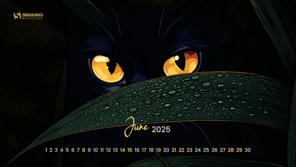


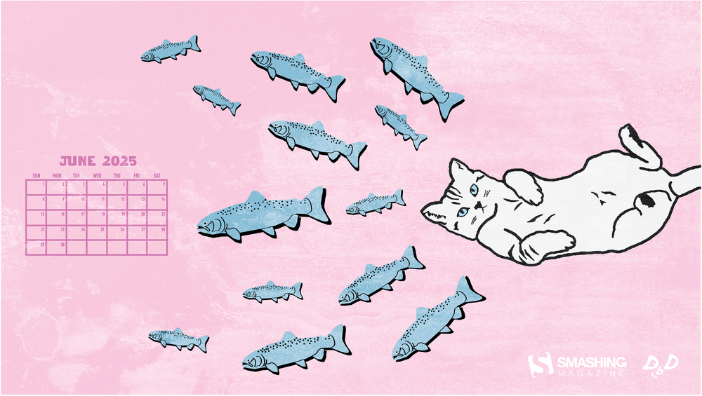


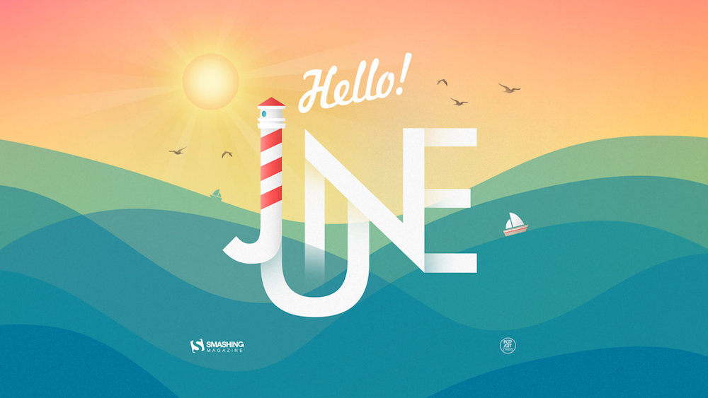

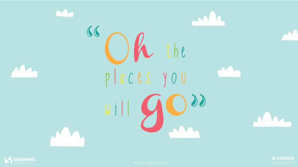


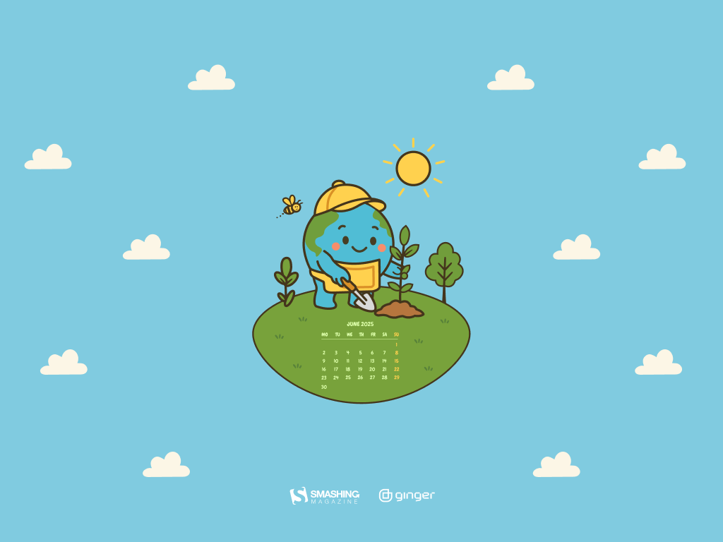
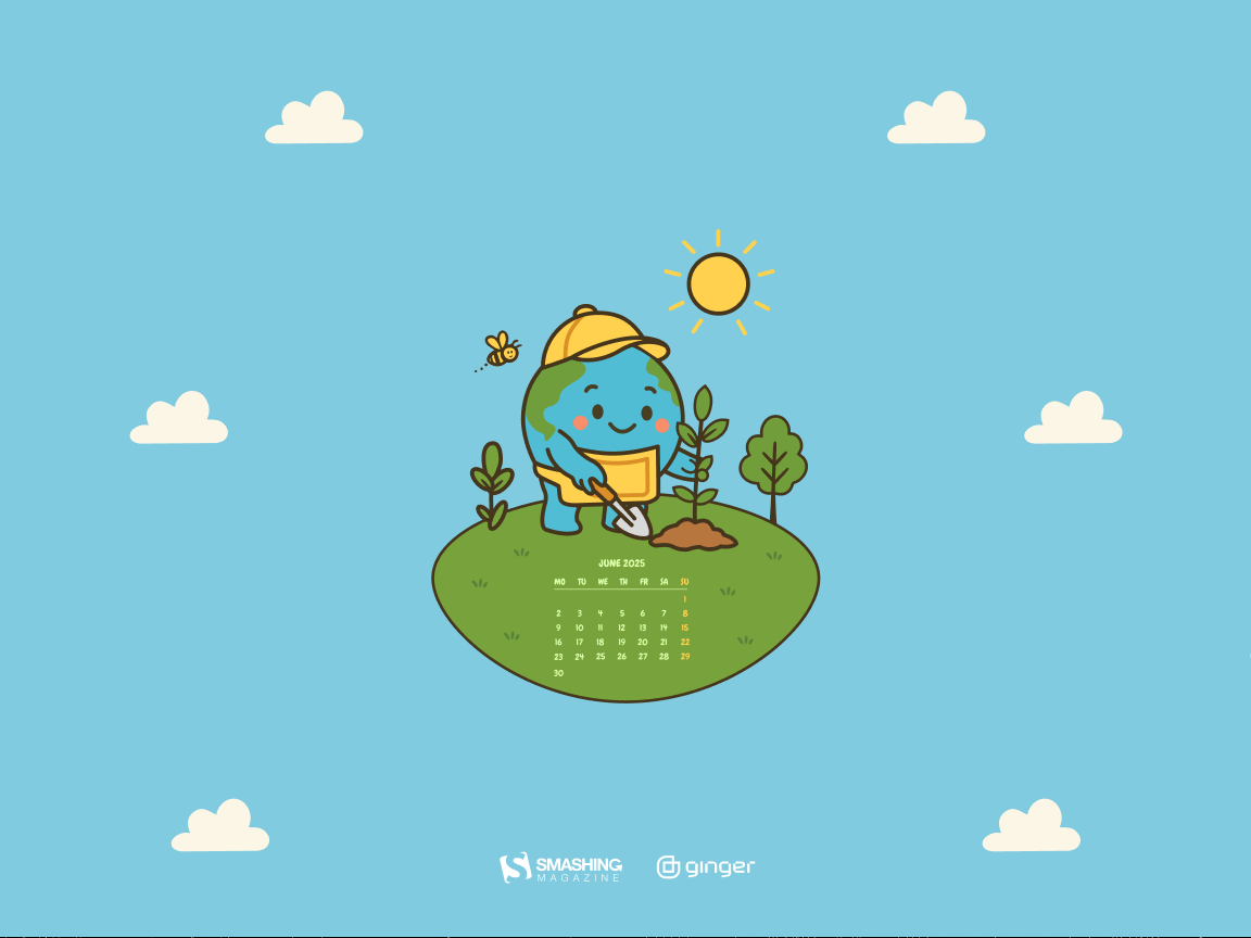
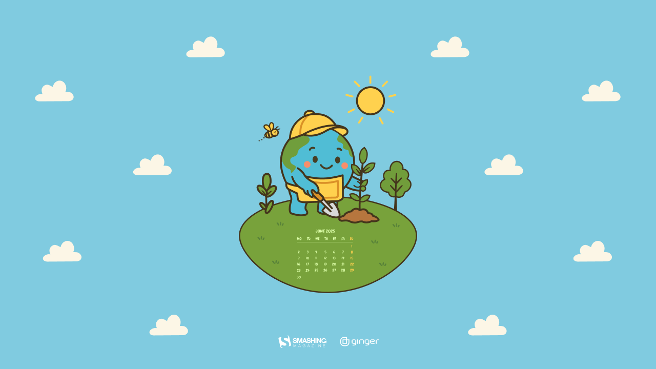
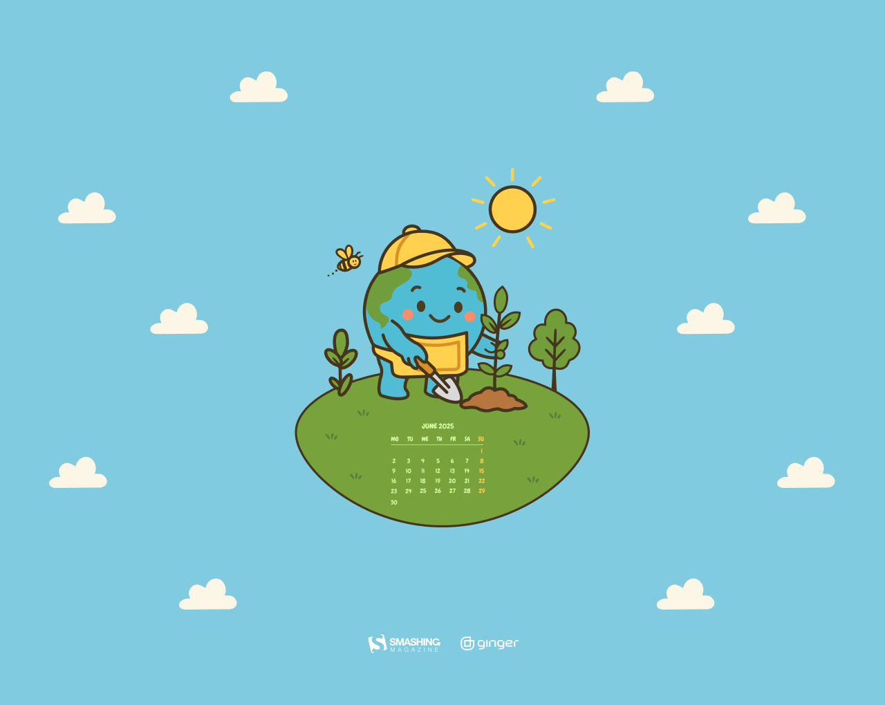
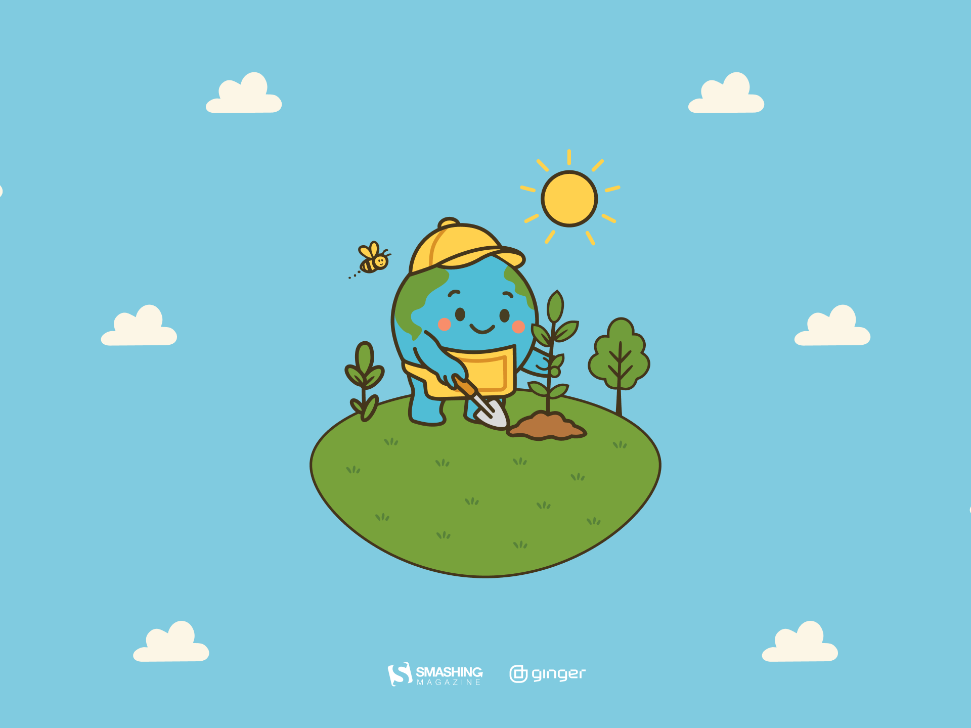
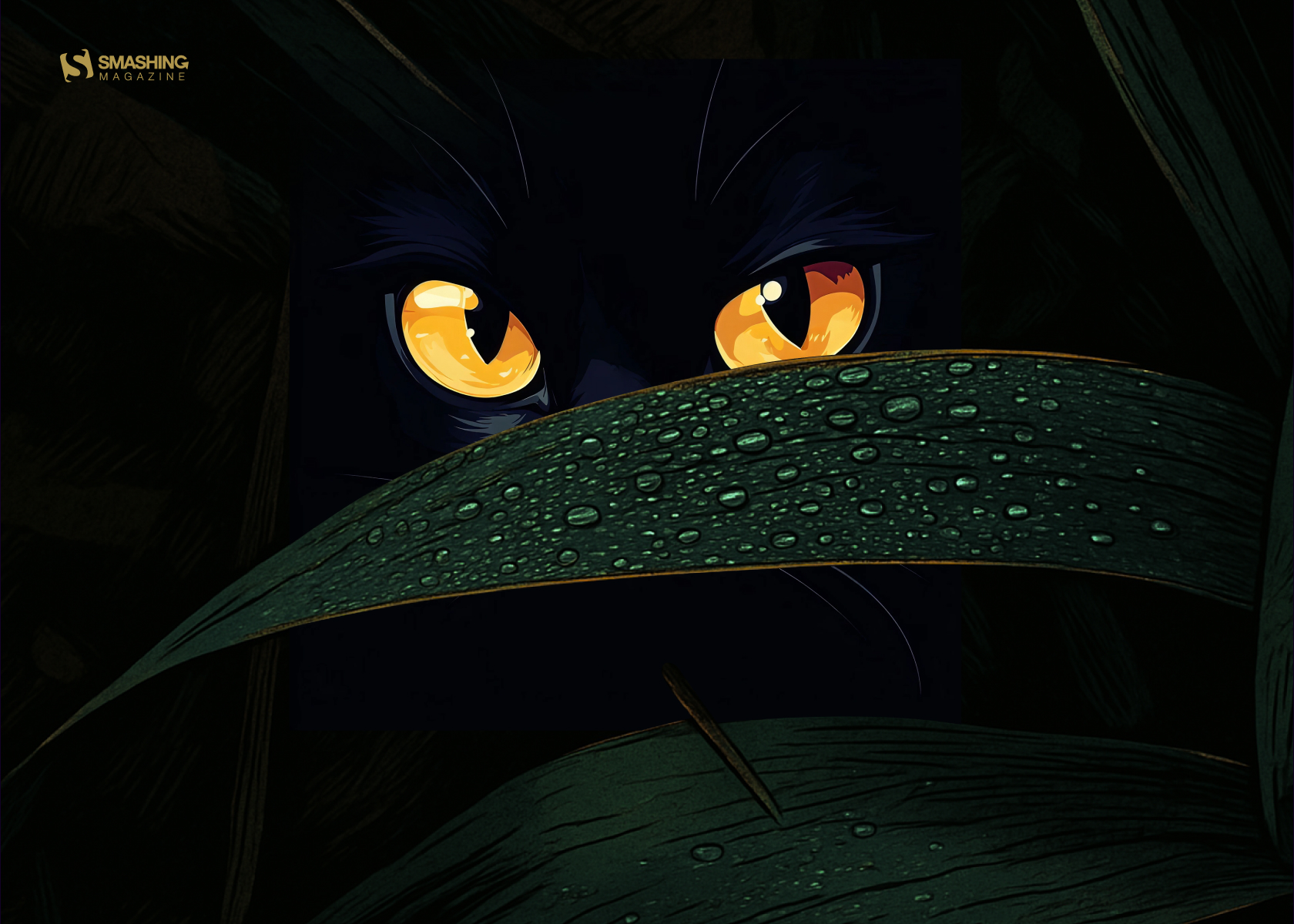
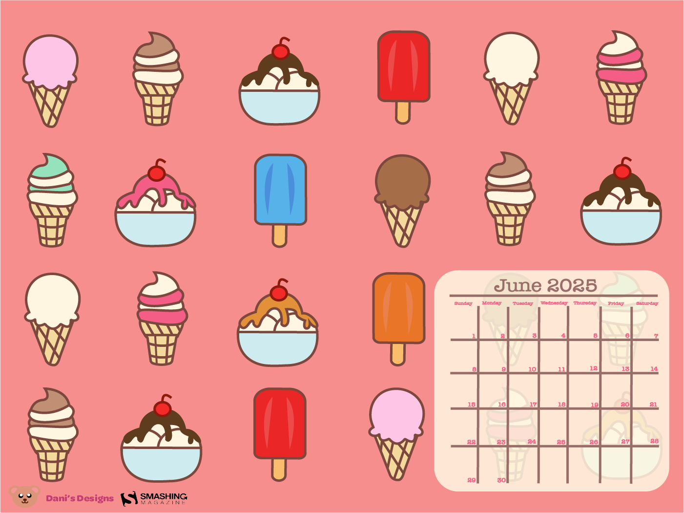
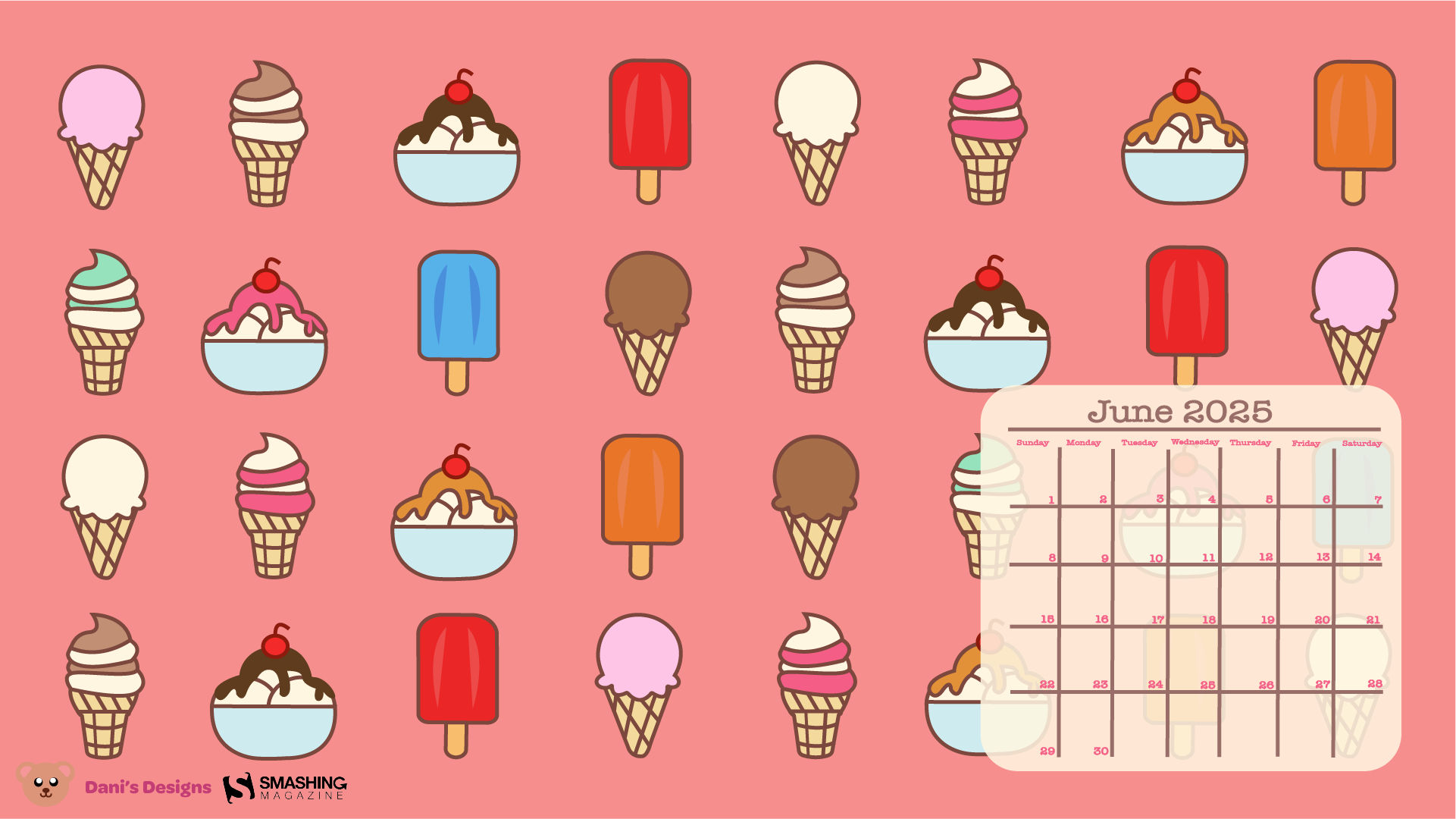
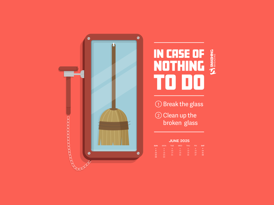
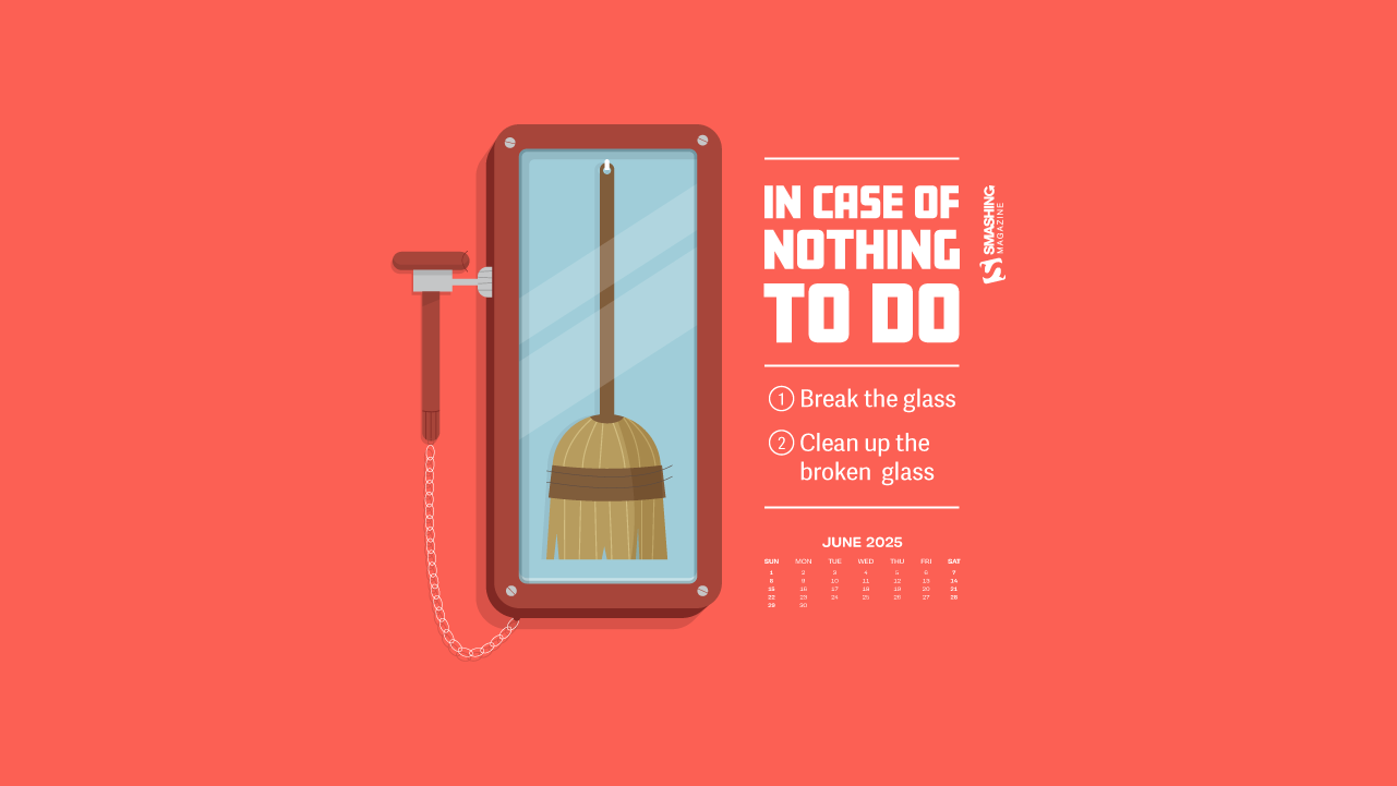
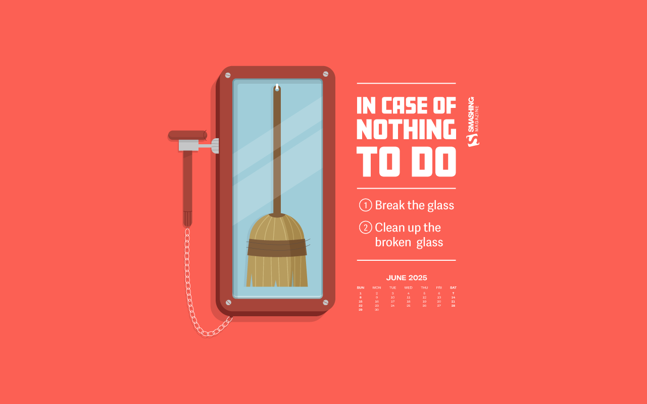
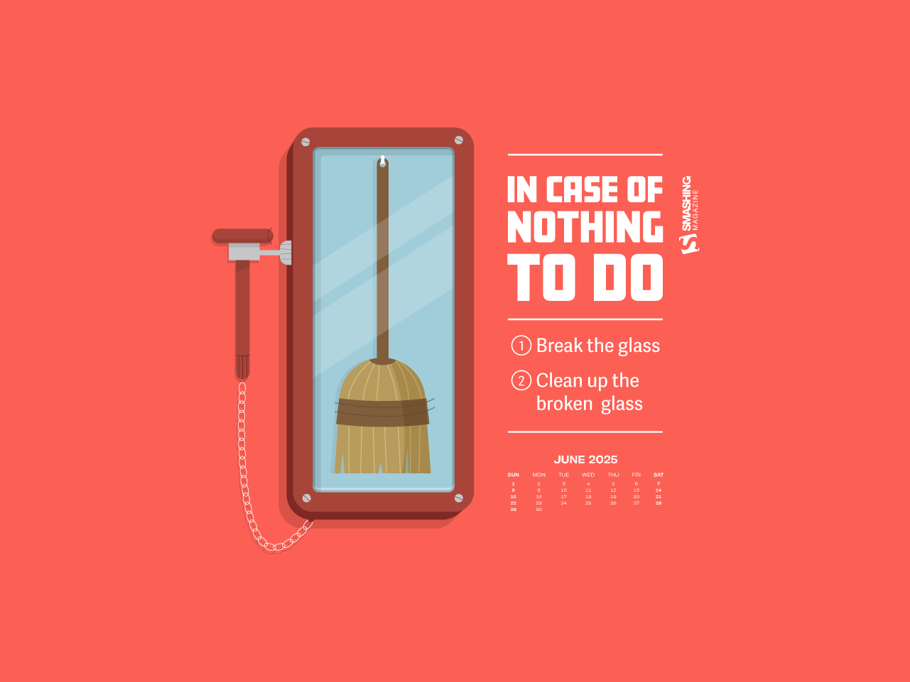
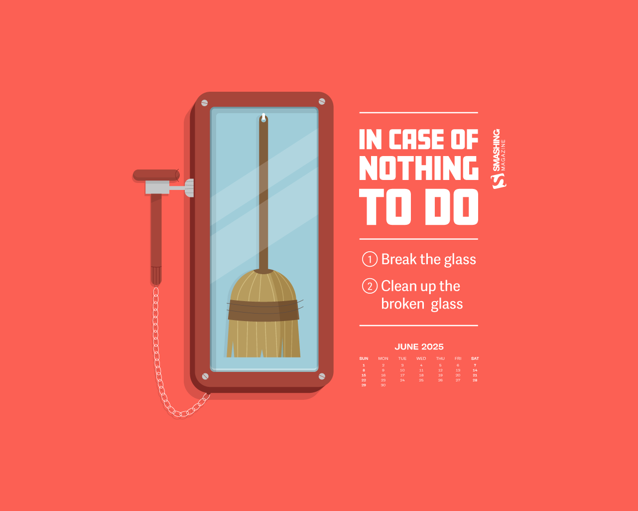
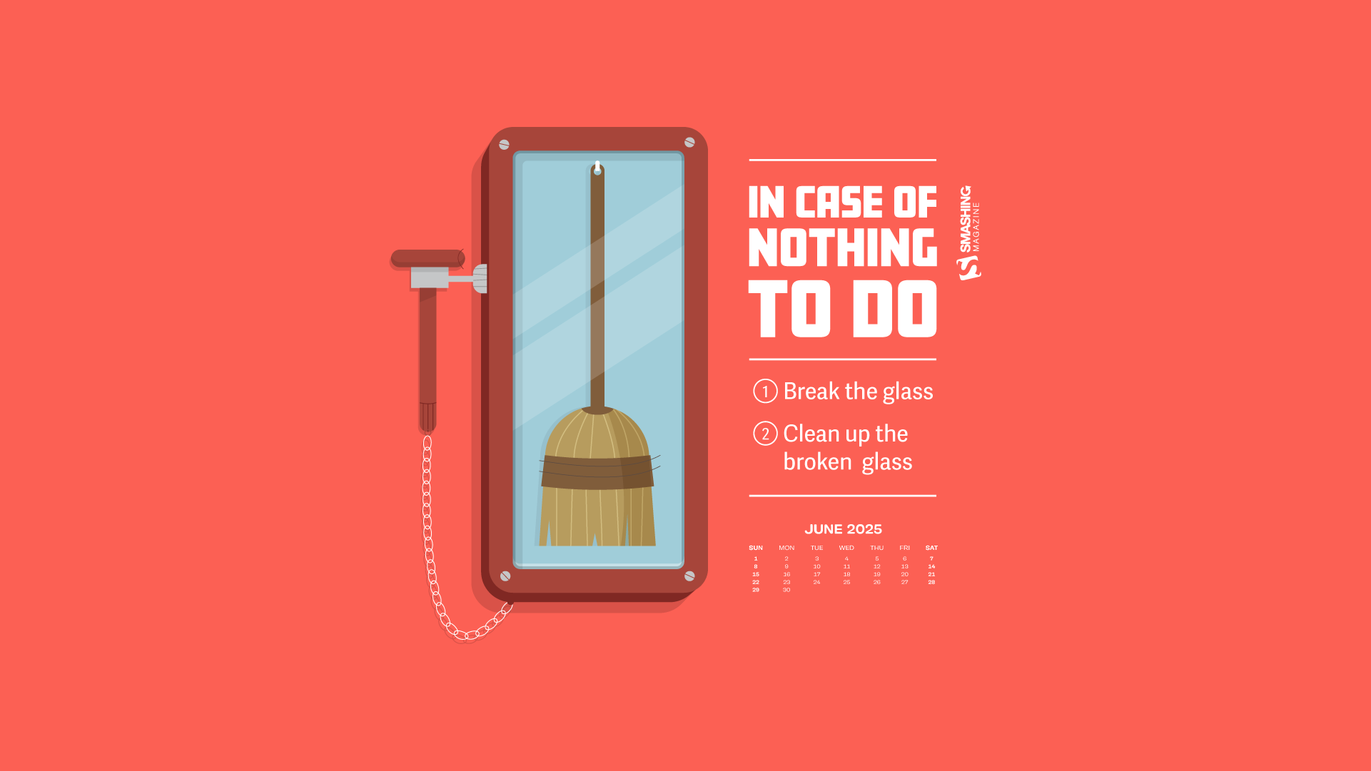
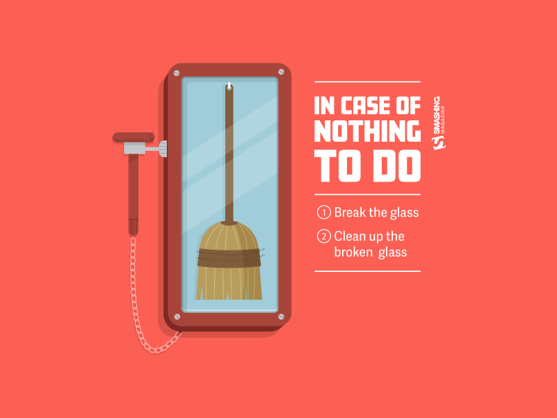
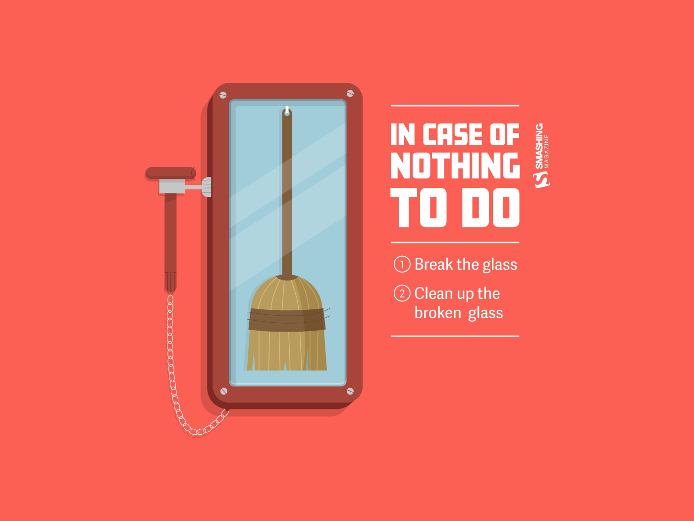
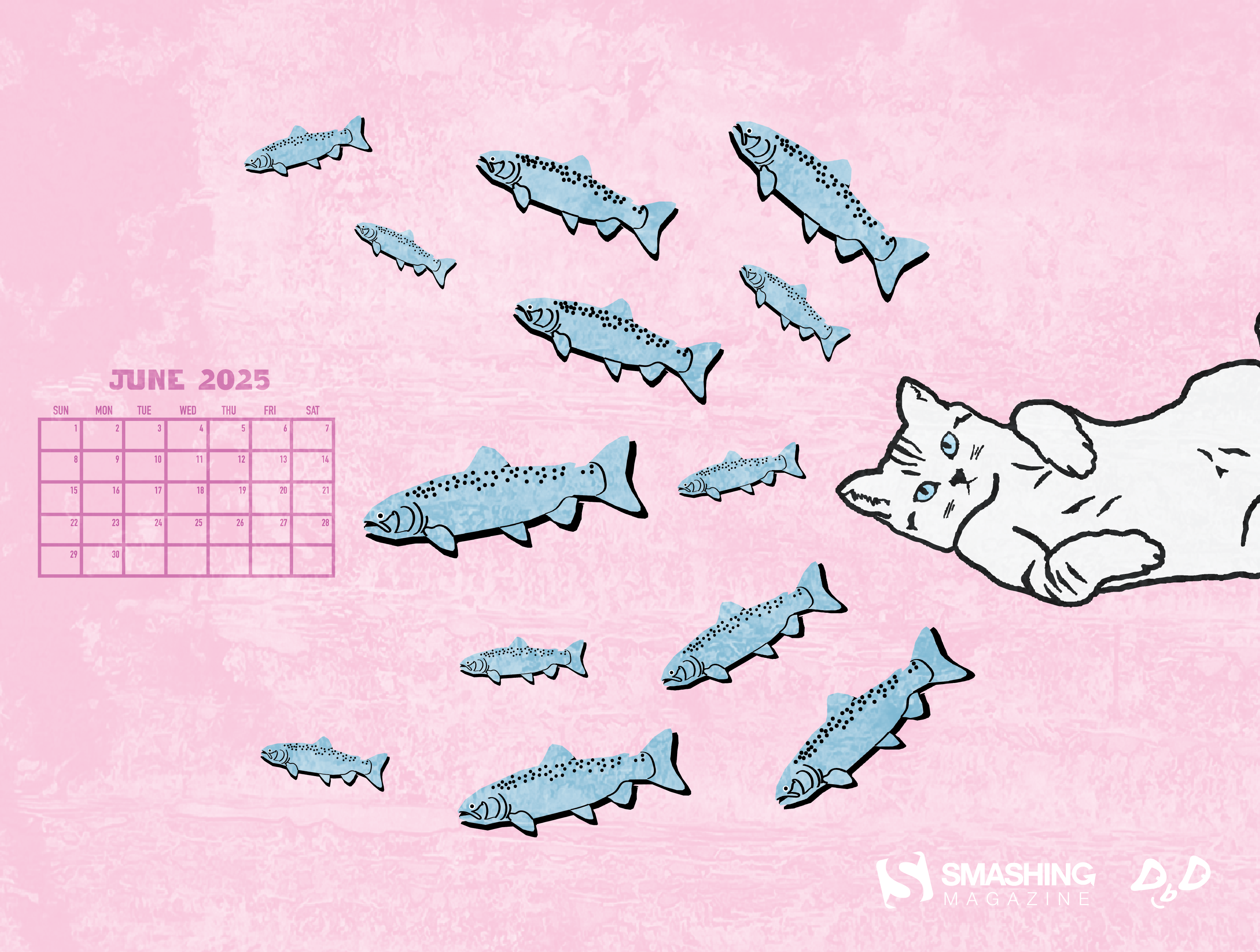